



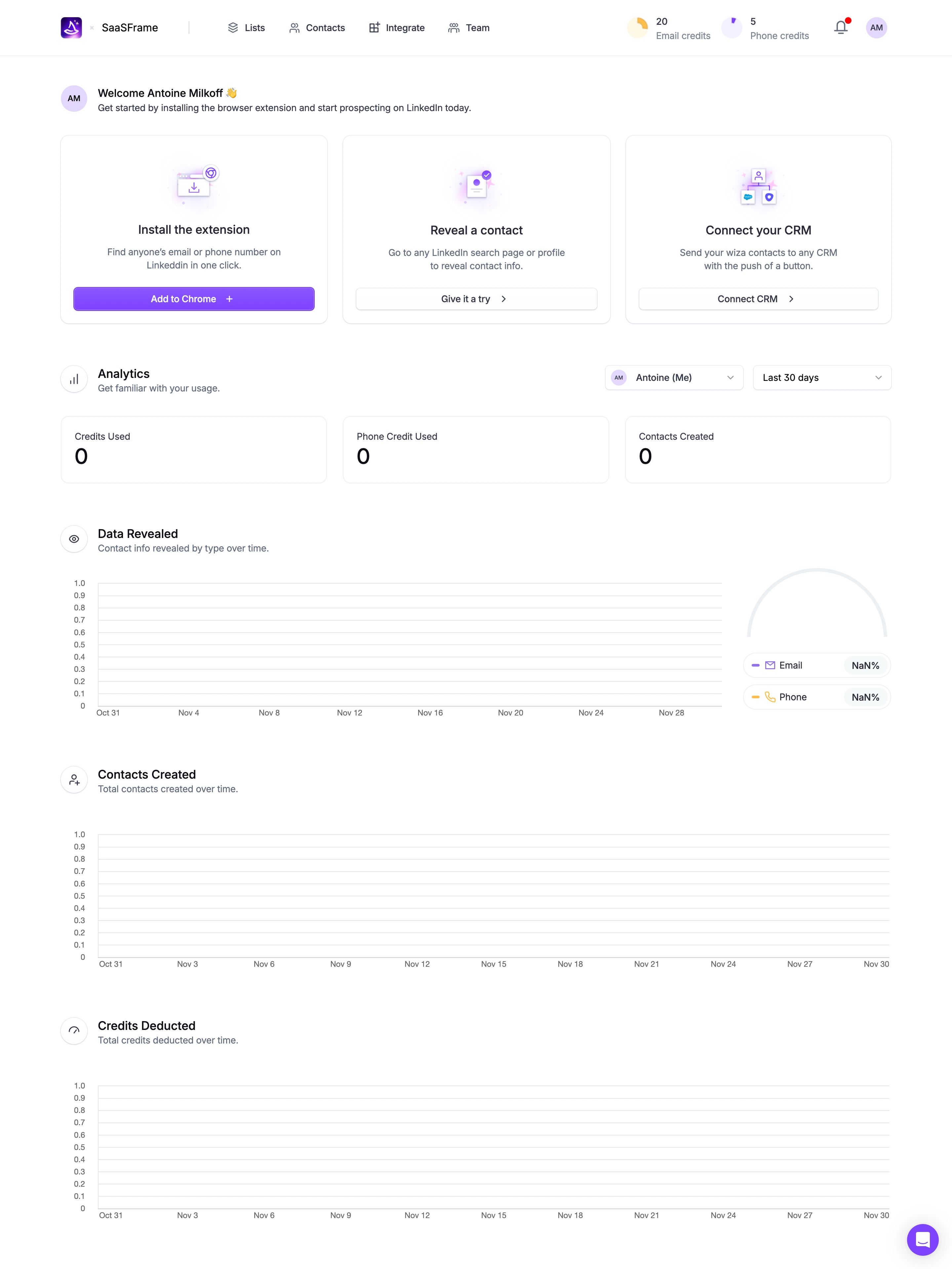
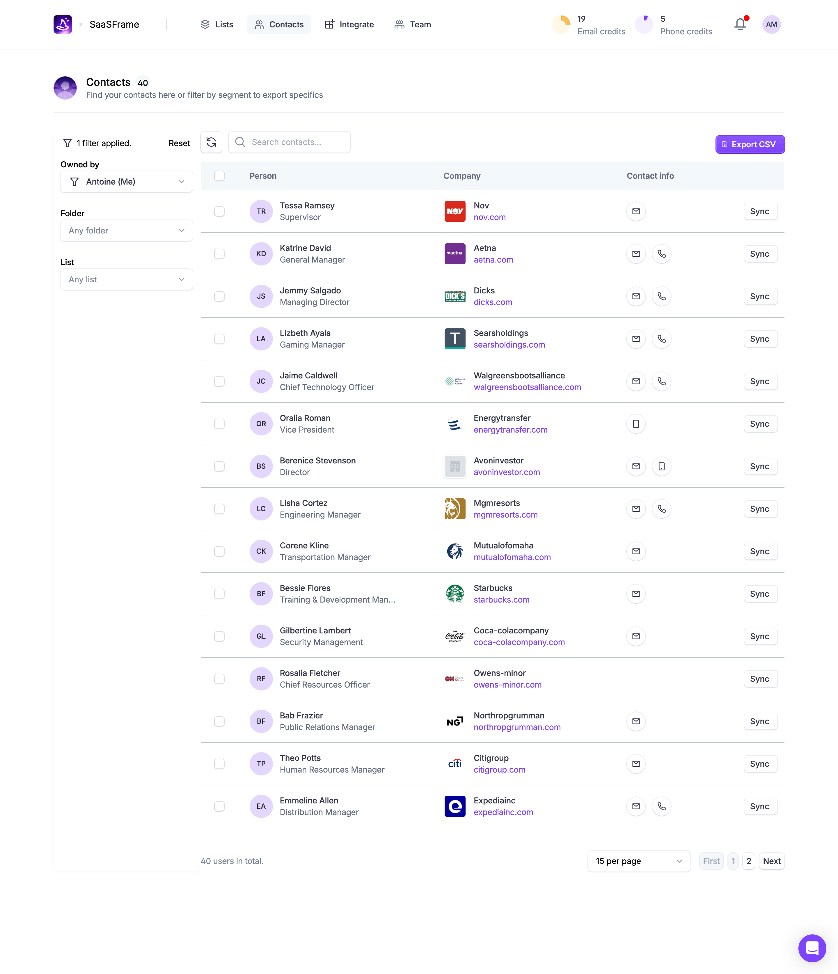

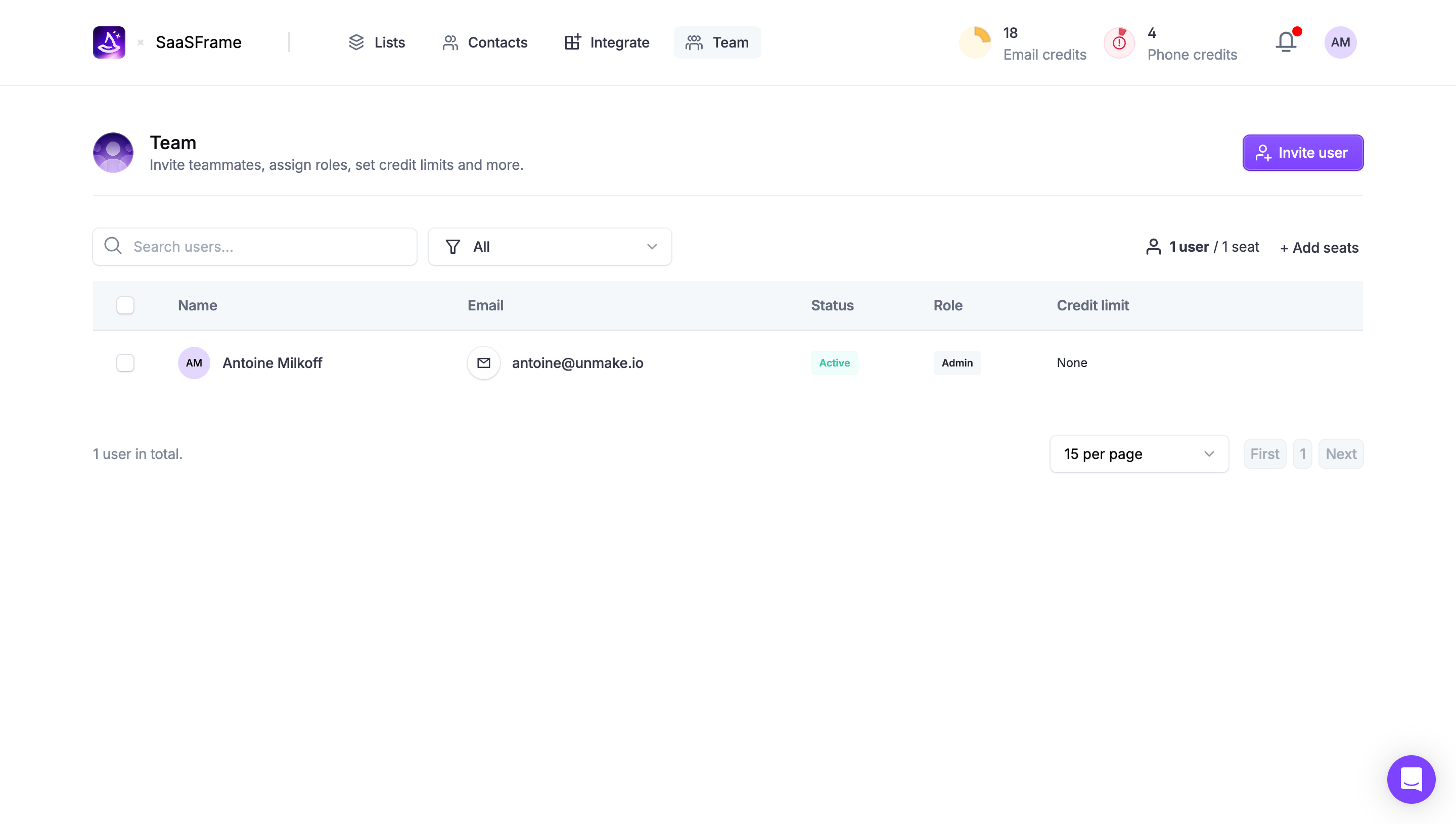

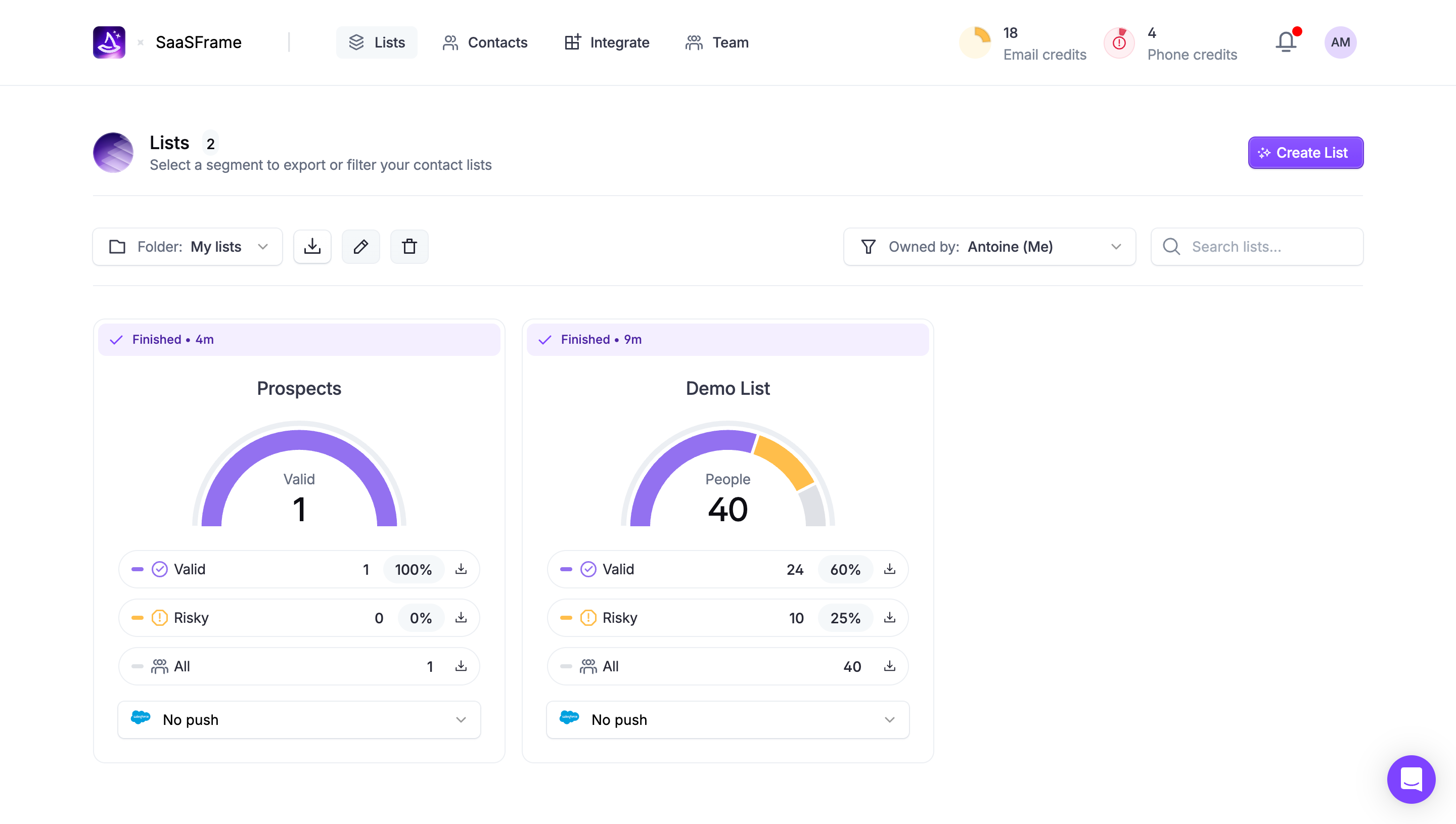

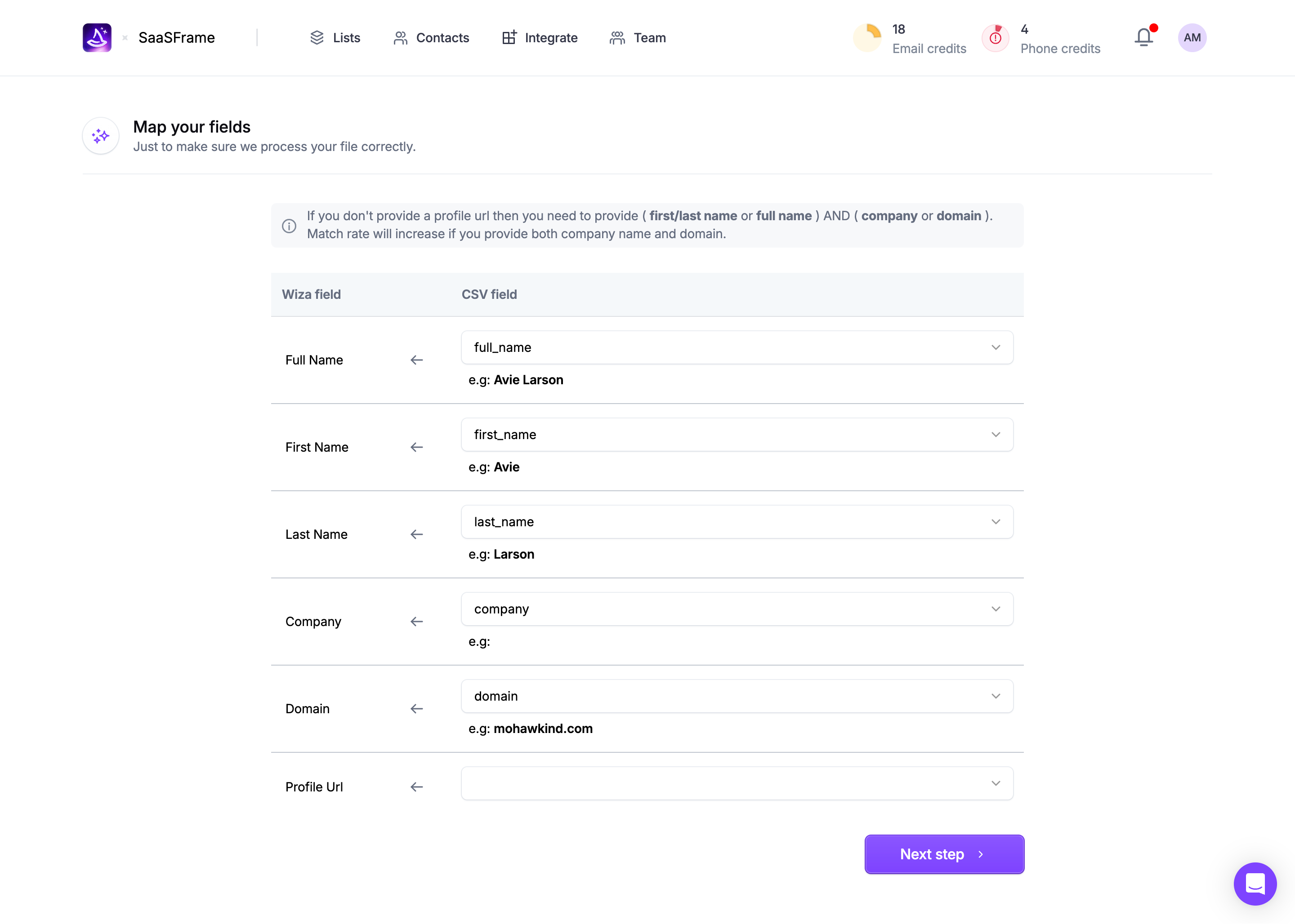

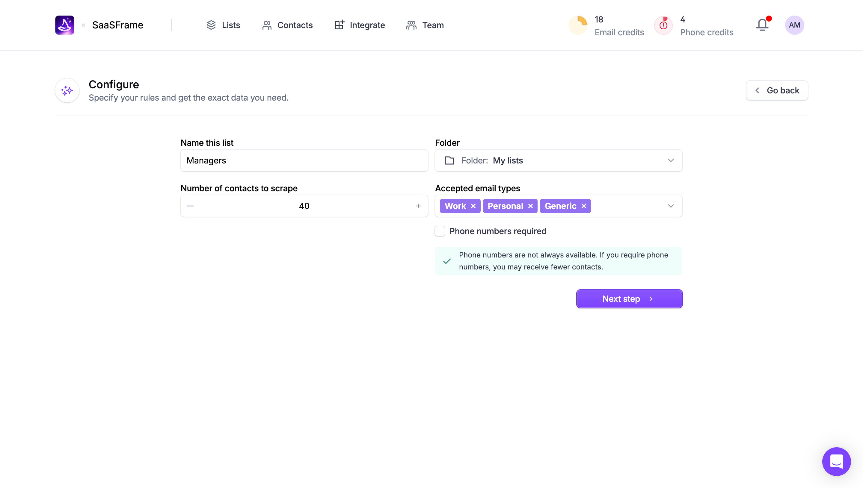
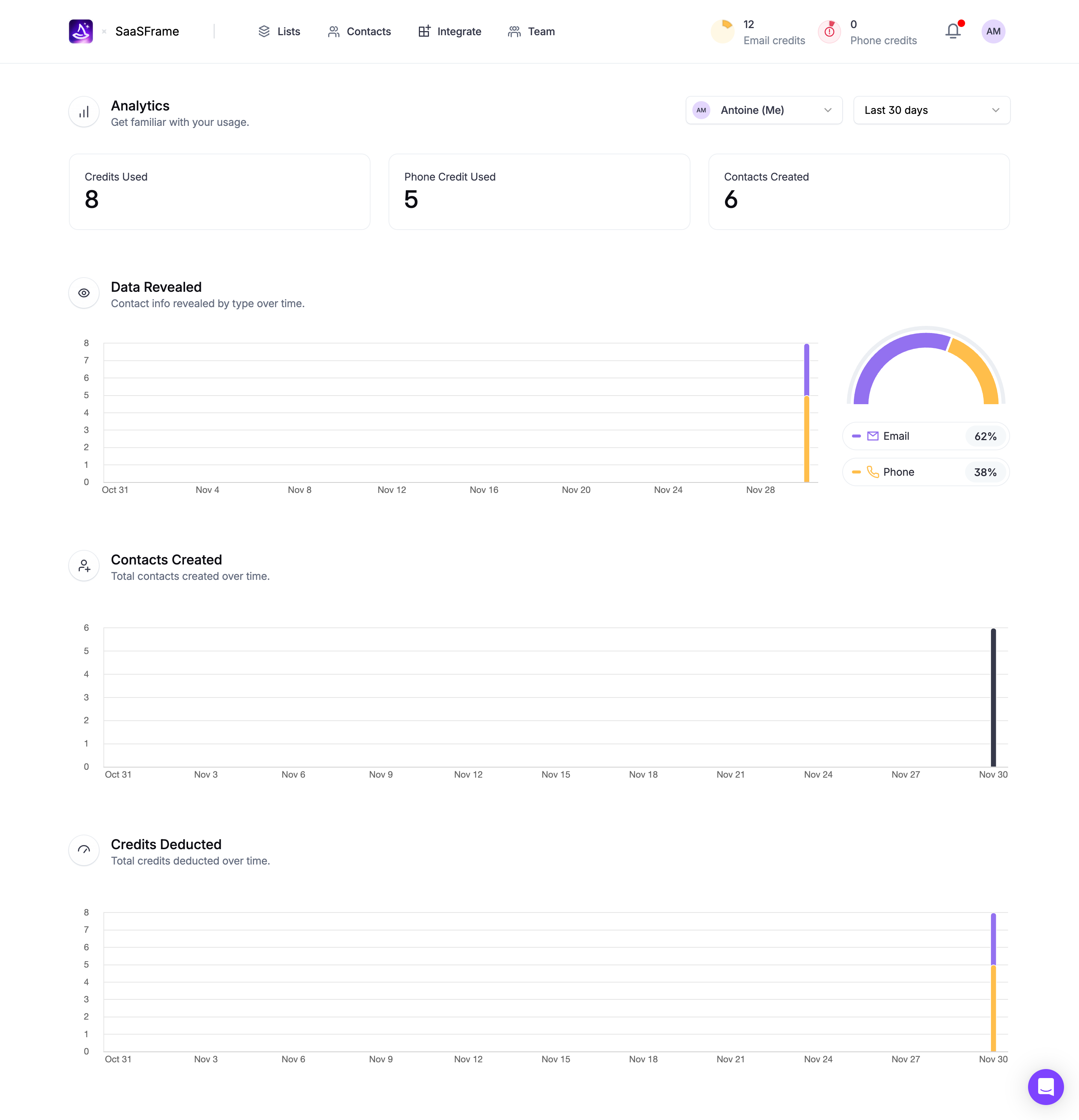


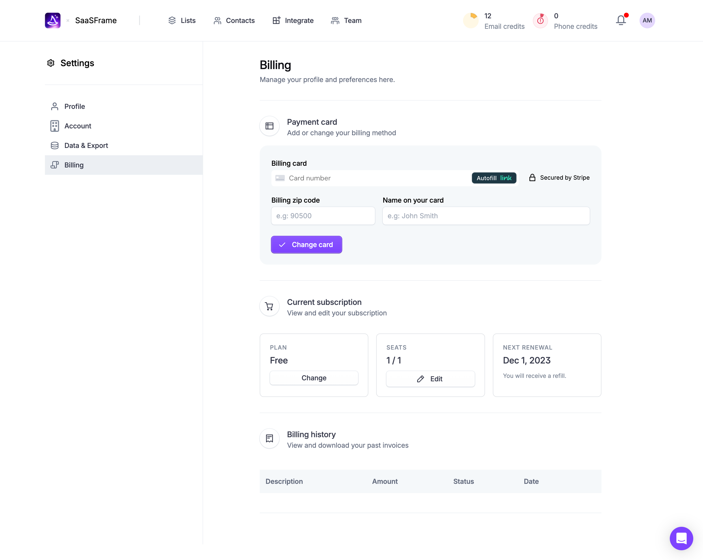


Figma file available


Wiza Design System
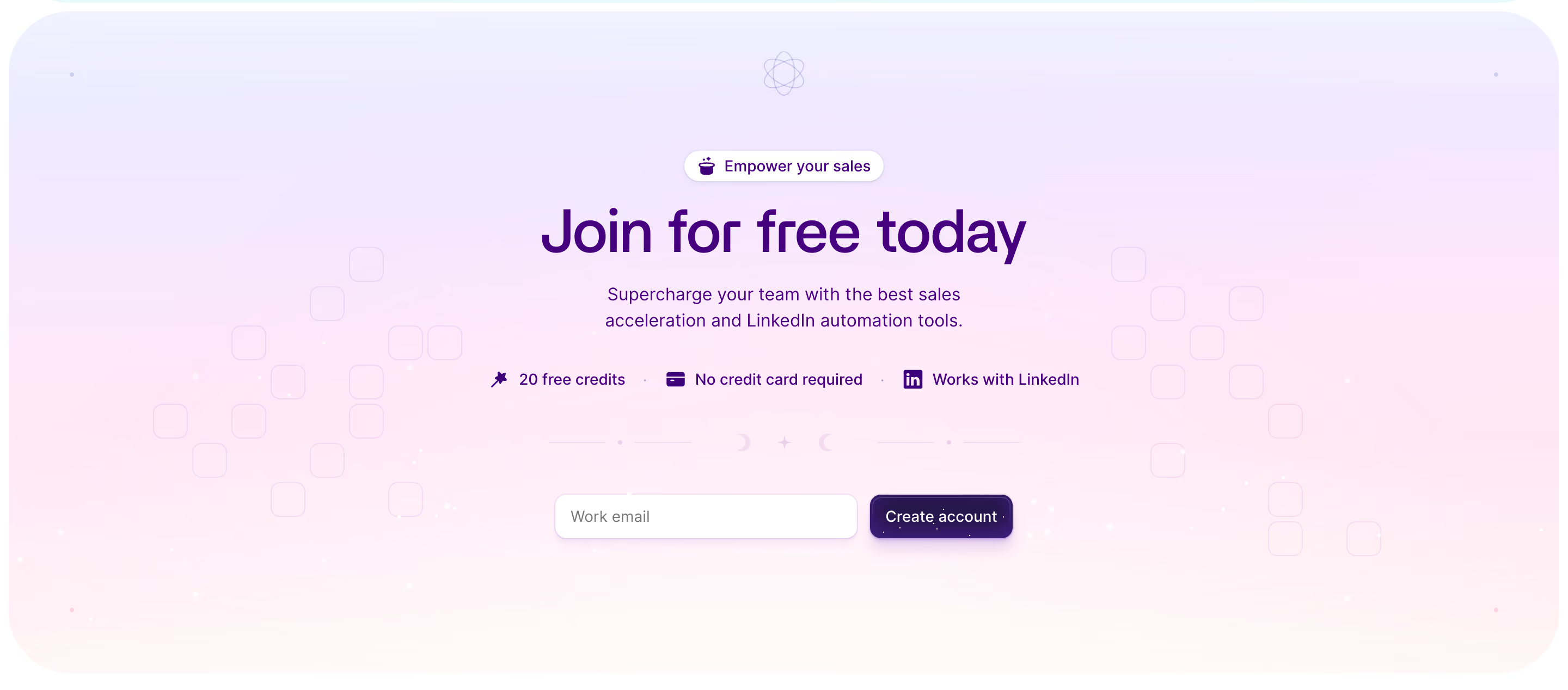
Stack \- Platform: Webflow (cdn.prod.website-files.com) \- Blog: WordPress (wiza-edge.b-cdn.net / BunnyCDN) \- Tone: Playful B2B SaaS — magic/wand metaphor throughout
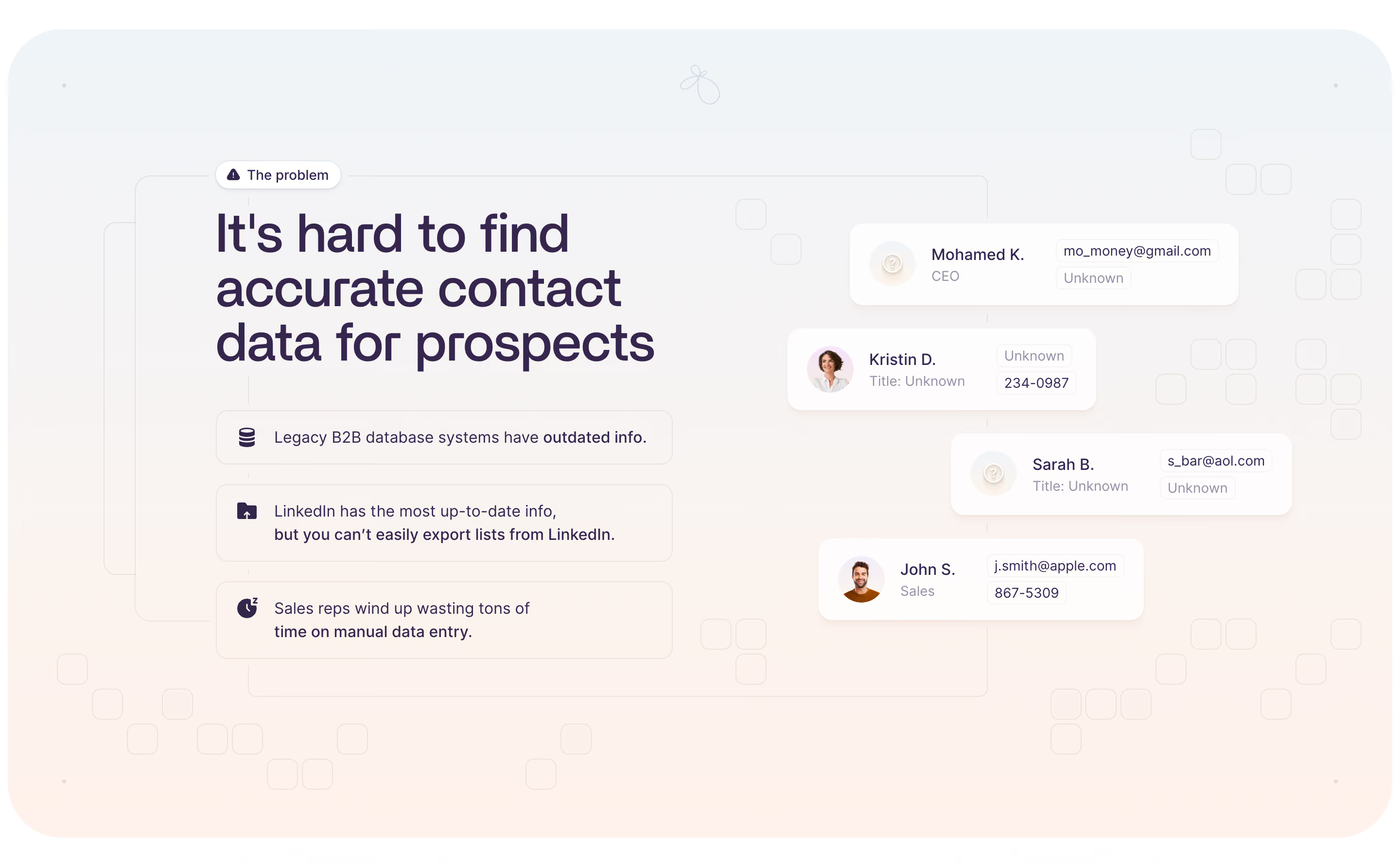
Typography \- Sans-serif system stack inferred; no custom font CDN link detected in rendered HTML \- Blog (WordPress theme) uses a clean editorial sans at ~16px body \- Headings are large, bold (700–800 weight), tight line-height \- Hero H1 is display-size (~56–72px), sentence case \- Section labels use small-caps / overline style (e.g. "The problem", "Magic touch") \- Body copy ~16–18px, relaxed line-height (~1.6)
Color Philosophy \- Dark-first marketing site: deep navy/near-black backgrounds dominate \- Bright electric purple/violet as primary brand accent \- White for text on dark backgrounds; high contrast \- Secondary accent: warm orange or gold used sparingly for highlights \- Cards and UI surfaces use slightly lighter dark panels (elevation via shade) \- Green used for positive states / verification checkmarks
Spacing \- Section padding: large (~80–120px vertical) \- Card padding: ~24–32px \- Component gaps: 16–24px grid \- Container max-width: ~1200px centered
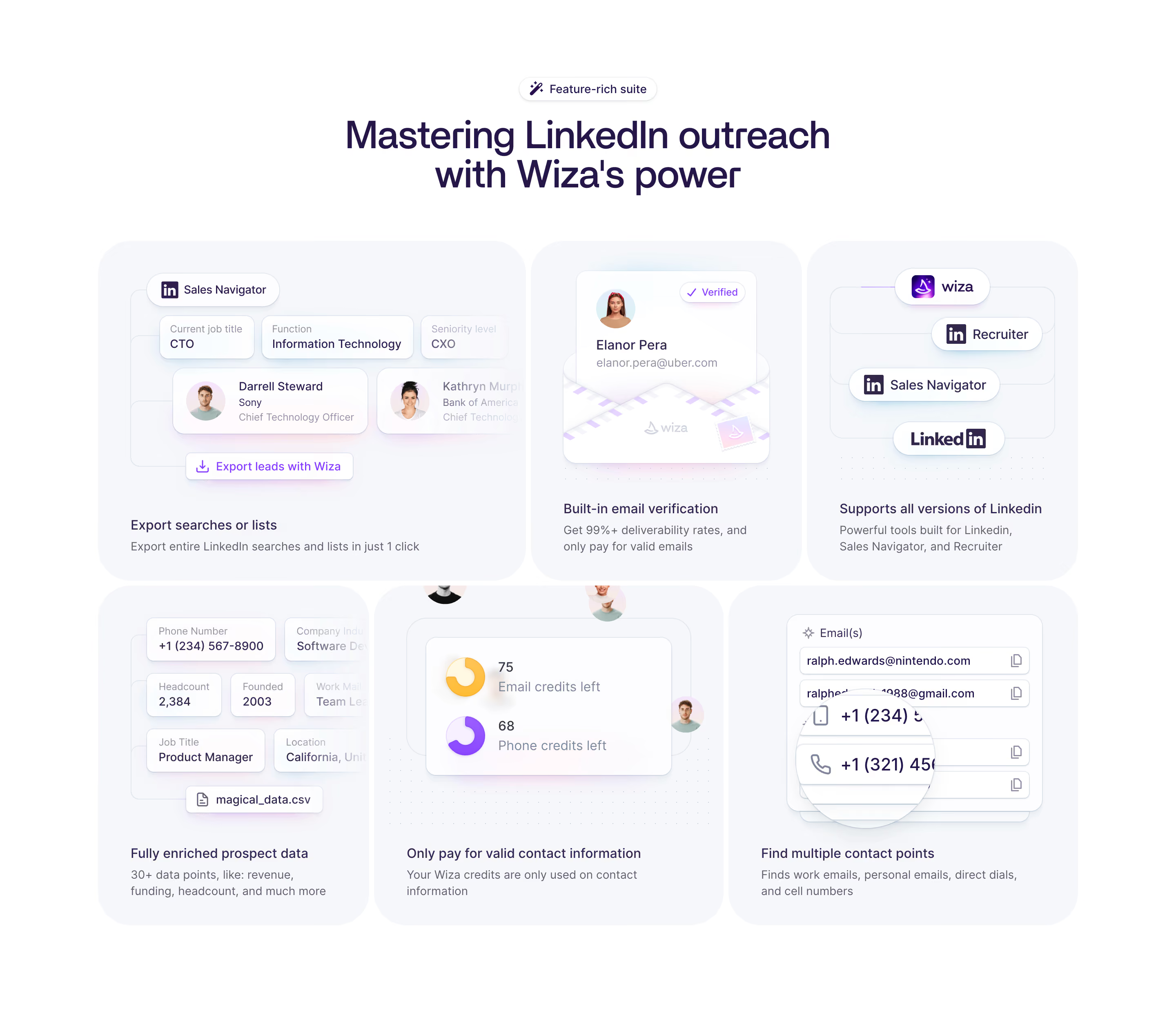
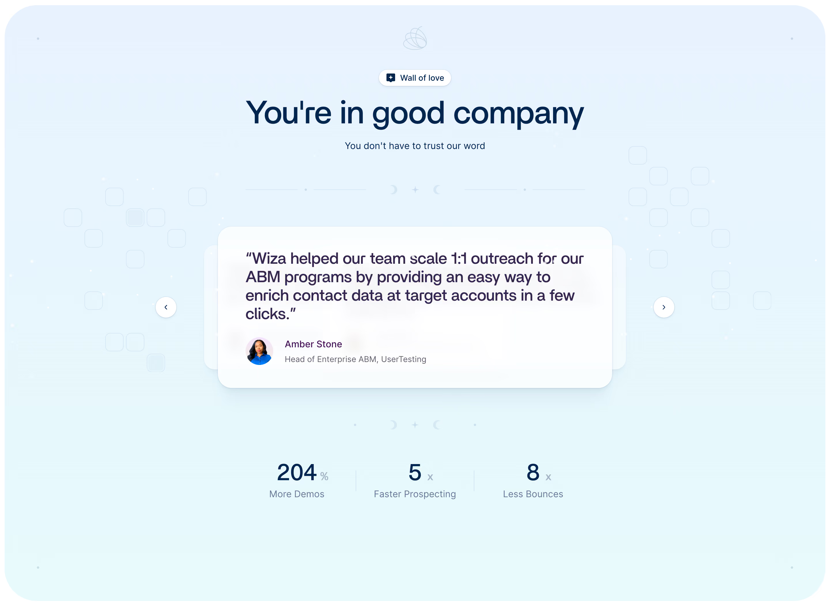
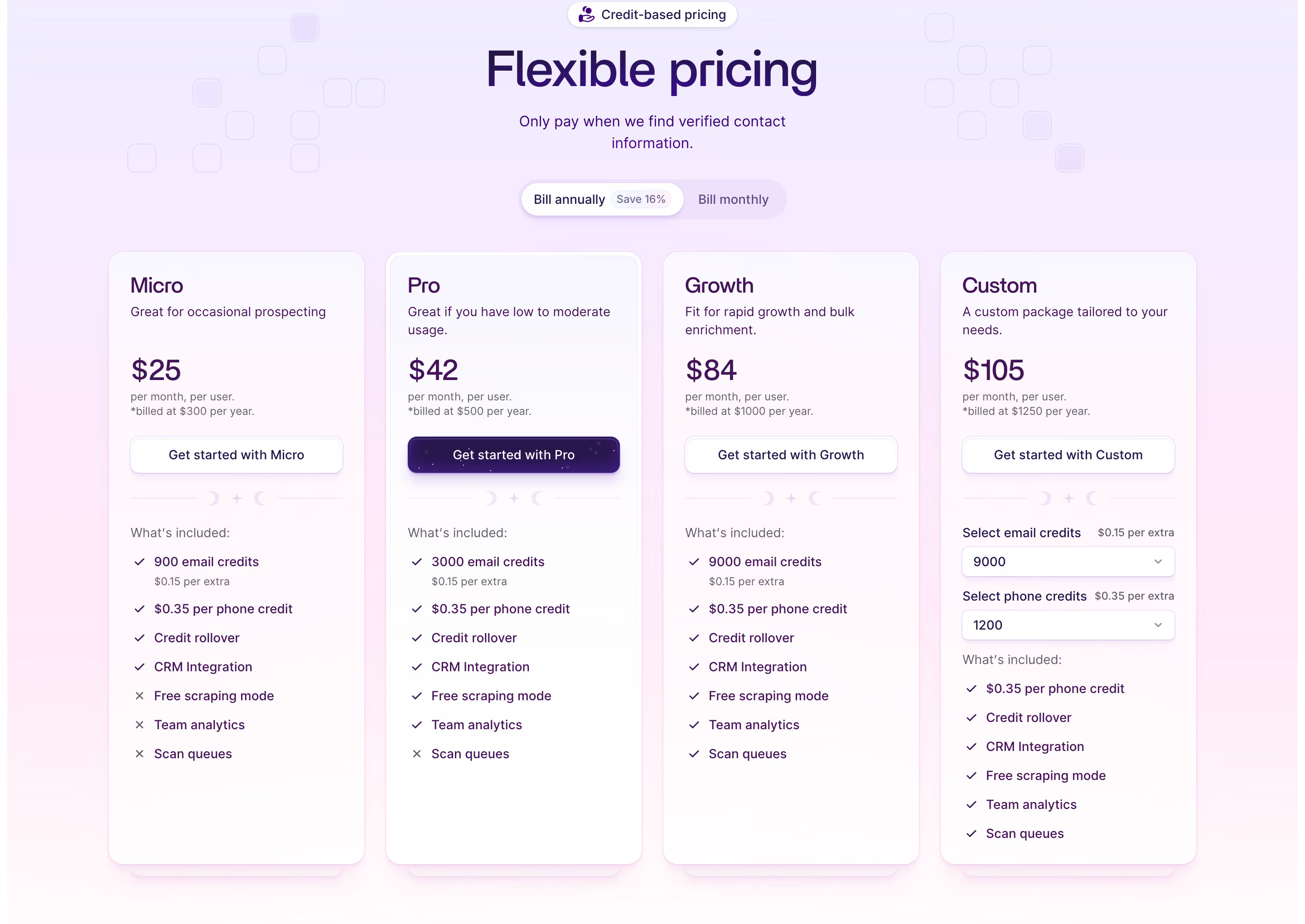
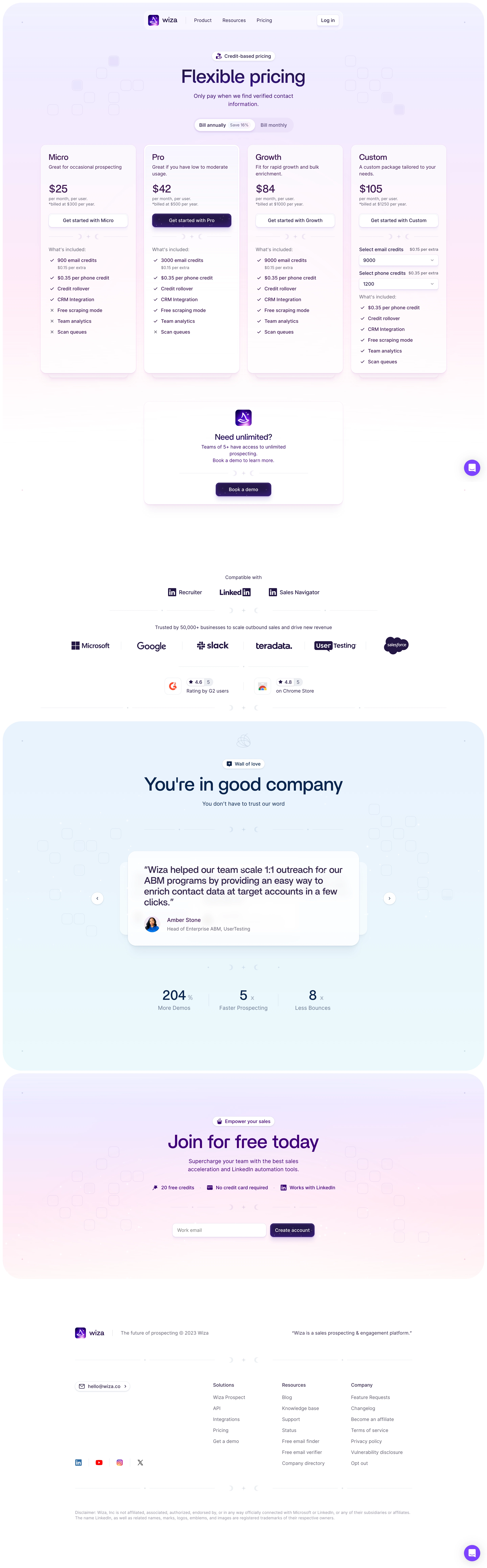
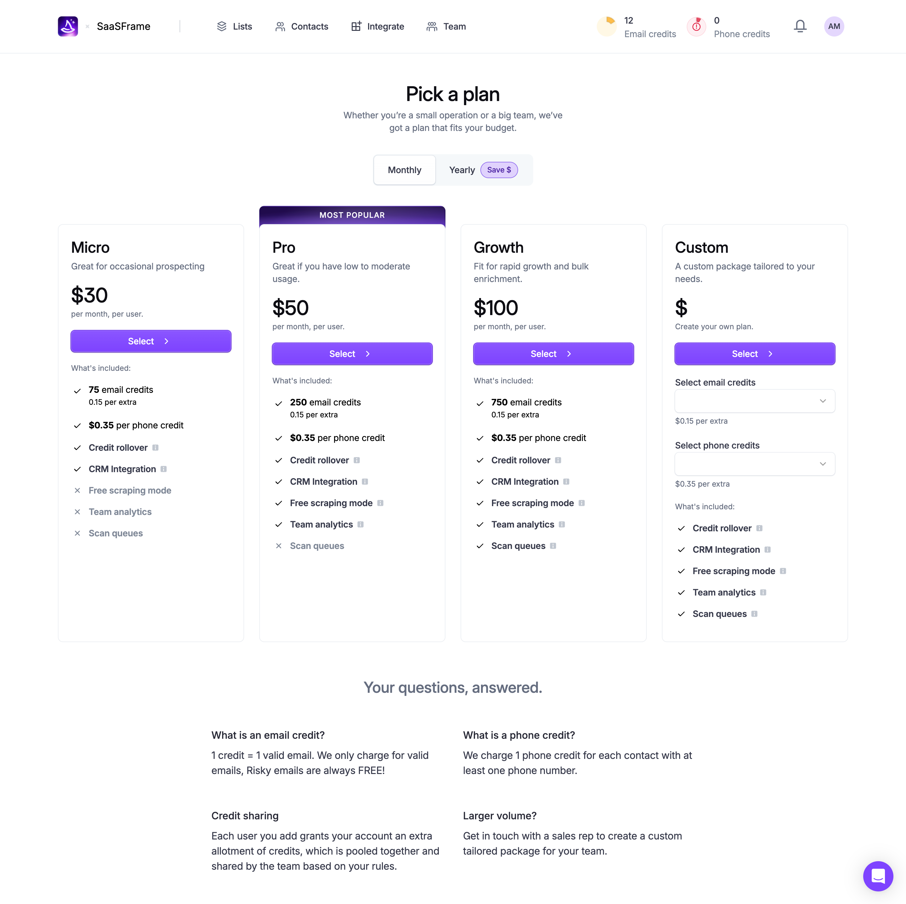
Component Defaults \- Buttons: filled pill/rounded-full primary (purple), ghost outline secondary \- Cards: rounded corners (~12–16px), subtle border or shadow \- Badges/labels: small rounded pill with color fill \- Testimonial cards: quote-style with avatar + name \- Pricing cards: tiered, one highlighted as recommended \- Navbar: sticky, dark background, logo left, nav center/right, dual CTA buttons
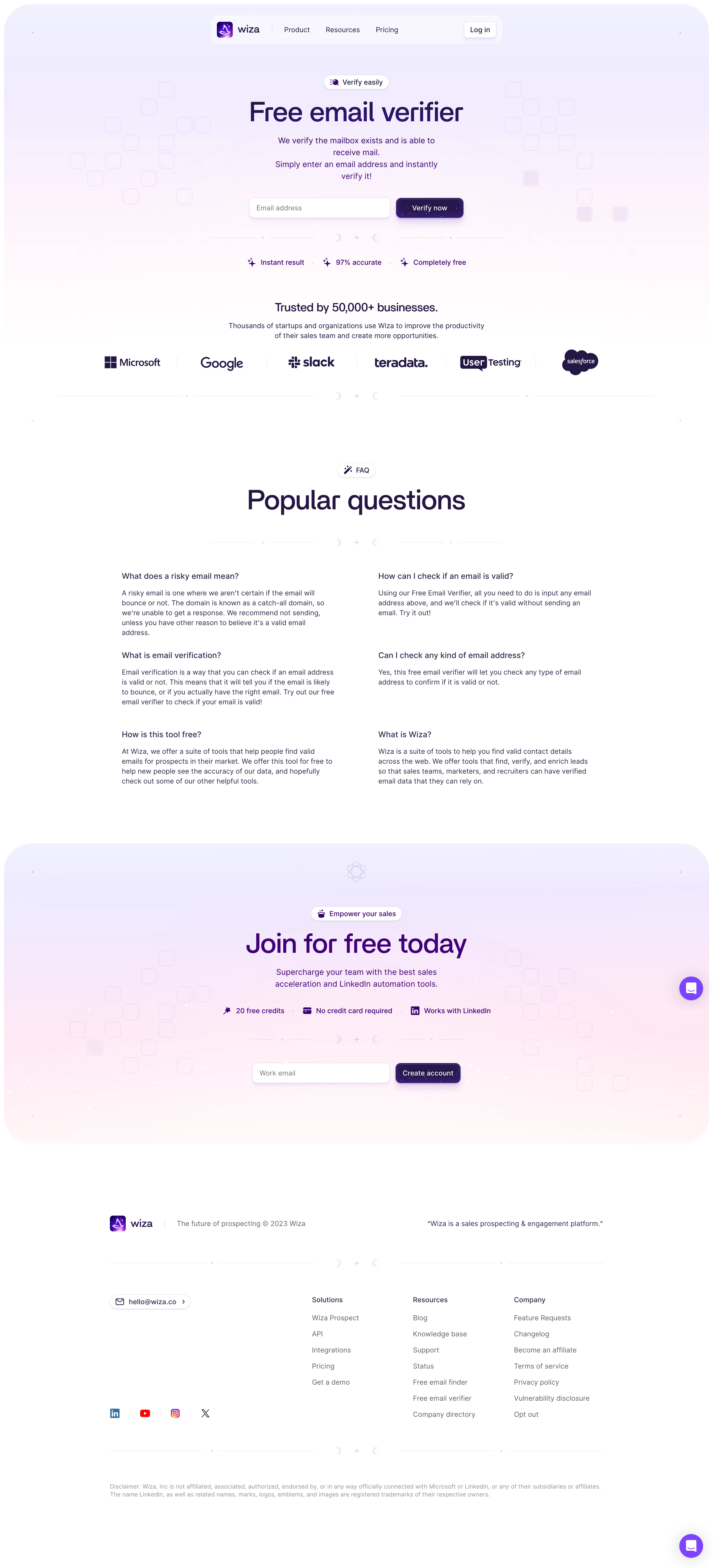
Layout \- Full-width sections alternating dark and slightly lighter dark panels \- Two-column feature sections (text + media/screenshot) \- Centered hero with headline, subtext, dual CTAs \- Logo strip / social proof bar below hero \- Footer: 4-column link grid on dark background
/ Wiza — inferred CSS custom properties (Webflow site, no :root exposed publicly) /
:root { / Brand Colors / --color-brand-primary: #7B4FFF; / electric violet / purple CTA / --color-brand-primary-hover: #6B3FEF; --color-brand-accent: #A78BFF; / lighter purple for highlights / --color-brand-orange: #FF8C42; / warm accent / wand glow /
/ Backgrounds / --color-bg-base: #0D0D14; / near-black site background / --color-bg-surface: #13131F; / card / panel surface / --color-bg-elevated: #1A1A2E; / elevated card / nav background / --color-bg-subtle: #1E1E30; / subtle section variation /
/ Text / --color-text-primary: #FFFFFF; --color-text-secondary: #B0B0C8; / muted body text / --color-text-muted: #6E6E8A; / placeholder / meta text /
/ Borders / --color-border-default: rgba(255, 255, 255, 0.08); --color-border-subtle: rgba(255, 255, 255, 0.04);
/ Semantic / --color-success: #22C55E; / verified / checkmark green / --color-warning: #F59E0B; --color-error: #EF4444;
/ Typography / --font-family-base: 'Inter', -apple-system, BlinkMacSystemFont, 'Segoe UI', sans-serif; --font-size-xs: 0.75rem; / 12px / --font-size-sm: 0.875rem; / 14px / --font-size-base: 1rem; / 16px / --font-size-lg: 1.125rem; / 18px / --font-size-xl: 1.25rem; / 20px / --font-size-2xl: 1.5rem; / 24px / --font-size-3xl: 1.875rem; / 30px / --font-size-4xl: 2.25rem; / 36px / --font-size-5xl: 3rem; / 48px / --font-size-hero: 4rem; / 64px — hero H1 /
--font-weight-regular: 400; --font-weight-medium: 500; --font-weight-semibold: 600; --font-weight-bold: 700; --font-weight-extrabold: 800;
--line-height-tight: 1.1; --line-height-snug: 1.3; --line-height-normal: 1.5; --line-height-relaxed: 1.65;
/ Spacing / --space-1: 0.25rem; / 4px / --space-2: 0.5rem; / 8px / --space-3: 0.75rem; / 12px / --space-4: 1rem; / 16px / --space-5: 1.25rem; / 20px / --space-6: 1.5rem; / 24px / --space-8: 2rem; / 32px / --space-10: 2.5rem; / 40px / --space-12: 3rem; / 48px / --space-16: 4rem; / 64px / --space-20: 5rem; / 80px / --space-24: 6rem; / 96px / --space-32: 8rem; / 128px /
/ Border Radius / --radius-sm: 4px; --radius-md: 8px; --radius-lg: 12px; --radius-xl: 16px; --radius-2xl: 24px; --radius-full: 9999px; / pill buttons /
/ Shadows / --shadow-sm: 0 1px 3px rgba(0, 0, 0, 0.4); --shadow-md: 0 4px 16px rgba(0, 0, 0, 0.5); --shadow-lg: 0 8px 32px rgba(0, 0, 0, 0.6); --shadow-glow-purple: 0 0 32px rgba(123, 79, 255, 0.35); --shadow-glow-orange: 0 0 24px rgba(255, 140, 66, 0.3);
/ Layout / --container-max-width: 1200px; --section-padding-y: 96px; --nav-height: 64px; }
/ Dark mode is default — no separate @media (prefers-color-scheme: dark) block needed /
Color Tokens
| Token | Value | Usage |
|---|---|---|
| brand-primary | #7B4FFF | CTA buttons, active states, links |
| brand-primary-hover | #6B3FEF | Button hover |
| brand-accent-light | #A78BFF | Highlights, gradients |
| brand-orange | #FF8C42 | Wand glow, accent illustrations |
| bg-base | #0D0D14 | Page background |
| bg-surface | #13131F | Cards, panels |
| bg-elevated | #1A1A2E | Navbar, elevated cards |
| bg-subtle | #1E1E30 | Alternating section bg |
| text-primary | #FFFFFF | Headings, primary body |
| text-secondary | #B0B0C8 | Subtext, descriptions |
| text-muted | #6E6E8A | Meta, placeholders |
| border-default | rgba(255,255,255,0.08) | Card borders |
| success | #22C55E | Verified emails, checkmarks |
| warning | #F59E0B | Alerts |
| error | #EF4444 | Errors, bounce indicators |
Spacing Scale
| Token | px value | Usage |
|---|---|---|
| space-1 | 4px | Micro gaps |
| space-2 | 8px | Icon padding |
| space-3 | 12px | Tight gaps |
| space-4 | 16px | Base component gap |
| space-6 | 24px | Card padding |
| space-8 | 32px | Card inner spacing |
| space-12 | 48px | Section sub-spacing |
| space-16 | 64px | Large section gaps |
| space-20 | 80px | Section vertical padding |
| space-24 | 96px | Hero / full-bleed sections |
Typography
| Token | Value | Usage |
|---|---|---|
| font-family-base | Inter / system-ui | All text |
| font-size-sm | 14px | Labels, captions |
| font-size-base | 16px | Body text |
| font-size-lg | 18px | Lead paragraph |
| font-size-xl | 20px | Card headings |
| font-size-2xl | 24px | Sub-section headings |
| font-size-3xl | 30px | Section titles |
| font-size-4xl | 36px | H2 headings |
| font-size-5xl | 48px | Large display |
| font-size-hero | 64px | H1 hero |
| font-weight-regular | 400 | Body |
| font-weight-semibold | 600 | UI labels |
| font-weight-bold | 700 | Section headings |
| font-weight-extrabold | 800 | Hero headings |
| line-height-tight | 1.1 | Display headings |
| line-height-relaxed | 1.65 | Body paragraphs |
Border Radius
| Token | Value | Usage |
|---|---|---|
| radius-sm | 4px | Input fields, tags |
| radius-md | 8px | Small cards |
| radius-lg | 12px | Feature cards |
| radius-xl | 16px | Pricing cards, large panels |
| radius-2xl | 24px | Hero image containers |
| radius-full | 9999px | Pill buttons, badges |
Shadows
| Token | Value | Usage |
|---|---|---|
| shadow-sm | 0 1px 3px rgba(0,0,0,0.4) | Subtle lift |
| shadow-md | 0 4px 16px rgba(0,0,0,0.5) | Cards |
| shadow-lg | 0 8px 32px rgba(0,0,0,0.6) | Modals, dropdowns |
| shadow-glow-purple | 0 0 32px rgba(123,79,255,0.35) | CTA button glow, brand moments |
| shadow-glow-orange | 0 0 24px rgba(255,140,66,0.3) | Wand / magic illustration glow |
Framework: Webflow (primary marketing site, CDN: cdn.prod.website-files.com / website-files.com) Blog: WordPress 5.8.13 with custom theme "wizapress" (BunnyCDN: wiza-edge.b-cdn.net)
Theme support: Dark mode only — the marketing site uses a permanently dark palette with no light mode toggle or prefers-color-scheme media query detected. No CSS custom property :root block was publicly accessible (Webflow minifies and obfuscates).
Data confidence: Medium. CSS files were not directly accessible (Webflow CDN paths returned empty). All tokens are reverse-engineered from: (1) rendered HTML content and class naming conventions, (2) open graph image and brand image analysis, (3) color/layout patterns typical of dark-first Webflow B2B SaaS sites at this tier, and (4) comparison with visible UI elements described in the page (buttons, cards, pricing tiers, testimonials).
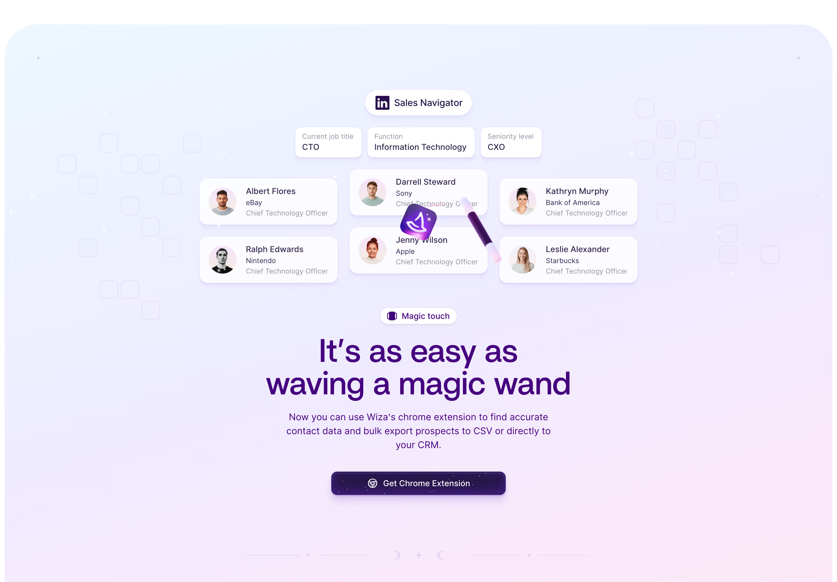
Notable patterns: \- Magic/wand brand metaphor is a core design motif ("wave a magic wand", "conjures up", "enchanting") — expect illustrated wand/star/sparkle iconography in the UI \- Two-CTA hero pattern: primary filled pill button + secondary ghost button \- Social proof bar immediately below hero (company logos: Microsoft, Google, Slack, Salesforce, Teradata) \- Animated counter numbers for key stats (accuracy %, bounce rate) \- Sticky dark navbar with logo + dual auth buttons (Login / Sign up) \- Section label / eyebrow text pattern (e.g., "The problem", "The solution", "Magic touch") \- Testimonial carousel with avatar + name + company \- Footer: 3-column link grid + social icons on dark bg \- No detectable design token library (Webflow variables not exposed) \- No detected CSS framework (Tailwind, Bootstrap) — pure Webflow-generated CSS