
Thank you! Your submission has been received!
Oops! Something went wrong while submitting the form.
Get SaaSFrame Pro
Monthly
$18
Quarterly
$48
Yearly
$180
Upgrade to access this feature
Browse all screens & flows
Filter and search screens & flows
Access Figma files
Access mobile versions
Bookmark screens & flows
Join now
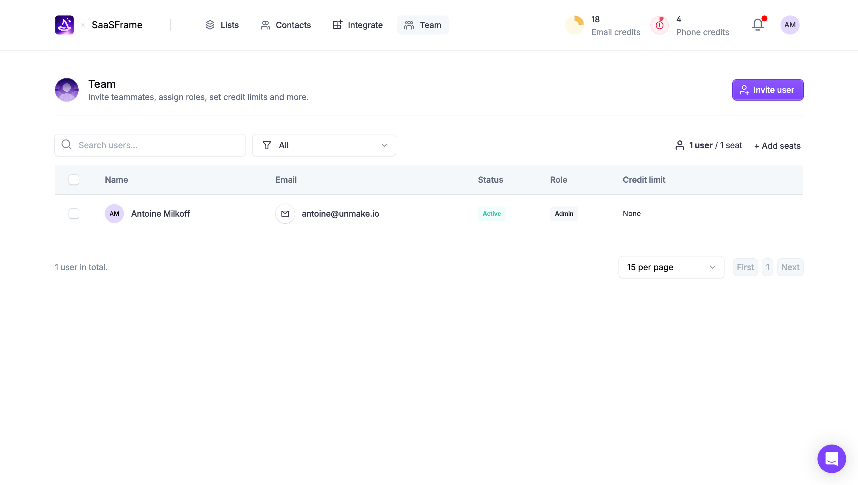
Wiza Team Members

Wiza
The future of prospecting
Designed by
No items found.

Bookmark
Bookmark

Design with AI
Thank you! Your submission has been received!
Oops! Something went wrong while submitting the form.
# Design from Reference: Wiza Team Members
Create an original, high-fidelity visual design inspired by the reference. Prioritize composition, typography, colors, spacing, and component styling over technical implementation.
## Reference
- **Product:** Wiza
- **Category:** Team Members
- **Screenshot:** https://cdn.prod.website-files.com/5e9dc792e1210c5325f7ebbc/6acad57b86f1bee9c36508c2_6acad4f072f8a3a5b865211b_cms-75d99e6a4c93fc4a5b4b0ab0.webp
Analyze the screenshot first. If inaccessible, request it rather than guessing.
## Content
{{content.instructions}}
{{content.data}}
Preserve essential messaging and factual accuracy. Adapt structure and copy length for visual balance; never invent product claims.
## Visual Design
### Overall aesthetic
- **Character:** A sparse team-management dashboard uses white surfaces, thin cool-gray rules and vivid purple actions.
- **Capture scale:** The screenshot measures 2880 × 1630 image pixels. Approximate CSS dimensions assume a 1440 × 815 viewport at 2× density; the scale is unverified.
- **Tone:** Compact controls and a single populated table row leave a large quiet workspace.
### Page composition
- **Top navigation:** Workspace identity sits left of four icon-and-label destinations, with Team selected. Credit balances, notifications and an avatar align right.
- **Section header:** A purple team illustration precedes the Team title and explanatory sentence; Invite user aligns at the right edge.
- **Control row:** Search and an All filter sit left; user/seat count and Add seats sit right.
- **Table:** A pale header row contains selection, name, email, status, role and credit-limit columns, followed by one visible member.
- **Lower controls:** Total count aligns left; page-size and disabled pagination controls align right. A purple circular chat launcher sits lower right.
### Information hierarchy
- **Current area:** Team is indicated both by the top selected navigation item and the section heading.
- **Primary action:** Invite user is the strongest filled action.
- **Member state:** A green Active badge and muted Admin badge distinguish account status and role.
- **Capacity:** User/seat information sits near Add seats, separate from the row data.
- **Sparse state:** The single member and disabled pagination establish a small populated table rather than an empty state.
### Typography
- **Family:** A neutral interface sans-serif is visible; exact identity is unverified.
- **Section heading:** Approximately 18px CSS, medium-to-semibold, with 24px line-height.
- **Navigation and controls:** Approximately 14px medium, with dark labels and muted secondary copy.
- **Table roles:** Headers and main member labels are around 14px semibold; secondary information around 13–14px.
- **Badges:** Approximately 11–12px compact text with small horizontal padding.
### Colors & surfaces
- **Canvas:** Sampled #FFFFFF forms nearly all the interface.
- **Secondary surfaces:** Sampled #F4F8FA supplies pale navigation and table-header areas.
- **Borders:** Sampled #EBEFF3 and #EAEFF3 form subtle rules and input outlines.
- **Primary text:** Sampled #34384A supplies dark navy-gray labels.
- **Secondary text:** Sampled #636D81 provides explanatory and supporting text.
- **Purple accent:** Sampled #873FFF highlights the invite action and relates to the chat launcher and brand imagery.
- **Status color:** A light mint badge with green text marks Active; credit indicators add small yellow and pink accents.
### Components
- **Search and filter:** Approximately 322px and 242px-wide CSS outlined controls are around 38px high with 6px radii.
- **Invite button:** A compact purple rectangle with a small person-plus icon, roughly 120 × 36px, uses 6px radii and a subtle lower edge.
- **Table header:** A roughly 48px-high pale band has bold column labels and a left selection checkbox.
- **Member row:** A circular initials avatar accompanies the name; email has a small circular envelope icon. Status and role are compact rounded badges.
- **Pagination:** A wide page-size dropdown precedes three small muted page controls.
- **Chat launcher:** A roughly 48px purple circle contains a white chat icon and soft shadow.
### Visual rhythm
- **Content frame:** Approximately 92px CSS side gutters create a broad centered workspace.
- **Section spacing:** Roughly 40–48px separates navigation, title, search and table layers.
- **Row alignment:** Table columns maintain stable left edges; icon/avatar elements use consistent spacing before labels.
- **Open lower area:** Large white space below the table emphasizes the small team size without extra messaging.
### Responsive
- **Evidence limit:** Only the desktop team state is observed; invitation, filtering and mobile behaviors are unverified.
- **Control recommendation:** Stack search/filter and seat controls on narrow screens.
- **Table recommendation:** Preserve essential member, status and role information with horizontal scrolling or a labeled compact view.
- **Navigation recommendation:** Collapse top destinations into an accessible menu while retaining current-area context.
### Adaptation guidance
- **Data model:** Keep status, role and credit limits as separate fields and visual treatments.
- **Component consistency:** Reuse outlined controls, small badges and purple primary actions throughout team administration.
- **Privacy:** Use representative account information in demos rather than copying personal identifiers.
- **Accessibility:** Label selection checkboxes and icon controls, expose disabled pagination semantically and provide visible keyboard focus.
Use this context to reproduce the reference's visual language: layout, typography, colors, spacing, borders, radii, and distinctive elements. The screenshot takes priority if descriptions conflict.
## Direction
{{preferences.fidelityInstructions}}
## Output
{{output.instructions}}
Deliver a polished, cohesive design with precise alignment, hierarchy, and spacing. Produce the requested visual artifact, not just a description. If unsupported, explain the limitation.


Category
Tech Stack

Added on
November 30, 2023
Similar screens
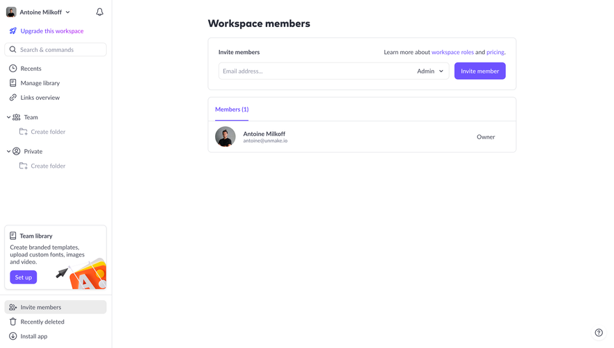


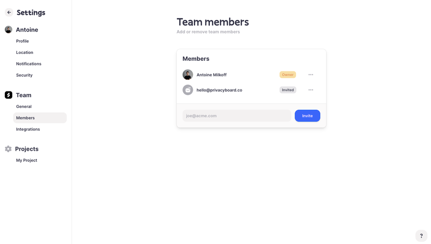

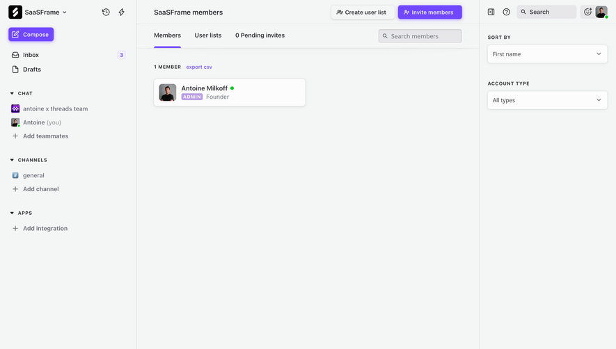

Upgrade to SaaSFrame Pro now to see similar examples.
Monthly
$18 /month
Billed $18 monthly
Browse all screens & flows
Filter and search screens & flows
Search text in screenshots
Access Figma files
Access mobile versions
Join now
Quarterly
$16 /month
Billed $48 quarterly
Browse all screens & flows
Filter and search screens & flows
Search text in screenshots
Access Figma files
Access mobile versions
Join now
Yearly
$15 /month
Billed $180 yearly
Browse all screens & flows
Filter and search screens & flows
Search text in screenshots
Access Figma files
Access mobile versions
Join now