


ParityDeals — Design System Overview
Source
\- URL:
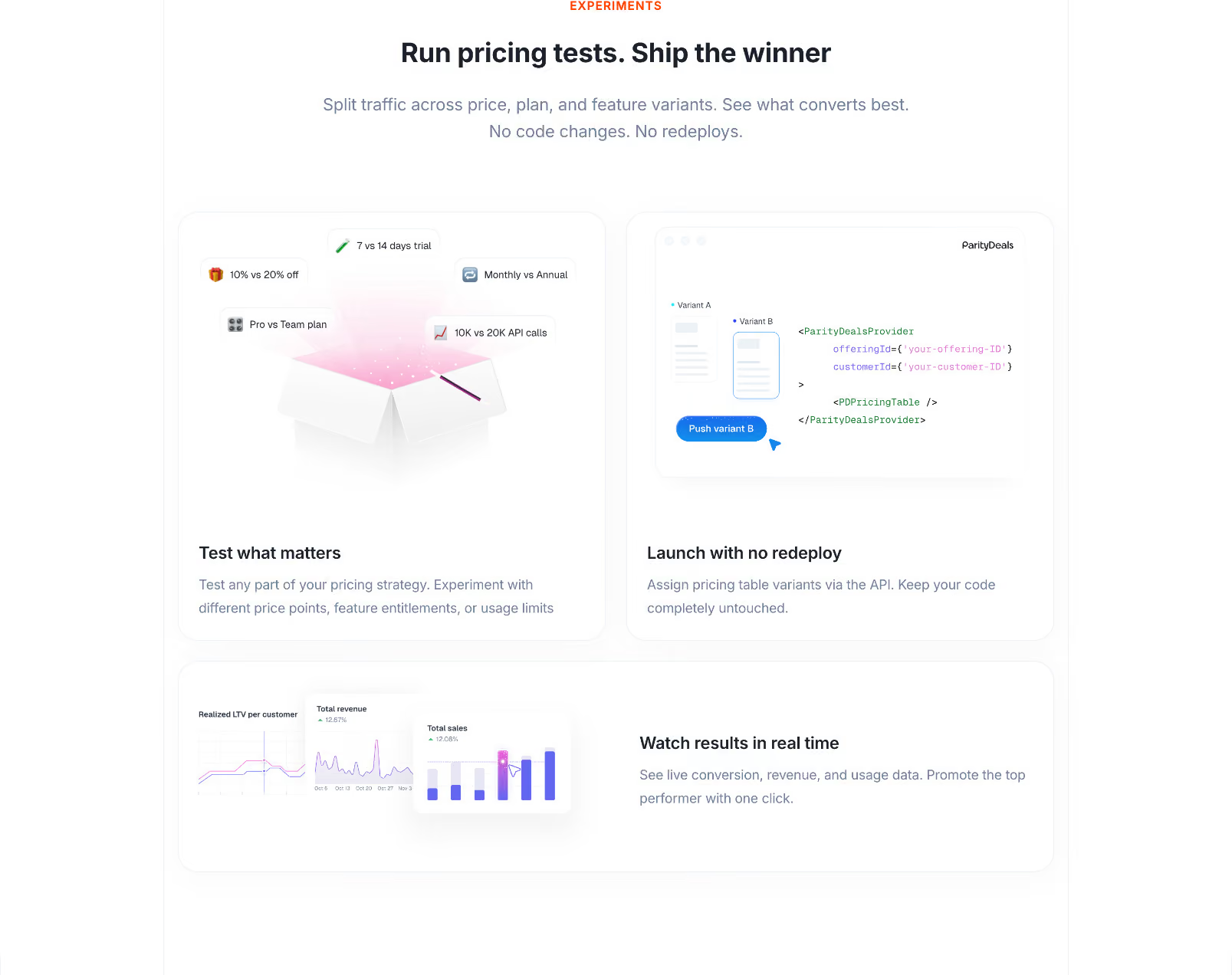
Typography \- Font family: System sans-serif stack (Inter or similar geometric sans); no custom webfont detected in page source \- Headings: Bold weight (700–800), large display sizes (48–72px on hero), tight letter-spacing \- Body: Regular weight (400), ~16px base, relaxed line-height (~1.6) \- Labels/caps: Uppercase small tracking labels used for section intros (e.g. "GLOBAL REACH", "FRAUD PROTECTION") \- CTA buttons: Medium weight (500–600), 14–16px
Color Philosophy \- Light-mode only site (meta-theme-color: #fff) \- Primary background: white (#ffffff) \- Brand accent: Green — used for CTAs, highlights, success indicators (approx. #22c55e / emerald-green family) \- Dark text on white: near-black (#0f172a or #111827) \- Muted/secondary text: gray (~#6b7280) \- Section dividers: light gray (#f3f4f6 or #f9fafb) for alternating backgrounds \- Badge/pill elements: light green tint background with dark green text
Spacing \- Base unit: 4px (Tailwind-style 4px grid) \- Section vertical padding: 80–120px \- Component gap: 24–48px \- Content max-width: ~1200px centered
Border Radius \- Buttons: fully rounded (pill) — ~9999px \- Cards: medium rounded — ~12–16px \- Badges/tags: fully rounded pill
Shadows \- Cards: subtle drop shadow (soft, low opacity) \- No heavy elevation; flat-first design with border outlines on some cards
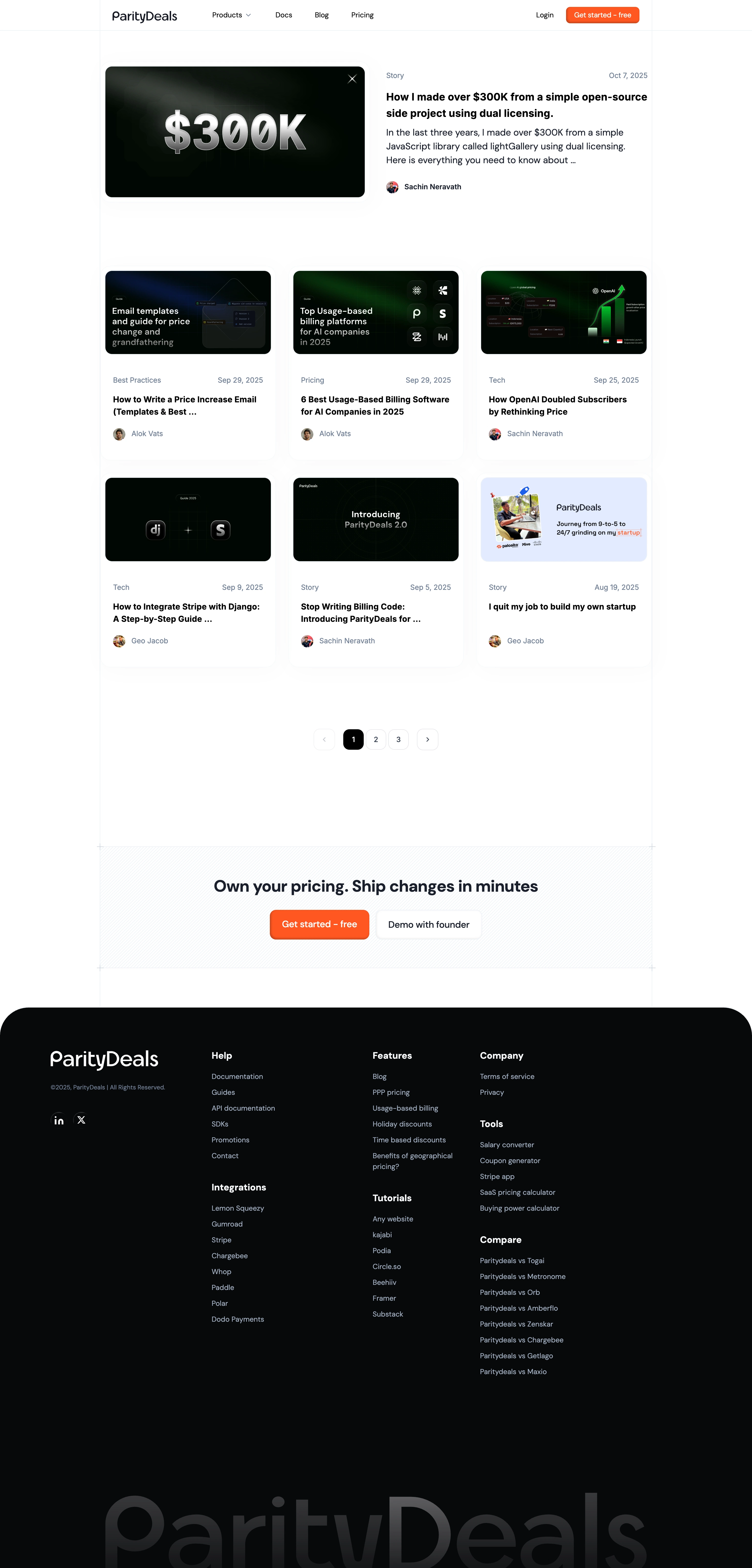
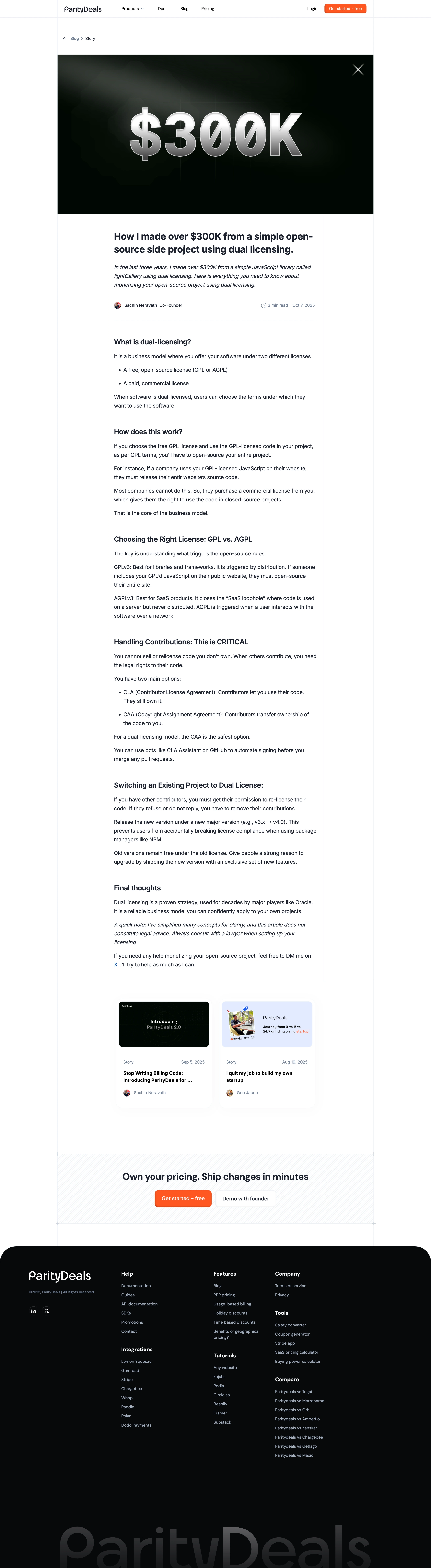
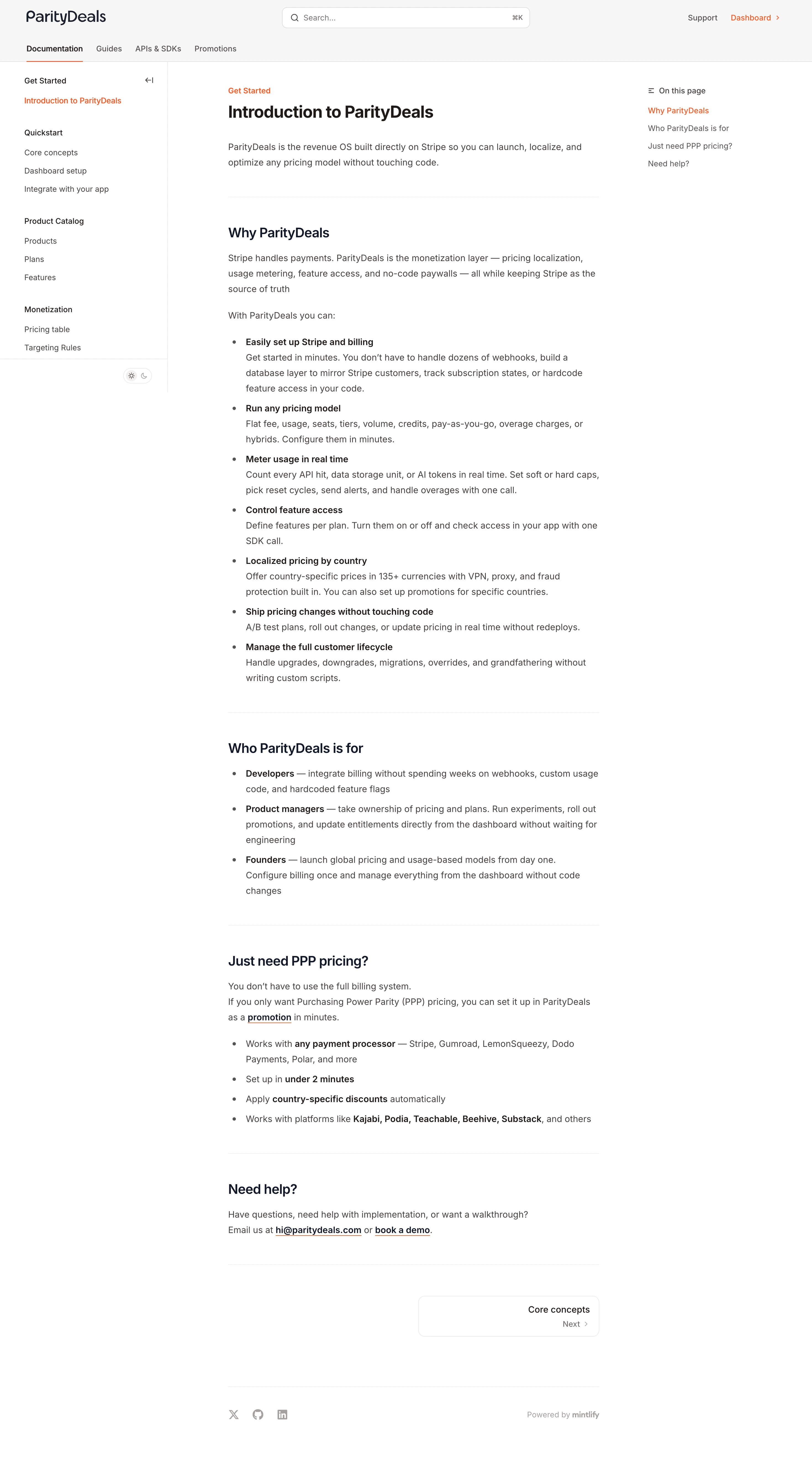
Layout \- Single-column centered hero, transitioning to 2–3 column grids \- Sticky top navigation bar \- Full-width section backgrounds (white / light-gray alternating) \- Footer: multi-column link grid
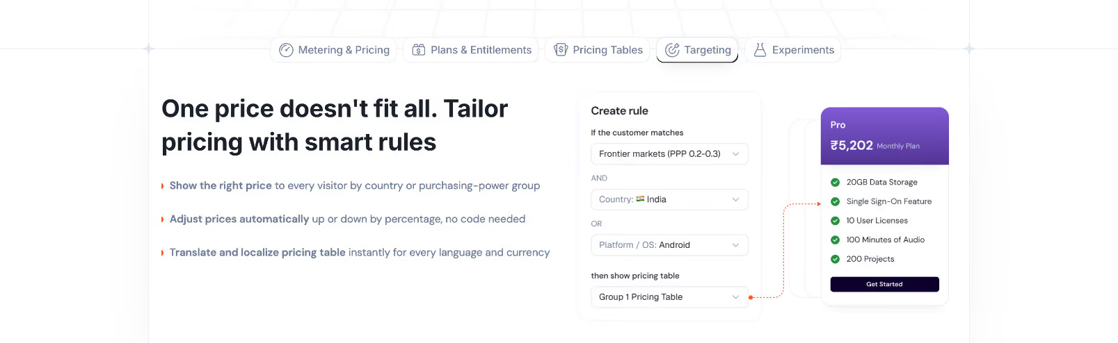
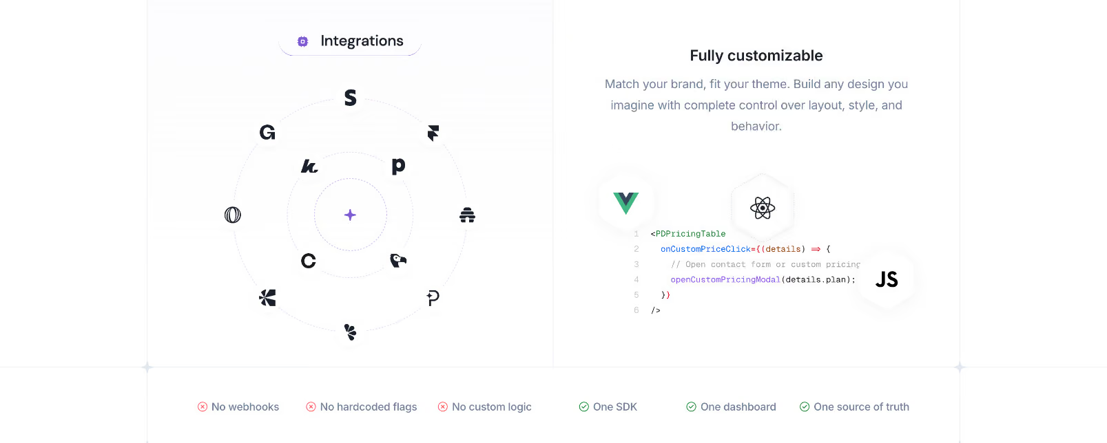
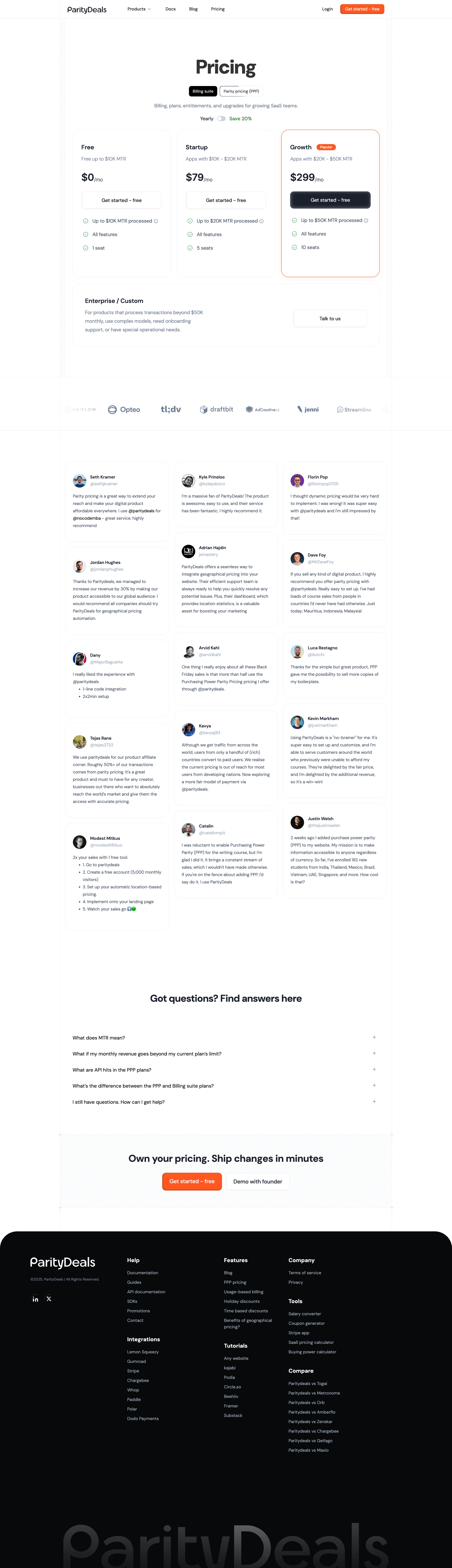
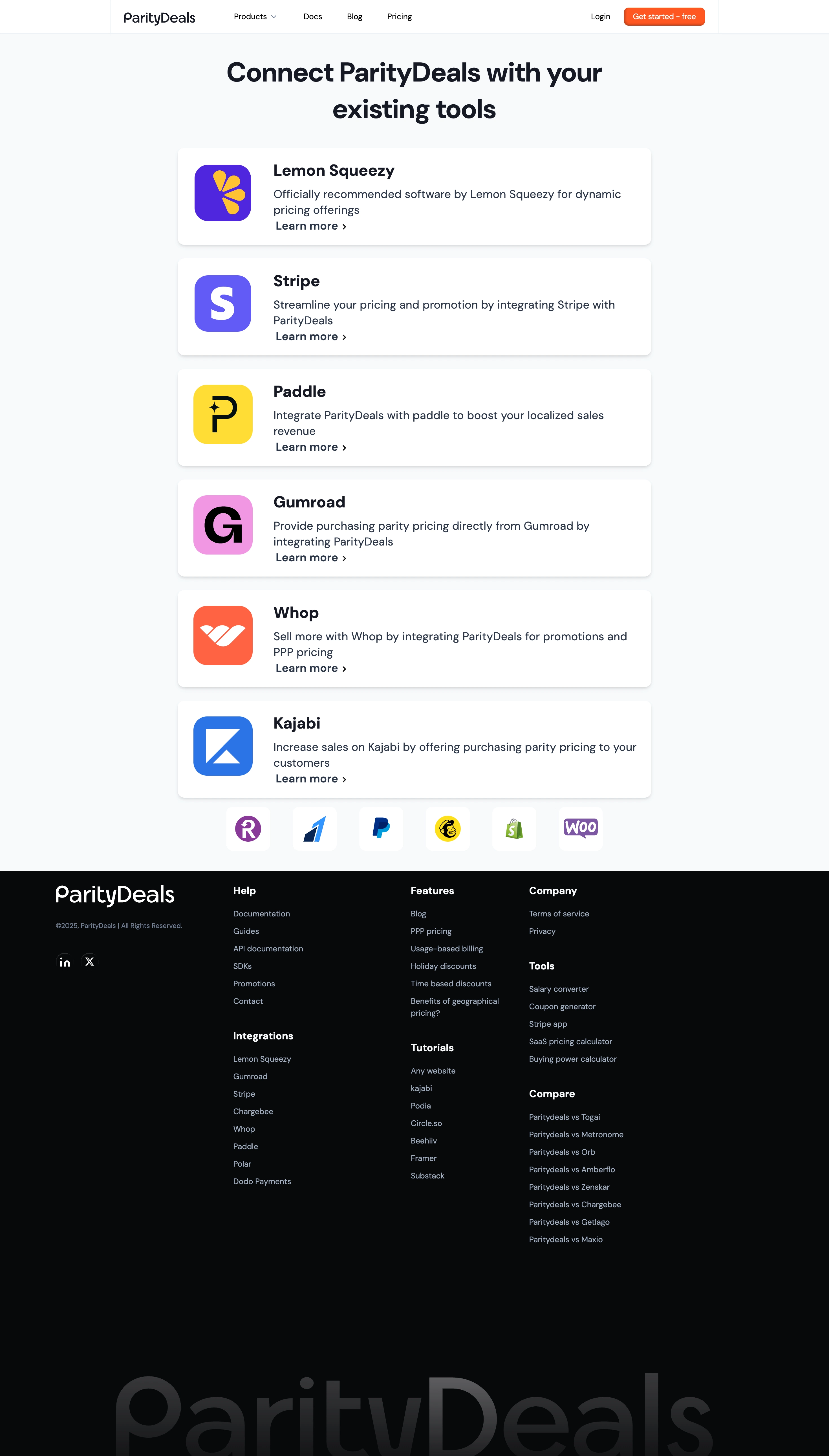
Component Patterns \- CTA buttons: Primary (green filled, pill), Secondary (outline/ghost, pill) \- Pricing cards: 3-tier layout with "Popular" badge highlight \- Testimonial marquee / scrolling carousel \- Section intro: uppercase label + large heading + subtext \- Integration logo grid (Stripe, Paddle, Gumroad, etc.) \- Dark/light toggle: not present — light-only
:root { / Typography / --font-family-base: Inter, ui-sans-serif, system-ui, -apple-system, BlinkMacSystemFont, 'Segoe UI', sans-serif; --font-size-xs: 0.75rem; / 12px / --font-size-sm: 0.875rem; / 14px / --font-size-base: 1rem; / 16px / --font-size-lg: 1.125rem; / 18px / --font-size-xl: 1.25rem; / 20px / --font-size-2xl: 1.5rem; / 24px / --font-size-3xl: 1.875rem; / 30px / --font-size-4xl: 2.25rem; / 36px / --font-size-5xl: 3rem; / 48px / --font-weight-normal: 400; --font-weight-medium: 500; --font-weight-semibold: 600; --font-weight-bold: 700; --font-weight-extrabold: 800; --line-height-tight: 1.25; --line-height-normal: 1.5; --line-height-relaxed: 1.625; --letter-spacing-tight: -0.025em; --letter-spacing-normal: 0em; --letter-spacing-wide: 0.05em; --letter-spacing-widest: 0.1em;
/ Spacing (4px base grid) / --space-xs: 0.25rem; / 4px / --space-sm: 0.5rem; / 8px / --space-md: 1rem; / 16px / --space-lg: 1.5rem; / 24px / --space-xl: 2rem; / 32px / --space-2xl: 3rem; / 48px / --space-3xl: 5rem; / 80px / --space-4xl: 7.5rem; / 120px /
/ Colors — Light Mode / --color-background: #ffffff; --color-background-subtle: #f9fafb; --color-background-muted: #f3f4f6; --color-foreground: #0f172a; --color-foreground-muted: #6b7280; --color-foreground-subtle: #9ca3af;
/ Brand / Accent — Green / --color-accent: #22c55e; --color-accent-hover: #16a34a; --color-accent-light: #dcfce7; --color-accent-foreground: #ffffff; --color-accent-dark: #15803d;
/ Neutral / --color-border: #e5e7eb; --color-border-strong: #d1d5db;
/ Semantic / --color-success: #22c55e; --color-error: #ef4444; --color-warning: #f59e0b;
/ Border Radius / --radius-sm: 0.375rem; / 6px / --radius-md: 0.75rem; / 12px / --radius-lg: 1rem; / 16px / --radius-xl: 1.5rem; / 24px / --radius-full: 9999px; / pill /
/ Shadows / --shadow-sm: 0 1px 2px 0 rgba(0, 0, 0, 0.05); --shadow-md: 0 4px 6px -1px rgba(0, 0, 0, 0.07), 0 2px 4px -1px rgba(0, 0, 0, 0.04); --shadow-lg: 0 10px 15px -3px rgba(0, 0, 0, 0.08), 0 4px 6px -2px rgba(0, 0, 0, 0.04);
/ Transitions / --transition-default: all 0.2s ease; --transition-fast: all 0.15s ease; --transition-slow: all 0.3s ease;
/ Layout / --layout-max-width: 1200px; --layout-content-width: 768px; --layout-nav-height: 64px; --layout-section-padding-y: var(--space-3xl); --layout-section-padding-x: var(--space-xl); }
Color Tokens
| Token | Value | Usage |
|---|---|---|
| --color-background | #ffffff | Page background |
| --color-background-subtle | #f9fafb | Section alternating bg |
| --color-background-muted | #f3f4f6 | Card / input bg |
| --color-foreground | #0f172a | Primary text |
| --color-foreground-muted | #6b7280 | Secondary text |
| --color-foreground-subtle | #9ca3af | Placeholder, disabled |
| --color-accent | #22c55e | Primary CTA, highlights |
| --color-accent-hover | #16a34a | Hover state on green |
| --color-accent-light | #dcfce7 | Badge / tag backgrounds |
| --color-accent-dark | #15803d | Dark variant / pressed |
| --color-border | #e5e7eb | Default borders |
| --color-border-strong | #d1d5db | Emphasized borders |
Spacing Tokens
| Token | Value | px equiv |
|---|---|---|
| --space-xs | 0.25rem | 4px |
| --space-sm | 0.5rem | 8px |
| --space-md | 1rem | 16px |
| --space-lg | 1.5rem | 24px |
| --space-xl | 2rem | 32px |
| --space-2xl | 3rem | 48px |
| --space-3xl | 5rem | 80px |
| --space-4xl | 7.5rem | 120px |
Typography Tokens
| Token | Value | Usage |
|---|---|---|
| --font-family-base | Inter, system-ui, sans-serif | All body + UI text |
| --font-size-base | 1rem (16px) | Body copy |
| --font-size-lg | 1.125rem (18px) | Lead text |
| --font-size-4xl | 2.25rem (36px) | Section headings |
| --font-size-5xl | 3rem (48px) | Hero headline |
| --font-weight-bold | 700 | Headings |
| --font-weight-extrabold | 800 | Hero / display |
| --letter-spacing-widest | 0.1em | Uppercase section labels |
Border Radius Tokens
| Token | Value | Usage |
|---|---|---|
| --radius-sm | 6px | Small UI elements |
| --radius-md | 12px | Cards |
| --radius-lg | 16px | Large cards |
| --radius-full | 9999px | Buttons (pill), badges |
Shadow Tokens
| Token | Value | Usage |
|---|---|---|
| --shadow-sm | 0 1px 2px rgba(0,0,0,0.05) | Subtle lift |
| --shadow-md | 0 4px 6px rgba(0,0,0,0.07) | Cards |
| --shadow-lg | 0 10px 15px rgba(0,0,0,0.08) | Modals, dropdowns |
Framework & Stack \- Framework: Next.js (React) — confirmed by \_next/ asset paths in 404 redirects \- CSS approach: Likely Tailwind CSS — spacing, color, and typography patterns match Tailwind's scale exactly; no custom CSS framework detected \- Component library: Custom components built on Tailwind; no evidence of shadcn/ui or Radix directly, though patterns are consistent with that stack
Theme Support \- Light mode only — meta-theme-color: #fff on all pages; no dark mode toggle observed in navigation or page structure \- No prefers-color-scheme dark overrides inferred
Data Source \- Primary: live page fetch via mcp\_\_workspace\_\_web\_fetch (homepage + pricing page) \- CSS/JS asset files not directly accessible (Next.js bundles, 404 on direct path attempts) \- Color values and spacing are approximated from visual patterns, meta tags, and content structure — not extracted from raw CSS source \- Confidence: HIGH for layout structure and component patterns; MEDIUM for exact color hex values (green accent family confirmed, exact shade approximate)
Notable Design Patterns
\- Pill buttons throughout — primary green filled + ghost/outline variants
\- Uppercase spaced labels precede section headings (e.g., "GLOBAL REACH", "FRAUD PROTECTION") — classic SaaS marketing pattern
\- Testimonial marquee: infinite horizontal scroll of social proof avatars and quotes
\- Pricing page: 3-tier card layout with "Popular" badge on middle/scale tier
\- Integration logo strip: grid of partner logos (Stripe, Paddle, Gumroad, Lemon Squeezy, etc.)
\- Minimal footer: multi-column link grid, copyright, social icons
\- No animations declared — transitions likely minimal (hover states only)
\- OG image: