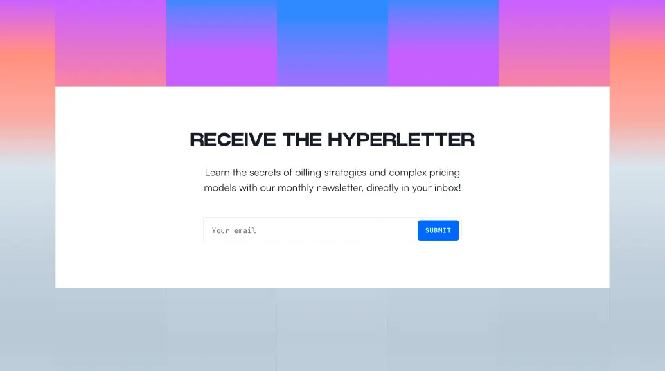
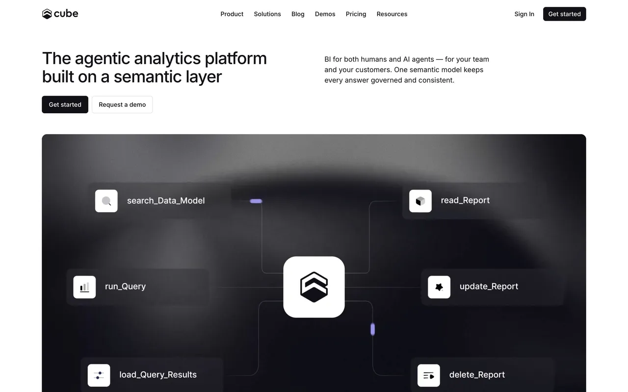
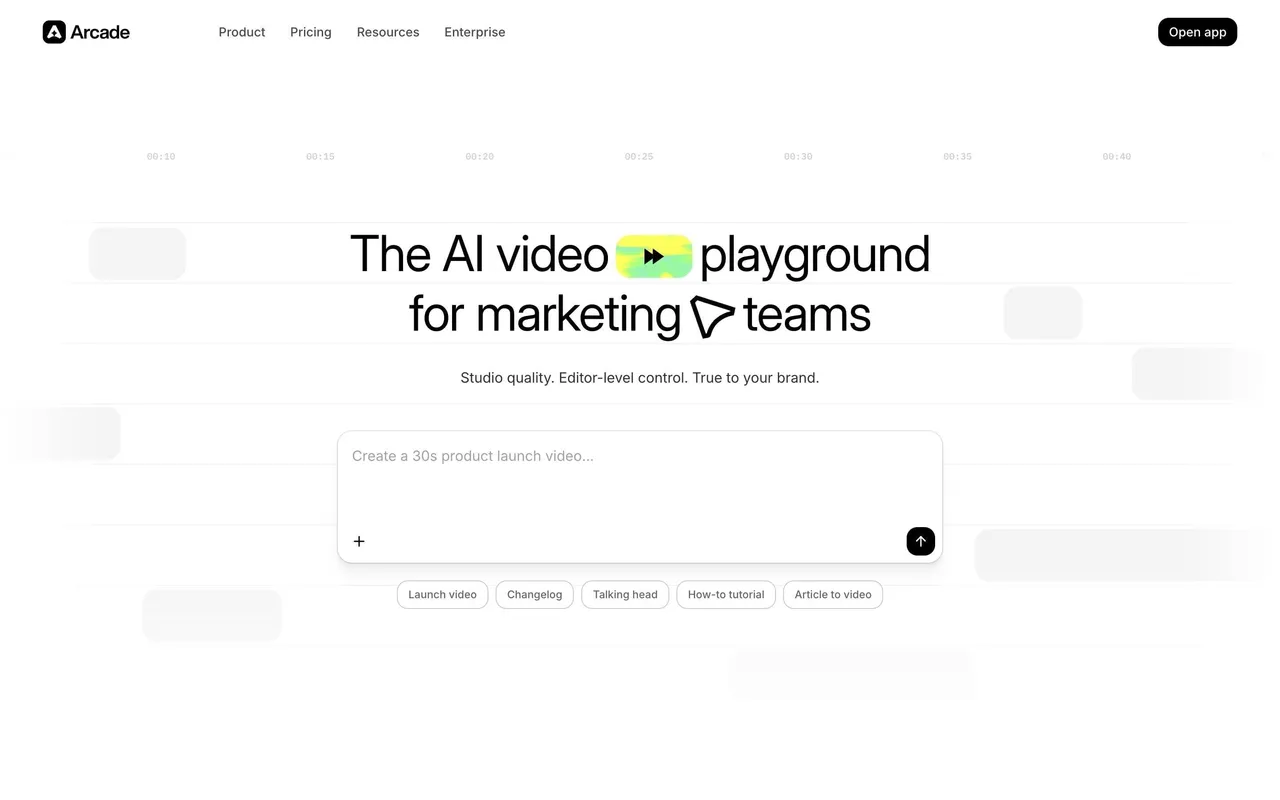
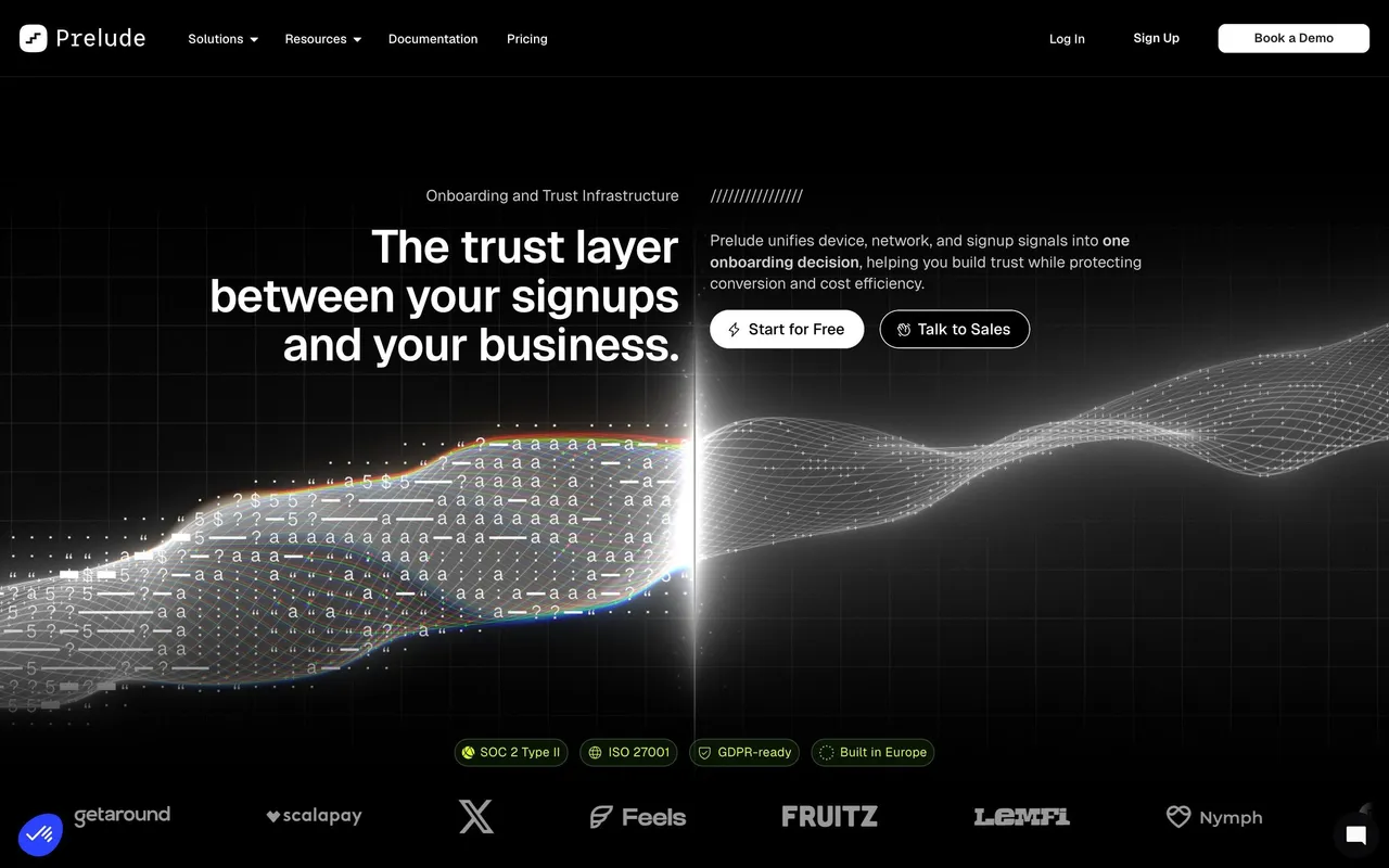
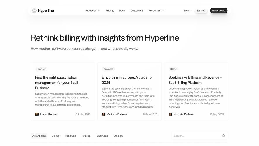
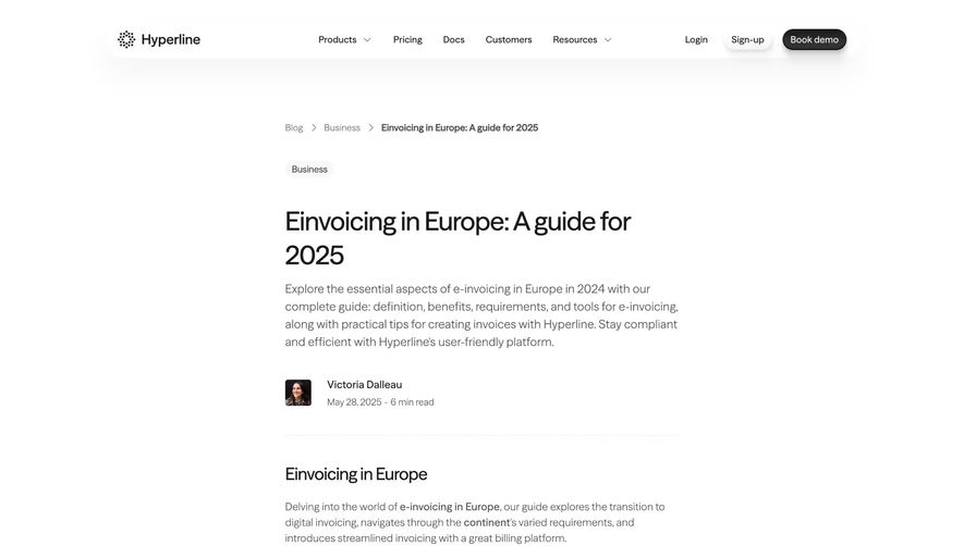
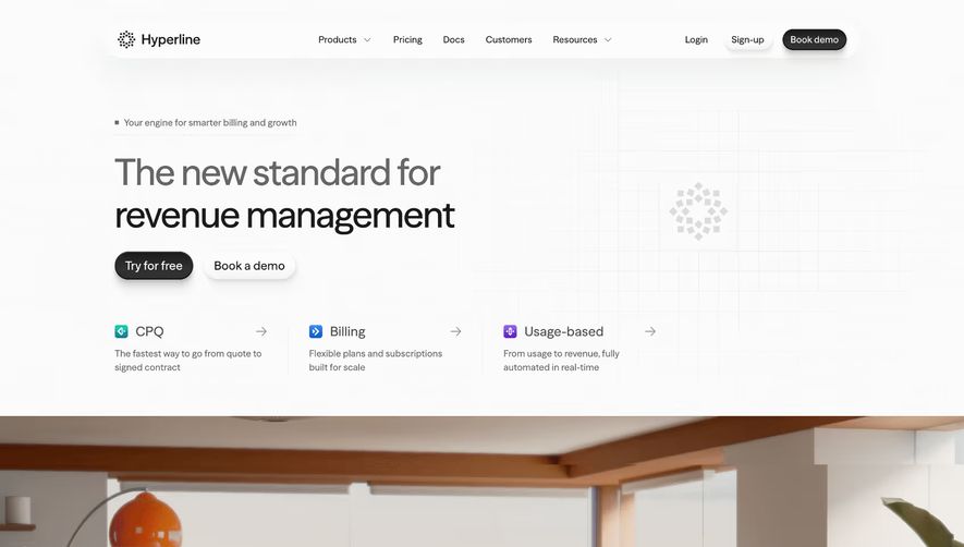
Hyperline’s homepage embodies a crisp, ultra-modern aesthetic, blending minimalism with bursts of vibrant, playful color. The design feels intelligent and energetic, striking a balance between professionalism and approachability—perfectly suited for SaaS aimed at dynamic teams and innovative businesses.
Layout and Structure
The layout is thoughtfully sectional. It begins with a high-impact hero section featuring concise copy and a prominent CTA, immediately introducing the platform’s value. Scrolling reveals animated feature overviews, customer logos, testimonial highlights, and a visually engaging pricing section. The footer is clean, housing key links and subtle branding.
Visual Elements
Vivid, 3D-style illustrations and lively micro-animations breathe life into the experience. Playful icons, smooth hover effects, and subtle motion add delight without distraction, creating a sense of progression as users move down the page. No stock photography—everything feels custom and on-brand, enhancing originality.
Color Palette and Typography
The palette uses a luminous blend of whites, deep blues, and electric purples, accented by pops of teal and orange. Typography is modern and geometric; bold headlines establish hierarchy, while lighter body text maintains clarity and polish—driving a streamlined reading experience.
User Experience Patterns
Navigation is sticky and exceptionally intuitive, with focused CTAs throughout. Frictionless forms encourage sign-up, and interactive elements guide exploration. Scroll-triggered animations foster engagement, making the site feel both responsive and immersive.
Unique or Notable Design Choices
Noteworthy is the consistent use of custom illustrations and light, kinetic animations, providing personality without overwhelming content. The interface expresses trust and innovation—showcasing how design can support clarity, credibility, and conversion in SaaS.
 SaaSFrame