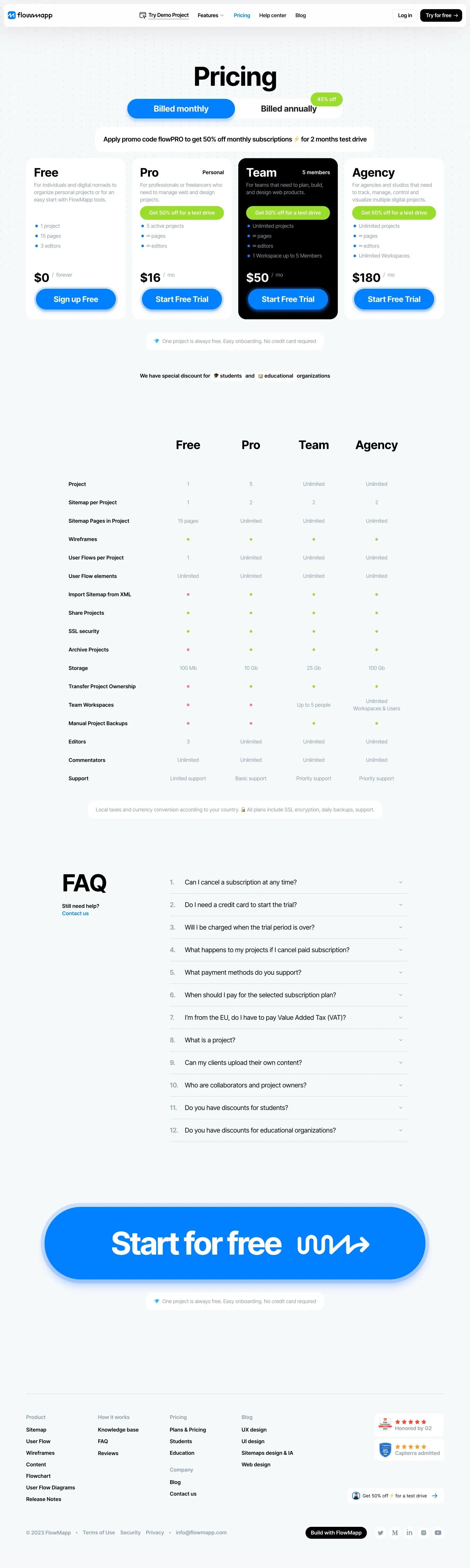
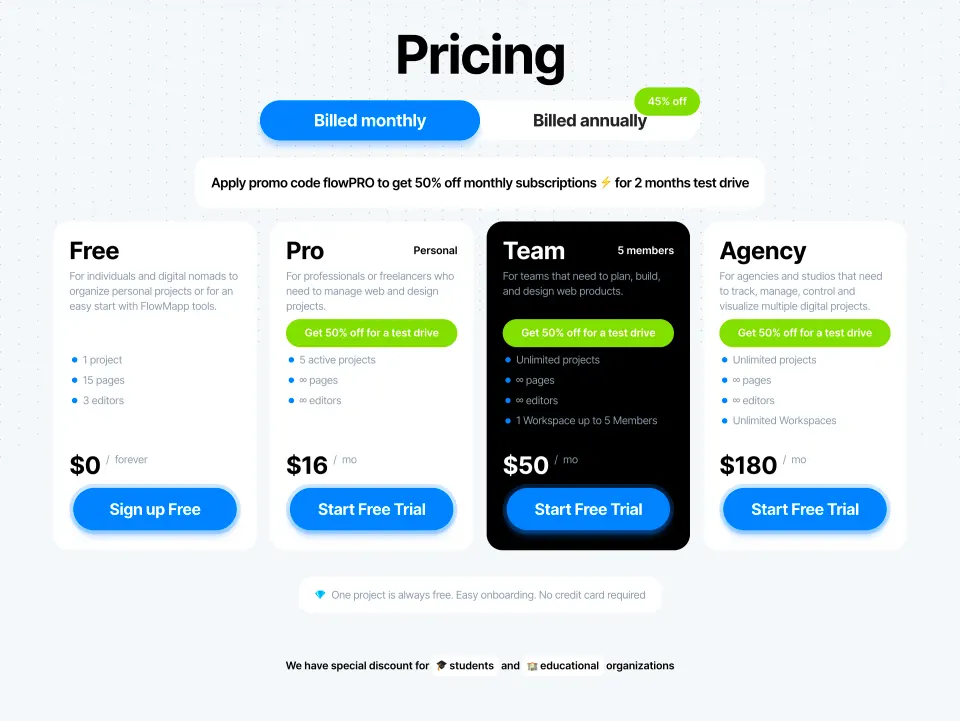
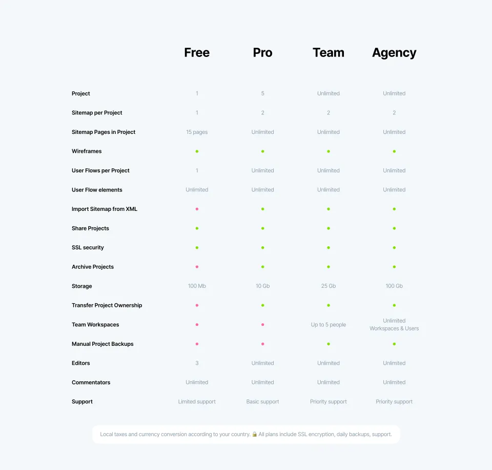
FlowMapp’s pricing page radiates a modern, approachable professionalism. The interface finds a sweet spot between playful and clean—gentle curves, softly colored backgrounds, and relatable line illustrations foster an inviting atmosphere without sacrificing clarity or focus. Minimal visual clutter allows the messaging to command attention.
Layout and Structure
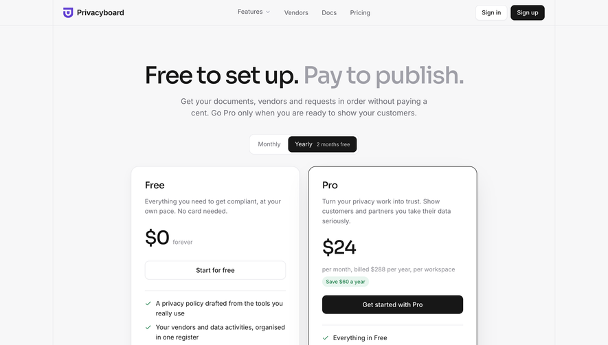
The page opens with a succinct hero banner, aligning pricing cards at the visual forefront. Each package is neatly delineated, supported by concise feature lists, upgrade prompts, and a prominent call to action. Below, a comparison table provides at-a-glance plan differentiation. Strategic use of whitespace guides the eye naturally downward, from primary offering to FAQ and support sections. The sticky header maintains effortless access to navigation.
Visual Elements
Custom, animated illustrations and intuitive icons reinforce the brand’s personality while highlighting each plan’s unique value. Subtle hover states and micro-interactions inject vitality, making the page feel both alive and reliable. The blend of vector artwork with clean modular cards underscores both creativity and orderliness.
Color Palette and Typography
The site employs a soothing palette—soft blues, warm yellows, and gentle grays—balancing vibrance with discretion. Typography is crisp and contemporary; bold headings create instant hierarchy, while readable sans-serif body text ensures comfort during scanning. Accent colors are smartly reserved for key actions and highlights.
User Experience Patterns
Floating CTAs, clear plan comparison, and an FAQ accordion foster a frictionless journey. A visually persistent, sticky “Get Started” button simplifies conversion. The navigation prioritizes ease, with smooth scroll anchors and quick support links for decisive engagement.
Unique or Notable Design Choices
Notably, playful “toolkit” illustrations humanize SaaS pricing, turning what could be a transactional moment into an enjoyable, branded interaction. The pricing cards’ gentle shadowing and animation on hover provide subtle delight, reflecting a UX-first approach that’s inventive yet reassuring. The overall tone is transparent, empathetic, and confidently modern—ideal inspiration for SaaS teams aiming to win user trust and action.
 SaaSFrame