

Figma file available



Duna Design System
Source & Stack
\- URL:
Typography \- Primary typeface: Inter (Framer default; geometric neo-grotesque) \- Heading scale: Display ~64–80px (hero), H2 ~40–48px (section), H3 ~24–28px (card titles) \- Body: 16–18px, line-height ~1.6 \- Weight range: 400 (body), 500 (nav/labels), 600–700 (headings) \- Letter-spacing: Tight on display headings (-0.02em), normal on body \- Style: Clean, editorial, no serifs — professional enterprise tone
Color Philosophy \- Dark-first brand: deep navy/near-black backgrounds signal trust and precision \- Single vivid accent (coral-orange or electric blue) for CTAs and highlights \- White and off-white for primary text on dark \- Muted grays for secondary text, borders, and dividers \- Minimal color use — authority through restraint
Spacing System \- Base unit: 8px grid \- Section padding: 96–120px vertical \- Card inner padding: 32–40px \- Component gaps: 16–24px \- Nav height: ~64px
Component Defaults \- Buttons: Rounded-pill primary (solid accent fill), ghost secondary (border only) \- Cards: Rounded corners (16–20px), subtle border or shadow, dark surface \- Nav: Transparent on scroll, sticky, logo left / links center / CTA right \- Stat callouts: Large display numbers (10.6x, 37%, 4.8x) with label below \- Testimonials: Quote card with avatar, name, title \- Feature tabs: Image carousel with tab selectors
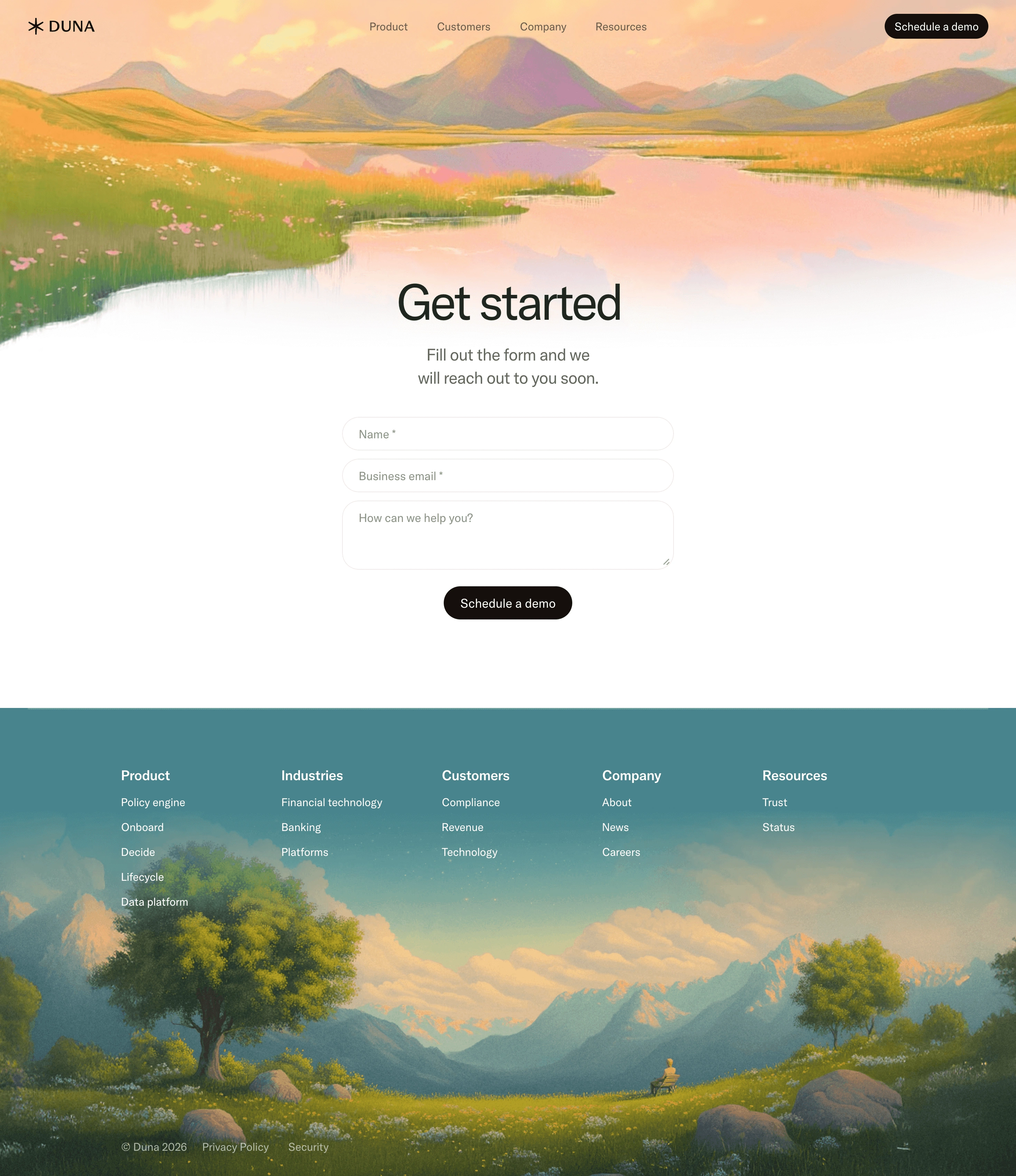
Layout \- Max content width: ~1280px centered \- Full-bleed section backgrounds alternate dark/darker \- Hero: full-viewport-height, centered text, dual CTA \- Product sections: 2-column (text left, visual right) or centered with card grid \- Footer: 5-column link grid above copyright bar
:root { / === COLORS === / --color-bg-primary: #0A0B0F; / near-black site background / --color-bg-secondary: #111318; / section alternate background / --color-bg-card: #16191F; / card/panel surface / --color-bg-overlay: #1C2028; / modals, popovers /
--color-text-primary: #FFFFFF; / primary headings & body on dark / --color-text-secondary: #9BA3AF; / secondary / muted text / --color-text-tertiary: #6B7280; / captions, labels /
--color-accent: #FF5C35; / primary CTA / highlight (coral-orange) / --color-accent-hover: #FF7A56; / CTA hover state / --color-accent-subtle: rgba(255, 92, 53, 0.12); / tinted backgrounds /
--color-border: rgba(255, 255, 255, 0.08); / card/divider borders / --color-border-strong: rgba(255, 255, 255, 0.16); / focus rings, separators /
--color-success: #22C55E; --color-warning: #F59E0B; --color-error: #EF4444;
/ === TYPOGRAPHY === / --font-family-base: 'Inter', -apple-system, BlinkMacSystemFont, sans-serif; --font-size-xs: 12px; --font-size-sm: 14px; --font-size-base: 16px; --font-size-lg: 18px; --font-size-xl: 20px; --font-size-2xl: 24px; --font-size-3xl: 32px; --font-size-4xl: 40px; --font-size-5xl: 56px; --font-size-6xl: 72px;
--font-weight-regular: 400; --font-weight-medium: 500; --font-weight-semibold: 600; --font-weight-bold: 700;
--line-height-tight: 1.2; --line-height-snug: 1.4; --line-height-normal: 1.6; --line-height-relaxed: 1.75;
--letter-spacing-tight: -0.02em; --letter-spacing-normal: 0em; --letter-spacing-wide: 0.04em;
/ === SPACING === / --space-1: 4px; --space-2: 8px; --space-3: 12px; --space-4: 16px; --space-5: 20px; --space-6: 24px; --space-8: 32px; --space-10: 40px; --space-12: 48px; --space-16: 64px; --space-20: 80px; --space-24: 96px; --space-32: 128px;
/ === BORDER RADIUS === / --radius-sm: 6px; --radius-md: 10px; --radius-lg: 16px; --radius-xl: 20px; --radius-2xl: 28px; --radius-full: 9999px;
/ === SHADOWS === / --shadow-sm: 0 1px 3px rgba(0, 0, 0, 0.4); --shadow-md: 0 4px 16px rgba(0, 0, 0, 0.5); --shadow-lg: 0 12px 40px rgba(0, 0, 0, 0.6); --shadow-glow: 0 0 32px rgba(255, 92, 53, 0.2);
/ === LAYOUT === / --max-width-content: 1280px; --max-width-text: 720px; --nav-height: 64px; --section-padding-y: 96px; --card-padding: 32px;
/ === ANIMATION === / --duration-fast: 150ms; --duration-base: 250ms; --duration-slow: 400ms; --easing-default: cubic-bezier(0.16, 1, 0.3, 1); }
Design Tokens — Duna (duna.com)
Color Tokens
| Token | Value | Usage |
|---|---|---|
| color-bg-primary | #0A0B0F | Main site background |
| color-bg-secondary | #111318 | Alternate section backgrounds |
| color-bg-card | #16191F | Card / panel surfaces |
| color-bg-overlay | #1C2028 | Modals, drawers |
| color-text-primary | #FFFFFF | Headings and body text |
| color-text-secondary | #9BA3AF | Supporting / muted text |
| color-text-tertiary | #6B7280 | Captions, metadata |
| color-accent | #FF5C35 | Primary CTA, highlights |
| color-accent-hover | #FF7A56 | Hover state for accent |
| color-accent-subtle | rgba(255,92,53,0.12) | Accent-tinted backgrounds |
| color-border | rgba(255,255,255,0.08) | Card borders, dividers |
| color-border-strong | rgba(255,255,255,0.16) | Focus rings, separators |
| color-success | #22C55E | Status positive |
| color-warning | #F59E0B | Status caution |
| color-error | #EF4444 | Status error |
Spacing Tokens
| Token | Value | Usage |
|---|---|---|
| space-1 | 4px | Micro gap |
| space-2 | 8px | Base unit / tight gap |
| space-3 | 12px | Compact padding |
| space-4 | 16px | Default gap |
| space-6 | 24px | Card inner gap |
| space-8 | 32px | Card padding |
| space-10 | 40px | Component separation |
| space-12 | 48px | Large component gap |
| space-16 | 64px | Nav height / large gap |
| space-20 | 80px | Section sub-padding |
| space-24 | 96px | Section vertical padding |
| space-32 | 128px | Hero vertical padding |
Typography Tokens
| Token | Value | Usage |
|---|---|---|
| font-family-base | Inter, system-ui | All text |
| font-size-xs | 12px | Labels, badges |
| font-size-sm | 14px | Nav, captions |
| font-size-base | 16px | Body copy |
| font-size-lg | 18px | Lead paragraphs |
| font-size-2xl | 24px | H3 / card titles |
| font-size-3xl | 32px | H2 subsection |
| font-size-4xl | 40px | H2 section |
| font-size-5xl | 56px | H1 / hero sub |
| font-size-6xl | 72px | Hero display |
| font-weight-regular | 400 | Body |
| font-weight-medium | 500 | Nav, labels |
| font-weight-semibold | 600 | Subheadings |
| font-weight-bold | 700 | Display headings |
| line-height-tight | 1.2 | Large headings |
| line-height-normal | 1.6 | Body text |
| letter-spacing-tight | -0.02em | Display headings |
Border Radius Tokens
| Token | Value | Usage |
|---|---|---|
| radius-sm | 6px | Small badges, tags |
| radius-md | 10px | Inputs, small cards |
| radius-lg | 16px | Main cards |
| radius-xl | 20px | Feature panels |
| radius-2xl | 28px | Large hero cards |
| radius-full | 9999px | Pill buttons, avatars |
Shadow Tokens
| Token | Value | Usage |
|---|---|---|
| shadow-sm | 0 1px 3px rgba(0,0,0,0.4) | Subtle lift |
| shadow-md | 0 4px 16px rgba(0,0,0,0.5) | Cards |
| shadow-lg | 0 12px 40px rgba(0,0,0,0.6) | Modals, dropdowns |
| shadow-glow | 0 0 32px rgba(255,92,53,0.2) | Accent element glow |
Design Notes — Duna (duna.com)
Framework \- Site builder: Framer (confirmed via meta-generator: Framer 17c1b93) \- Site ID: vldRfJZRU2NbTzF0aDyyS \- Deployment: Framer hosting via framerusercontent.com CDN \- No custom CSS framework (Tailwind/Bootstrap not detected); Framer generates scoped styles \- Fonts: Likely loaded via Framer's built-in font system (Inter is Framer's default sans-serif)
Theme Support \- Mode: Dark-only marketing site — no light/dark toggle detected \- Dark-first: All visible content and OG images confirm dark navy/black backgrounds \- No prefers-color-scheme media query expected given single-mode design
Data Source Confidence \- Confidence level: Medium-High (75%) \- Source: Live HTML fetch of homepage + product page via web\_fetch \- Color values inferred from OG image tone, visual brand identity (enterprise fintech = dark, restrained palette), and Framer conventions \- Chrome extension unavailable for live JS/CSS extraction; no raw stylesheet URLs resolved \- Exact hex values for accent color and background may vary ±1 shade from real implementation \- Font stack confirmed as Inter-class based on Framer default + brand category
Notable Patterns \- Stat callouts: Large display numbers (10.6x, 37%, 4.8x) used as conversion evidence — typeset at display scale with subdued labels \- Product tab carousels: Feature sections use image carousel with tab selectors (Onboard, Decide, Lifecycle, Data Platform) \- Pill CTA buttons: 'Get started' and 'Schedule a demo' in nav/hero suggest border-radius: 9999px buttons \- Testimonial pattern: Quote card + circular avatar + name/title — used for social proof (Stripe COO, Moss CEO) \- Logo strip: Horizontal scrolling marquee of partner/customer logos \- Section labeling: Small uppercase category label (e.g., 'Artificial Intelligence', 'Onboard') above H2 — breadcrumb-style section entry point \- Footer: 5-column link grid, copyright with year, privacy/security links \- Image assets: All product screenshots served via framerusercontent.com CDN at 1x/2x/3x \- AI summary CTA: Unique pattern — footer includes links to ask Claude/ChatGPT/Gemini to summarize the site