Radio Buttons
62
Facilitate clear choices with SaaS Radio Button patterns. Explore how to use these for mutually exclusive options in settings, surveys, and plan selections.

Radio buttons let users choose one option from a defined group. In SaaS products, they can support onboarding questions, configuration choices, delivery methods, or other decisions where selecting one alternative replaces the previous selection. Their strength is making the available options visible and comparable; their limitation is that the product must genuinely need a single answer.
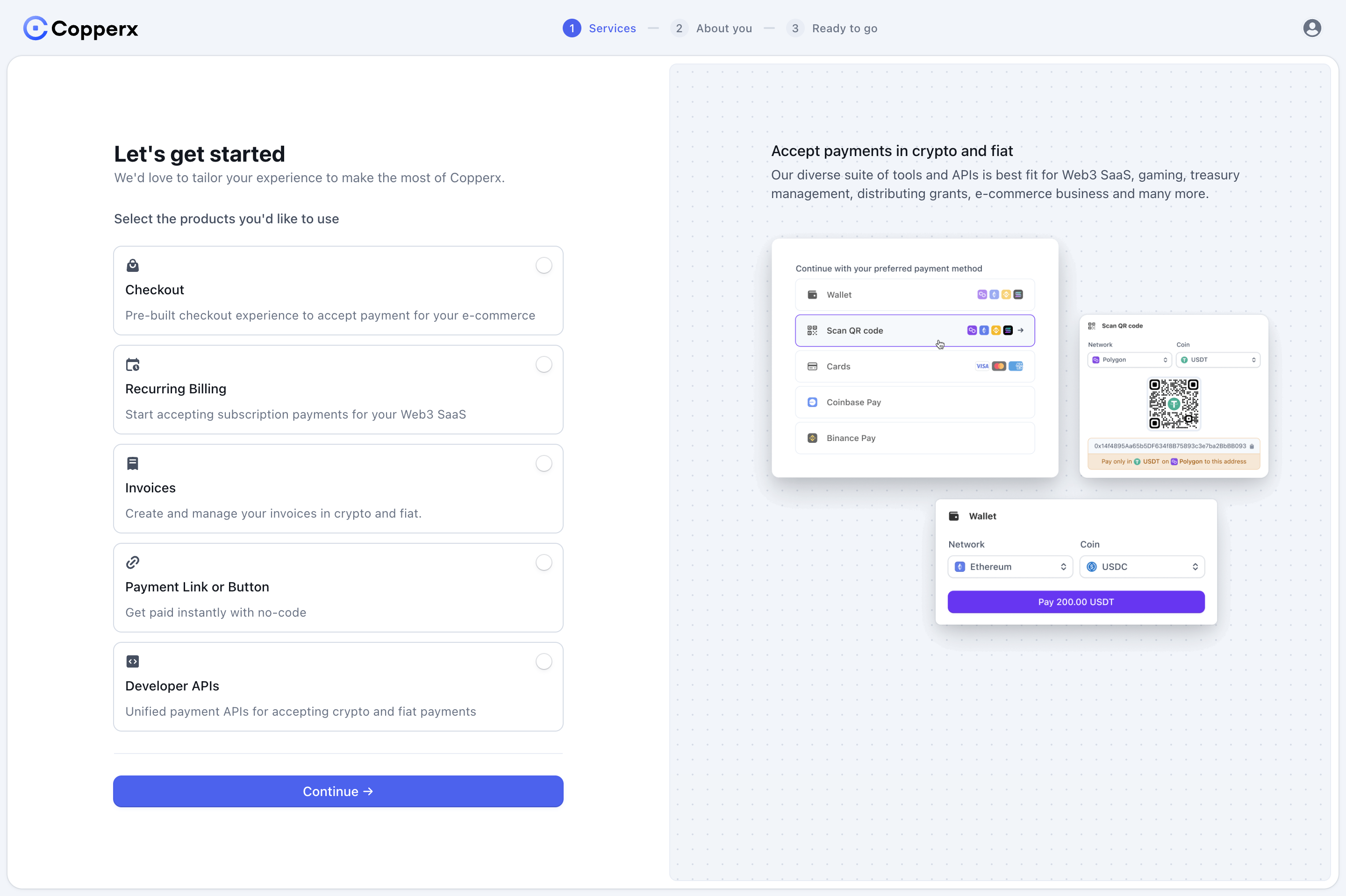
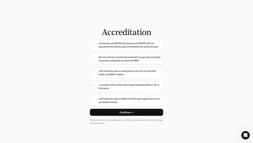
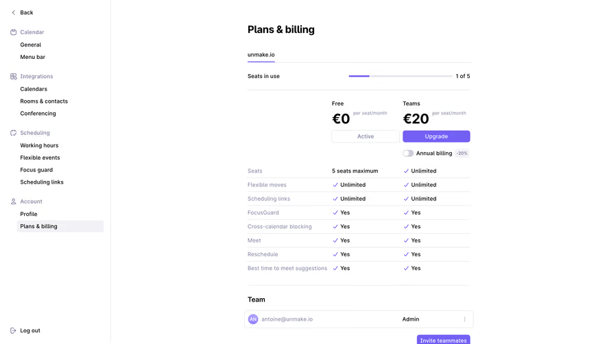
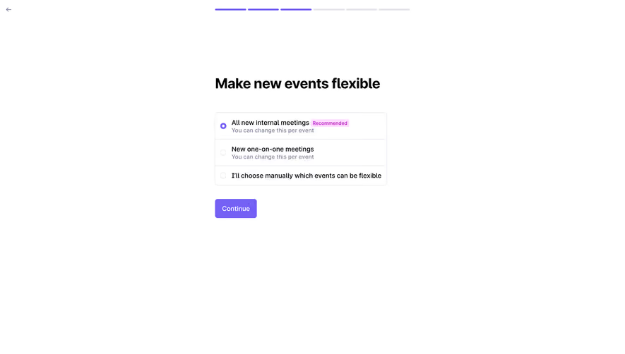
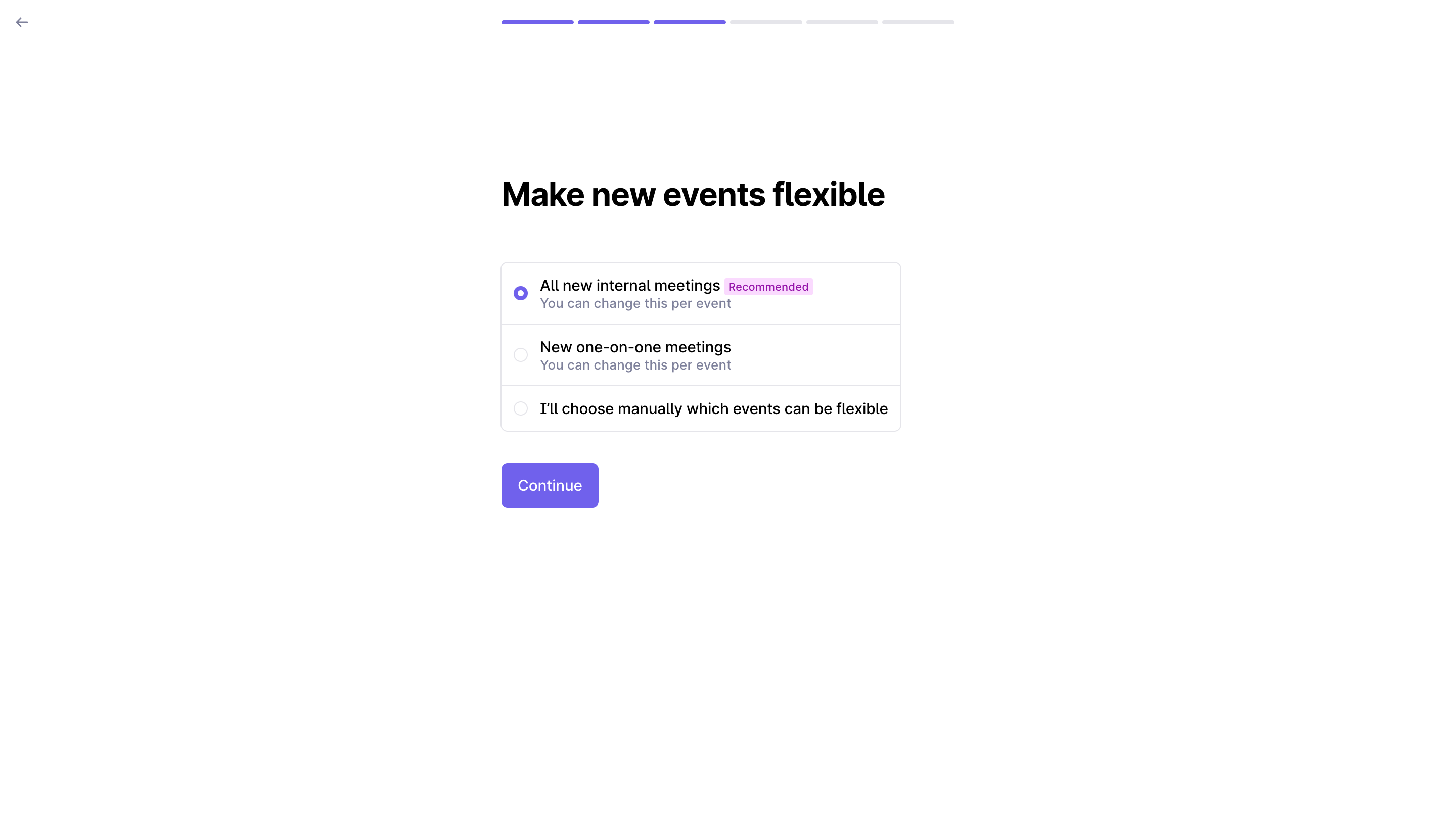
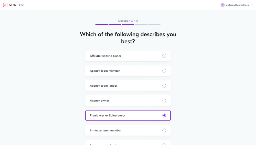
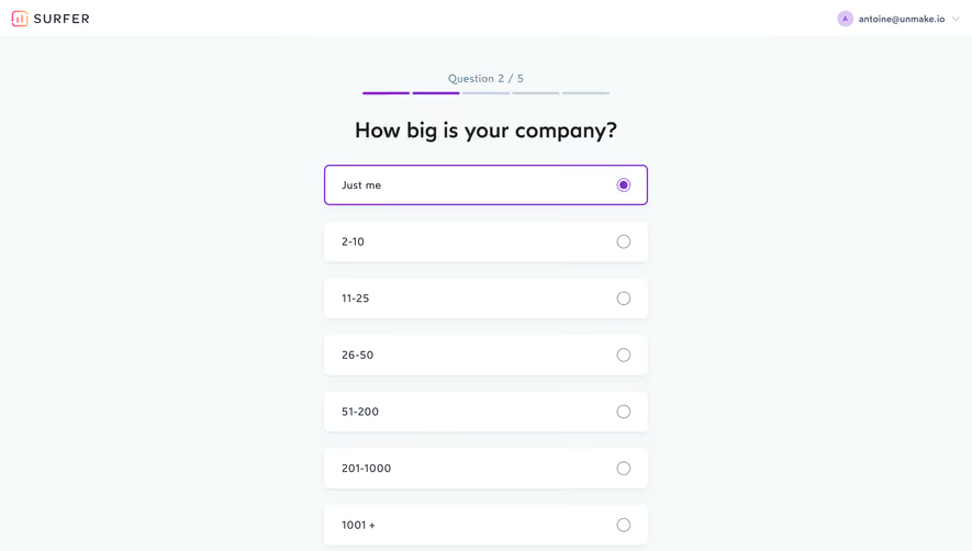
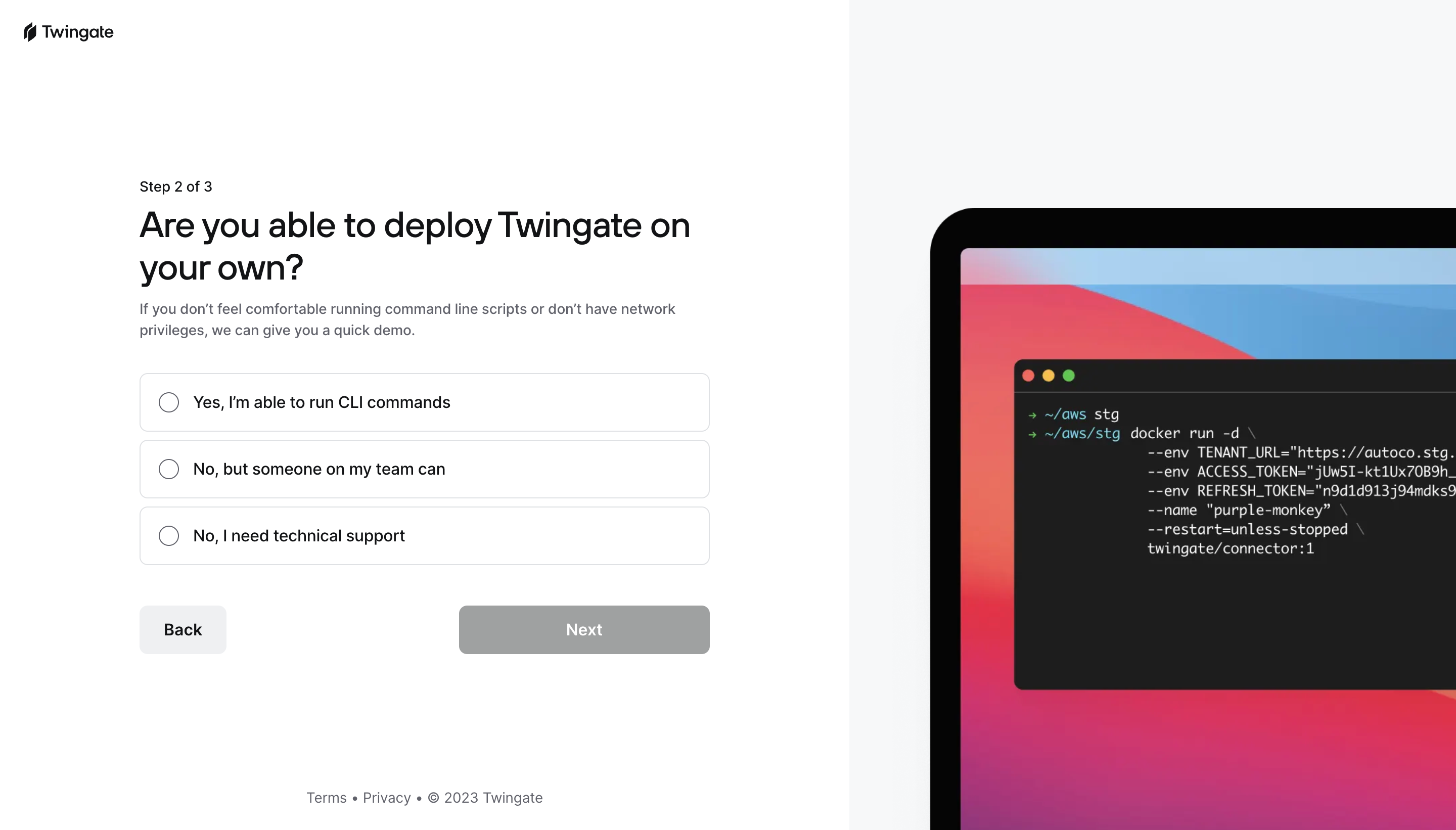
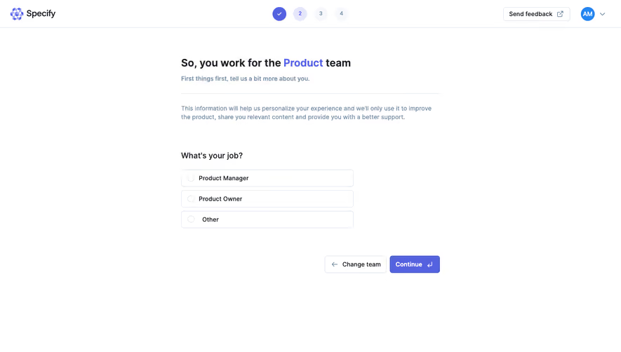
SavvyCal's setup question and two Surfer onboarding screens illustrate different single-choice problems: choosing a first task, reporting company size, and identifying a professional role. The controls share a familiar selection model, but the quality of the answer depends on how each question and its options are framed.
Use a radio group when alternatives belong to the same question and the user should choose only one. The choice can be required or optional according to the task, but its cardinality should remain understandable. Do not present independent preferences as a radio group merely because the options fit a tidy list.
Ask whether the underlying categories are mutually exclusive in the real world. A person can be both a freelancer and an agency owner; a product can be used for personal and team scheduling. If the interface asks for one answer, explain the decision rule, such as the main goal today or the role that best describes the current use.
A dropdown can save space for a long list, while radio buttons expose alternatives directly. Choose according to comparison needs, label complexity, and frequency rather than a fixed option-count rule. If people need to compare explanations, hiding every choice inside a menu can increase effort.
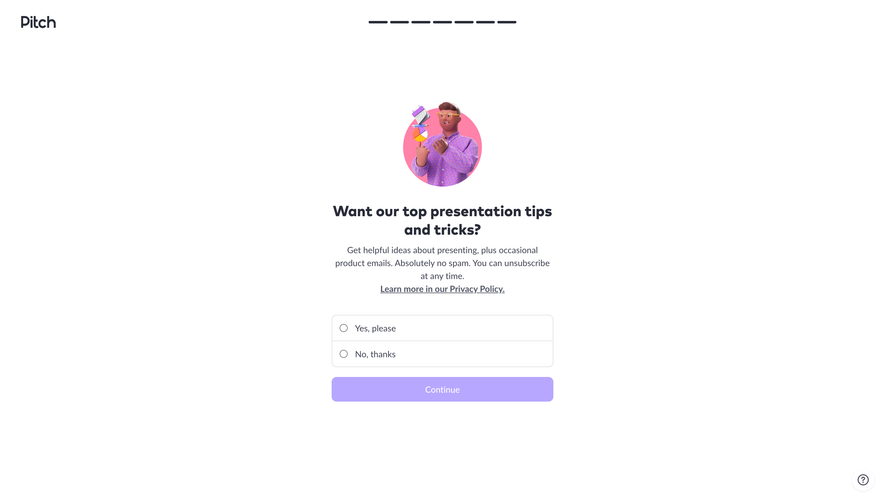
SavvyCal asks what the person hopes to achieve today and offers personal scheduling, a group meeting poll, a team scheduling link, and “I'm not sure.” The question describes a near-term goal rather than a permanent identity.
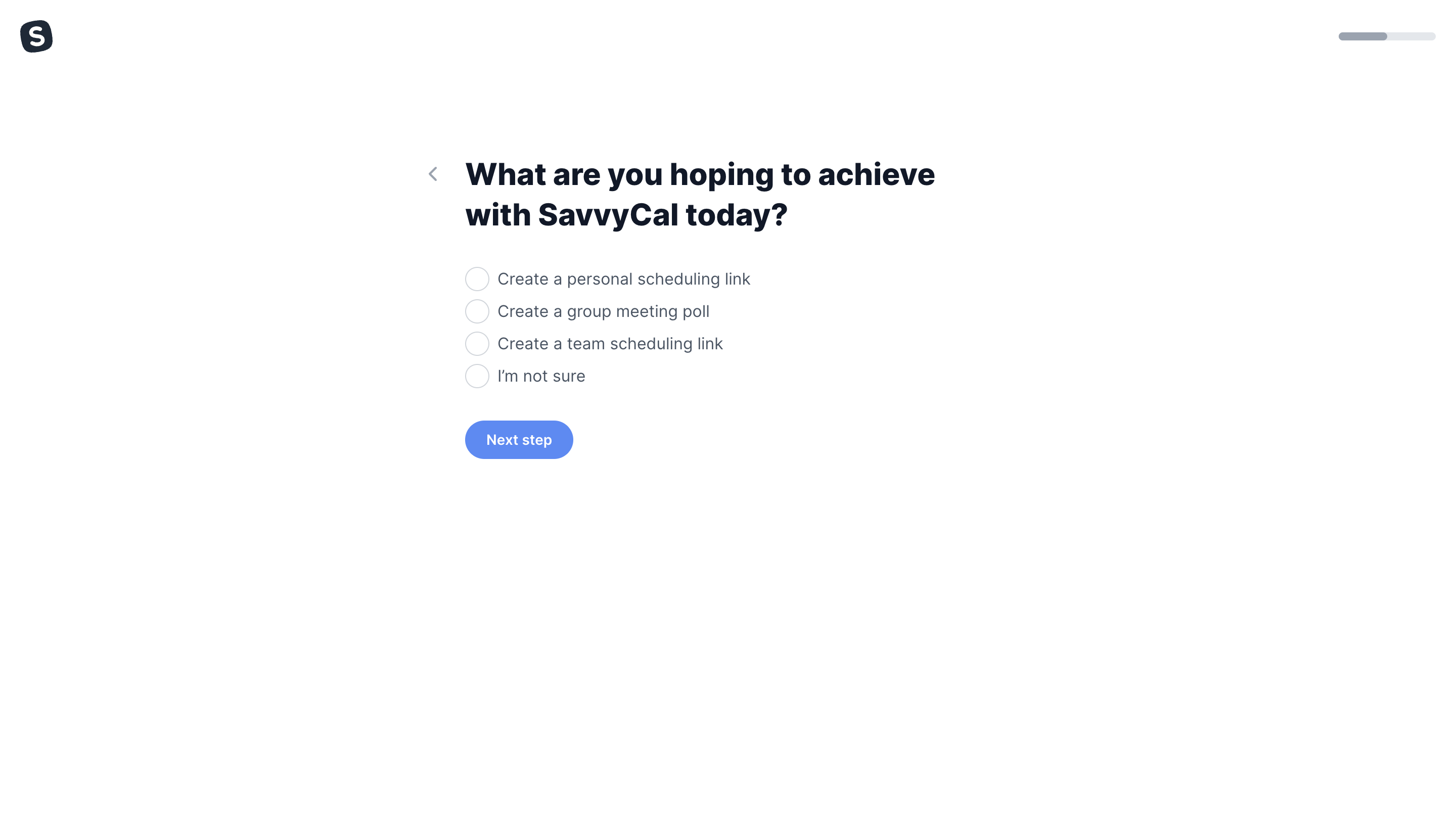
This framing helps resolve a common single-choice problem: users may want several capabilities eventually, but can identify which task to start with. If the selection routes onboarding, tell users that it determines their starting path rather than locking them into one product mode.
The uncertainty option prevents people who do not yet understand the product from fabricating a goal. Design a useful next step for that answer. It might lead to an explanation or a general introduction; the screenshot does not establish which route SavvyCal uses.
Keep option labels parallel. Starting each concrete choice with “Create” clarifies that the alternatives are actions. A mix of job titles, features, and actions under one question would be harder to compare even with perfect radio-button styling.
Surfer's company-size question displays “Just me,” several numeric ranges, “1001+,” and a personal-project alternative. The capture shows “Just me” selected with a colored card outline and a filled radio marker.
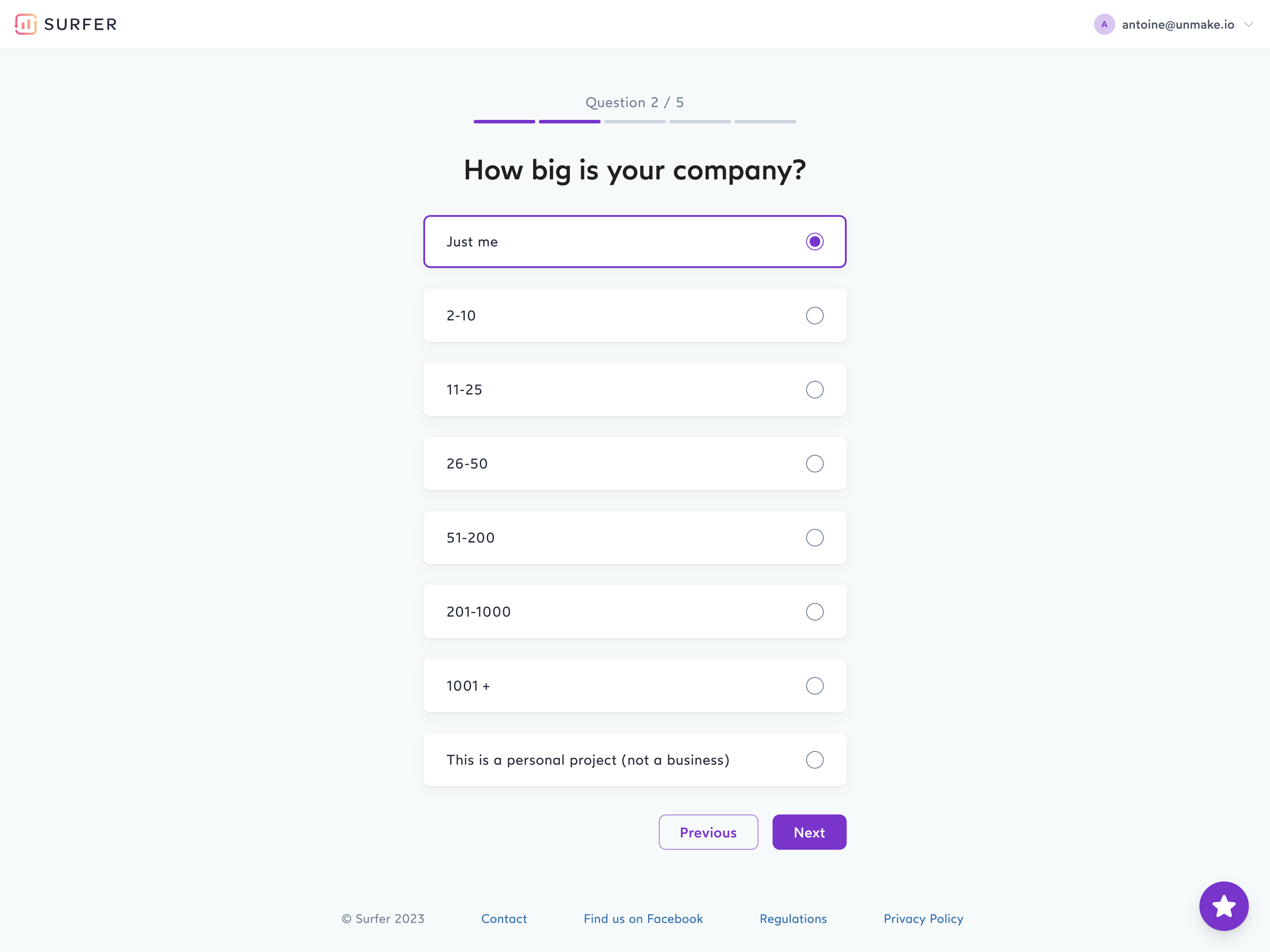
Range choices should cover the intended population without overlap. If a person belongs to a company with ten employees, they should not need to guess between two ranges that both include ten. Keep boundary conventions consistent and avoid gaps.
Explain the unit when it matters: employees, team members, seats, or active users can produce different answers. If company size affects the recommended plan, help people understand whether to count the whole company or only the team using the product.
A personal-project answer belongs to a different conceptual dimension than headcount. It can be useful as an escape route, but the question should explain how it fits. If project type and size both materially affect setup, two questions may preserve clearer data than combining them.
Surfer's role question asks which option describes the person best. It includes agency roles, freelancer or solopreneur, in-house roles, company owner, nonprofit or charity, and Other. The selected freelancer option is reinforced by both a card border and a filled circular marker.
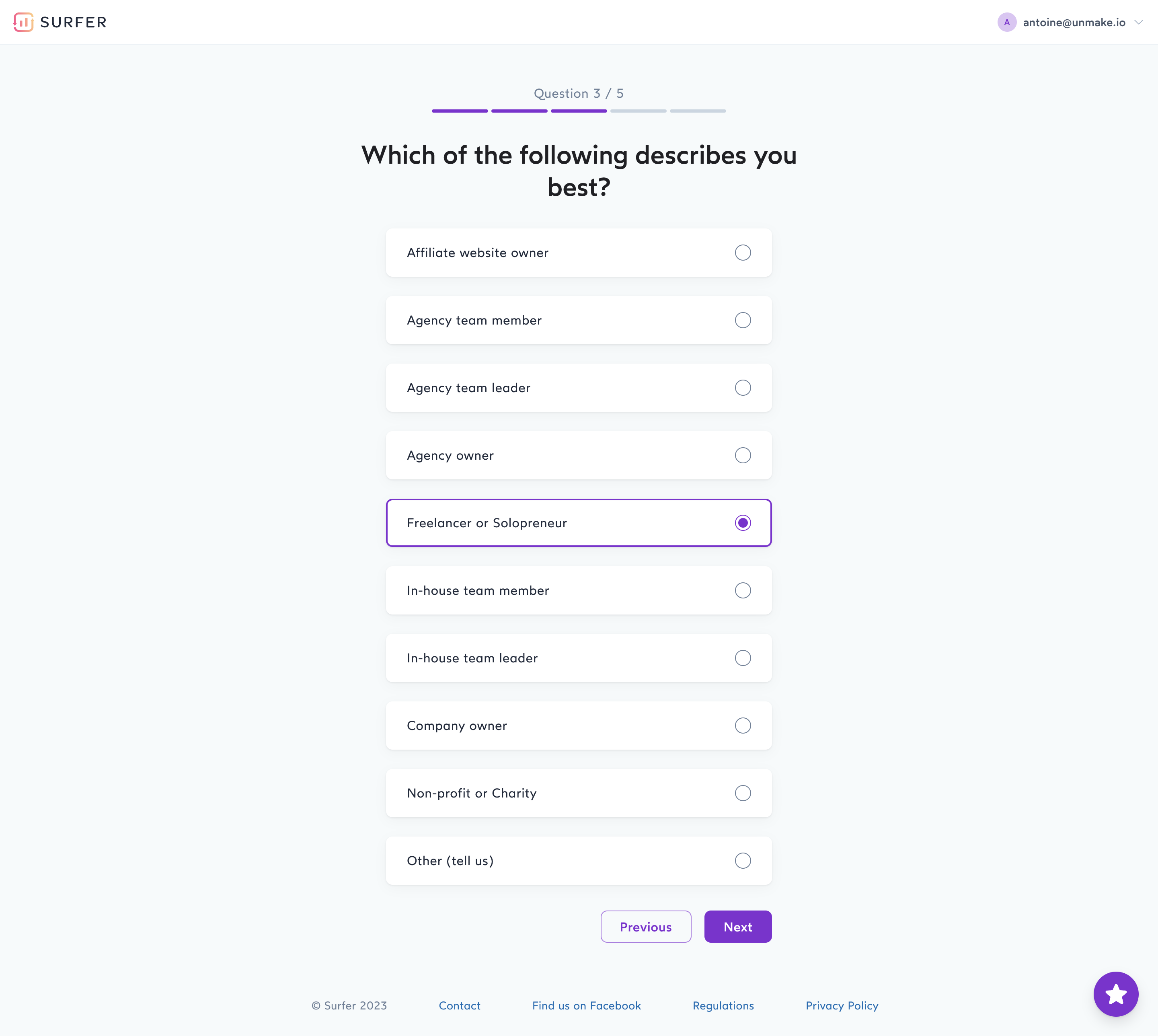
“Best” helps define the selection rule, but the option taxonomy still needs review. Employment role, ownership, and organization type are not identical concepts. Decide whether one answer is adequate for the product's actual use of that information.
If role data only changes helpful defaults, users should be able to revise it later. If it affects access or a consequential business decision, a lightweight best-fit answer may not provide enough precision. Align the question's wording with the weight placed on its result.
An Other option can expose missing categories, but it should not become a dumping ground for a poorly designed list. Review those responses to identify recurring omissions. If choosing Other opens a field, label it clearly and explain whether an explanation is required.
Radio options can be presented as compact label rows or larger cards. A card can accommodate explanation, pricing, or consequences, but it still represents one option within a group. Do not make visual size imply a different selection model.
Associate the label with the control so users do not need to hit a tiny circle. Provide adequate spacing between options, especially on touch devices. Keep the selected state visible through the marker and another appropriate cue rather than relying only on a subtle color change.
Descriptions should help compare choices rather than repeat the title. A plan option might explain who it suits and what changes; a routing option might describe the next step. Keep additional links or controls from making the option's click behavior ambiguous.
Long labels need a stable layout. Allow wrapping without separating the radio marker from the associated text. For card grids, maintain a reading order that still makes sense when the layout collapses into a single column.
A default can reduce work when there is a clear, safe, common setting. It can also bias a research or profiling answer. Distinguish a product configuration from a question intended to learn something about the user.
For a self-description question, leaving the group unselected can prompt an intentional answer. For a configuration with an established current value, show that value rather than asking users to select it again. Do not treat an unselected group as equivalent to selecting “None” unless the model defines that meaning.
If the question is optional, provide a clear way to leave it unanswered or revise the choice. Once a radio option is selected, the familiar interaction replaces it with another option rather than independently unchecking it. A deliberate “No preference” choice or skip action can make optionality understandable.
When recommended defaults exist, label the recommendation without making the other options seem unavailable. Explain the relevant reason briefly when users need it to decide.
The SavvyCal and Surfer captures include a next-step action after the choices. That visible structure separates choosing from moving forward. It lets the person reconsider before submitting the answer or changing screens.
Automatic advancement can reduce clicks in some flows, but it can surprise people who are inspecting alternatives or using a keyboard. If selection changes context, make that behavior predictable and test the full interaction. Do not infer automatic navigation from a static selection screenshot.
For consequential settings, a Save or Continue action can communicate commitment. For an immediately applied view preference, immediate feedback may be suitable. Keep the pending and applied states distinguishable where selecting does not yet change the system.
Do not trigger a major side effect simply because focus moved among options. Keyboard exploration and selection behavior need to follow the control's expected model.
A chosen option may reveal additional inputs, such as an Other description or custom delivery details. Place those inputs near the relevant choice, give them labels, and make their dependency understandable. Preserve entered values when users compare alternatives where that is appropriate.
Define whether hidden dependent values are retained, ignored, or cleared when another option is selected. An invisible stale field should not affect submission unexpectedly. If changing the option discards meaningful work, consider whether the user needs an explanation.
When a required group is unanswered, associate the error with the question and provide a correction route. Do not mark every individual radio as a separate error. Keep the message visible alongside the options rather than only in a distant page summary.
Unavailable choices need a reason when useful. Disabled options can communicate a constraint, but a user should understand whether access, plan, setup, or another dependency prevents selection.
Returning through a multi-step flow should preserve the prior answer when it remains valid. Users should not have to recall and re-enter choices simply because they reviewed another step.
If an earlier answer changes which options are available later, resolve any now-invalid selection explicitly. Show the updated choices and explain what needs attention. Silently substituting a different option can alter the user's intent.
For editing existing records, load the saved value before showing a default. A brief default selection during loading can look like a real value and invite an accidental overwrite. Use a clear loading state when necessary.
Keep product configuration separate from analytics assumptions. A restored radio choice should reflect the actual saved or pending state, not an inferred persona that the user never selected.
Native radio inputs with associated labels and an appropriately named group provide a strong starting point. Custom cards should preserve the same single-choice semantics rather than behave as unrelated buttons.
W3C's radio-group guidance describes keyboard behavior for moving through a group and identifies a distinct case for radio groups inside toolbars. Match implementation to the real context and test it rather than reproducing only the circular icon.
Make the question, current selection, option labels, and relevant help available to assistive technology. Keep focus visible in selected and unselected states. Focus and selection are related but different information and should not be indistinguishable visually.
Test small screens, zoom, long labels, optional groups, errors, and conditional inputs. A custom grid that works with a pointer may still have a confusing keyboard order or screen-reader announcement.
Use radio buttons for one choice within a group. Use checkboxes for independent selections where several or none may be chosen.
Yes, when the underlying behavior and semantics remain a single-choice group. The card treatment should improve comparison rather than obscure selection.
Only when that default is appropriate for the task. Profiling questions may benefit from an intentional answer; existing settings should show the saved value.
For an optional choice, provide a clear no-preference option or another deliberate reset route. Do not rely on users discovering a nonstandard deselection interaction.
Compare Checkbox for independent selections, Toggle for on/off settings, Segmented Control for compact alternatives, and Wizard for the surrounding setup journey. See W3C's radio-group guidance for interaction and semantic requirements.