Design with AI
Generate a new design based on this screen using your own content.
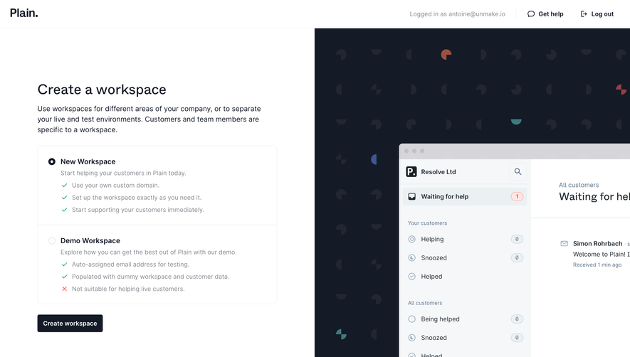
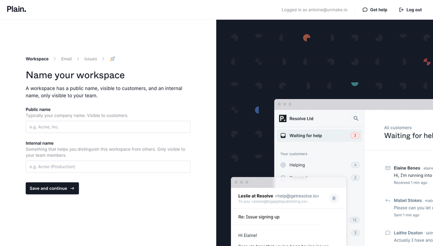
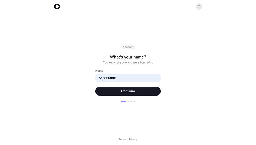
# Design from Reference: Plain Account Setup
Create an original, high-fidelity visual design inspired by the reference. Prioritize composition, typography, colors, spacing, and component styling over technical implementation.
## Reference
- **Product:** Plain
- **Category:** Account Setup
- **Screenshot:** https://cdn.prod.website-files.com/5e9dc792e1210c5325f7ebbc/6acbba9bd01e364847659aed_6acbb965f36145947e6ccf75_cms-84f08dc4b38d5bc2026ac670.webp
Analyze the screenshot first. If inaccessible, request it rather than guessing.
## Content
{{content.instructions}}
{{content.data}}
Preserve essential messaging and factual accuracy. Adapt structure and copy length for visual balance; never invent product claims.
## Visual Design
### Overall aesthetic
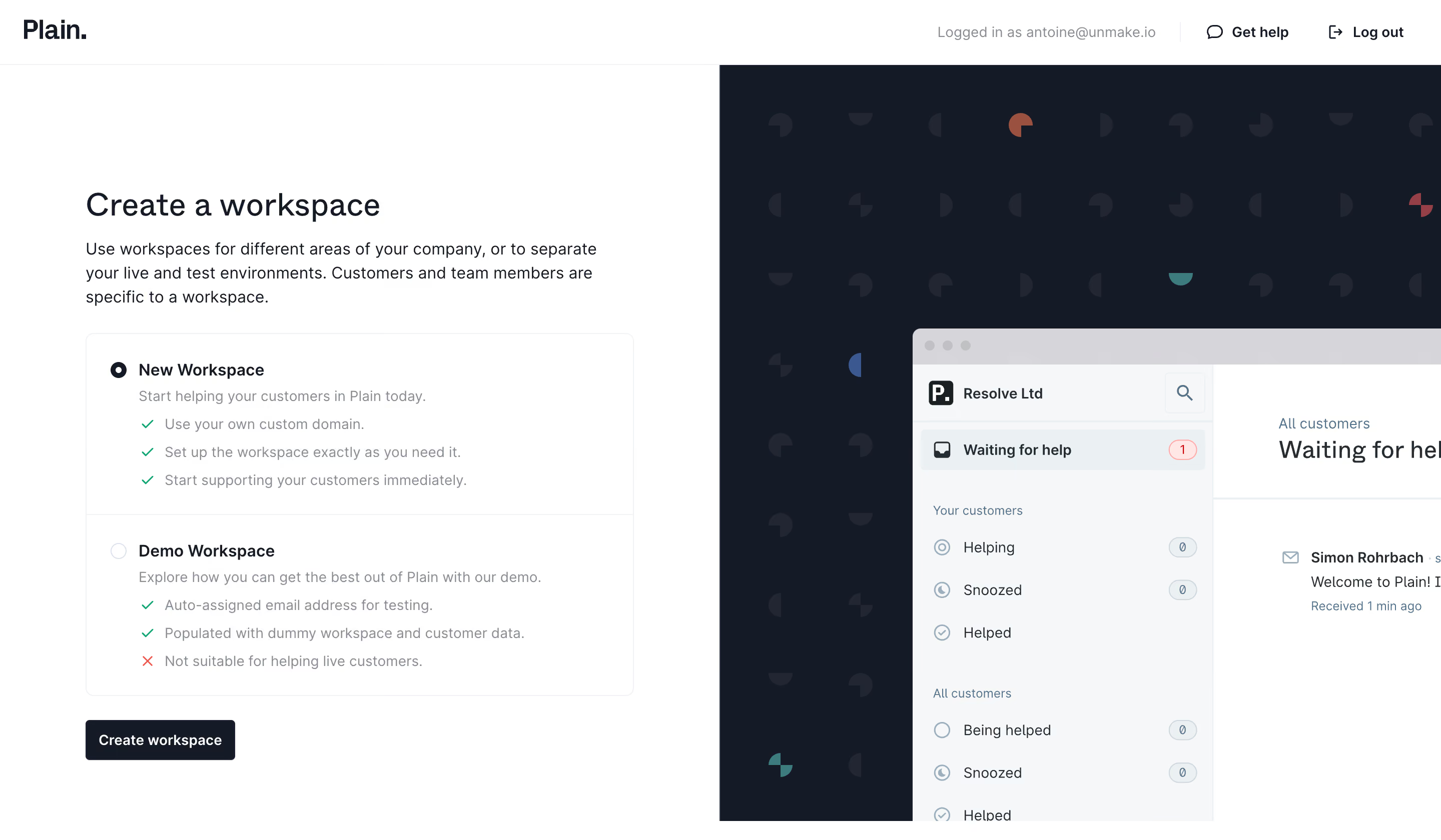
- **Style:** Clean workspace-creation screen with a white form half and dark product-preview half.
- **Character:** Neutral typography, radio-card choices, small green checks, and minimal action styling.
### Page composition
- **Canvas:** 2880 × 1680 image px; CSS estimates assume an unverified 2× capture.
- **Header:** Approximately 64 CSS px tall, with logo left and account/help/logout utilities right.
- **Split:** Equal-width white left pane and dark right pane.
- **Form:** Approximately 550 CSS px wide with heading, explanatory paragraph, two stacked workspace choices, and dark submit button.
- **Preview:** Cropped product window over a dark patterned backdrop.
### Information hierarchy
- **Primary:** Create a workspace heading.
- **Choice:** New Workspace selected above Demo Workspace.
- **Explanation:** Muted descriptions and checkmarked capability lists explain each option.
- **Action:** Dark Create workspace button beneath the choice panel.
- **Preview:** Supports the form without introducing competing actions.
### Typography
- **Family:** Neutral interface sans serif; exact family unverified.
- **Heading:** Approximately 32 CSS px, medium under assumed 2×.
- **Body:** Approximately 16px with 24px line-height.
- **Option titles:** Approximately 16px, semibold.
- **Details:** Approximately 14px with 24px line-height.
- **Header and button:** Approximately 14px.
- **Precision:** Font metrics and 2× conversion are estimates.
### Colors & surfaces
- **Form surface:** #FFFFFF.
- **Preview backdrop and primary action:** #151A27.
- **Preview pale surfaces:** #F6F7F9 and #EBF0F3.
- **Preview window chrome:** #D6D5DA.
- **Pattern marks:** #212632.
- **Secondary text:** #888C94.
- **Accents:** Small green checks, red exclusion mark, and colored geometric background motifs.
- **Precision:** Samples from screenshot after profile conversion where applicable.
### Components
- **Choice panel:** Thin light border, approximately 8px radius, two vertically separated sections.
- **Radio controls:** Small circles aligned with option titles.
- **Capability lists:** Three concise rows under each choice, with check or cross icons.
- **Submit:** Dark compact rounded rectangle, approximately 40px tall under assumed 2×.
- **Preview:** Large app window cropped at right and bottom, with support-list UI.
- **Backdrop pattern:** Small circular/quadrant motifs repeated on a grid.
### Visual rhythm
- **Spacing:** Broad top margin above form; regular 24px group spacing.
- **Alignment:** Title, prose, choice panel, and action share a left edge.
- **Balance:** Dense explanatory form contrasts with decorative cropped preview.
- **Panel hierarchy:** Selected radio, bold title, then muted details.
### Responsive
- **Observed:** Desktop only.
- **Recommendation:** Prioritize the form in one column and move or hide decorative preview on narrow screens.
- **Choices:** Preserve clear radio state and readable capability lists.
- **Header:** Simplify account utilities while retaining help.
### Adaptation guidance
- **Preserve:** Real/demo workspace comparison and strong separation between input and illustration.
- **Privacy:** Replace account identifiers and preview customer data.
- **Content:** Use actual workspace capabilities and restrictions.
- **Behavior:** Radio changes and submission outcomes are not shown.
Use this context to reproduce the reference's visual language: layout, typography, colors, spacing, borders, radii, and distinctive elements. The screenshot takes priority if descriptions conflict.
## Direction
{{preferences.fidelityInstructions}}
## Output
{{output.instructions}}
Deliver a polished, cohesive design with precise alignment, hierarchy, and spacing. Produce the requested visual artifact, not just a description. If unsupported, explain the limitation.