Design with AI
Generate a new design based on this screen using your own content.
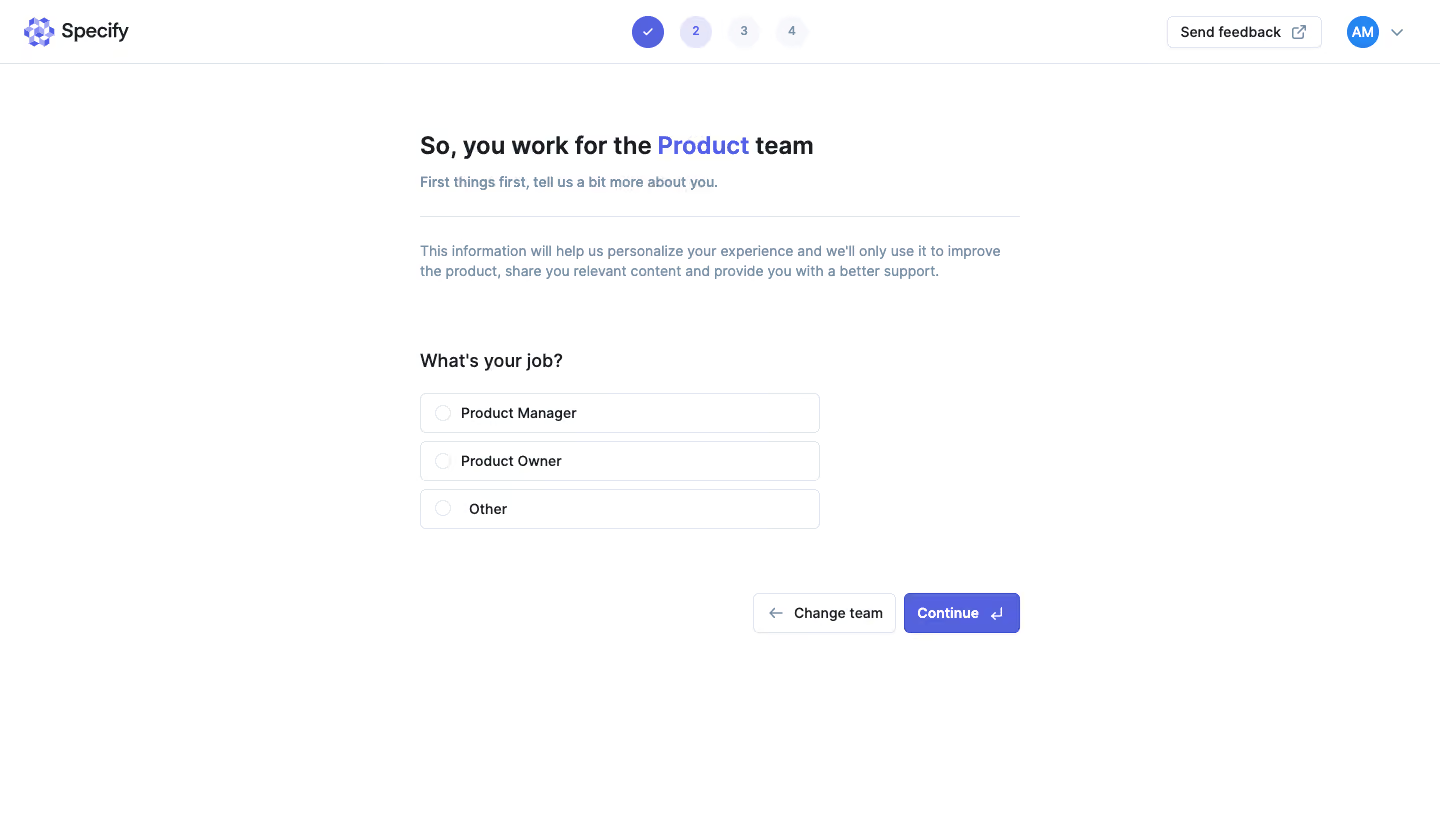
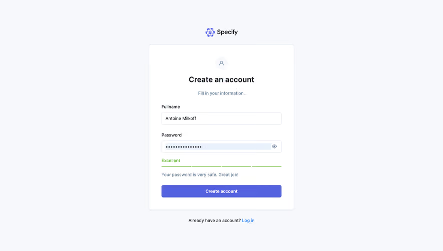
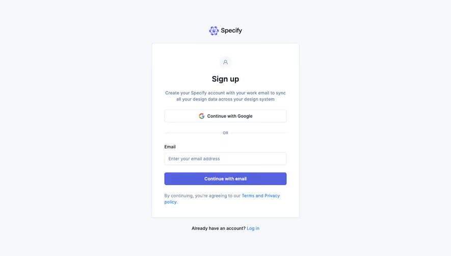
# Design from Reference: Specify Account Setup
Create an original, high-fidelity visual design inspired by the reference. Prioritize composition, typography, colors, spacing, and component styling over technical implementation.
## Reference
- **Product:** Specify
- **Category:** Account Setup
- **Screenshot:** https://cdn.prod.website-files.com/5e9dc792e1210c5325f7ebbc/6acbba09d37e66e942ffbdc6_6acb70e317a745bec7f4e710_cms-49d4ea17f21dc699c7ad2cfe.webp
Analyze the screenshot first. If inaccessible, request it rather than guessing.
## Content
{{content.instructions}}
{{content.data}}
Preserve essential messaging and factual accuracy. Adapt structure and copy length for visual balance; never invent product claims.
## Visual Design
### Overall aesthetic
- **Character:** Minimal role-personalization step with white canvas, violet progress markers and outlined radio choices.
### Page composition
- **Capture:** 1440 × 821 screenshot pixels; estimated CSS scale approximately 1×.
- **Structure:** Brand/header with four-step indicator, centered content heading/help, divider, explanatory paragraph, job choices and lower-right Change team/Continue.
### Information hierarchy
- **Priority:** Team identity is highlighted in violet within the heading; three job choices are the main task.
### Typography
- **Family:** Sans serif; exact family unverified.
- **Estimated CSS sizes:** Heading 24px, question 18px, body 14px and action 14px bold.
### Colors & surfaces
- **Measured palette:** White #FFFFFF, borders #DFE4ED, violet #5562E0, dark #191E25, secondary #7B8CA4 and pale #F6F8FB.
### Components
- **Elements:** Completed/current/future step circles, three full-row radios, feedback link and paired navigation buttons.
- **Estimated geometry:** Content 600px wide, choices 400px wide, rows 40px, 6px radii and 8px row gaps.
### Visual rhythm
- **Spacing:** Large gaps separate explanation, decision and progression; the narrow choice list leaves ample white space.
### Responsive
- **Suggested adaptation:** Use fluid content/choice widths and keep step markers compact. Mobile behavior is not shown.
### Adaptation guidance
- **Transfer:** Preserve personalized team context and one clear role choice before proceeding.
Use this context to reproduce the reference's visual language: layout, typography, colors, spacing, borders, radii, and distinctive elements. The screenshot takes priority if descriptions conflict.
## Direction
{{preferences.fidelityInstructions}}
## Output
{{output.instructions}}
Deliver a polished, cohesive design with precise alignment, hierarchy, and spacing. Produce the requested visual artifact, not just a description. If unsupported, explain the limitation.