Paywall
8
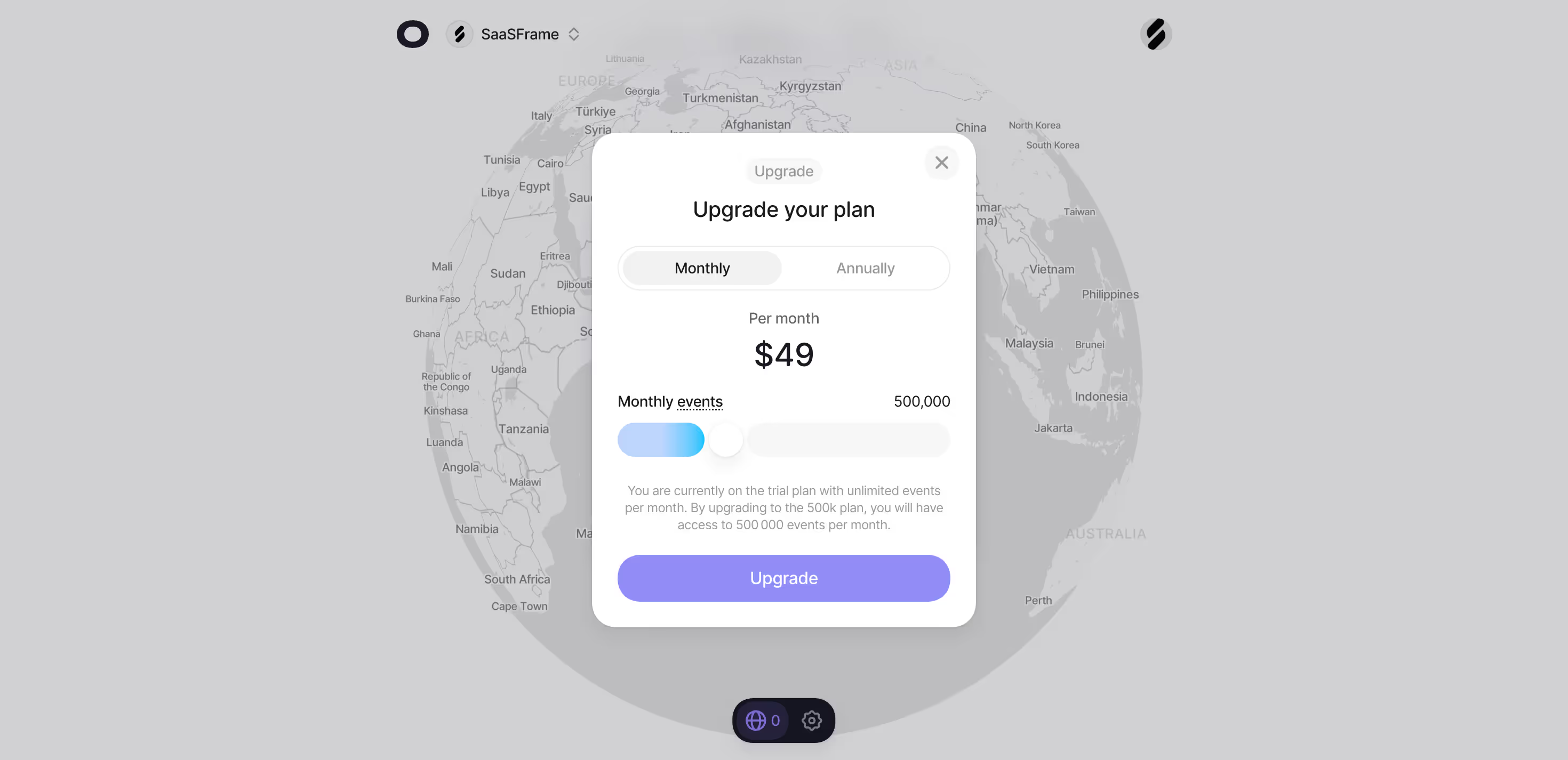
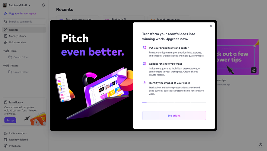
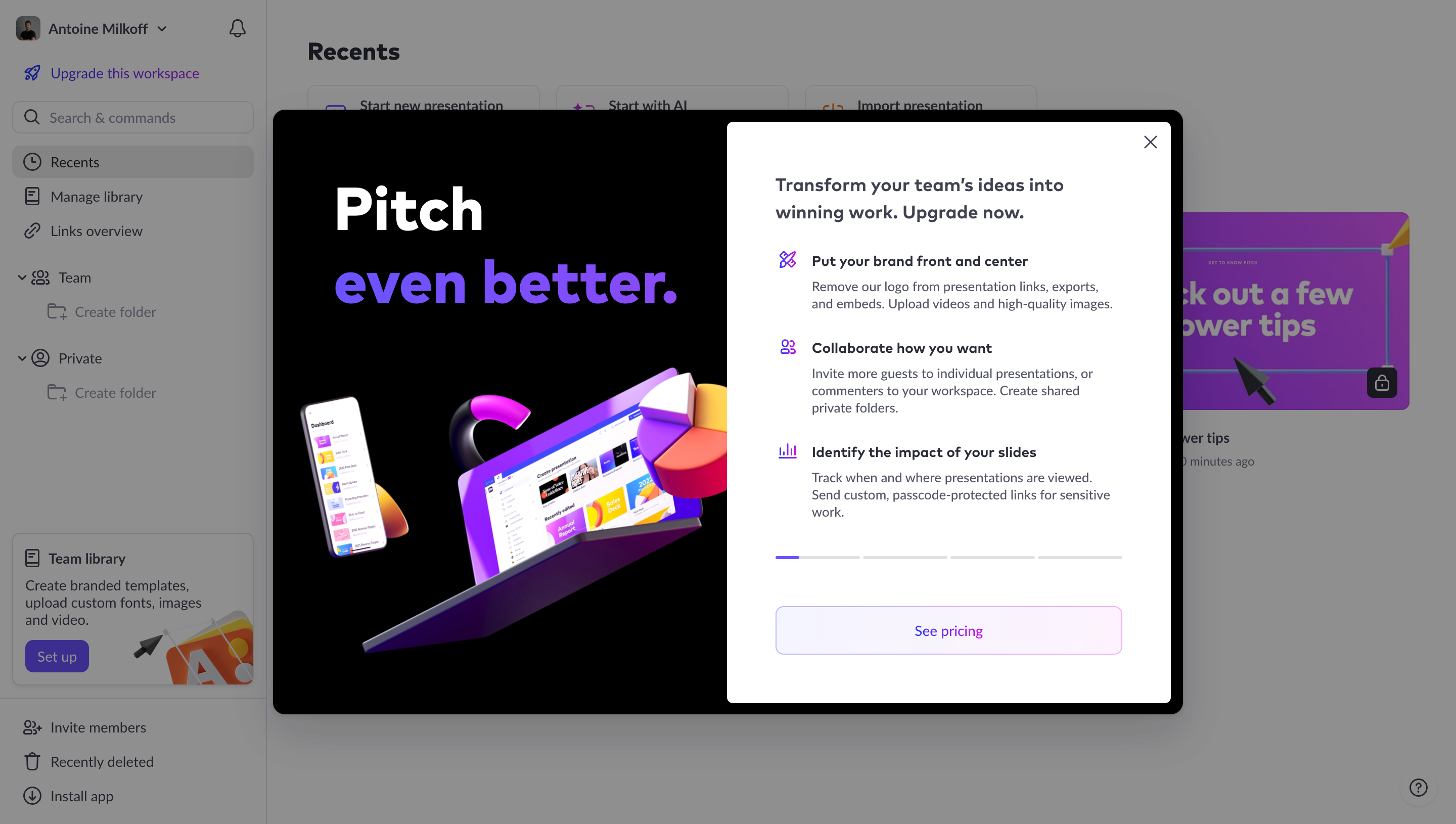
Drive expansion revenue with strategic SaaS Paywall patterns. See how to present 'Feature Locked' states and 'Upgrade' CTAs that encourage users to move to a higher tier.

A paywall presents a commercial requirement before users can access a product, capability, or result. It may appear during onboarding, after a trial, or at a restricted destination. The interface needs to explain what access requires and provide a clear decision path without leaving the account in an ambiguous state.
A paywall differs from an optional upgrade invitation. It defines a boundary in the current journey. Users need to know what is already complete, what remains inaccessible, and whether they can continue through a trial, purchase, sales conversation, or another available route.
Start with the actual access model. Identify the affected account, available plans, entry conditions, and entitlement timing. Then connect the barrier to the product value users are evaluating. A price table alone does not explain why the current task stopped or what will happen after selecting an option.
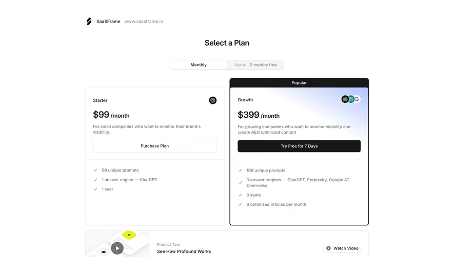
Profound's captured screen identifies the configured brand and website above a Select a Plan heading. Starter and Growth cards appear beneath a monthly-versus-yearly control. The brand context indicates that earlier setup has established an object, while the current step asks for a commercial choice.
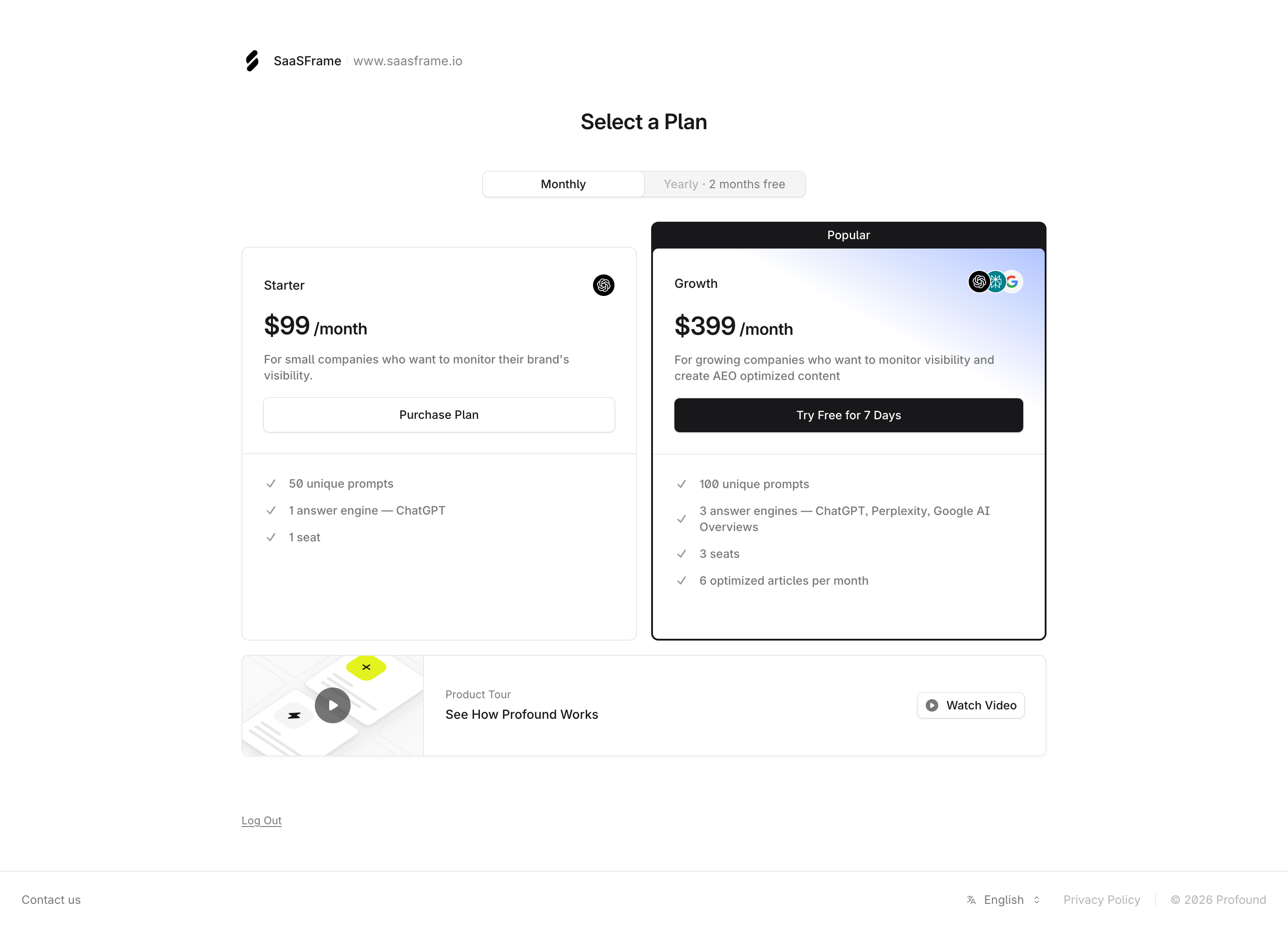
The actions differ: one offers purchase and the other offers a trial. Users should not have to assume that both buttons produce the same commitment. A comparable design should explain the actual entry conditions and preserve the setup information if the user leaves before deciding.
The capture also includes a product-tour route. That can support evaluation when users have reached the boundary before seeing enough of the product. Treat captured prices and terms as historical content rather than current offers. The useful principle is the relationship among setup context, plan choice, and evidence.
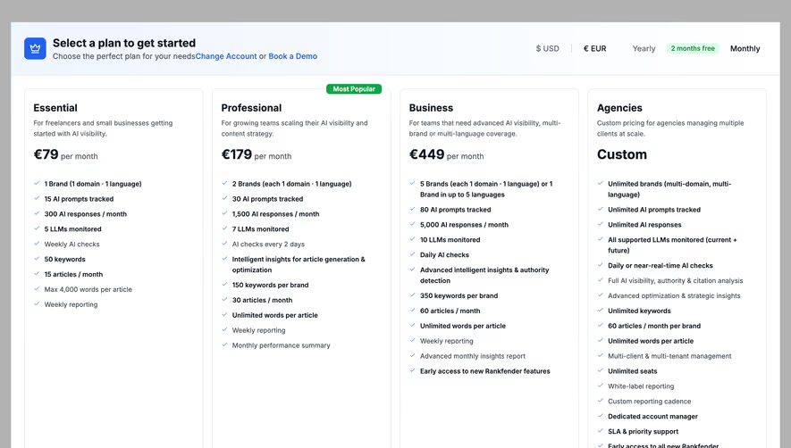
Rankfender's captured paywall shows several self-service plans and an Agencies option with a sales route. It includes currency and billing-period choices, a change-account route, and demo links. This acknowledges that commercial decisions and account identity may need adjustment at the same boundary.
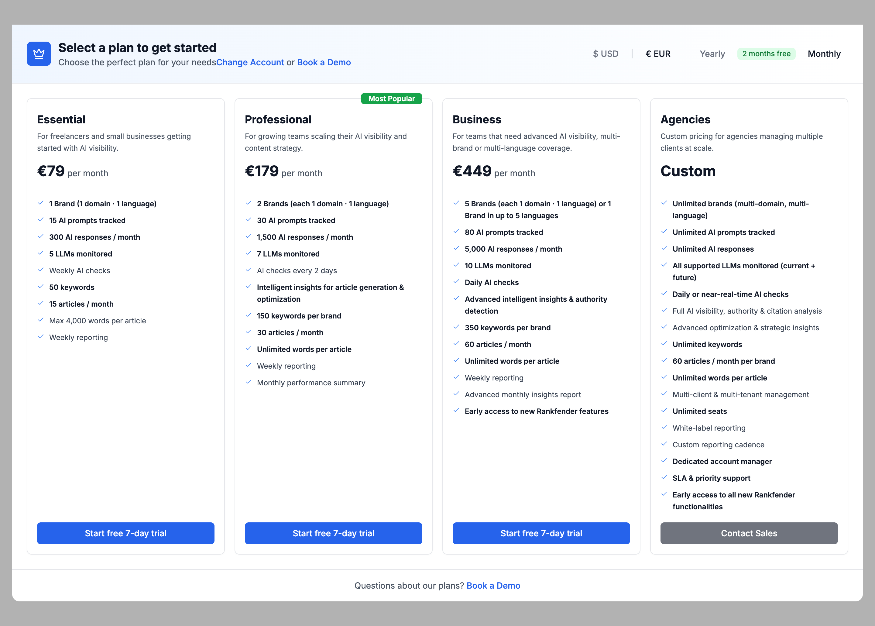
A change-account route matters when a user is in the wrong organization or already has access elsewhere. A demo route matters when the offer requires more explanation. These should support real alternatives rather than appear as decorative links with unrelated destinations.
The plan descriptions identify different audiences and capacities. Keep those distinctions readable without forcing users to compare every line. A popular label can guide attention, but it should not replace an explanation of fit. The account-specific decision remains the user's.
A paywall should identify the inaccessible scope. It may block the whole product, one workspace, a feature, or a generated result. Avoid implying that every capability is unavailable when only one boundary applies. Likewise, do not suggest that a purchase unlocks more than the chosen entitlement.
Make any available preview or read-only route understandable. Users may be able to inspect existing work without editing, view a sample, or return to setup. Explain the actual options. A blurred screen alone gives little information about what remains possible.
When a result has already been generated, communicate what users can access before and after the commercial step. Preserve the relationship to their request. If the result will expire or must be regenerated, explain that where it affects the decision rather than hiding it behind the purchase action.
A displayed amount needs a unit and billing basis. Per-user, per-workspace, and usage-based offers describe different arrangements. Monthly presentation with annual billing requires clear wording. Currency changes should update the relevant commercial information consistently rather than only the large number.
Capacity should connect to the user's likely task. Seats, brands, prompts, storage, and processing volume are different limits. Use readable units and time periods, and explain any material overage or blocking behavior in the appropriate review flow.
Do not make a short paywall carry every contractual detail, but preserve the qualifications that change the immediate decision. The next screen should agree with the initial presentation. A user should not discover a different billing basis only after investing effort in checkout.
A trial is a temporary access arrangement, not simply a softer purchase label. Explain the relevant duration, payment-method requirement, end behavior, and capability scope. Use the product's actual rules rather than generic assumptions about free trials.
An expired trial needs a different explanation from a new account choosing its first plan. A failed renewal needs a different recovery route from an optional plan comparison. The paywall should reflect current account state so users understand why it appeared now.
Keep action language precise. Start trial, Review plan, Purchase, and Contact sales belong to different stages. If an action opens another decision screen, its label should not imply immediate access. If it commits a purchase, provide the relevant review and resulting state.
A paywall often interrupts work already begun. Preserve entered configuration and drafts where appropriate. If the user returns later, show recognizable account context and avoid forcing repeated setup merely because they postponed the commercial decision.
Provide a clear route out where the product supports one. That may be returning to a dashboard, changing account, logging out, or exploring a demo. Dismissing an overlay should not leave users on an inaccessible screen with no explanation.
If the paywall cannot be dismissed because access is genuinely required, make that boundary explicit. Do not style a close control that does nothing or hide navigation in a way that traps users unnecessarily. Account and support routes should remain usable where they are relevant to resolving access.
The person encountering the barrier may not control billing. Identify the permission boundary and provide an appropriate administrator route. A purchasing flow that fails predictably after several steps wastes effort and obscures the real reason access is unavailable.
After a successful commercial operation, update entitlement state and explain any delay. A payment confirmation and an access change may complete at different times. Show pending processing when necessary rather than leaving the old paywall unchanged.
Handle repeated activation and uncertain results. A slow request should not encourage duplicate purchases or trial attempts. If another administrator changes the plan concurrently, reconcile the current state before presenting an outdated offer. Keep account scope attached to the operation throughout.
Plan cards need a readable order and clear relationships among label, price, qualifications, and action. Keyboard navigation should reach the same decisions as pointer input. Currency and cadence controls should expose their selected state and update content predictably.
If the paywall is a dialog, manage focus and dismissal appropriately. If it is a full page, establish a clear heading and useful navigation. A decorative overlay should not conceal important labels or make the background appear interactive when it is not.
Review narrow layouts and text enlargement. A horizontal plan comparison may become a long vertical sequence. Preserve key differences and qualifications without requiring users to remember every detail across distant cards. Ensure that supporting routes remain discoverable after the layout changes.
Ask users why the paywall appeared, what each action commits, which account changes, and what becomes available afterward. Include a wrong account, an expired trial, and a user without purchasing permission. These cases reveal whether the barrier explains the product's actual model.
Measure completed, understood access changes alongside checkout clicks. Review abandonment caused by unexpected terms, repeated setup, or an unclear return route. A purchase is not the end of evaluation: verify that users can reach the intended capability and continue the task.
Use this checklist:
Keep the barrier aligned with billing and product configuration. A changed entitlement, renamed plan, or discontinued trial can make a previously accurate paywall misleading. Maintain the message and access rules together, including the destination opened by each action.
Review how the boundary appears to returning customers. A sign-in mistake or stale session can resemble lack of subscription. Before asking for another purchase, give users an appropriate way to restore the correct account context. The paywall should explain a commercial requirement, not conceal an authentication problem.
For a generated or imported object behind the barrier, identify whether the commercial step preserves that object or starts another process. A user may reasonably assume that selecting a plan reveals the existing result. If it instead reruns analysis or requires another setup stage, communicate the distinction before commitment.
Compare entry points into the same paywall. A new account, a shared link, and a returning expired subscriber can arrive with different knowledge. Keep the commercial offer consistent while adapting the explanation of why access is unavailable. This reduces the need for a generic message that leaves every audience partially confused.
Review sales-assisted routes as part of the boundary. Contacting sales may not immediately enable access, and a booked demo may be another evaluation step. Explain the expected continuation rather than presenting these routes as equivalent to a self-service trial. Users should know whether they are starting access or starting a conversation.
They can overlap, but a paywall establishes an access requirement in the current journey. An upgrade prompt may be optional. Explain the boundary and available routes rather than relying on the visual format alone.
Provide coherent exit or account routes where available. If access genuinely requires a commercial choice, make that state clear while preserving appropriate support and account controls.
Confirm the commercial operation and update access. If entitlement processing is delayed, explain the pending state and provide a way to check progress. Preserve the task the user was trying to complete.
Explore the SaaSFrame paywall examples to compare plan selection, access explanations, and commercial transitions inside SaaS products.