Gallery
5
Visualize your software in action with SaaS Product Gallery patterns. These examples show how to use lightboxes, carousels, and grid views to give users a comprehensive look at your UI/UX.

A gallery presents a collection through visual previews so users can recognize, compare, and inspect its contents. In SaaS products, galleries can contain templates, media, design assets, examples, or shared project material. The pattern is useful when seeing an object contributes directly to choosing it.
The gallery's value depends on what the preview tells the user. A wall of attractive thumbnails can still be hard to use if essential differences are hidden, filtering is weak, or opening an item loses the browsing context. Design the journey from overview to inspection and back, rather than treating the preview grid as the complete feature.
A grid is a layout. A gallery is a browsing experience in which visual representation carries an important part of recognition. A catalog of configuration names can use cards without requiring image inspection. A library of testimonial designs benefits from previews because the visual arrangement is part of the choice.
Identify the decision the preview supports. Users may be choosing a layout, checking a screenshot, or locating a familiar asset. The preview's crop, size, and metadata should help that decision. Decorative images that do not represent the object can make the collection look rich while reducing useful information.
Consider whether another view is needed for metadata-heavy work. Visual browsing and precise comparison can coexist. A gallery may help people recognize an asset while a list view helps them compare names, owners, or dates. Offer the alternate view when it supports a real task.
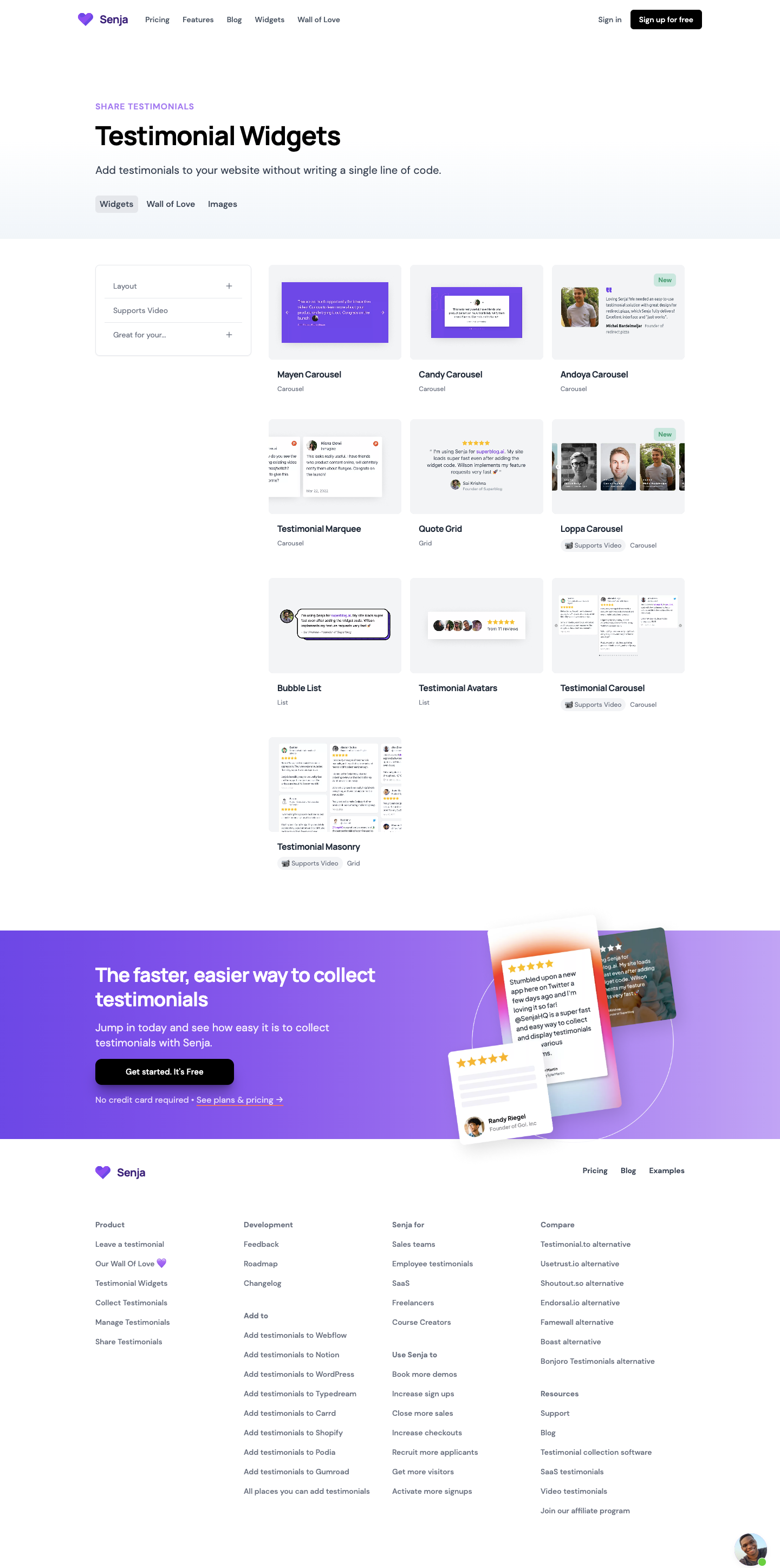
The Senja screenshot shows a Testimonial Widgets page with a gallery of design options. Each entry has a preview, a name, and a layout label such as Carousel, Grid, or List. Some entries carry a Supports Video badge, and a filter area appears on the left.
The previews show meaningful differences in arrangement: quotation cards, avatar treatments, grids, and video-oriented layouts. This makes visual inspection relevant to the task. A text-only list of template names would provide less help to someone choosing how testimonials should appear on a website.
The metadata adds constraints the image alone cannot reliably convey. A visually appealing option may still be unsuitable if the user needs video support. Pairing capability labels with previews lets the gallery support both aesthetic and practical decisions.
The screenshot does not demonstrate filtering or the next step after selecting a widget. It supports the visible relationship between preview, name, layout, and capability. Those elements are the basis for the analysis, rather than assumed behavior beyond the capture.
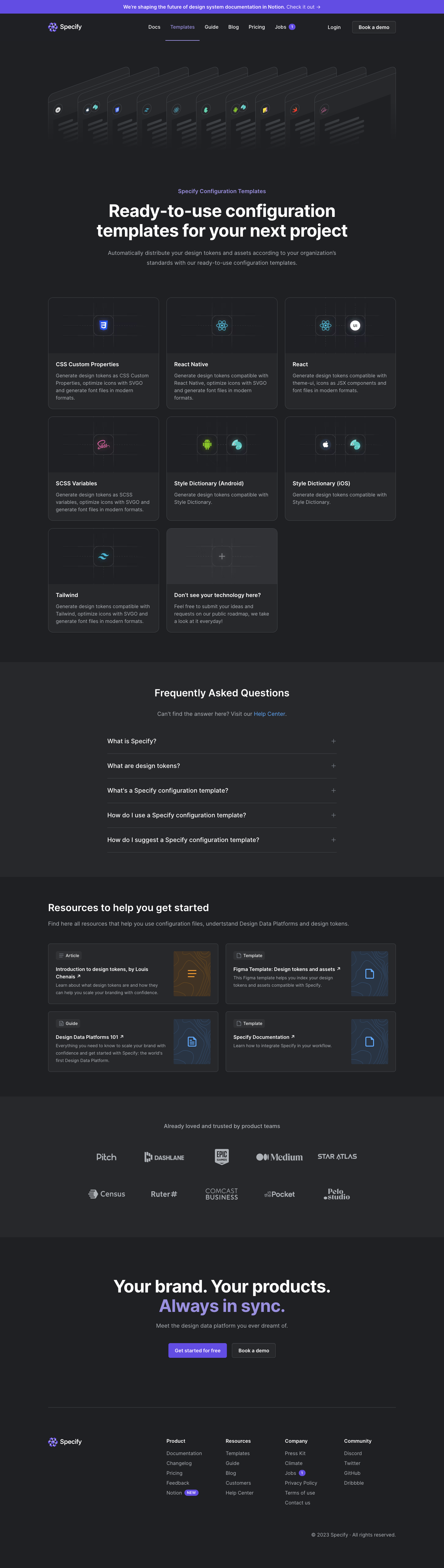
The Specify screenshot presents ready-to-use configuration templates. Cards use technology icons, names, and explanatory text for destinations such as CSS custom properties, React, and other formats. The page also contains FAQs and supporting resources.
This is a useful boundary case. The cards are visual, but choosing a configuration template depends strongly on technical destination and compatibility. Large preview images would not necessarily improve that decision. The appropriate information hierarchy differs from Senja's visually distinct widget layouts.
Use this distinction when deciding how to build your own library. A gallery should allocate space to visual evidence only when that evidence helps users choose. Otherwise, clear names and descriptions may deserve more emphasis.
The comparison does not require the two pages to serve the same audience. It shows that similar collection layouts can support different recognition tasks. The pattern should adapt to the object rather than impose a uniform thumbnail-first model.
A crop can make thumbnails consistent, but it can also conceal the very feature being compared. For a layout template, users may need to see the structure rather than one enlarged corner. For a photograph, the composition may matter. Choose the crop policy according to the asset type.
Provide a fallback when aspect ratios vary. Containment can preserve the full object with extra space; cropping can emphasize a representative area. Neither is universally correct. Test realistic portrait, landscape, and unusually long assets before committing to one treatment.
Keep a clear relationship between thumbnail and full inspection. The larger view should reveal the same object, with enough resolution to support the intended detail. Do not let an attractive preview misrepresent the actual content users receive.
For animated or video content, distinguish the media type. A still image does not tell users whether the object contains motion. A meaningful marker or local play control can help, provided its behavior does not conflict with opening the item.
A title identifies the object, while a small number of relevant attributes can help users decide whether to inspect it. Template type, format, capability, or author may matter depending on the collection. Avoid attaching every available field to every thumbnail.
Use consistent metadata positions so that people can scan across entries. Senja's layout labels and video-support badges provide an example of practical context beneath a preview. They supplement the visual choice rather than repeat what is already obvious.
Keep unknown or unavailable values honest. A missing capability label should not imply support, and a stale badge should not promise a feature the object no longer has. The gallery's metadata needs the same maintenance discipline as other product information.
Opening an item may lead to a modal, panel, or detail page. Choose according to the amount of information and work involved. A quick preview can stay close to the collection, while configuration or a long-lived object may need a dedicated destination.
The inspection view should identify the item and expose the next useful action. Downloading, using a template, saving, and editing are different outcomes. A larger image without a clear path forward can turn inspection into a dead end.
Preserve the browsing context on return. Keep the query, filters, sort, and location where feasible. If users compare several candidates, repeatedly restarting at the beginning imposes unnecessary work and undermines the gallery's value.
If users can move to adjacent items inside the inspection view, define which collection that sequence follows. It should normally reflect the active result set rather than unexpectedly jumping to unrelated assets.
A large gallery needs ways to reduce candidates before inspection. Categories support broad exploration; search supports known names or concepts; capability filters help with practical constraints. Show active filters and provide a clear route to remove them.
Define how multiple filters combine. A user selecting a layout and a capability should understand whether results satisfy both. The visible count should reflect the actual result set, not an unrelated total for the whole library.
Offer an appropriate no-match state. Suggest revising the query or clearing constraints rather than presenting a generic invitation to create the first item. The gallery may contain many objects even when the current request returns none.
Ordering also shapes discovery. Recent, popular, recommended, and alphabetical orders imply different priorities. Make promotions and featured entries recognizable so that they do not masquerade as neutral result order.
Collection thumbnails and full-size assets serve different purposes. Use appropriately sized preview files and reserve space for them in the layout. A gallery should not need every original image merely to present its initial overview.
Load detailed assets when the inspection task requires them, according to the implementation's actual behavior. A visually hidden modal can still contain asset requests. Verify network loading directly instead of assuming that hidden means unloaded.
Provide useful states for missing or failed images. Names and essential actions should remain available. A broken preview should not make an otherwise valid object impossible to identify or open.
For long collections, choose a navigation strategy that supports exploration and return. Incremental loading, pagination, or a bounded result view can each work. Test whether users can recover their place after opening an asset or changing filters.
Text should identify objects independently of their previews. If an image communicates essential information, provide a suitable textual equivalent. If it is redundant decoration beside a complete label, handle it accordingly in the implementation.
Keyboard users need to reach cards, open inspection, use local actions, and return coherently. Avoid several redundant focus stops for the same destination unless each supports a separate task. Repeated buttons need understandable object context.
If the gallery supports multi-selection, distinguish selection from hover and focus. Show how many items are selected and clarify whether selection persists across filters or loaded segments. An outlined card should not leave users guessing which state it represents.
On touch screens, local actions need practical targets. Hover-only controls can disappear from the user's workflow. Include narrow-screen inspection and return behavior in the design rather than shrinking the desktop gallery without testing it.
Ask users to find a known asset, discover a suitable template, and compare two similar options. Observe which preview details and metadata they use. This reveals whether the gallery supplies useful evidence or mainly visual decoration.
Repeatedly opening and closing unsuitable items can indicate weak previews or missing capability information. Low opening rates can also be ambiguous: users may find the overview sufficient or may fail to recognize a relevant object. Interpret behavior through the actual task.
No. A gallery relies on visual representation as an important part of browsing and recognition. Some card libraries are better understood through names, descriptions, or structured attributes.
Only when that crop preserves the information users need. Mixed asset shapes may require containment, different preview treatments, or a clearer route to full inspection.
A modal can suit quick comparison. A dedicated page may be better for substantial detail, configuration, or sharing. Preserve the collection context whichever route you choose.
Browse gallery examples on SaaSFrame to compare previews, capability metadata, collection controls, and visual browsing surfaces.