Design with AI
Generate a new design based on this screen using your own content.
# Design from Reference: Zendesk Onboarding Emails
Create an original, high-fidelity visual design inspired by the reference. Prioritize composition, typography, colors, spacing, and component styling over technical implementation.
## Reference
- **Product:** Zendesk
- **Category:** Onboarding Email
- **Screenshot:** https://cdn.prod.website-files.com/5e9dc792e1210c5325f7ebbc/6acc0f3e304575a4a3255273_6acc0e4652f808a00f52e89f_cms-e9ad89cac2f09ee51fa9a7e3-v3.webp
Analyze the screenshot first. If inaccessible, request it rather than guessing.
## Content
{{content.instructions}}
{{content.data}}
Preserve essential messaging and factual accuracy. Adapt structure and copy length for visual balance; never invent product claims.
## Visual Design
### Overall aesthetic
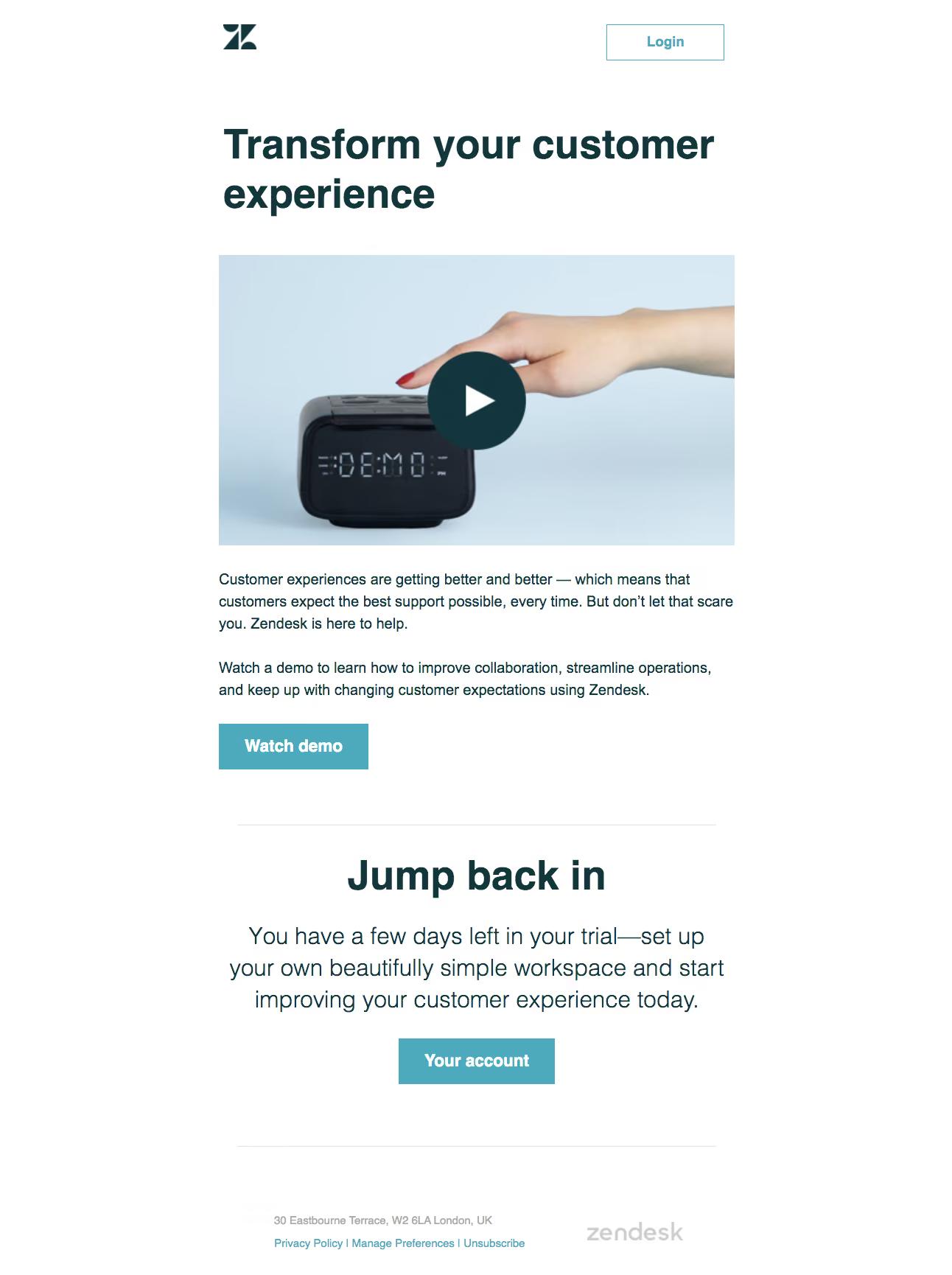
- **Character:** A clean onboarding email combines oversized dark teal headlines, a photographic demo thumbnail and bright cyan action buttons.
- **Treatment:** The white, borderless message feels editorial, with a direct demo invitation followed by a centered trial-return section.
### Page composition
- **Capture dimensions:** The original is 1292 × 1730 image pixels. Measurements below describe image pixels; email CSS scale and capture zoom are unverified.
- **Content column:** A roughly 700-pixel-wide column sits centrally with broad white margins.
- **Header:** A small dark brand symbol aligns left, with an outlined Login button toward the right.
- **Primary block:** A large two-line heading precedes a wide video-style thumbnail, two paragraphs and a left-aligned Watch demo button.
- **Secondary block:** A thin divider introduces centered heading, trial reminder copy and Your account button. A second divider separates the small footer.
### Information hierarchy
- **Headline dominance:** The large bold opening message is the first major visual anchor; the thumbnail and circular play symbol establish the demo content.
- **Action sequence:** The first filled button follows explanatory copy, while the second sits beneath a centered trial reminder.
- **Footer de-emphasis:** Address, policy/preference links and a pale wordmark use small type and subdued color below a generous gap.
### Typography
- **Family:** A conventional sans serif appears throughout; exact font identity is unverified.
- **Headlines:** Both main and secondary headings are approximately 54–56 image pixels, bold, with about 66-pixel line spacing.
- **Body:** The first block uses roughly 20 pixels with 30-pixel leading; the centered reminder increases to around 32 pixels with 43-pixel leading.
- **Controls and footer:** Filled buttons use approximately 23-pixel bold white labels; Login is around 20 pixels. Footer text is approximately 14–15 pixels.
### Colors & surfaces
- **Measured canvas:** #FFFFFF forms the uninterrupted message background.
- **Measured primary ink:** Dark teal #13363D appears in headline/brand areas and the play-symbol disc.
- **Measured accent:** Cyan-teal #4CAABC supports filled calls to action and outline/link accents.
- **Measured image palette:** Pale blues including #D4E6F2, #D8E9F3 and #CEE2ED appear within the photographic thumbnail background.
### Components
- **Login button:** Approximately 160 × 50 image pixels, with a thin cyan border, white fill and square corners.
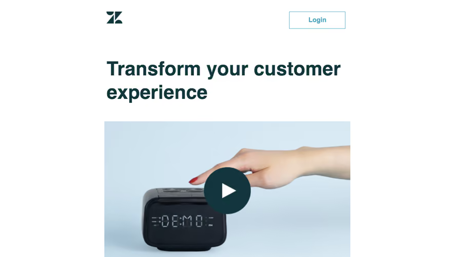
- **Demo thumbnail:** Approximately 700 × 394 pixels, showing a hand above an alarm-clock-like object against pale blue; a centered dark circular play disc is about 132 pixels across with a white triangle.
- **Primary CTA:** The Watch demo rectangle is approximately 203 × 63 pixels, cyan filled with square corners and generous horizontal padding.
- **Account CTA:** A similarly styled approximately 212 × 62-pixel button centers under the reminder.
- **Dividers:** Fine pale-gray horizontal rules are slightly inset relative to the main column; the footer uses a two-part address/links and wordmark arrangement.
### Visual rhythm
- **Vertical cadence:** Large 60–90-pixel gaps separate header, heading, image and closing blocks; paragraphs retain a more compact reading rhythm.
- **Alignment change:** The main demo section is left aligned, while the trial reminder is centered to signal a distinct purpose.
- **Footer spacing:** The closing action receives substantial whitespace before the final divider and small legal/navigation content.
### Responsive
- **Observed state:** Only a wide email rendering is visible; mobile typography and client behavior are unverified.
- **Recommended sizing:** Make the 700-pixel content column fluid, retain side padding and scale the thumbnail proportionally.
- **Recommended type:** Reduce oversized headlines and reminder copy for narrow screens while preserving line-height and tap-friendly buttons.
### Adaptation guidance
- **Preserve the sequence:** Keep headline, demo thumbnail, explanatory copy and demo CTA together before the separate trial-return block.
- **Reuse the palette:** Limit interface colors to dark teal ink, cyan actions and white, leaving photographic variation inside the thumbnail.
- **Email resilience:** Use email-compatible layout, image alternatives and an accessible linked thumbnail; do not assume an embedded video player is supported.
- **Content flexibility:** Allow headline and body wrapping without fixed-height text containers, and keep footer preference links readable.
Use this context to reproduce the reference's visual language: layout, typography, colors, spacing, borders, radii, and distinctive elements. The screenshot takes priority if descriptions conflict.
## Direction
{{preferences.fidelityInstructions}}
## Output
{{output.instructions}}
Deliver a polished, cohesive design with precise alignment, hierarchy, and spacing. Produce the requested visual artifact, not just a description. If unsupported, explain the limitation.