Design with AI
Generate a new design based on this screen using your own content.
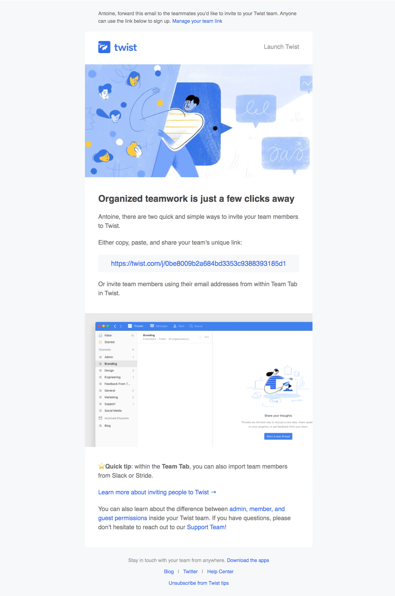
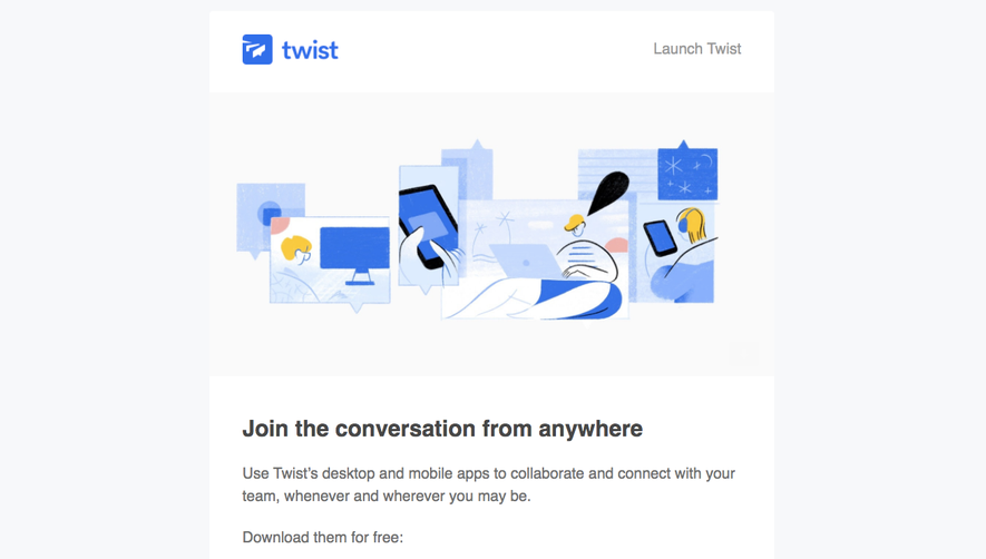
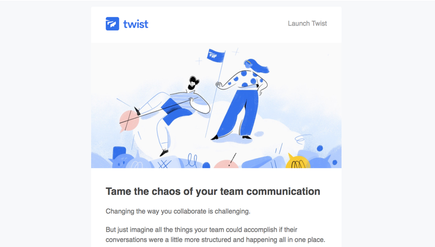
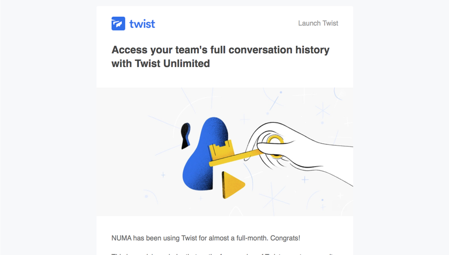
# Design from Reference: Twist Onboarding Emails
Create an original, high-fidelity visual design inspired by the reference. Prioritize composition, typography, colors, spacing, and component styling over technical implementation.
## Reference
- **Product:** Twist
- **Category:** Onboarding Email
- **Screenshot:** https://cdn.prod.website-files.com/5e9dc792e1210c5325f7ebbc/6acbc9421790037d3e0591a2_6acbc65939e7f22db404bb1d_cms-84405f21ba5521c373e856f8.webp
Analyze the screenshot first. If inaccessible, request it rather than guessing.
## Content
{{content.instructions}}
{{content.data}}
Preserve essential messaging and factual accuracy. Adapt structure and copy length for visual balance; never invent product claims.
## Visual Design
### Overall aesthetic
- **Character:** Illustrated team-invitation email combining soft blue artwork, practical instructions and an embedded product screenshot.
### Page composition
- **Capture:** 1302 × 1964 screenshot pixels; CSS scale unverified.
- **Structure:** Forwarding note above centered white email card; logo header, full-width illustration, headline, invitation instructions/link panel, product screenshot, tip/support text and external footer links.
### Information hierarchy
- **Priority:** Illustration introduces collaboration; bold headline leads to a prominent blue invitation link. Product screenshot and Quick tip explain the alternate invitation method.
### Typography
- **Family:** Arial-like sans serif; exact family unverified.
- **Screenshot sizes:** Heading approximately 30px, body 20px, footer 16px; estimated CSS body around 16px at roughly 1.25× scale.
### Colors & surfaces
- **Measured palette:** Outer #F7F8FA, white #FFFFFF, subtle #FAFAFA, screenshot frame #EAEAEA, light illustration blue #A4C3FC and stronger blue #3F82EF.
- **Accents:** Blue links, yellow illustration details and dark gray prose.
### Components
- **Elements:** Launch Twist link, textured people/chat illustration, pale invitation-link panel, wide app screenshot, bold tip and grouped footer links.
- **Screenshot geometry:** Card approximately 750px wide, internal gutters 44px, small 4px radii and large uninterrupted media blocks.
### Visual rhythm
- **Spacing:** Alternating image and text bands break a long instructional email into clear stages; footer sits separately in the pale outer canvas.
### Responsive
- **Suggested adaptation:** Make media fluid, wrap long invitation URLs safely and use 20–24px mobile gutters. Mobile rendering is not shown.
### Adaptation guidance
- **Transfer:** Keep the two invitation routes explicit, distinguish the shareable-link panel from prose and use an accurate product screenshot. Do not reuse the reference invitation token.
Use this context to reproduce the reference's visual language: layout, typography, colors, spacing, borders, radii, and distinctive elements. The screenshot takes priority if descriptions conflict.
## Direction
{{preferences.fidelityInstructions}}
## Output
{{output.instructions}}
Deliver a polished, cohesive design with precise alignment, hierarchy, and spacing. Produce the requested visual artifact, not just a description. If unsupported, explain the limitation.