
Thank you! Your submission has been received!
Oops! Something went wrong while submitting the form.
Get SaaSFrame Pro
Monthly
$18
Quarterly
$48
Yearly
$180
Upgrade to access this feature
Browse all screens & flows
Filter and search screens & flows
Access Figma files
Access mobile versions
Bookmark screens & flows
Join now


Zendesk Customer Stories

Zendesk
Customer support platform
Designed by
No items found.

Bookmark
Bookmark

Design with AI
Thank you! Your submission has been received!
Oops! Something went wrong while submitting the form.
# Design from Reference: Zendesk Customer Stories
Create an original, high-fidelity visual design inspired by the reference. Prioritize composition, typography, colors, spacing, and component styling over technical implementation.
## Reference
- **Product:** Zendesk
- **Category:** Customer Stories
- **Screenshot:** https://cdn.prod.website-files.com/5e9dc792e1210c5325f7ebbc/62ec9c81b0a5d8da9f75cdce_1659624681905-screenshot-device-841df30be7f358808ae9665f33459017-1659604507722.webp
Analyze the screenshot first. If inaccessible, request it rather than guessing.
## Content
{{content.instructions}}
{{content.data}}
Preserve essential messaging and factual accuracy. Adapt structure and copy length for visual balance; never invent product claims.
## Visual Design
### Overall aesthetic
- **Style:** An editorial customer story with a strongly typographic opening, understated teal branding, documentary photography, and a narrow long-form reading column.
- **Character:** The page feels credible and spacious. Evidence is presented through quotations, product marks, metrics, and images rather than decorative cards.
### Page composition
- **Capture and scale:** The screenshot is 2385 × 6580 pixels. Its CSS scale is unverified; approximate dimensions here refer to screenshot pixels.
- **Opening:** A centered header and utility links precede a back link. The hero places a tall multiline customer-story headline and short summary on the left, with a square customer photograph to the right. Sharing icons and paired actions sit beneath the summary.
- **Evidence band:** A pale-gray band holds a white two-column quotation panel and a separate product-logo strip. Four evenly distributed metrics follow on white.
- **Article and footer:** A roughly 800 px reading column alternates paragraphs and bold subsection headings with wider landscape photographs and a desktop/mobile product montage. The closing pale footer contains a brand statement, five link columns, a newsletter row, social icons, and legal links.
### Information hierarchy
- **Hero:** The very large headline is the dominant element. A small customer logo sits above it; summary, social sharing, and conversion actions follow.
- **Proof:** Paired testimonials and four numeric highlights create a scannable evidence layer before the full article.
- **Reading flow:** Subsection headings divide the story without introducing a sidebar. Images extend beyond the prose width to punctuate the narrative.
### Typography
- **Family:** A rounded geometric sans serif appears in headings, paired with a readable sans serif body; exact families are unverified.
- **Headline:** Approximately 76–84 screenshot px, bold, with tight line-height around 1.1 and slightly tight tracking. Its narrow column creates many deliberate line breaks.
- **Body and subheads:** Body copy is approximately 17–19 screenshot px with 27–29 px line-height. Subheadings are about 26 px bold.
- **Evidence and navigation:** Metric figures are approximately 54–58 px bold in a lighter teal. Quotes are about 22 px semibold; attribution and navigation are substantially smaller.
### Colors & surfaces
- **Foundation:** Sampled sRGB colors include white #FFFFFF and near-white #F9F9F9. Pale gray sections separate testimonial and footer content.
- **Brand contrast:** Dark teal is used for headings, buttons, and emphasized copy. A lighter blue-teal highlights metrics; exact teal hex values are not verified.
- **Photography:** The customer images introduce warm wood, green plants, and multicolored fabric without extending those colors into the interface.
- **Embedded product:** A sampled plum #4D384A appears within the Slack product imagery; it is an image-specific accent rather than the page's primary brand color.
### Components
- **Hero actions:** Use one filled dark-teal button and one outlined counterpart, with square or minimally rounded corners and approximately equal height. Sharing icons form a separate compact row.
- **Quote panels:** Two centered quotations sit side by side on a white rectangle, each with a bold name and smaller role beneath. The product strip below uses an uppercase label and four evenly spaced logos.
- **Metrics:** Four unboxed metric blocks pair a large number with one short caption, aligned on a common baseline.
- **Article media:** Use square hero photography, wide landscape photographs, and a centered device montage. Images have restrained framing and no heavy decorative borders.
- **Footer utilities:** The newsletter input and filled subscribe button share a row; social icons align beside them. A circular teal chat control appears at bottom right.
### Visual rhythm
- **Width contrast:** The page alternates broad proof blocks, narrow prose, and medium-width photography, maintaining a common central axis.
- **Spacing:** Allow large 80–140 screenshot-pixel gaps around major evidence and image regions. Paragraph spacing is closer to 20–28 px.
- **Restraint:** Keep the article background white and let headings, image changes, and section spacing provide navigation.
### Responsive
- **Observed state:** Only a desktop page is provided.
- **Recommended reflow:** Stack hero text above the photograph, quotations into one column, and metrics into a two-by-two or single-column arrangement.
- **Reading and footer:** Use a fluid prose width with 20–24 px mobile gutters, scale headline size down substantially, and stack footer groups and newsletter controls.
### Adaptation guidance
- **Preserve:** Retain the story-led hero, compact summary/actions, quote and product evidence band, numeric highlights, and focused article column.
- **Adapt evidence:** Use only verified quotations, customer logos, and business metrics from the new content. Remove unavailable proof modules rather than fabricating them.
- **Image direction:** Choose authentic customer/workplace photography and relevant product media. Preserve the alternation of reading and visual evidence without copying the reference's story.
Use this context to reproduce the reference's visual language: layout, typography, colors, spacing, borders, radii, and distinctive elements. The screenshot takes priority if descriptions conflict.
## Direction
{{preferences.fidelityInstructions}}
## Output
{{output.instructions}}
Deliver a polished, cohesive design with precise alignment, hierarchy, and spacing. Produce the requested visual artifact, not just a description. If unsupported, explain the limitation.


Category
Patterns
No items found.
Tech Stack


Added on
June 10, 2020
Similar screens
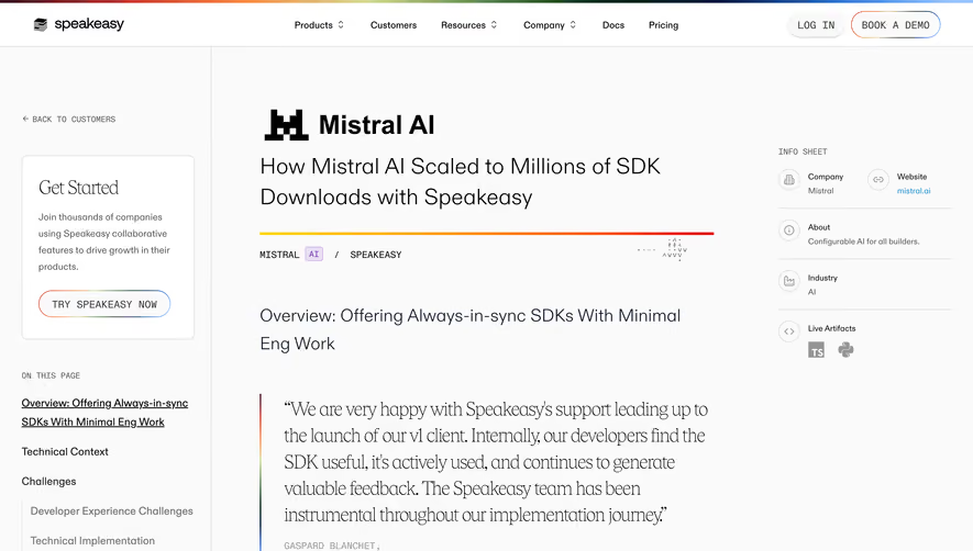


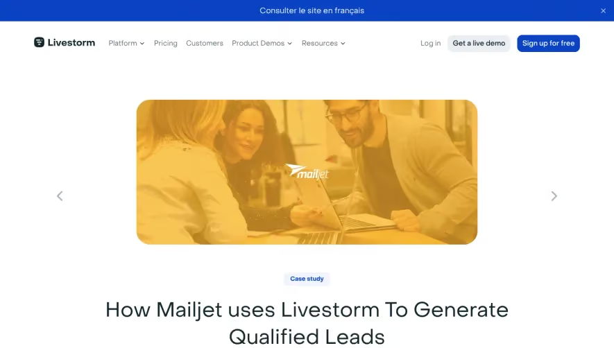



Upgrade to SaaSFrame Pro now to see similar examples.
Monthly
$18 /month
Billed $18 monthly
Browse all screens & flows
Filter and search screens & flows
Search text in screenshots
Access Figma files
Access mobile versions
Join now
Quarterly
$16 /month
Billed $48 quarterly
Browse all screens & flows
Filter and search screens & flows
Search text in screenshots
Access Figma files
Access mobile versions
Join now
Yearly
$15 /month
Billed $180 yearly
Browse all screens & flows
Filter and search screens & flows
Search text in screenshots
Access Figma files
Access mobile versions
Join now