Slite’s blog page for the VanMoof case study is a masterclass in modern minimalism. The design radiates a professional yet approachable vibe, using ample white space and subtle color accents. The visual clarity creates an inviting atmosphere that feels both sleek and trustworthy, ideal for SaaS storytelling.
Layout and Structure
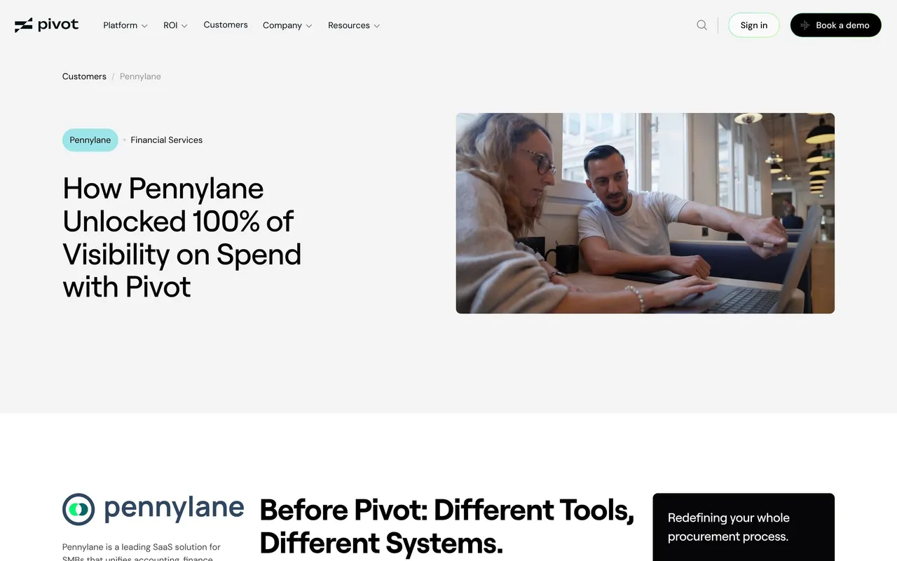
The page is structured for effortless readability. It opens with a bold hero section featuring a striking headline and a high-quality photo of the VanMoof team, instantly humanizing the story. Content areas flow seamlessly, mixing concise text blocks, user quotes, and visual media. There’s no clutter—just carefully curated sections that keep the narrative engaging. The footer is clean, offering essential navigation without distraction.
Visual Elements
Photography takes center stage, with vibrant images of VanMoof employees and their workspace, breaking up text and injecting authenticity. Subtle brand illustrations and simple icons provide context without overwhelming visual hierarchy. Pull quotes are highlighted in soft containers, guiding readers’ eyes and reinforcing key points.
Color Palette and Typography
The palette is light and neutral, punctuated by Slite’s signature blue and muted earth tones. This fosters focus while accentuating calls-to-action and interactive elements. Typography is modern—likely geometric sans-serif—balancing high readability with a touch of personality. Clear heading hierarchies and generous line spacing contribute to a stress-free reading experience.
User Experience Patterns
Navigation is understated, supporting deep, focused reading over rapid skimming. Persistent CTAs stand out elegantly, and scrolling interactions feel effortless thanks to consistent spacing and visual rhythm. The storytelling-first approach, combined with friendly, conversational copy, delivers a tone that’s both innovative and relatable—a gold standard for SaaS content design inspiration.
 SaaSFrame