Design with AI
Generate a new design based on this screen using your own content.
# Design from Reference: Zencal Free Trial Emails
Create an original, high-fidelity visual design inspired by the reference. Prioritize composition, typography, colors, spacing, and component styling over technical implementation.
## Reference
- **Product:** Zencal
- **Category:** Free Trial Emails
- **Screenshot:** https://cdn.prod.website-files.com/5e9dc792e1210c5325f7ebbc/6acb6a4c03442b22fb62ab32_6acb6961666ef5239d92b47d_cms-e156e82f9009bfd8d54c6596.webp
Analyze the screenshot first. If inaccessible, request it rather than guessing.
## Content
{{content.instructions}}
{{content.data}}
Preserve essential messaging and factual accuracy. Adapt structure and copy length for visual balance; never invent product claims.
## Visual Design
### Overall aesthetic
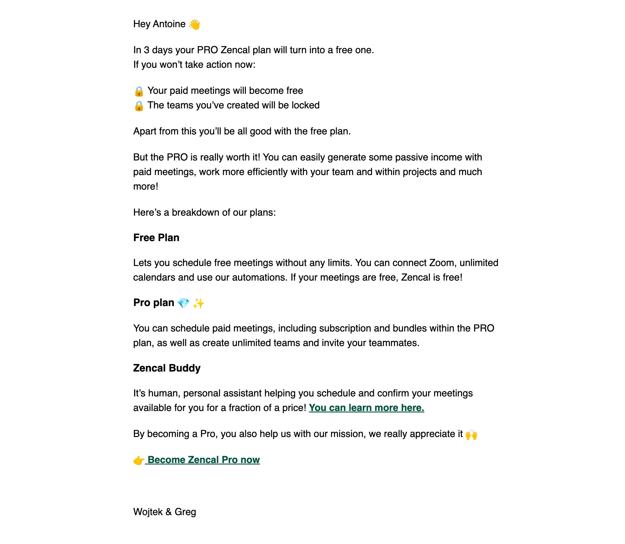
- **Character:** A plain-text-style trial email with black type on white, modest bold section headings and dark-green underlined links. Emoji supply the only decorative cues.
- **Image basis:** The 2186 × 1902 source was inspected at approximately 1400 × 1218. Measurements below refer to inspection pixels; email CSS scale and font identity are unverified.
### Page composition
- **Reading column:** A broad left-aligned text column begins around x298, y45, with large white margins.
- **Opening:** Greeting, expiry explanation and two lock-icon consequence lines introduce the message.
- **Plans:** Several short paragraphs lead into three bold plan/service headings with descriptive text.
- **Action/closing:** A green underlined upgrade link appears near the end, followed by a generous gap and a short sender sign-off.
- **Capture limit:** No logo banner, enclosing card, legal footer or additional content is visible.
### Information hierarchy
- **Urgency:** The opening paragraph establishes the trial deadline; two lock-icon lines summarize consequences.
- **Explanation:** Bold plan headings divide the remaining reading content without changing layout.
- **Actions:** One inline learn-more link and one standalone upgrade link are bold, green and underlined.
- **State:** This is static email content; no subscription change, form or confirmation state is shown.
### Typography
- **Body:** Approximately 22 px regular sans-serif with roughly 32 px line-height at inspection scale.
- **Headings:** Plan labels use bold at approximately the same size as body text.
- **Links:** Bold, underlined dark-green text remains within the body scale.
- **Font certainty:** Exact font identity and underlying email CSS size cannot be established from pixels.
### Colors & surfaces
- **Measured base:** White #FFFFFF dominates.
- **Measured text:** Black #000000, near-black #0D0D0D, #161616 and #222222 occur in text/antialiasing.
- **Measured links:** Dark green #005342 defines the link family.
- **Detail:** Gray #D8D8D8 appears among antialiased edges; colored emoji are content accents rather than interface tokens.
### Components
- **Consequence lines:** Two lock emoji align before short statements, functioning as a lightweight list.
- **Plan sections:** Bold labels sit above short paragraphs with generous blank lines.
- **Links:** One inline informational link and one standalone upgrade action use conventional underlining; no filled button is present.
- **Signature:** A plain sender line closes the message with substantial separation from the action.
- **States:** No hover, focus or visited-link appearance is established.
### Visual rhythm
- **Alignment:** All paragraphs and headings share one reading edge.
- **Spacing:** Regular paragraph gaps separate ideas, with larger gaps around headings and sign-off.
- **Density:** Long lines and limited styling make the message feel personal rather than promotional.
- **Emphasis:** Bold headings, emoji and two green links provide scan points.
### Responsive
- **Evidence limit:** Only the captured email layout is visible.
- **Recommended column:** Use a fluid readable width and safe mobile gutters.
- **Recommended text:** Preserve natural wrapping and sufficient line-height instead of shrinking type.
- **Recommended actions:** Keep links clearly underlined and spaced for touch use.
### Adaptation guidance
- **Preserve:** Keep the personal text-led format, clear expiry consequences and concise upgrade link.
- **Build:** Use robust email-compatible real text and links.
- **Content integrity:** Verify current plan details and deadlines before reusing commercial content.
- **Validate:** Test email-client rendering, line length, green-link contrast and link destinations.
Use this context to reproduce the reference's visual language: layout, typography, colors, spacing, borders, radii, and distinctive elements. The screenshot takes priority if descriptions conflict.
## Direction
{{preferences.fidelityInstructions}}
## Output
{{output.instructions}}
Deliver a polished, cohesive design with precise alignment, hierarchy, and spacing. Produce the requested visual artifact, not just a description. If unsupported, explain the limitation.