Design with AI
Generate a new design based on this screen using your own content.
# Design from Reference: Zeda.io Integrations Library
Create an original, high-fidelity visual design inspired by the reference. Prioritize composition, typography, colors, spacing, and component styling over technical implementation.
## Reference
- **Product:** Zeda.io
- **Category:** Integrations Library
- **Screenshot:** https://cdn.prod.website-files.com/5e9dc792e1210c5325f7ebbc/6acadc4a5c79bb17f221af1e_6acadba0d05a3f53c0a84ed9_cms-261325ca8c3fc429900b9f22.webp
Analyze the screenshot first. If inaccessible, request it rather than guessing.
## Content
{{content.instructions}}
{{content.data}}
Preserve essential messaging and factual accuracy. Adapt structure and copy length for visual balance; never invent product claims.
## Visual Design
### Overall aesthetic
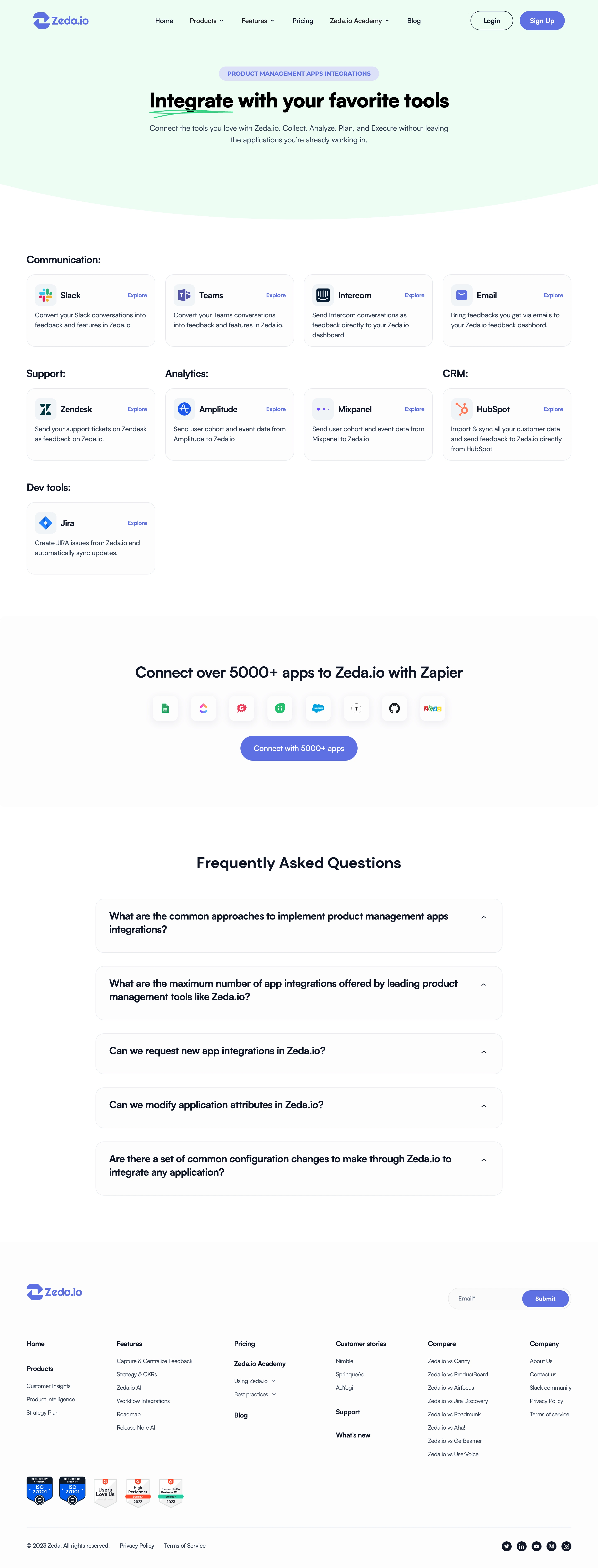
- **Style:** Friendly integration directory with a mint hero, blue actions, white cards, and restrained navy typography.
### Page composition
- **Canvas:** 2880 × 7544 image px; CSS estimates assume an unverified 2× capture.
- **Hero:** Centered navigation, eyebrow pill, headline, subtitle, and curved lower edge.
- **Catalog:** Four-column card grid grouped as Communication, Support, Analytics, CRM, and Dev tools.
- **Lower page:** Zapier integration band, five FAQ rows, then multi-column footer with newsletter and certification marks.
### Information hierarchy
- **Primary:** Integration headline with hand-drawn green underline.
- **Catalog:** Category labels precede logo/name/description cards.
- **Conversion:** Centered cross-app CTA below catalog.
- **Support:** FAQ and footer links close the page.
### Typography
- **Family:** Compact sans serif; exact family unverified.
- **Hero heading:** Approximately 40–44 CSS px, bold under assumed 2×.
- **Section headings:** Approximately 30–32px, semibold.
- **Category titles:** Approximately 20px, semibold.
- **Cards:** Approximately 16px names and 14px body with 20px line-height.
- **Precision:** Font metrics are visual estimates.
### Colors & surfaces
- **Canvas/cards:** #FFFFFF and #FCFCFD.
- **Hero:** #E8FDF2.
- **Primary text:** #0F1829.
- **Accent blue:** #5972EC.
- **Secondary text:** #304055.
- **Borders:** #E8ECF0.
- **Eyebrow tint:** #DBE1FB.
- **Precision:** Colors sampled from screenshot; minor shades vary.
### Components
- **Cards:** Light outline, approximately 16px radius, 16–20px padding under assumed 2×.
- **Card header:** Small logo tile, product name, and compact Explore link.
- **CTA:** Blue pill with white label.
- **FAQ:** Wide pale cards, bold question and small chevron; no answers visible.
- **Footer:** Newsletter pill, link columns, badges, and social icons.
### Visual rhythm
- **Spacing:** Consistent catalog columns with roughly 20px gutters; broad gaps between sections.
- **Balance:** Sparse card groups retain empty columns instead of stretching individual items.
- **Alignment:** Catalog and footer share broad page insets.
### Responsive
- **Observed:** Desktop only.
- **Recommendation:** Reduce catalog to two then one column, stack footer groups, and allow FAQ questions to wrap.
- **Navigation:** Collapse secondary links while retaining sign-up action.
### Adaptation guidance
- **Preserve:** Category-led catalog, recognizable integration logos, concise cards, mint introduction, and blue CTAs.
- **Content:** Use supplied integrations and supported capabilities; do not copy cross-app counts or certification claims.
- **Behavior:** Explore links and FAQ interactions are not demonstrated.
Use this context to reproduce the reference's visual language: layout, typography, colors, spacing, borders, radii, and distinctive elements. The screenshot takes priority if descriptions conflict.
## Direction
{{preferences.fidelityInstructions}}
## Output
{{output.instructions}}
Deliver a polished, cohesive design with precise alignment, hierarchy, and spacing. Produce the requested visual artifact, not just a description. If unsupported, explain the limitation.