Design with AI
Generate a new design based on this screen using your own content.
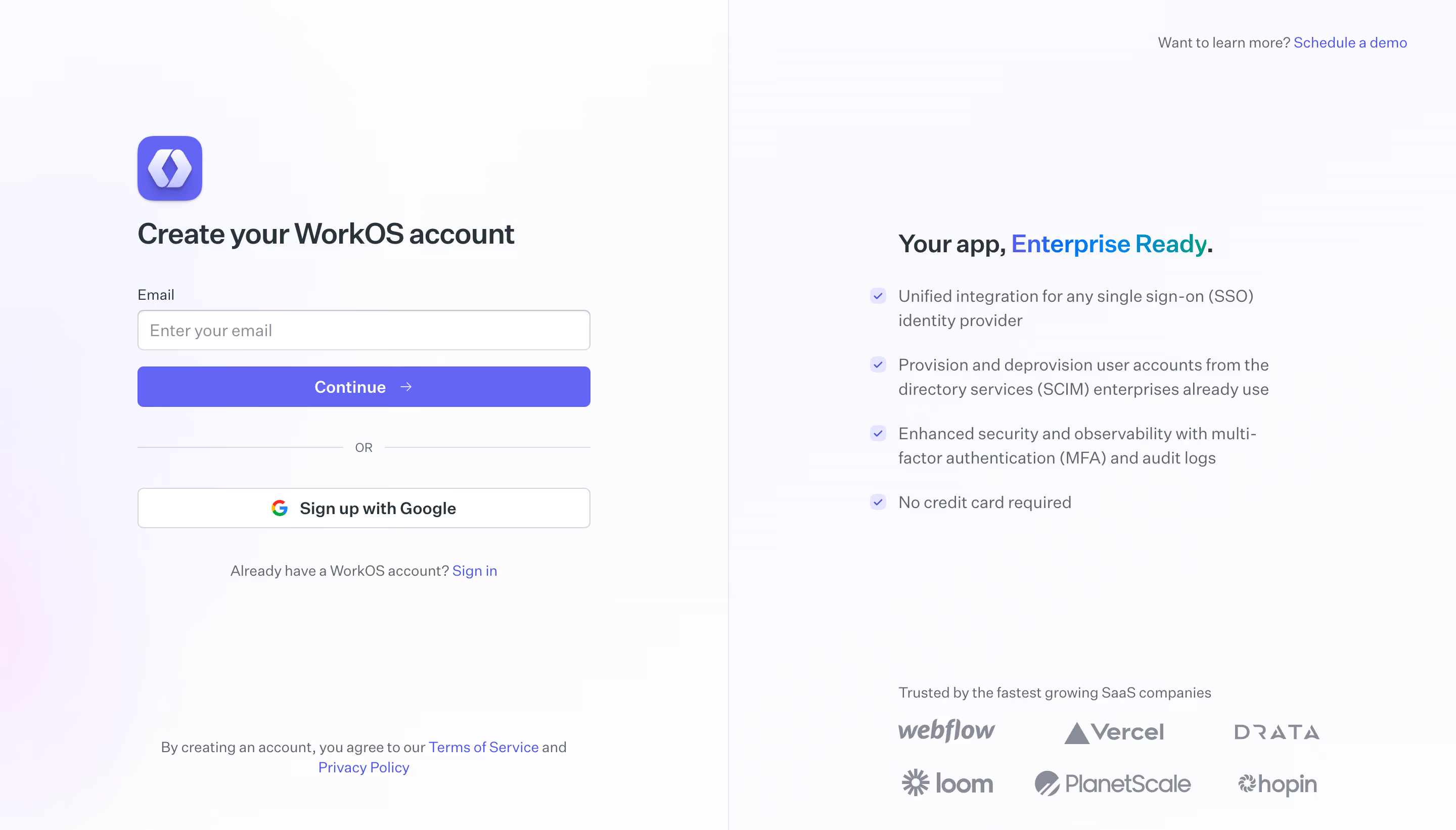
# Design from Reference: WorkOS Signup
Create an original, high-fidelity visual design inspired by the reference. Prioritize composition, typography, colors, spacing, and component styling over technical implementation.
## Reference
- **Product:** WorkOS
- **Category:** Signup
- **Screenshot:** https://cdn.prod.website-files.com/5e9dc792e1210c5325f7ebbc/6acb6a4703442b22fb62aa2c_6acb69535e515b69c7963280_cms-d81ec20f85abe384c9a64313.webp
Analyze the screenshot first. If inaccessible, request it rather than guessing.
## Content
{{content.instructions}}
{{content.data}}
Preserve essential messaging and factual accuracy. Adapt structure and copy length for visual balance; never invent product claims.
## Visual Design
### Overall aesthetic
- **Character:** Minimal enterprise signup screen with a soft pastel atmosphere and a clear separation between conversion and reassurance.
### Page composition
- **Canvas:** 2880 × 1642 screenshot pixels; CSS estimates assume approximately 2× capture scale.
- **Structure:** Two nearly equal vertical halves divided by a fine rule. A narrow signup stack sits on the left; a centered value proposition, benefit list and customer logos sit on the right.
### Information hierarchy
- **Priority:** Brand mark and account-creation title precede email entry and the purple Continue action.
- **Supporting content:** An OR divider introduces Google signup; sign-in and legal links are subordinate. The right column builds confidence through benefits and six monochrome customer marks.
### Typography
- **Family:** Modern neutral sans-serif; exact typeface is unverified.
- **Scale:** Estimated CSS main heading 28–32px, supporting text 15–16px, field labels 13–14px and legal copy 11–12px. Bold weight is concentrated in headings.
### Colors & surfaces
- **Sampled palette:** Extremely pale backgrounds #FAFAFD, #FBFBFE, #FCFCFE and #FDFDFE form a subtle lavender-tinted field.
- **Contrast:** Dark gray copy anchors the layout. A violet primary button and blue-to-teal headline accent provide restrained color focal points; exact accent values are not verified.
### Components
- **Form:** Full-width outlined email field, filled Continue button with arrow, horizontal divider and bordered Google button.
- **Geometry:** Estimated 40–46px control heights, 6–8px radii and 12–16px horizontal padding.
- **Trust panel:** Four checkmarked benefits form a compact list above a two-row logo grid; a small demo link occupies the upper-right corner.
### Visual rhythm
- **Spacing:** Ample whitespace surrounds both columns. Within the form, regular 16–24px gaps keep a quiet vertical cadence.
- **Balance:** The centered right-hand statement counterweights the left form without adding a heavy enclosing card.
### Responsive
- **Guidance:** Mobile is not shown. Present signup first, move benefits and logos below, and remove the vertical divider in favor of spacing.
### Adaptation guidance
- **Transfer:** Preserve the two-part signup/reassurance logic, gentle gradient atmosphere and single strong action. Use the target brand's verified logos and value statements.
Use this context to reproduce the reference's visual language: layout, typography, colors, spacing, borders, radii, and distinctive elements. The screenshot takes priority if descriptions conflict.
## Direction
{{preferences.fidelityInstructions}}
## Output
{{output.instructions}}
Deliver a polished, cohesive design with precise alignment, hierarchy, and spacing. Produce the requested visual artifact, not just a description. If unsupported, explain the limitation.