Overall Style and Aesthetic
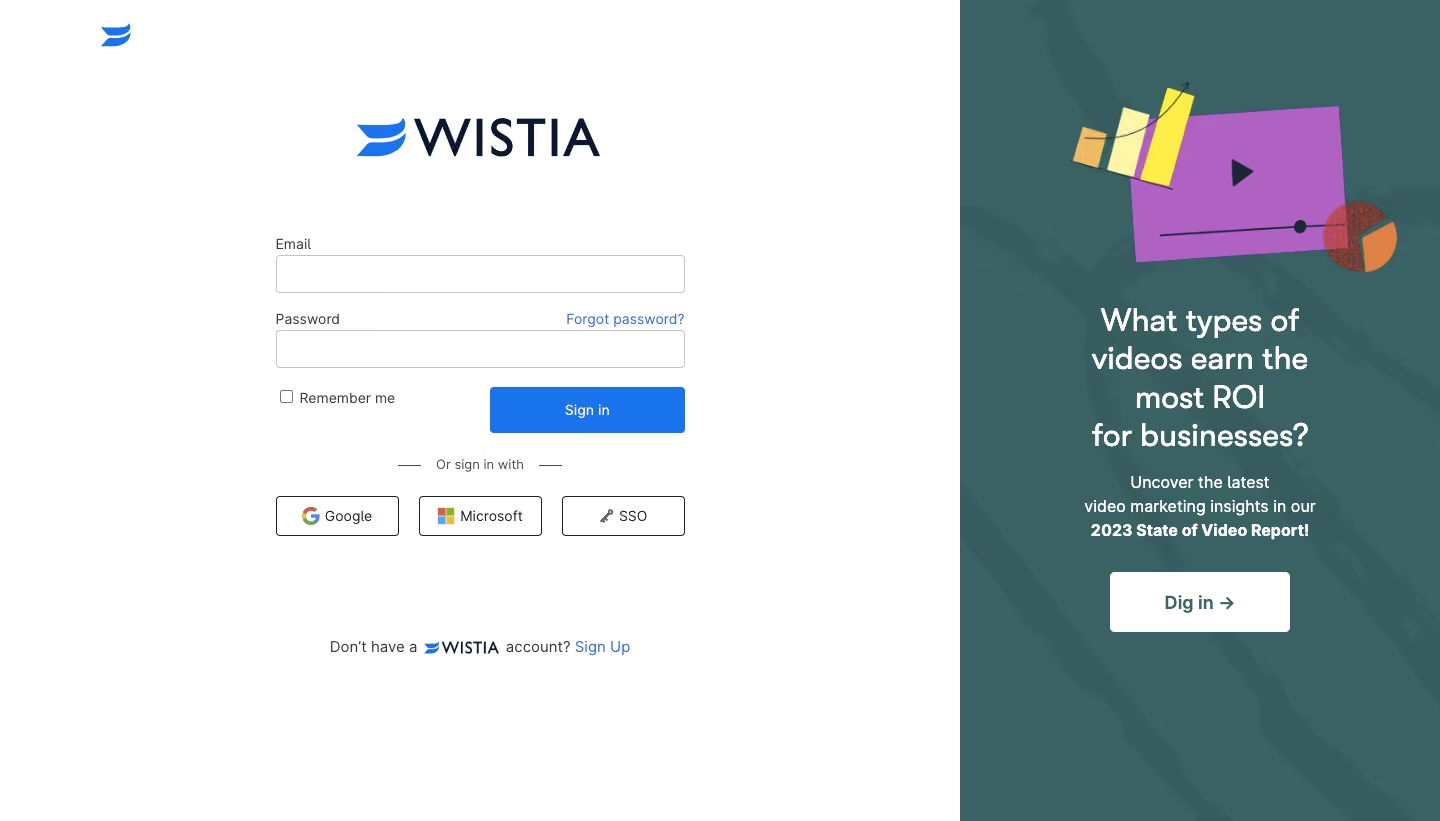
Wistia’s login page embodies a streamlined, modern sensibility, leveraging white space and carefully curated color to establish a professional yet approachable vibe. The minimalist design sharply focuses attention on the primary action, while subtle personality shines through in playful iconography and gentle accent hues. Layout and Structure
The layout is direct and efficient—a single-column central block invites users into the login experience with just the essentials. There’s no distraction from extraneous sections (no hero images, features, or testimonials), reflecting the fast, focused approach common in SaaS authentication flows. A compact header and footer frame the central content, keeping navigation simple and uncluttered. Visual Elements
Visual energy comes from small but effective touches: a friendly lock icon, micro-animations on input focus, and a distinct branded logo. There are no images or large illustrations, maintaining quick load times and emphasizing functionality. The iconography is modern and slightly playful, giving a sense of warmth without sacrificing professionalism. Color Palette and Typography
A crisp white background dominates, punctuated by Wistia’s iconic deep blue and vibrant teal for primary actions and highlights. Typography is clean, accessible, and sans-serif, with bold weight used for critical instructions and gentle grays for secondary information, enforcing a strong visual hierarchy. User Experience Patterns
Clear field labels, tactile form elements, and a prominent call-to-action button enforce usability. Account assistance (“Forgot password?”) is unobtrusive but instantly accessible. The single-focus form reduces friction and supports fast logins, emphasizing security and ease. Unique or Notable Design Choices
The blend of playful icon accents with a focused, distraction-free form speaks volumes about Wistia’s user-first mindset. The restrained, purposeful color use underscores brand recognition and trust. Tone and Feel
The page communicates trust, competence, and friendliness—inviting users to proceed confidently and comfortably. This is SaaS design that’s both delightful and efficient, setting a high bar for conversion-focused authentication pages.