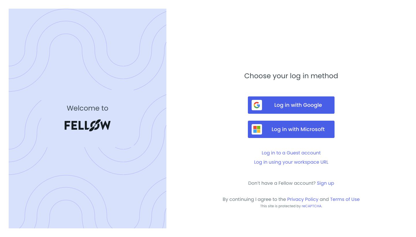
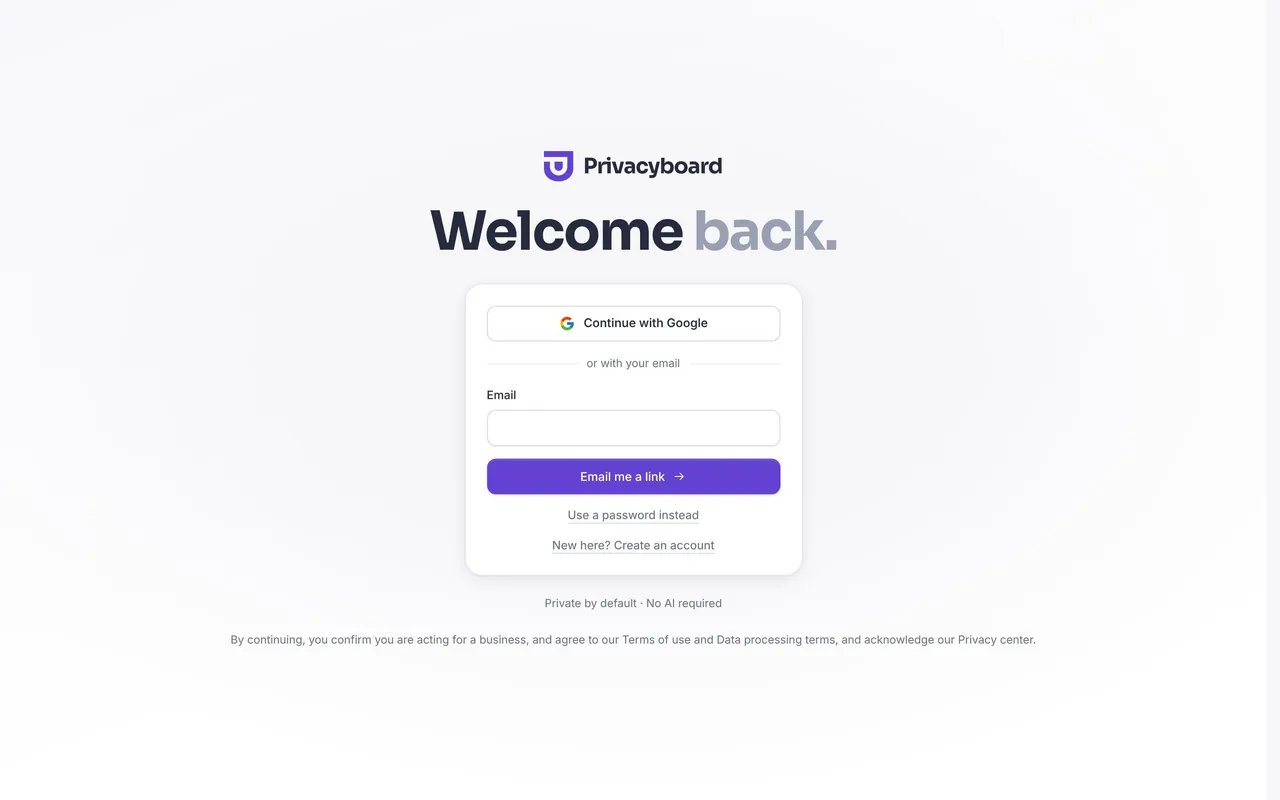
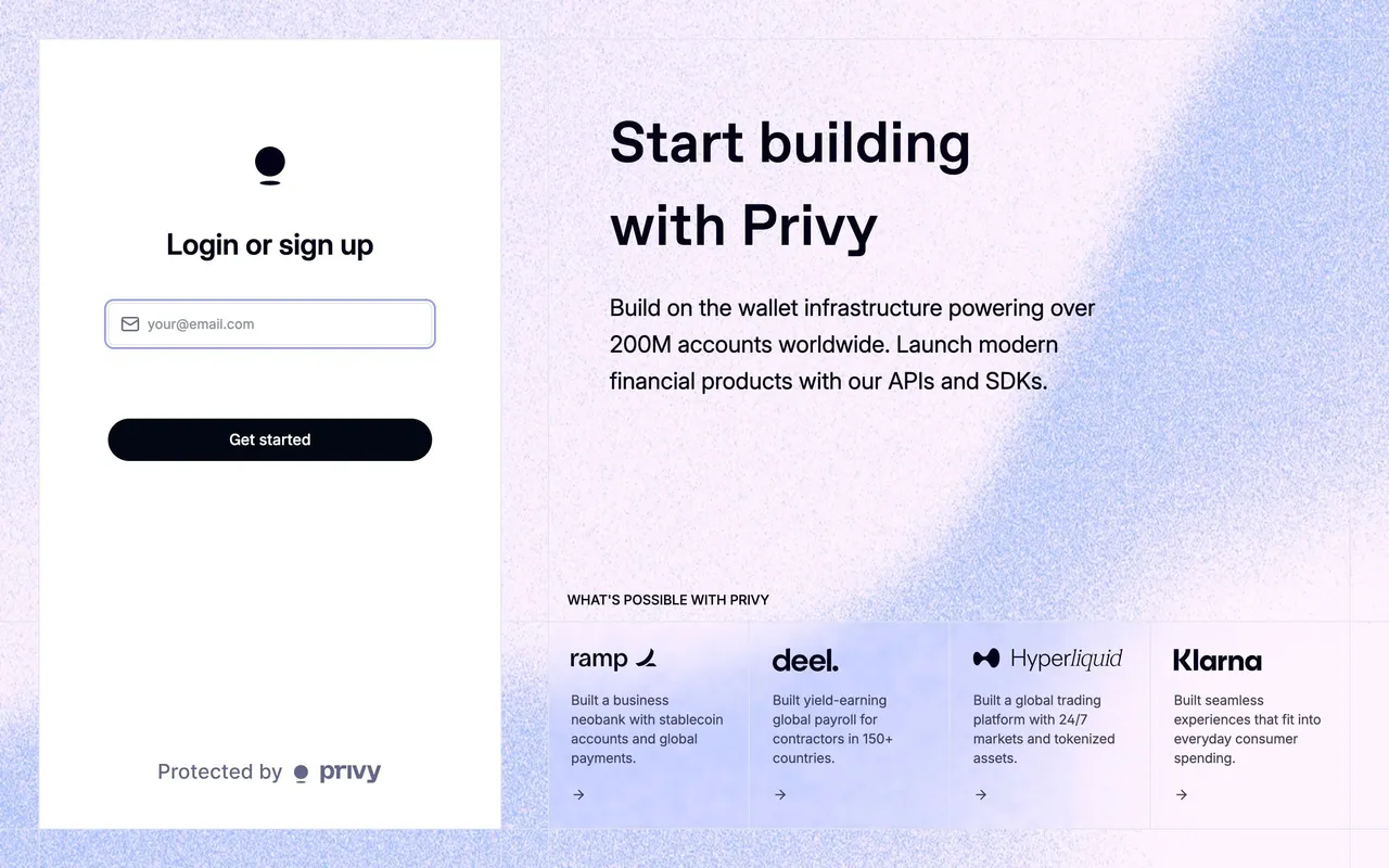
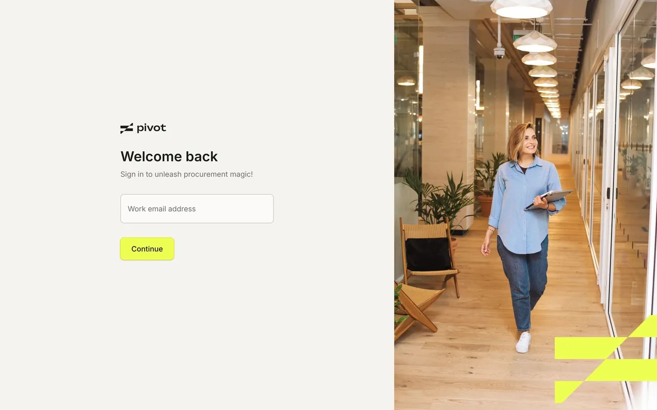
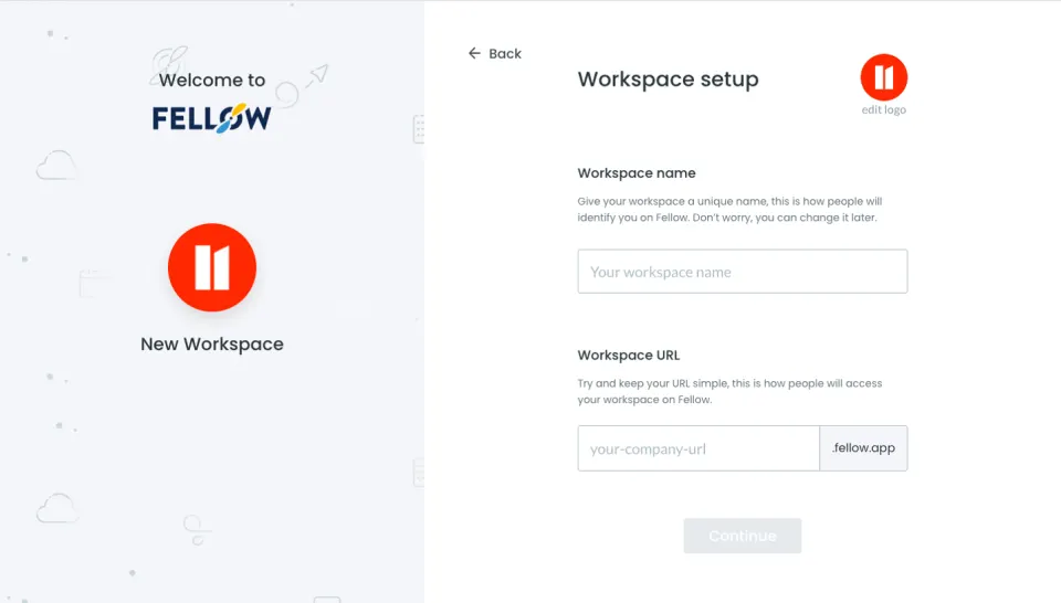
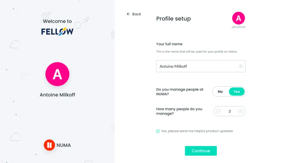
Fellow’s login page exemplifies a crisp, modern minimalism, favoring a clean interface with generous white space and restrained, consistent color accents. The visual mood exudes professionalism and focus, evoking trust without unnecessary flourish. Rounded corners and gentle shadows on card elements lend a soft, approachable quality, striking a thoughtful balance between enterprise-grade and inviting.
Layout and Structure
The login interface centers a substantial card against a spacious, subtly tinted backdrop, immediately directing attention to the authentication form. There’s no hero section or marketing material, ensuring zero distractions for returning users. Beneath the prominent login panel sits a slim footer with understated navigation links, subtly presented to avoid competing with the main action.
Visual Elements
Rather than using illustrations or photographs, the page relies on subtle branding touches: a compact logo in the upper left, clean form controls with discreet iconography, and tailored input highlights. While largely static, micro-animations on buttons and error states provide responsive feedback, enhancing perceived polish and usability.
Color Palette and Typography
Charcoal hues anchor the type hierarchy against a fresh white background, punctuated with Fellow’s signature blue for primary calls-to-action. Font selections are approachable but sharp, leveraging a geometric sans-serif that prioritizes legibility and hierarchy using thoughtful weight and size variations. The overall effect is calm and utterly readable.
User Experience Patterns and Notable Choices
The login flow is frictionless—streamlined fields, clear input labels, and a prominent primary button encourage swift interaction. Modern UX details shine: an effortless “Sign in with Google” option, well-spaced form elements for touch accessibility, and instant validation cues. The focus on clarity and simplicity makes logging in feel seamless and secure, subtly reinforcing the product’s reliability.
 SaaSFrame