Generate a new design based on this screen using your own content.
Thank you! Your submission has been received!
Oops! Something went wrong while submitting the form.
# Design from Reference: Wise Add Transfer Recipient
Create an original, high-fidelity visual design inspired by the reference. Prioritize composition, typography, colors, spacing, and component styling over technical implementation.
## Reference
- **Product:** Wise
- **Category:** Add & Edit
- **Screenshot:** https://cdn.prod.website-files.com/5e9dc792e1210c5325f7ebbc/6aca27e7aca7079066e8e7a9_6aca2704fc79d3a6f5db2a45_cms-aa9b99e161d4dc9ee399cfb9.webp
Analyze the screenshot first. If inaccessible, request it rather than guessing.
## Content
{{content.instructions}}
{{content.data}}
Preserve essential messaging and factual accuracy. Adapt structure and copy length for visual balance; never invent product claims.
## Visual Design
Use this context to reproduce the reference's visual language: layout, typography, colors, spacing, borders, radii, and distinctive elements. The screenshot takes priority if descriptions conflict.
## Direction
{{preferences.fidelityInstructions}}
## Output
{{output.instructions}}
Deliver a polished, cohesive design with precise alignment, hierarchy, and spacing. Produce the requested visual artifact, not just a description. If unsupported, explain the limitation.
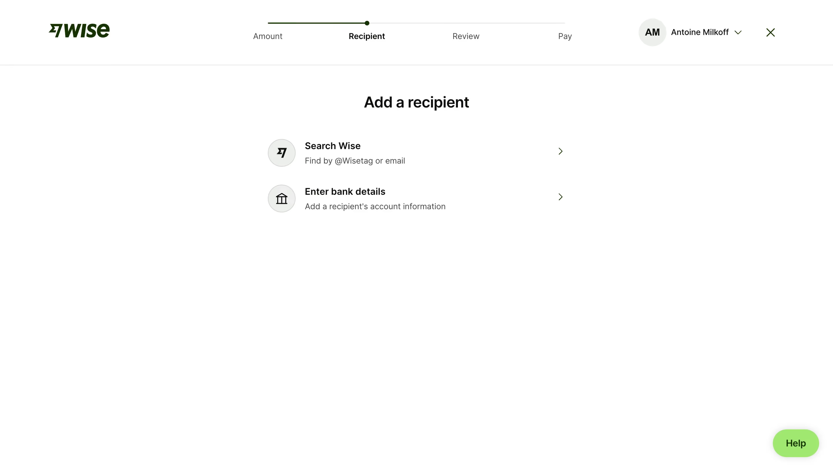
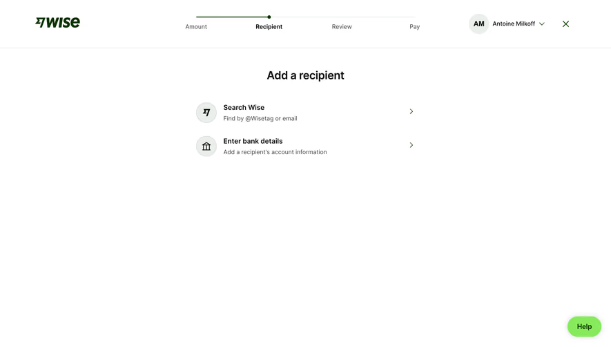
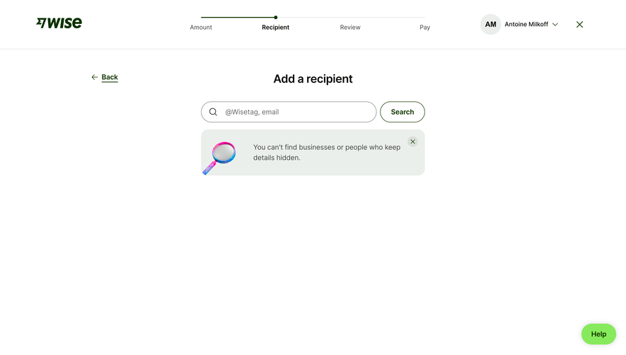
This Wise recipient screen is almost aggressively minimal and it works. The page strips away everything except two clear options: search by Wisetag/email or enter bank details. That's it. No clutter, no decision fatigue. The massive white space does the heavy lifting here, making the whole experience feel calm during what's usually a stressful flow (sending money internationally).
Smart Visual Hierarchy
The stepper nav at top (Amount → Recipient → Review → Pay) uses a simple green progress line that tells you exactly where you are. Bold "Add a recipient" heading anchors the page. The two options use subtle icon circles with a chevron arrow on the right, creating an obvious tap target. Typography is tight. Headers are dark and punchy, descriptions sit underneath in a softer gray. Classic but effective.
What Makes It Stand Out
The restraint is the design. Most fintech flows try to cram help text, tooltips, and upsells into every step. Wise just... doesn't. The green Help bubble in the corner is the only escape hatch. That confidence in simplicity is rare and worth studying.