Overall Style and Aesthetic
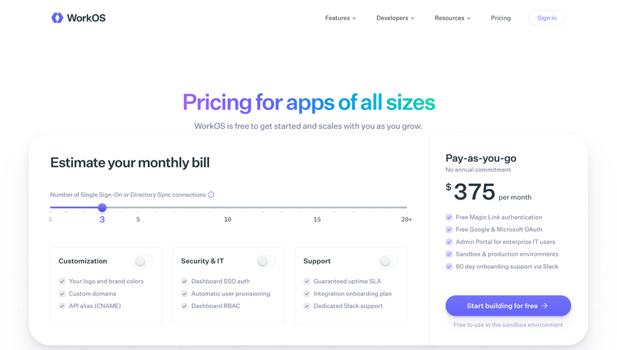
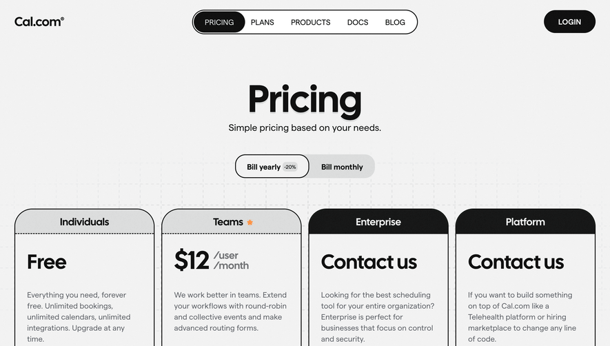
Webflow’s pricing page radiates a harmonious blend of modern minimalism and polished professionalism. The design foregrounds clarity—ample white space, crisp lines, and a restrained color palette underscore its clean, contemporary look. Subtle gradients and gentle shadows create visual interest without clutter, while microinteractions give it an innovative edge. The atmosphere feels trustworthy and approachable, evoking calm confidence throughout the experience. Layout and Structure
The structure unfolds methodically: a concise hero section offers an immediate overview, followed by well-organized pricing tables separated into “Site” and “Workspace” plans. A sticky header with persistent navigation boosts usability as users scroll. Supplementary sections provide plan comparisons, tooltips for FAQs, and a smart floating CTA, all anchored by a comprehensive footer packed with secondary links and essential information. Visual Elements
Refined icons, soft illustrations, and tasteful vector graphics highlight features without distracting from core content. Subtle hover effects and lightweight animations breathe life into interactive elements. Visual cues—like checkmarks and badges—guide attention to plan differentiators, while screen snippets offer contextual clarity. Color Palette and Typography
Webflow’s color palette leans on calming blues, clean whites, and selective accent hues (purples, gradients) to delineate sections and actions. Typography is sharp and hierarchical, with bold sans-serif headings, clean body texts, and strategic weight usage for pricing and CTAs, ensuring hierarchy is unmistakable. User Experience Patterns & Unique Touches
Intuitive group toggles, sticky navigation, and concise tooltips ensure seamless exploration. The interactive pricing calculator and animated transitions on CTA buttons stand out, making complex decisions easier and visually engaging. The design feels cohesive, innovative, and user-centric—everything a SaaS inspiration seeker wants.