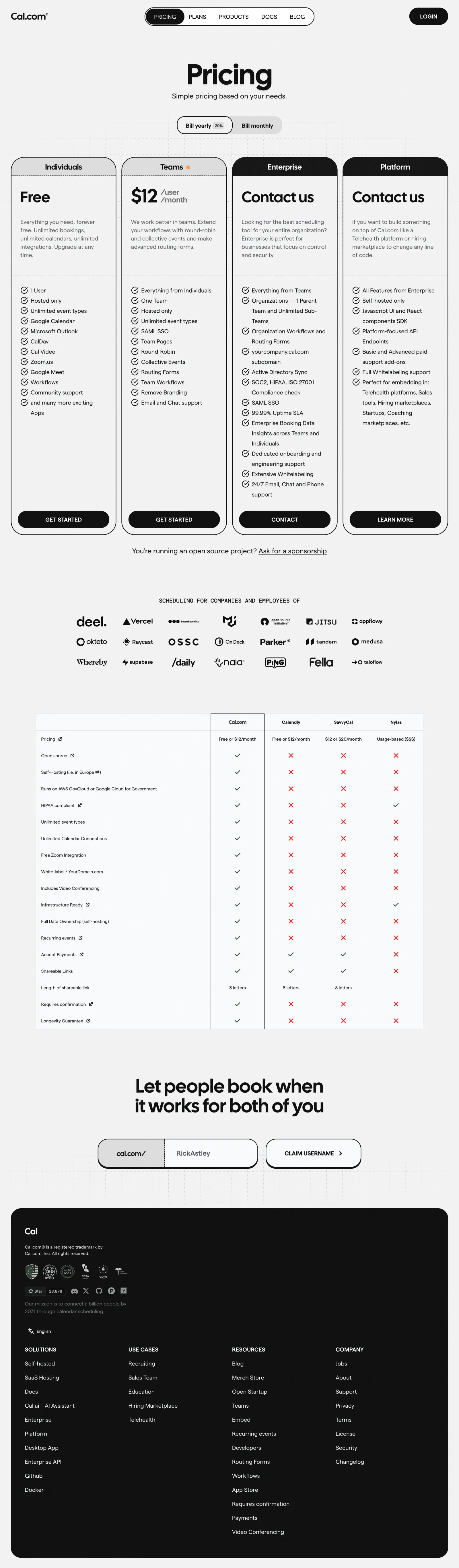
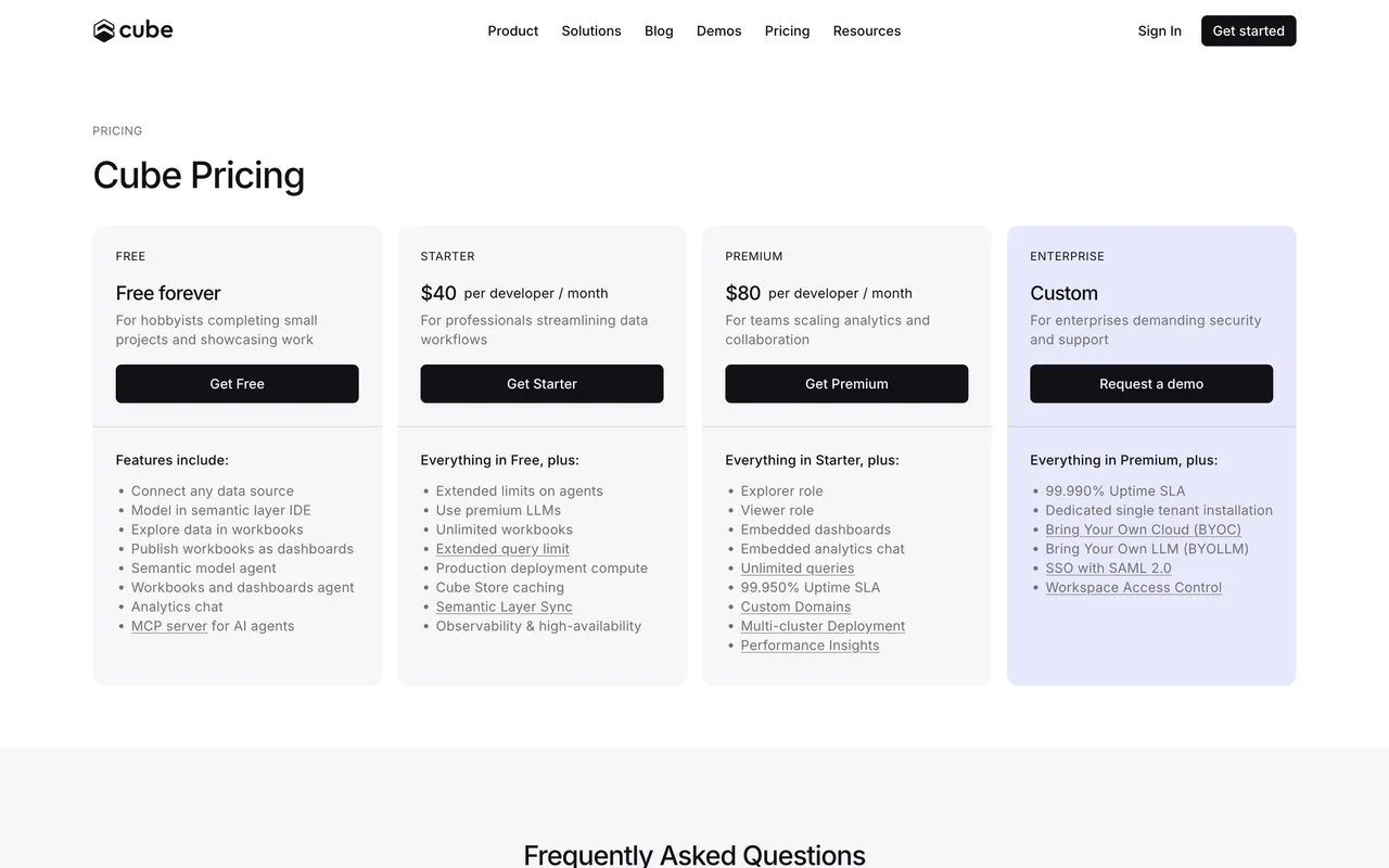
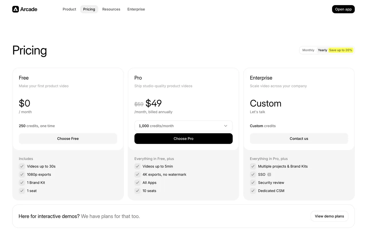
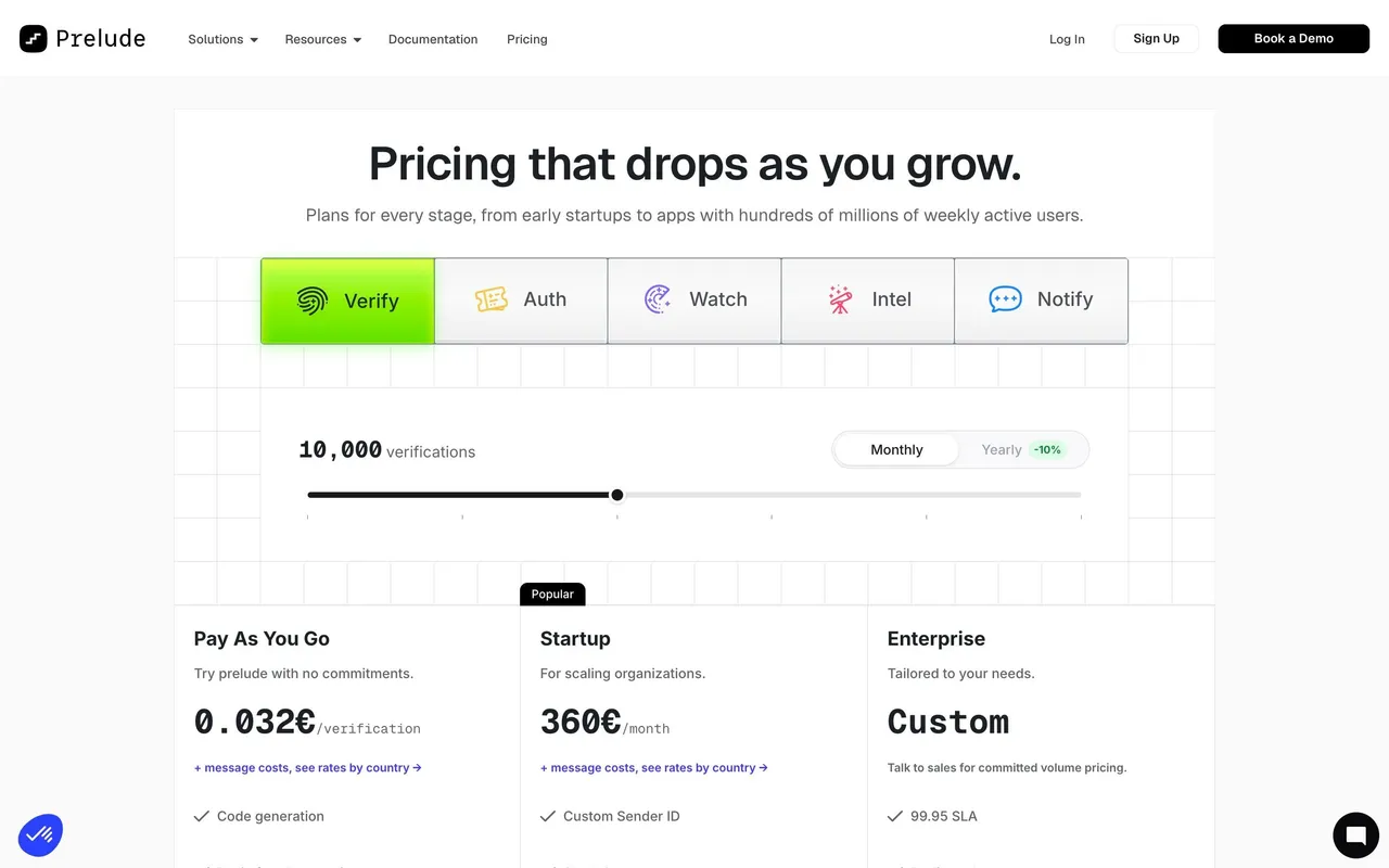
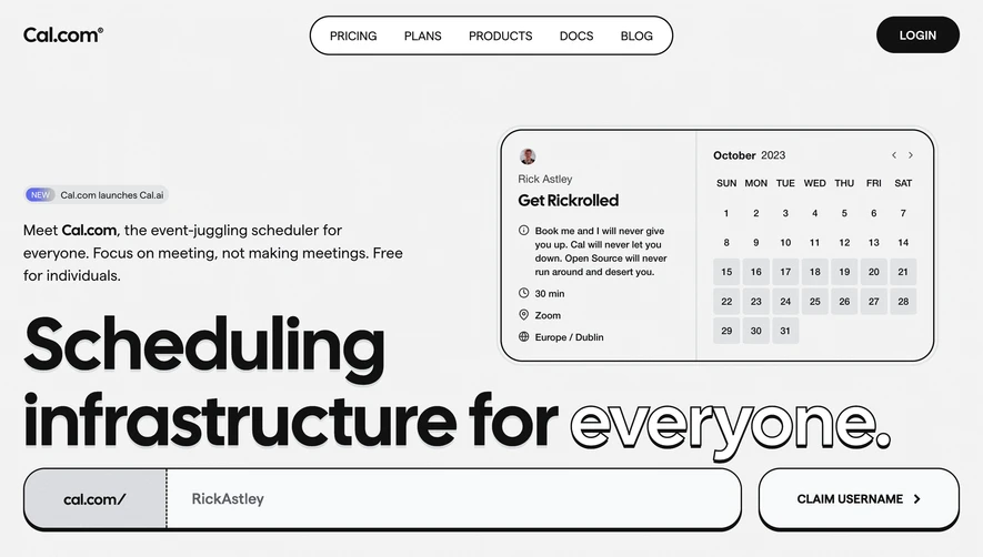
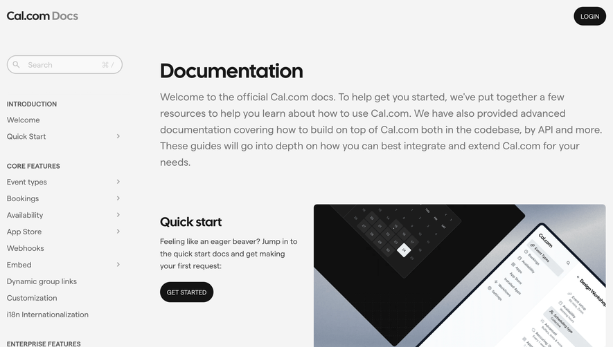
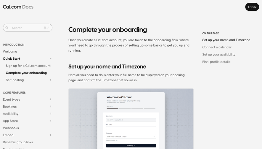
Cal.com’s pricing page employs a sleek, minimalist style defined by ample white space, subtle accents, and a restrained color palette. The design feels modern and sophisticated, projecting a sense of professionalism and trust. The overall aesthetic is refreshingly unadorned, focusing visitor attention on clarity and value rather than decorative excess.
Layout and Structure
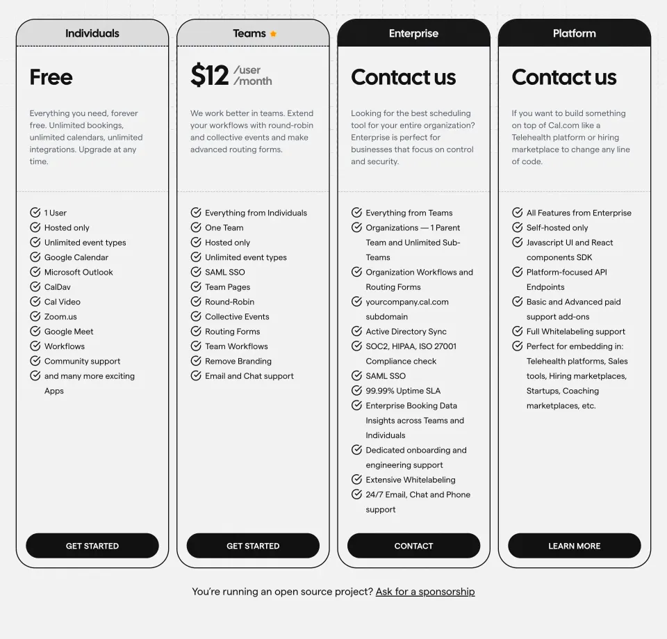
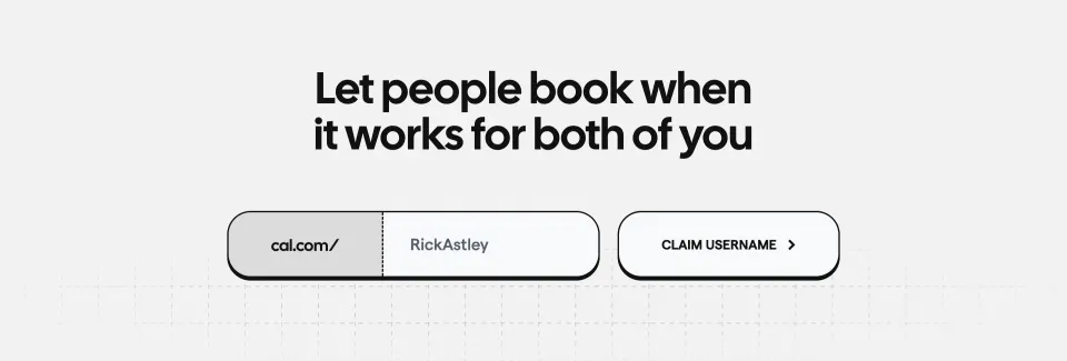
The page structure is highly scannable, with a concise header and an immediate introduction to the product’s key selling proposition. Pricing tiers are presented in a prominent, horizontally-aligned card layout, making comparison effortless. Feature lists are cleanly tabulated, while gentle section dividers and padding create natural breathing room. Supporting sections, such as FAQs, an enterprise callout, and an understated footer, maintain an intuitive hierarchy and keep the user’s path clear.
Visual Elements
Minimal vector icons elegantly punctuate features and benefits, supporting comprehension without overwhelming the senses. Light hover effects and micro-animations subtly guide interactions, adding polish without clutter. The absence of large illustrations or stock photography sharpens the focus on core content and pricing data.
Color Palette and Typography
A monochromatic base (white, light gray, deep charcoal) is paired with distinctive accent colors—Cal.com’s signature blue and soft purple—for CTAs and highlights. A geometric sans-serif font provides crisp readability, while font weights and sizes delineate headings, prices, and supporting text with clear hierarchy and accessible contrast.
User Experience Patterns & Unique Choices
Sticky navigation ensures users never lose access to the broader site. Bold “Get started” and “Contact sales” CTAs are visually prioritized for action, supported by toggle switches for monthly/annual pricing that update instantly. Notably, the inclusion of a transparent “Free” tier and open-source messaging reinforces accessibility and brand authenticity. The overall tone feels calm yet innovative—carefully curated for trust, clarity, and conversion.
 SaaSFrame