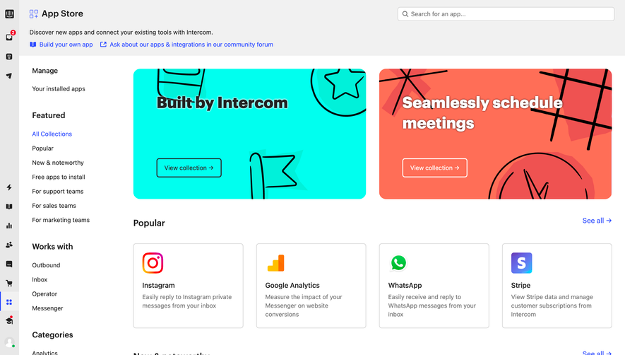
Generate a new design based on this screen using your own content.
Thank you! Your submission has been received!
Oops! Something went wrong while submitting the form.
# Design from Reference: Uvodo Integrations
Create an original, high-fidelity visual design inspired by the reference. Prioritize composition, typography, colors, spacing, and component styling over technical implementation.
## Reference
- **Product:** Uvodo
- **Category:** Integrations
- **Screenshot:** https://cdn.prod.website-files.com/5e9dc792e1210c5325f7ebbc/6acad66cd63d2caea65c6348_6acad5fc0f527efc4a5af445_cms-6bd01f2035b00e9a5654ee14.webp
Analyze the screenshot first. If inaccessible, request it rather than guessing.
## Content
{{content.instructions}}
{{content.data}}
Preserve essential messaging and factual accuracy. Adapt structure and copy length for visual balance; never invent product claims.
## Visual Design
Use this context to reproduce the reference's visual language: layout, typography, colors, spacing, borders, radii, and distinctive elements. The screenshot takes priority if descriptions conflict.
## Direction
{{preferences.fidelityInstructions}}
## Output
{{output.instructions}}
Deliver a polished, cohesive design with precise alignment, hierarchy, and spacing. Produce the requested visual artifact, not just a description. If unsupported, explain the limitation.
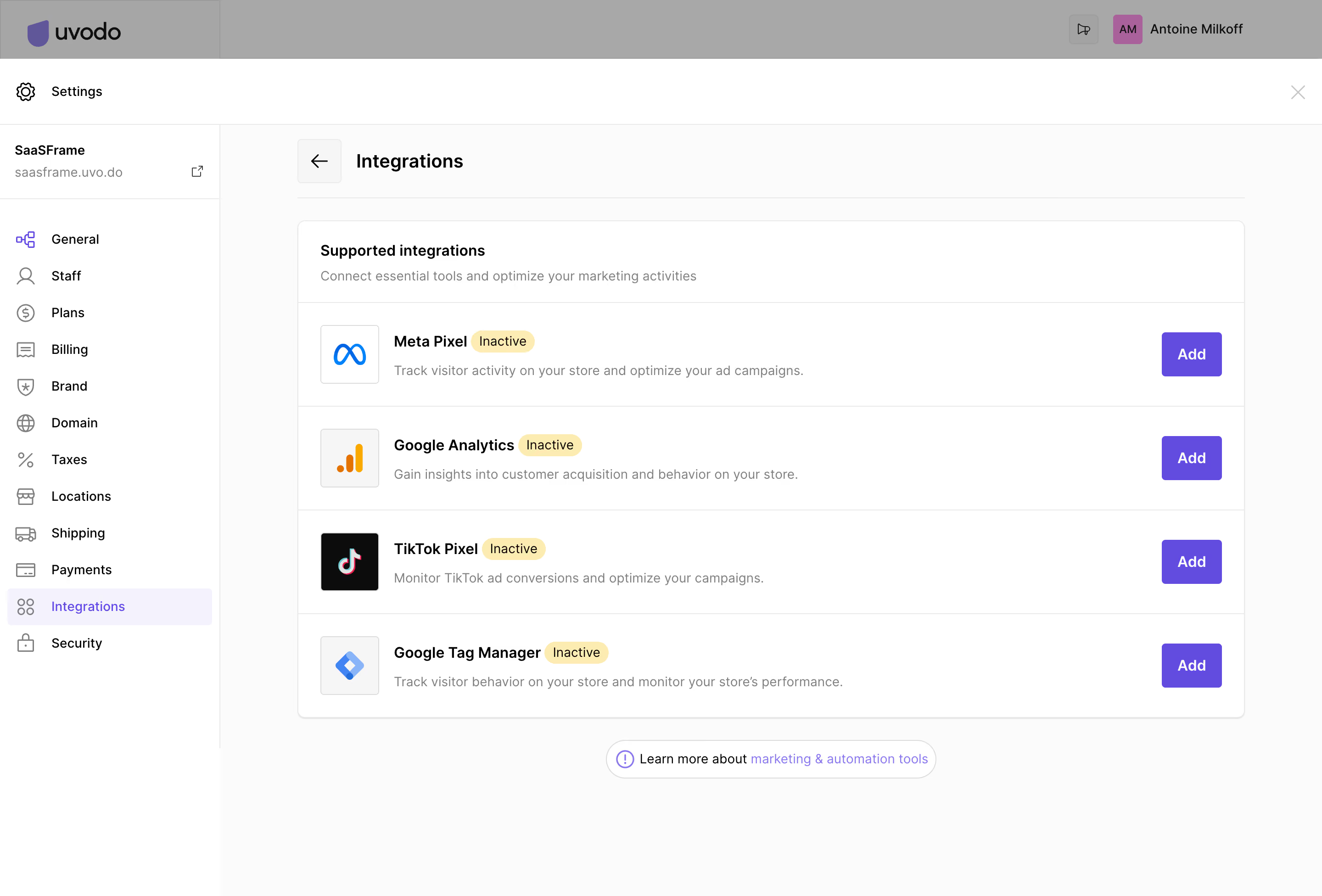
The Integrations settings page from SaaSFrame embodies a crisp, modern, and minimalist aesthetic. Ample white space anchors the layout, ensuring content feels uncluttered and approachable. Subtle shadows and soft borders contribute to a sense of depth without overwhelming the user, delivering a professional yet inviting vibe perfect for SaaS admin interfaces.
Layout and Structure
The page structure emphasizes clarity and utility. A fixed sidebar offers persistent navigation for seamless access to admin sections, while the main content area focuses exclusively on integrations. The design employs clear headings and grouped integration cards, making it easy for users to scan, locate, and manage connected tools. There’s no traditional hero or pricing section—this page is purpose-built for in-app configuration rather than marketing.
Visual Elements
Branded integration icons bring visual interest and context, helping users identify platforms at a glance. Status toggles and crisp action buttons (add, manage, disconnect) use subtle fill and contrast to guide interaction, maintaining a clean visual language with just enough color to aid usability.
Color Palette and Typography
A cool, understated palette—soft grays, vivid blues, and hints of green for active integrations—sets a trustworthy tone. Typography is functional and modern: a sans-serif primary font prioritizes clarity, with bold weights highlighting section titles and action points for effortless navigation.
User Experience Patterns and Notable Design Choices
Sticky left navigation, hover effects, and inline editing streamline user flow without distraction. Microinteractions (like toggle switches and loading spinners) subtly enhance feedback. The clean “add integration” modal exemplifies simplicity in form design, reducing friction. Trustworthiness, efficiency, and user empowerment define the page’s overall feel—showing that thoughtful design can elevate even the most utilitarian admin page.