Design with AI
Generate a new design based on this screen using your own content.
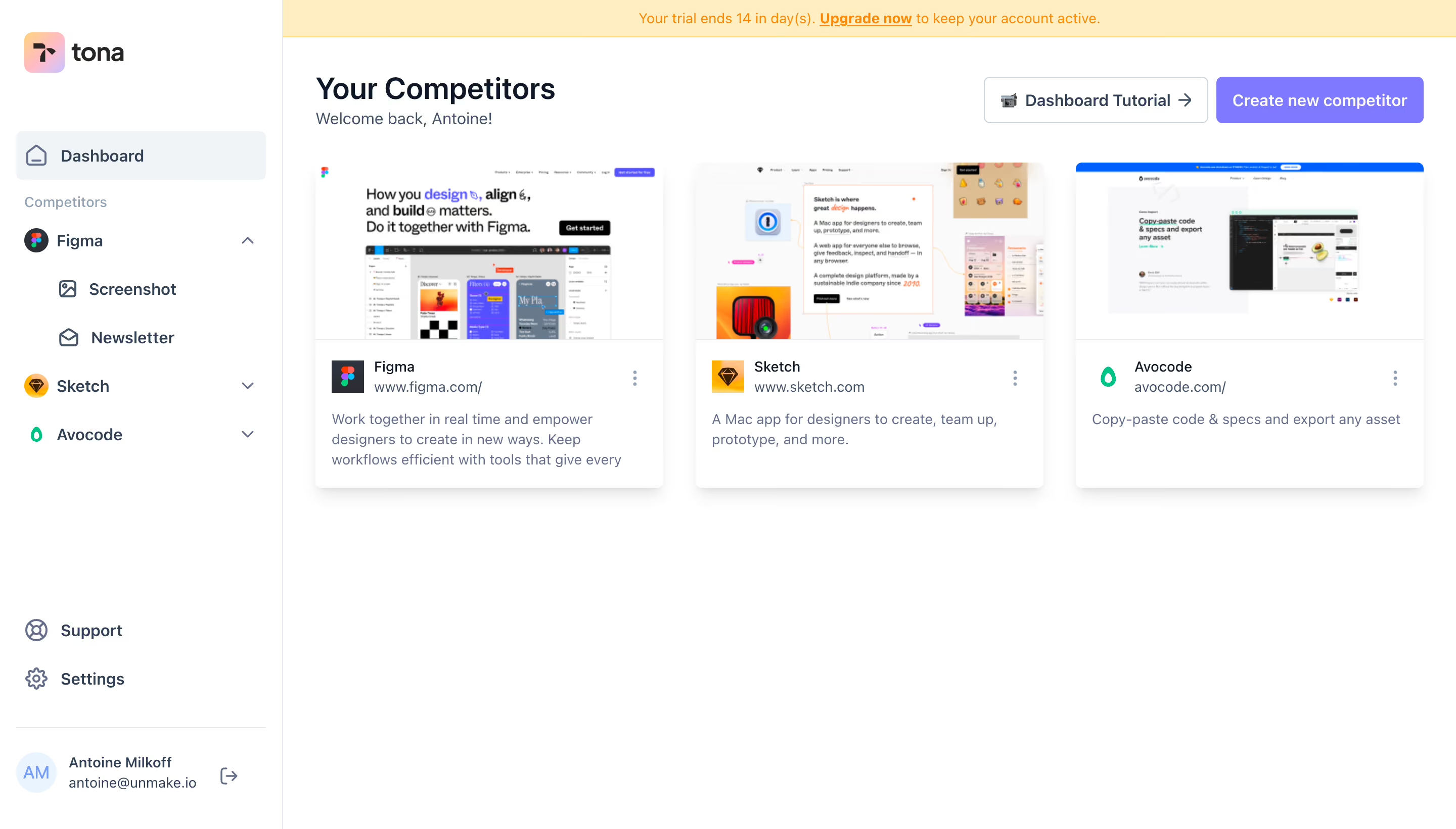
# Design from Reference: Tona Dashboard
Create an original, high-fidelity visual design inspired by the reference. Prioritize composition, typography, colors, spacing, and component styling over technical implementation.
## Reference
- **Product:** Tona
- **Category:** Dashboard
- **Screenshot:** https://cdn.prod.website-files.com/5e9dc792e1210c5325f7ebbc/6acb6348adcf005a3c5c3203_6acb62942d777adaad161fc3_cms-e3af87c79cd4a5e5c2608dbc.webp
Analyze the screenshot first. If inaccessible, request it rather than guessing.
## Content
{{content.instructions}}
{{content.data}}
Preserve essential messaging and factual accuracy. Adapt structure and copy length for visual balance; never invent product claims.
## Visual Design
### Overall aesthetic
- **Style:** Light competitor-monitoring dashboard with screenshot-led cards and violet creation action.
- **Visual character:** White canvas, pale selected navigation, quiet blue-gray text, and compact product logos.
- **Surface treatment:** Cards have subtle shadows and small corners; most workspace remains open.
### Page composition
- **Screenshot size:** 2880 × 1642 image px. CSS estimates assume an unverified 2× capture.
- **Sidebar:** Approximately 280 CSS px wide, with logo, selected Dashboard, competitor tree, support/settings, and bottom profile.
- **Trial strip:** Pale-yellow horizontal notice spans only the main workspace.
- **Header:** Your Competitors and welcome text at left; tutorial and creation actions aligned right.
- **Grid:** Three equal competitor cards in one row beneath the header.
- **Card anatomy:** Large website preview above logo/name/URL, overflow menu, and a short description.
### Information hierarchy
- **Page title:** Establishes competitor collection as the main workspace.
- **Primary action:** Violet Create new competitor button has stronger emphasis than outlined Dashboard Tutorial.
- **Card hierarchy:** Website preview leads visually; identity and URL precede description.
- **Navigation:** One competitor is expanded to Screenshot and Newsletter subitems.
- **Notice hierarchy:** Trial expiry and upgrade link are visible but separated from content.
### Typography
- **Family:** Neutral proportional sans serif; exact family unverified.
- **Page title:** Approximately 30 CSS px, weight 600, line-height 36 px.
- **Supporting greeting:** Approximately 16 px, regular.
- **Card title/body:** Approximately 14 px; descriptions use 20 px leading.
- **Navigation:** Approximately 16 px, selected item medium weight.
- **Trial notice:** Approximately 14 px.
- **Precision:** Sizes, weights, and assumed scale are reconstruction estimates.
### Colors & surfaces
- **Canvas/cards:** Sampled sRGB #FFFFFF.
- **Trial notice:** Sampled #FFEEC1.
- **Subtle surface:** Sampled #FAFAFA and #F8F8F9.
- **Navigation selection:** Sampled #F0F4F7.
- **Primary violet:** Sampled #7F79FF.
- **Borders:** Sampled #E1E1E1.
- **Secondary treatment:** Blue-gray descriptive text and icons remain lower contrast than headings.
### Components
- **Competitor cards:** Approximately 344 × 324 CSS px, 6 px corners, soft downward shadow.
- **Preview:** Roughly 176 px high, full card width, separated from identity by a thin rule.
- **Identity row:** Small square product mark, two text lines, and vertical ellipsis at right.
- **Actions:** Approximately 46 px high; tutorial outlined, creation filled violet, both around 5 px radius.
- **Sidebar tree:** Brand icons, expansion chevrons, and indented channel entries.
- **Profile:** Circular initial avatar, name/email, and logout icon.
- **Observed state:** Three saved competitors; no creation dialog or expanded card menu is shown.
### Visual rhythm
- **Alignment:** Title and card grid share a left edge around 32 CSS px into the workspace.
- **Grid spacing:** Approximately 32 px gaps between cards.
- **Header spacing:** About 32 px between header text and card row.
- **Whitespace:** Large blank lower canvas emphasizes the small saved collection.
- **Sidebar rhythm:** Competitor groups are spaced farther apart than their nested channel rows.
### Responsive
- **Observed version:** Desktop only.
- **Grid recommendation:** Reduce three columns to two, then one.
- **Navigation recommendation:** Collapse competitor tree into a drawer.
- **Actions recommendation:** Wrap tutorial/create controls below the heading when space narrows.
- **Card recommendation:** Preserve preview aspect ratio and allow descriptions to grow.
### Adaptation guidance
- **Preserve:** Screenshot-led competitor cards, clear creation hierarchy, and channel-based sidebar navigation.
- **Content fidelity:** Use actual competitor names, URLs, descriptions, and captured sites.
- **Starting values:** Approximately 30 px page title, 14 px card text, 46 px action height, and 32 px grid gaps under assumed scale.
- **Trial fidelity:** Render genuine subscription timing and upgrade destination.
- **Interaction fidelity:** Card menus, monitoring channels, and creation behavior are not demonstrated.
Use this context to reproduce the reference's visual language: layout, typography, colors, spacing, borders, radii, and distinctive elements. The screenshot takes priority if descriptions conflict.
## Direction
{{preferences.fidelityInstructions}}
## Output
{{output.instructions}}
Deliver a polished, cohesive design with precise alignment, hierarchy, and spacing. Produce the requested visual artifact, not just a description. If unsupported, explain the limitation.