Design with AI
Generate a new design based on this screen using your own content.
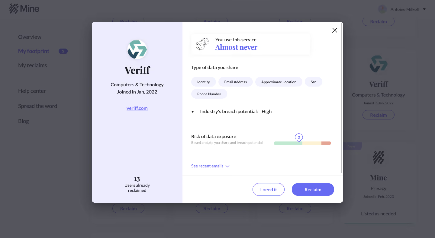
# Design from Reference: Mine Dashboard
Create an original, high-fidelity visual design inspired by the reference. Prioritize composition, typography, colors, spacing, and component styling over technical implementation.
## Reference
- **Product:** Mine
- **Category:** Dashboard
- **Screenshot:** https://cdn.prod.website-files.com/5e9dc792e1210c5325f7ebbc/6acbca398313d4c6c0cc40d0_6acbc838862bf04f5623baa3_cms-3c5262124d3b3370edd741da.webp
Analyze the screenshot first. If inaccessible, request it rather than guessing.
## Content
{{content.instructions}}
{{content.data}}
Preserve essential messaging and factual accuracy. Adapt structure and copy length for visual balance; never invent product claims.
## Visual Design
### Overall aesthetic
- **Character:** Personal-data dashboard dimmed behind a two-part service-detail modal, with pale lavender identity panel and violet actions.
### Page composition
- **Canvas:** 1440 × 789 screenshot pixels; CSS estimates are near screenshot scale, with capture scale unverified.
- **Structure:** Central modal approximately 830px CSS wide; left identity strip about 36% of modal width, right detail/action area.
### Information hierarchy
- **Priority:** Service logo/name/category establish identity. Right side presents usage frequency, shared-data chips, breach-potential label and exposure-risk scale.
- **Action:** I need it and Reclaim sit in a separated bottom footer; recent-emails link sits above.
### Typography
- **Families:** Bold serif service/frequency emphasis paired with sans-serif labels; exact fonts are unverified.
- **Scale:** Estimated CSS service title 32px, emphasis 24px, body 16px and chip/helper text 12px.
### Colors & surfaces
- **Sampled palette:** White #FFFFFF; lavender #EDECFE and #F2F1FE; dimmed gray #54555D and #55565E.
- **Accents:** Violet primary action and links; exposure gauge uses green, pale yellow and muted coral segments.
### Components
- **Modal details:** Rounded frequency callout, wrapped data-category pills, thin rules, small numbered risk pointer and internal scrollbar.
- **Geometry:** Estimated 8px modal radius, 24–32px padding and 42px pill actions; large close icon at upper right.
### Visual rhythm
- **Spacing:** Compact detail groups are separated by 28–32px; generous blank left-panel space balances the denser right side.
### Responsive
- **Guidance:** Mobile is not shown. Stack identity above details and keep modal scrolling/actions accessible.
### Adaptation guidance
- **Transfer:** Retain transparent data categories and clear decision actions. Treat captured risk/usage values as example interface content, not target assessments.
Use this context to reproduce the reference's visual language: layout, typography, colors, spacing, borders, radii, and distinctive elements. The screenshot takes priority if descriptions conflict.
## Direction
{{preferences.fidelityInstructions}}
## Output
{{output.instructions}}
Deliver a polished, cohesive design with precise alignment, hierarchy, and spacing. Produce the requested visual artifact, not just a description. If unsupported, explain the limitation.