1. Header: At the top of the page, there is a header with the Swell logo and a navigation menu that includes links to different pages on the Swell website. 2. Hero section: The hero section includes a prominent heading that reads "Swell vs. Shopify," with a subheading that explains the purpose of the comparison. This section also features two buttons: "Try Swell for Free" and "Get Shopify Now" that direct users to a sign-up or checkout page. 3. Feature comparison: The main section of the page is dedicated to comparing Swell and Shopify in terms of features. This is done using a table with headers for different feature categories and lists each platform’s offerings. 4. Pricing comparison: Beneath the feature comparison table is another table comparing pricing for the two platforms. This table is similar to the feature comparison table in design and provides a comprehensive overview of the pricing structure for each platform. 5. Customer reviews: Below the pricing table, there is a section that showcases testimonials from Swell customers, accompanied by their photos and company logos. These reviews highlight the benefits of using Swell over Shopify. 6. Conclusion: The page ends with a brief summary of the comparison, encouraging users to choose Swell as the better option for eCommerce businesses looking for a more customizable, flexible, and affordable experience.

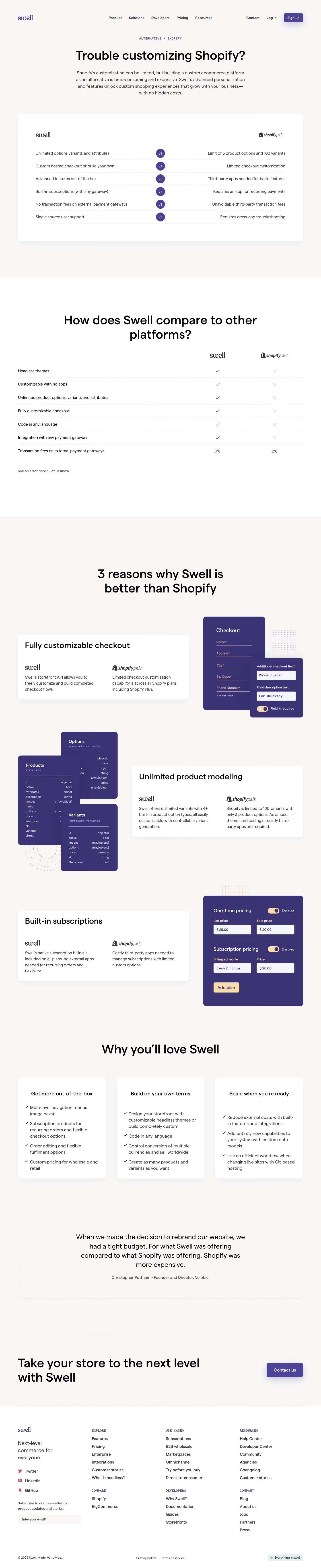

Swell Comparison Page

Swell
Sell creatively
Designed by
No items found.
Category
Patterns
No items found.
Tech Stack
Added on
October 19, 2020