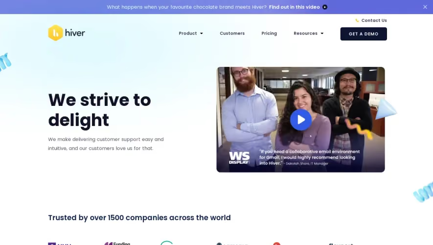
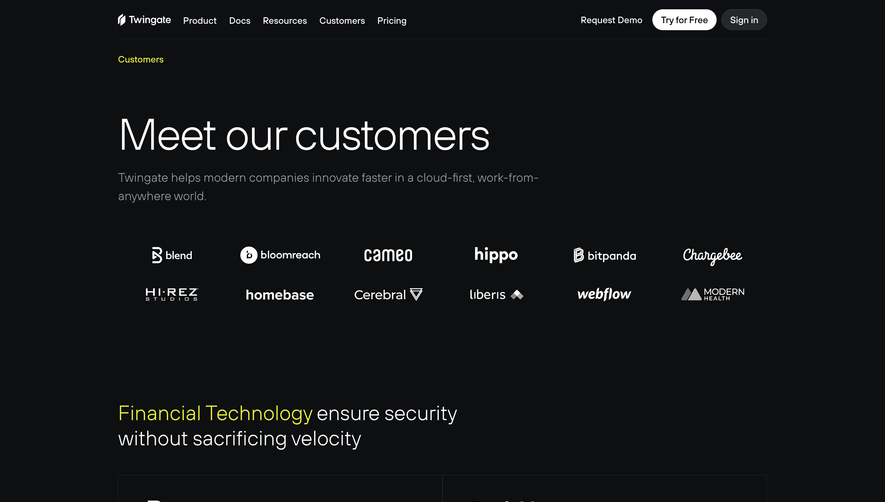
Overall Style and Aesthetic
Swan’s "Customers" page radiates a clean, modern professionalism built for trust and clarity. Its minimalist foundation is punctuated by vibrant accent colors, resulting in a page that feels both dynamic and approachable. The overall mood is confident yet friendly—balancing enterprise credibility with fintech innovation. Layout and Structure
The page forgoes the standard hero section in favor of an instantly engaging customer logo wall, immediately establishing social proof. This is followed by a sleek grid of case studies, each displayed as an interactive card, drawing curiosity without overwhelming users. Clear section divisions and consistent spacing promote easy scanning and smooth cognitive flow. Visual Elements
Subtle animations bring customer cards to life on hover, providing tactile feedback. Clean, geometric icons denote industries and solutions, while candid customer photography adds authenticity without disrupting the visual focus. There's a deft use of whitespace, keeping the visuals uncluttered and crisp. Color Palette and Typography
Swan leverages its signature indigo-azure hues alongside understated grays and whites, lending gravitas while strategically using color for highlights and calls-to-action. The sans-serif typeface is modern and legible, with thoughtful use of font weight and sizing to anchor hierarchy—customer names pop, summaries stay subtle, and CTAs stand out. User Experience Patterns
Navigation is streamlined: sticky header, clear breadcrumbs, and intuitive card-based filtering. Calls-to-action are focused and sparingly placed, allowing stories to lead, with frictionless transitions to deeper content. Micro-interactions, like hover states and smooth scrolling, elevate engagement without distraction. Unique or Notable Design Choices
A standout touch is the seamless blend of customer logos in color and grayscale, signaling both diversity and unity. The absence of cluttered sidebars or superfluous banners allows the real-world results to stay center stage, making this page a masterclass in letting user stories drive conversion. The overall tone is one of transparent innovation—quietly persuasive, never pushy.