
Thank you! Your submission has been received!
Oops! Something went wrong while submitting the form.
Get SaaSFrame Pro
Monthly
$18
Quarterly
$48
Yearly
$180
Upgrade to access this feature
Browse all screens & flows
Filter and search screens & flows
Access Figma files
Access mobile versions
Bookmark screens & flows
Join now
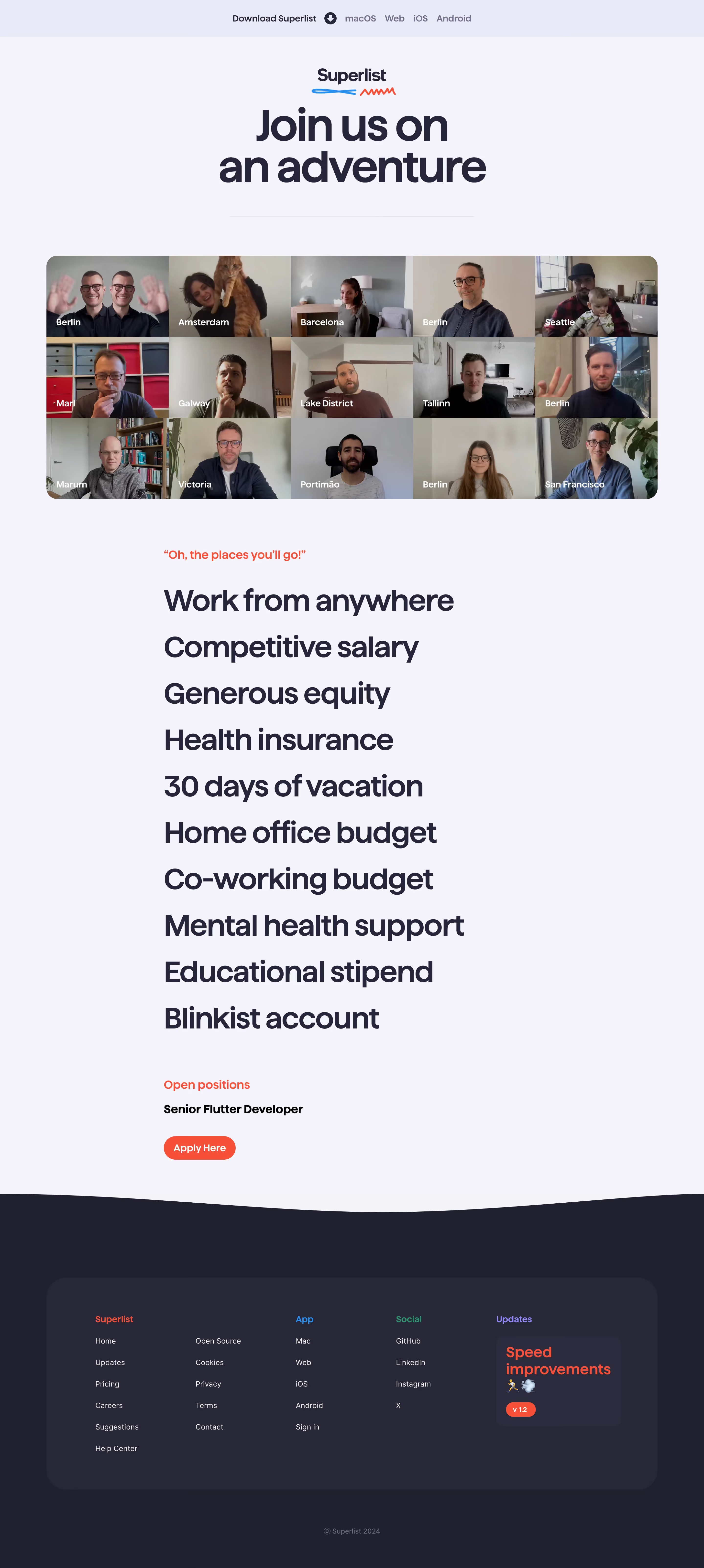

Superlist Careers Page

Superlist
Home to all your lists
Designed by
No items found.

Bookmark
Bookmark

Design with AI
Thank you! Your submission has been received!
Oops! Something went wrong while submitting the form.
# Design from Reference: Superlist Careers Page
Create an original, high-fidelity visual design inspired by the reference. Prioritize composition, typography, colors, spacing, and component styling over technical implementation.
## Reference
- **Product:** Superlist
- **Category:** Careers Page
- **Screenshot:** https://cdn.prod.website-files.com/5e9dc792e1210c5325f7ebbc/6acad5175a5fdf4c30310d37_6acad4395a5fdf4c3030c45b_cms-b55f2abae1b686cc57bba233.webp
Analyze the screenshot first. If inaccessible, request it rather than guessing.
## Content
{{content.instructions}}
{{content.data}}
Preserve essential messaging and factual accuracy. Adapt structure and copy length for visual balance; never invent product claims.
## Visual Design
### Overall aesthetic
- **Style:** Expressive careers page with enormous dark typography on pale lavender and a photographic remote-team mosaic.
- **Character:** Friendly heavy rounded sans serif, sparse red accents, playful blue/red doodles, and a dark softly curved footer.
- **Surface treatment:** Mostly unboxed content; large rounded photo montage and a rounded dark footer panel.
### Page composition
- **Capture and scale:** 2880 × 6420 image px. CSS estimates assume a 2× capture, approximately 1440 × 3210 CSS px; scale is unverified.
- **Top strip:** Centered download prompt and platform links on a slightly darker lavender band.
- **Hero:** Small centered brand with blue/red underline doodles, huge two-line recruitment headline, and narrow horizontal rule.
- **Team mosaic:** Approximately 1250px-wide rounded montage of fifteen webcam-like portraits in a five-by-three grid, each with a white location label.
- **Benefits:** Narrower centered text column, left aligned, with a small red introductory line and ten very large benefit statements.
- **Open role:** Red section label, one dark bold role title, and red Apply Here pill beneath.
- **Footer transition:** Broad shallow curved boundary from pale page into dark background.
- **Footer panel:** Rounded dark-lavender container with brand/site links, app links, social links, and update card; centered copyright below.
### Information hierarchy
- **Recruitment:** Huge headline dominates the first screen.
- **Team proof:** Large portrait grid communicates distributed-team character.
- **Benefits:** Oversized one-line statements emphasize employment proposition without explanatory cards.
- **Application:** Single visible role and red pill form the main conversion point.
- **Footer:** Colored group labels organize secondary navigation; update card uses bold red copy and version pill.
- **Historical content:** Role and benefit statements are captured page content, not verified current openings or employment terms.
### Typography
- **Family:** Heavy rounded/geometric proportional sans serif; exact identity is unverified.
- **Hero headline:** Approximately 88–96px bold with 88–92px line-height and tight tracking.
- **Benefit statements:** Approximately 58–60px bold with roughly 96px vertical pitch.
- **Intro / open-role labels:** Approximately 24px medium in red.
- **Role title:** Approximately 24px bold.
- **Location labels:** Approximately 18px semibold white.
- **Footer:** Approximately 16px links; update title around 30px bold.
- **Precision:** CSS sizes, weights, and line-height are visual reconstruction estimates.
### Colors & surfaces
- **Main canvas:** Sampled #F4F3FA.
- **Footer background:** Sampled #20202F.
- **Footer panel:** Sampled #272738.
- **Dark heading tone:** Sampled #26253C.
- **Top strip / subtle lavender:** Sampled #E9E9F8.
- **Secondary dark surface:** Sampled #2C2C3E.
- **Red accent:** Sampled #FF3A27.
- **Other accents:** Bright blue doodle/app label, green social label, and purple update label.
- **Photography:** Natural portrait colors provide most of the page’s local variation.
### Components
- **Download strip:** Approximately 76px high, inline prompt, circular download symbol, and four platform labels.
- **Brand doodles:** Short blue loop and red zigzag beneath the wordmark.
- **Mosaic:** Approximately 1250 × 500px with 24px outer radius and edge-to-edge portrait cells; labels sit near each cell’s lower-left.
- **Benefits list:** Ten unboxed large text lines, with no bullet icons or surrounding cards.
- **Apply action:** Approximately 146 × 50px red pill with bold white label.
- **Footer shell:** Approximately 1250px wide, 40px radius, and generous 100px-like side/top insets.
- **Update card:** Smaller dark rounded tile with red multiline headline, small emoji, and red version badge.
- **State limits:** No application form, job-detail page, hover, or download state is shown.
### Visual rhythm
- **Centered opening:** Brand, headline, and rule share a central axis.
- **Width contrast:** Broad team mosaic gives way to a narrower left-aligned benefit column.
- **Repeated benefit rhythm:** Large uniform line spacing creates a typographic list rather than a dense paragraph.
- **Application pause:** Clear gap separates benefits and the open-role block.
- **Footer cadence:** Curved transition, rounded panel, then isolated copyright provide a soft ending.
### Responsive
- **Observed state:** Desktop only; mobile behavior is unverified.
- **Typography recommendation:** Reduce hero toward 44–52px and benefits toward 30–36px.
- **Mosaic recommendation:** Use fewer columns or a deliberate horizontal gallery while retaining meaningful image alternatives.
- **Content recommendation:** Keep benefits in a single readable column with consistent spacing.
- **Footer recommendation:** Stack groups and update card; allow platform links to wrap.
- **Action recommendation:** Preserve a clear, comfortably tappable application route.
### Adaptation guidance
- **Preserve:** Bold recruitment headline, real distributed-team imagery, large benefit list, red application action, and dark curved footer.
- **Starting geometry:** Approximately 1250px broad container, 88–96px hero, 58px benefits, 24px montage radius, and 50px application pill under the unverified 2× assumption.
- **Content fidelity:** Populate actual approved benefits and open positions; do not assume captured role availability.
- **Photography:** Use consented supplied team imagery and location labels.
- **Implementation recommendation:** Provide accessible application links, readable small-screen typography, and stable reduced-motion presentation if adding animation.
Use this context to reproduce the reference's visual language: layout, typography, colors, spacing, borders, radii, and distinctive elements. The screenshot takes priority if descriptions conflict.
## Direction
{{preferences.fidelityInstructions}}
## Output
{{output.instructions}}
Deliver a polished, cohesive design with precise alignment, hierarchy, and spacing. Produce the requested visual artifact, not just a description. If unsupported, explain the limitation.


Category
Patterns
No items found.
Tech Stack

Added on
March 15, 2024
Similar screens
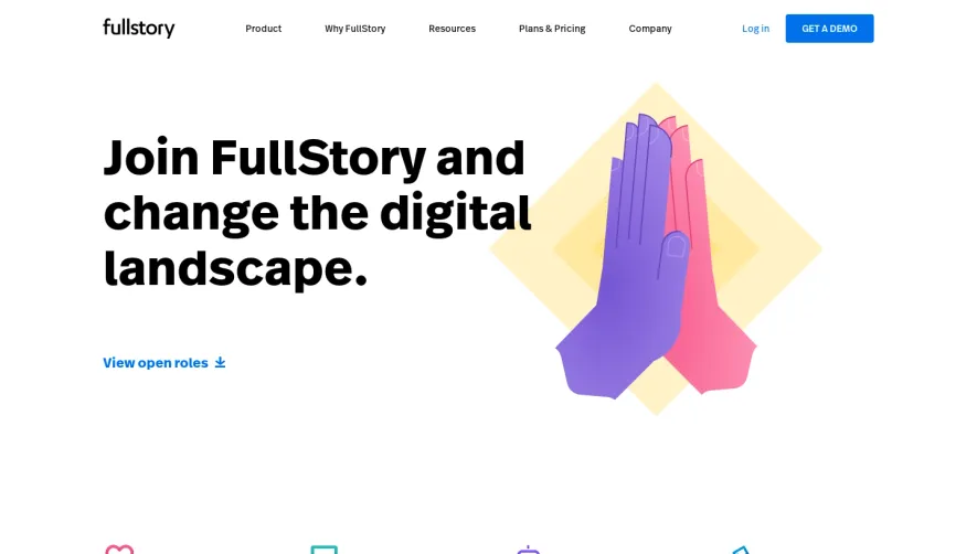




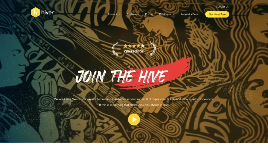

Upgrade to SaaSFrame Pro now to see similar examples.
Monthly
$18 /month
Billed $18 monthly
Browse all screens & flows
Filter and search screens & flows
Search text in screenshots
Access Figma files
Access mobile versions
Join now
Quarterly
$16 /month
Billed $48 quarterly
Browse all screens & flows
Filter and search screens & flows
Search text in screenshots
Access Figma files
Access mobile versions
Join now
Yearly
$15 /month
Billed $180 yearly
Browse all screens & flows
Filter and search screens & flows
Search text in screenshots
Access Figma files
Access mobile versions
Join now