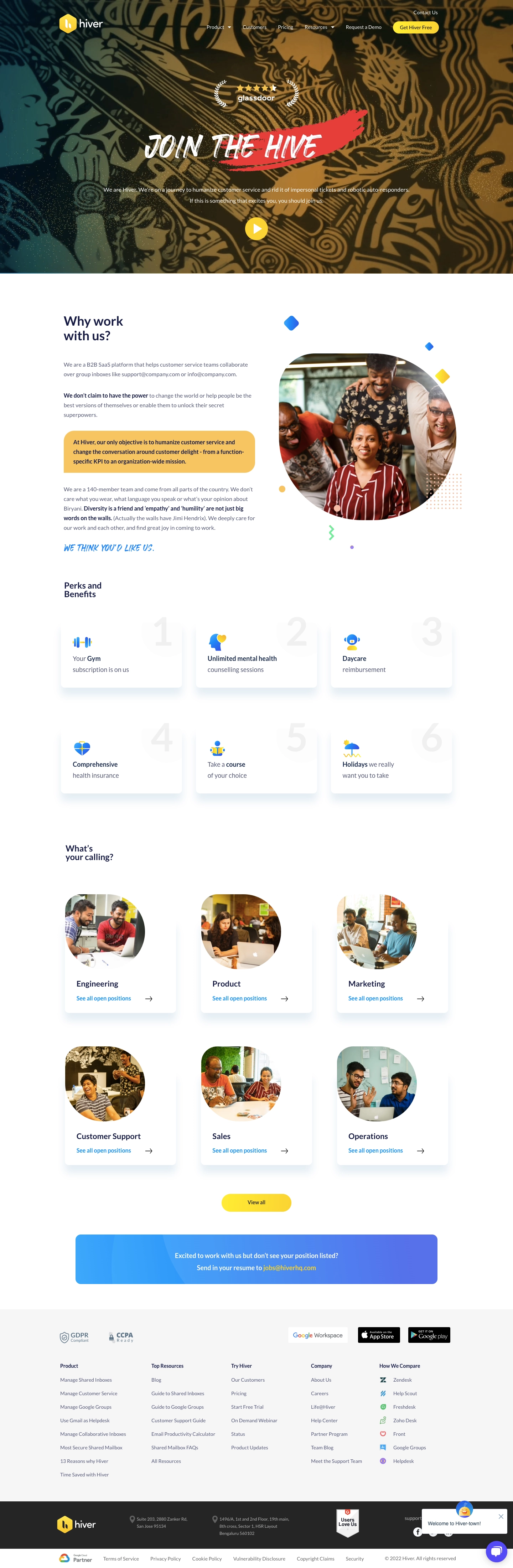
The hero hits hard. "JOIN THE HIVE" in a chunky, hand-drawn typeface over a warm golden background with a red Glassdoor badge feels confident and human. It's not trying to be corporate. The play button invites you deeper without being pushy.
Smart Visual Rhythm
The layout alternates between text-heavy sections and photo blocks really well. "Why work with us?" pairs a clean sans-serif header with candid team photos that feel genuine, not stock. The handwritten "WE THINK YOU'D LIKE US" line adds personality that most SaaS career pages completely skip.
Perks Done Right
The numbered perks grid is clean. Big watermark numbers behind each card give visual weight without competing with the content. Gym, mental health, daycare, insurance. Straightforward, no fluff.
What Makes It Stand Out
The department cards with circular team photos feel warm and approachable. Yellow accents and blue CTAs create a consistent color story throughout. That bottom yellow banner for unsolicited applications is a smart catch-all. The whole page feels like a company that actually likes its people.
 SaaSFrame