
Thank you! Your submission has been received!
Oops! Something went wrong while submitting the form.
Get SaaSFrame Pro
Monthly
$18
Quarterly
$48
Yearly
$180
Upgrade to access this feature
Browse all screens & flows
Filter and search screens & flows
Access Figma files
Access mobile versions
Bookmark screens & flows
Join now
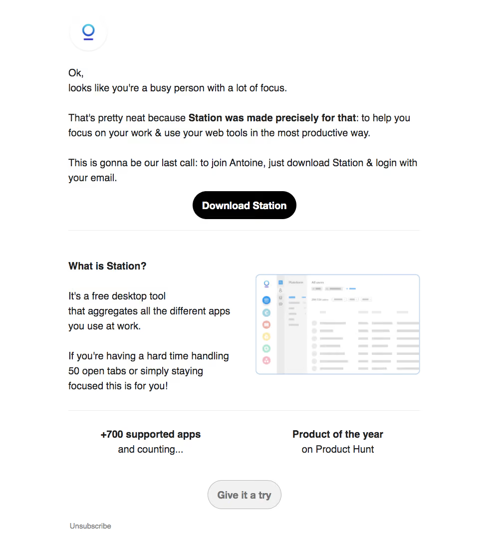
Station Invitation Emails

Station
One app to rule them all
Designed by
No items found.

Bookmark
Bookmark

Design with AI
Thank you! Your submission has been received!
Oops! Something went wrong while submitting the form.
# Design from Reference: Station Invitation Emails
Create an original, high-fidelity visual design inspired by the reference. Prioritize composition, typography, colors, spacing, and component styling over technical implementation.
## Reference
- **Product:** Station
- **Category:** Invitation Emails
- **Screenshot:** https://cdn.prod.website-files.com/5e9dc792e1210c5325f7ebbc/6acbc696edc235600abc93ba_6acbc115aa23dc1cf5aa13b1_cms-efba51d7c65ef671ea408a5c.webp
Analyze the screenshot first. If inaccessible, request it rather than guessing.
## Content
{{content.instructions}}
{{content.data}}
Preserve essential messaging and factual accuracy. Adapt structure and copy length for visual balance; never invent product claims.
## Visual Design
### Overall aesthetic
- **Style:** Plainspoken invitation-reminder email with an open white canvas, mostly black text, and one emphatic black pill action.
- **Character:** Conversational paragraphs, selective bold emphasis, small brand mark, and a modest product screenshot.
- **Surface treatment:** No large enclosing card; thin horizontal rules divide the message, product explanation, and proof points.
### Page composition
- **Capture:** 1010 × 1102 image px. Dimensions below describe screenshot pixels; email-client zoom and CSS scale are unverified.
- **Content column:** Approximately 704 image px wide, from x≈137 to 841, with broad white margins.
- **Brand:** Small circular white logo tile near the top-left content edge, about 76 image px across.
- **Message:** Several left-aligned paragraphs followed by a centered Download Station action.
- **Explanation:** Heading above a two-column area: short paragraphs left, bordered product screenshot right.
- **Proof and close:** Two centered proof blocks sit side by side below a divider, followed by a pale secondary pill and a small unsubscribe link at the lower left.
### Information hierarchy
- **Opening:** Conversational body copy leads instead of a large marketing headline.
- **Emphasis:** One bold phrase within the main paragraph highlights the product’s focus benefit.
- **Primary action:** Solid black download pill stands out between the invitation text and the explanation.
- **Supporting argument:** Product explanation and illustration precede two bold proof labels.
- **Secondary action:** Pale Give it a try pill is quieter than the primary download action; unsubscribe remains small and muted.
### Typography
- **Family:** Arial-like proportional sans serif; exact family is unverified.
- **Body:** Approximately 20 image px, regular, with about 30px line spacing.
- **Bold roles:** Product emphasis, explanatory heading, and proof labels use approximately 20–21 image px bold.
- **Buttons:** Approximately 21 image px bold centered labels.
- **Footer link:** Approximately 14 image px, regular and gray.
- **CSS caution:** These are observed image-scale estimates, not established email CSS sizes.
### Colors & surfaces
- **Background:** Sampled #FFFFFF.
- **Main text:** Sampled #202020 and #000000.
- **Primary CTA:** Black fill with white text.
- **Secondary CTA:** Sampled pale grays #F1F1F1 and #F4F4F4, with a fine gray outline and gray label.
- **Dividers / demo:** Sampled #EAEAEA and #DBDBDB in light rules and the miniature interface.
- **Brand accent:** Small cyan-to-indigo logo provides the strongest nonneutral brand color; product screenshot includes small pastel app icons.
### Components
- **Primary pill:** Approximately 208 × 56 image px with fully rounded ends, bold white label, and no visible icon.
- **Dividers:** Thin light-gray rules span the full content width.
- **Product image:** Approximately 330 × 200 image px with pale-blue outline and about 8px radius; shows a miniature application sidebar and content rows.
- **Proof blocks:** Two equal text zones with bold first line and regular second line, without surrounding cards.
- **Secondary pill:** Approximately 148 × 58 image px, pale fill, thin gray border, and fully rounded ends.
- **Unsubscribe:** Simple muted text link with no enclosing footer panel.
### Visual rhythm
- **Paragraph rhythm:** Approximately 30–36 image px separates text groups, creating a readable letter-like progression.
- **Action spacing:** The primary pill has clear white space above and below before the first divider.
- **Explanation balance:** Left text and right demo share the section width, with substantial separation.
- **Closing rhythm:** Divider, proof points, secondary action, then unsubscribe form distinct descending levels.
### Responsive
- **Observed state:** One email capture only; mobile rendering and client-specific behavior are unverified.
- **Container recommendation:** Use a fluid email-safe maximum-width layout with generous side padding.
- **Column recommendation:** Stack explanatory copy above the product image and proof blocks on narrow screens.
- **Action recommendation:** Preserve readable button labels and sufficient tap targets across email clients.
### Adaptation guidance
- **Preserve:** Conversational opening, selective bold emphasis, one black primary pill, concise product explanation, and restrained proof points.
- **Content fidelity:** Replace recipient-specific details and product claims with supplied approved content; screenshot claims are historical copy, not independently verified facts.
- **Image adaptation:** Use a real supplied product image and meaningful alternative text rather than inventing interface details at miniature scale.
- **Email implementation:** Use robust layout tables or supported email markup, with real links and unsubscribe behavior supplied by the sending system.
- **Scale guidance:** Re-establish an appropriate email CSS width instead of assuming the 1010px screenshot represents a browser viewport.
Use this context to reproduce the reference's visual language: layout, typography, colors, spacing, borders, radii, and distinctive elements. The screenshot takes priority if descriptions conflict.
## Direction
{{preferences.fidelityInstructions}}
## Output
{{output.instructions}}
Deliver a polished, cohesive design with precise alignment, hierarchy, and spacing. Produce the requested visual artifact, not just a description. If unsupported, explain the limitation.


Category
Patterns
No items found.
Tech Stack



Added on
February 4, 2023


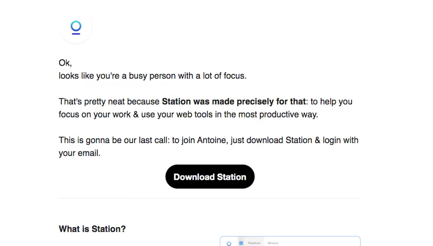
Similar screens
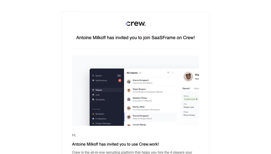






Upgrade to SaaSFrame Pro now to see similar examples.
Monthly
$18 /month
Billed $18 monthly
Browse all screens & flows
Filter and search screens & flows
Search text in screenshots
Access Figma files
Access mobile versions
Join now
Quarterly
$16 /month
Billed $48 quarterly
Browse all screens & flows
Filter and search screens & flows
Search text in screenshots
Access Figma files
Access mobile versions
Join now
Yearly
$15 /month
Billed $180 yearly
Browse all screens & flows
Filter and search screens & flows
Search text in screenshots
Access Figma files
Access mobile versions
Join now