
Thank you! Your submission has been received!
Oops! Something went wrong while submitting the form.
Get SaaSFrame Pro
Monthly
$18
Quarterly
$48
Yearly
$180
Upgrade to access this feature
Browse all screens & flows
Filter and search screens & flows
Access Figma files
Access mobile versions
Bookmark screens & flows
Join now
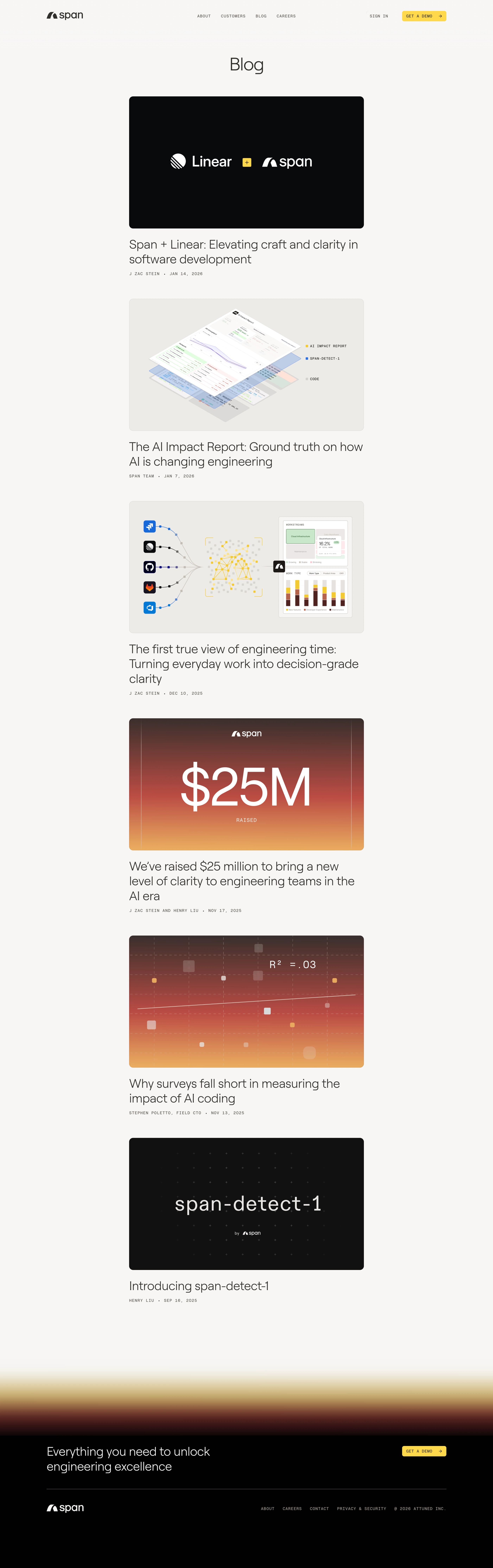

Span Blog Feed

Span
AI-native engineering automations
Designed by


Bookmark
Bookmark

Design with AI
Thank you! Your submission has been received!
Oops! Something went wrong while submitting the form.
# Design from Reference: Span Blog Feed
Create an original, high-fidelity visual design inspired by the reference. Prioritize composition, typography, colors, spacing, and component styling over technical implementation.
## Reference
- **Product:** Span
- **Category:** Blog Feed
- **Screenshot:** https://cdn.prod.website-files.com/5e9dc792e1210c5325f7ebbc/6acad39cc2028efdec71aeae_6acad14111963fdadfb4c5a4_cms-cab98e5c3572d1f268308f75.webp
Analyze the screenshot first. If inaccessible, request it rather than guessing.
## Content
{{content.instructions}}
{{content.data}}
Preserve essential messaging and factual accuracy. Adapt structure and copy length for visual balance; never invent product claims.
## Visual Design
### Overall aesthetic
- **Character:** A minimal editorial feed pairs a warm off-white canvas, light oversized typography, small monospaced metadata, and richly designed article artwork.
- **Evidence:** Original image dimensions are 2803 × 8918 px. All four readable crops were inspected at 1400 px width. Measurements below use inspection pixels; a roughly 1400 CSS px desktop layout at 2× capture is plausible but unverified.
- **Contrast:** Black artwork and a black footer punctuate the pale page. Yellow demo buttons and occasional warm gradient illustrations provide restrained color.
### Page composition
- **Header:** A wide horizontal header places the span logo near x132, centered uppercase navigation, and a sign-in link plus yellow demo button at right.
- **Title:** A centered Blog heading sits below the header with generous white space.
- **Feed:** Six article entries form one narrow central column approximately 668 inspection px wide, from x366 to x1034. Each consists of a large landscape image, a left-aligned title, and a single author/date line.
- **Ending:** Substantial empty space follows the last article. A blurred horizontal gradient transitions from pale gold through dark red into a black footer.
- **Footer:** A large white conversion message and yellow demo action form the upper footer row. A fine rule separates them from the white logo, compact links, and copyright.
### Information hierarchy
- **Images first:** Large thumbnails introduce each article. Titles follow without an enclosing card surface, producing a direct image-to-headline reading sequence.
- **Headlines:** Multi-line titles use large, light text. No excerpts, category filters, sidebar, or pagination controls are visible.
- **Metadata:** Small uppercase monospaced author names and dates provide secondary information beneath each headline.
- **Conversion:** Demo actions repeat in the header and footer; the footer message is the main concluding landmark.
### Typography
- **Family:** Headlines use a rounded, light sans serif; utility text uses a monospaced face. Exact identities are unverified.
- **Page title:** Approximately 50 inspection px, regular to light weight, with neutral or slightly tight tracking.
- **Article titles:** Approximately 34–36 px with 41–43 px line-height and light weight. Longer titles occupy two or three lines.
- **Metadata:** Approximately 11–12 px uppercase monospaced text, with visible tracking and a centered dot separating author and date.
- **Navigation and CTA:** Small uppercase monospaced labels around 11–12 px. Footer conversion copy is approximately 34–36 px, light weight.
### Colors & surfaces
- **Measured colors:** Source sampling found dominant warm off-white #F7F6F5, image near-black #010101, warm pale gray #ECEBE7, dark #08090B, black-gray #111111, and white #FFFFFF.
- **Semantic use:** Off-white is the page canvas; pale gray frames product-diagram artwork. Black anchors the first and last images and the footer.
- **Accents:** Yellow highlights demo buttons and small illustration details. Warm brown-red-gold gradients appear in fundraising/chart artwork and the footer transition; these are image treatments rather than a universal background token.
- **Borders:** Thumbnails have subtle outlines where they meet the pale canvas; the feed itself has no visible card shadow.
### Components
- **Article artwork:** Approximately 668 × 376 inspection px, near a 16:9 ratio, with about 12 px corner radii. Images contain logos, layered interface diagrams, charts, or display lettering.
- **Article block:** Image, headline, and metadata share the same left edge. Titles sit roughly 24–30 px below their images; metadata follows after about 14–18 px.
- **Demo buttons:** Compact yellow rectangles around 126 × 30 px in the inspection image, with small 5–6 px radii, uppercase text, and a right arrow.
- **Footer separator:** A thin muted horizontal rule spans the wide footer container.
- **Brand assets:** The span and partner marks are distinct graphic assets; do not approximate their lettering with the body font.
### Visual rhythm
- **Narrow feed:** The centered editorial column creates very large side gutters despite a wide desktop viewport.
- **Repeated cadence:** Article entries repeat image, headline, metadata, and an approximately 65–75 px pause before the next image.
- **Whitespace:** The header-to-title and title-to-feed gaps establish an unhurried pace. The final empty region and gradient give the footer a separate visual identity.
- **Alignment:** The feed remains left-aligned internally, while the page title is centered and footer content returns to the wider header grid.
### Responsive
- **Observed limit:** Only desktop is shown; mobile navigation and actual breakpoints are unverified.
- **Recommended feed:** Use a fluid column with a maximum width, 20–24 CSS px side gutters on small screens, and proportionally scaled thumbnails.
- **Recommended type:** Reduce headline sizes fluidly and let titles wrap without truncation. Keep metadata readable and allow author/date lines to wrap.
- **Recommended footer:** Stack conversion copy and button, then wrap legal/navigation items beneath the logo. Keep the gradient decorative and prevent horizontal overflow.
### Adaptation guidance
- **Preserve:** Keep the single-column feed, large image-led entries, light typography, monospaced metadata, and limited yellow conversion accents.
- **Build:** Use one reusable article-preview component with image, title, author, and date slots. Avoid imposing equal title heights or adding excerpts absent from the reference.
- **Assets:** Provide accurate thumbnail artwork at multiple resolutions; miniature charts and code inside those images are editorial graphics.
- **Validate:** Confirm actual font families and CSS scale, accessible focus and link names, image alternatives, and contrast of small metadata. Hover and active states are not visible.
Use this context to reproduce the reference's visual language: layout, typography, colors, spacing, borders, radii, and distinctive elements. The screenshot takes priority if descriptions conflict.
## Direction
{{preferences.fidelityInstructions}}
## Output
{{output.instructions}}
Deliver a polished, cohesive design with precise alignment, hierarchy, and spacing. Produce the requested visual artifact, not just a description. If unsupported, explain the limitation.


Category
Patterns
No items found.
Tech Stack


Added on
January 17, 2026
Similar screens




Upgrade to SaaSFrame Pro now to see similar examples.
Monthly
$18 /month
Billed $18 monthly
Browse all screens & flows
Filter and search screens & flows
Search text in screenshots
Access Figma files
Access mobile versions
Join now
Quarterly
$16 /month
Billed $48 quarterly
Browse all screens & flows
Filter and search screens & flows
Search text in screenshots
Access Figma files
Access mobile versions
Join now
Yearly
$15 /month
Billed $180 yearly
Browse all screens & flows
Filter and search screens & flows
Search text in screenshots
Access Figma files
Access mobile versions
Join now