
Thank you! Your submission has been received!
Oops! Something went wrong while submitting the form.
Get SaaSFrame Pro
Monthly
$18
Quarterly
$48
Yearly
$180
Upgrade to access this feature
Browse all screens & flows
Filter and search screens & flows
Access Figma files
Access mobile versions
Bookmark screens & flows
Join now
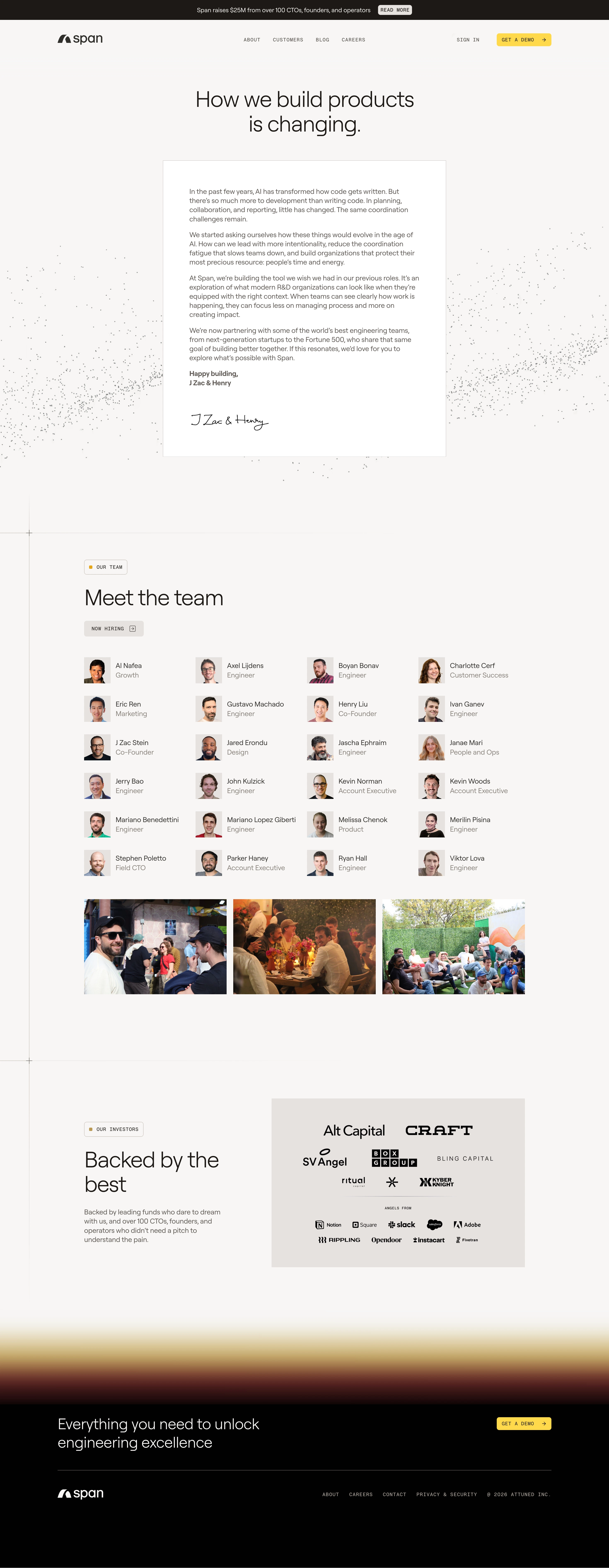

Span About Page

Span
AI-native engineering automations
Designed by


Bookmark
Bookmark

Design with AI
Thank you! Your submission has been received!
Oops! Something went wrong while submitting the form.
# Design from Reference: Span About Page
Create an original, high-fidelity visual design inspired by the reference. Prioritize composition, typography, colors, spacing, and component styling over technical implementation.
## Reference
- **Product:** Span
- **Category:** About Page
- **Screenshot:** https://cdn.prod.website-files.com/5e9dc792e1210c5325f7ebbc/6acad39bc2028efdec71ae85_6acad11a5a5fdf4c302f8c40_cms-1264760d54a2522aca5d2f26.webp
Analyze the screenshot first. If inaccessible, request it rather than guessing.
## Content
{{content.instructions}}
{{content.data}}
Preserve essential messaging and factual accuracy. Adapt structure and copy length for visual balance; never invent product claims.
## Visual Design
### Overall aesthetic
- **Style:** Warm editorial company page with an off-white canvas, thin construction lines, large light-weight headings and small monospaced labels.
- **Character:** A founder letter, people grid and investor marks build a human company narrative; particle dots and a warm blurred transition provide restrained decoration.
- **Contrast:** A black closing region and yellow demo controls punctuate the otherwise muted neutral page.
### Page composition
- **Canvas:** Source 2940 × 7570 pixels, inspected in three crops at 1400px width. Geometry below uses that inspection scale; an approximately 2× capture is plausible but unverified.
- **Header:** Dark announcement bar around 46px high, followed by a spacious logo/navigation row. Main header/footer wrapper spans roughly x132–1267.
- **Hero:** Centered two-line statement above a white founder-letter panel approximately 652 × 681px at x374, y369. Fine gray particles spread behind and beside it.
- **Team:** A ruled section begins below a generous gap. Label, large heading and hiring control precede a four-column, six-row people grid, followed by three equal landscape photographs.
- **Investors:** A split region pairs label, two-line heading and short copy on the left with a pale warm-gray logo board on the right.
- **Closing:** A broad blurred gold/rust-to-black transition leads to a black CTA band and minimal footer with white logo and compact legal/navigation links.
### Information hierarchy
- **Opening statement:** The large centered headline leads to a narrower, readable letter with several paragraphs, bold sign-off and handwritten signature artwork.
- **People:** The team heading introduces repeated square portraits with name and role; a small hiring action sits above the grid.
- **Credibility:** Investor logos are grouped separately from a smaller set of company marks beneath a tiny divider label.
- **Conversion:** Yellow Get a demo buttons appear in the top navigation and closing band; other navigation remains quieter and text-based.
### Typography
- **Hero and sections:** Approximately 50px light-to-regular sans serif with 55–57px line height and tight tracking. Exact family is unverified.
- **Letter and people:** Around 16px regular, roughly 21px line height; letter sign-off is bold, roles use a lighter gray than names.
- **Labels/navigation:** Approximately 11–12px monospaced uppercase with expanded tracking; buttons follow the same compact technical treatment.
- **Closing heading:** Around 34px light sans serif on black, with roughly 42px line height.
- **Signature:** Handwritten artwork is distinct from the text font.
### Colors & surfaces
- **Measured canvas:** #F7F6F5, with white #FFFFFF letter surface.
- **Measured text and dark regions:** #1D1916 warm dark text, #010101 closing area and #5C5752 secondary copy.
- **Measured logo-board neutral:** #E7E2E0; nearby #F6F5F4 and #F7F7F6 occur in subtle surface variations.
- **Accents:** Demo controls appear saturated yellow; section-label dots are warm gold. The transition blends pale gold through rust into black, rather than a flat section fill.
- **Borders:** Fine warm-gray rules structure panels and sections with very little shadow.
### Components
- **Letter panel:** White rectangular sheet with a thin neutral border, sharp corners and roughly 60px padding at inspection scale.
- **Small labels:** Outlined rounded rectangles, about 34px high, combine a tiny gold square with uppercase text.
- **Demo button:** Roughly 126 × 30px with 5px radius, yellow fill, dark monospaced label and right arrow.
- **People entries:** Approximately 60px square portraits beside two-line name/role text. Four evenly spaced columns repeat over six rows without enclosing cards.
- **Photo strip:** Three approximately 328 × 220px photographs separated by roughly 15px gaps, with square corners.
- **Investor board:** A broad rectangular warm-gray panel with black marks arranged in multiple balanced rows; it is visually distinct from individual interactive cards.
- **Footer:** Thin horizontal divider, white logo at left and muted monospaced links aligned along the right. Hover/focus states are not shown.
### Visual rhythm
- **Hero spacing:** Broad whitespace separates navigation, headline and letter; the letter itself has comfortable paragraph gaps.
- **Team cadence:** Portrait rows follow an approximately 88px vertical pitch, while columns share fixed portrait/text alignment.
- **Section boundaries:** Long horizontal rules intersect a subtle vertical guide near x67, marked with small crosshair-like intersections.
- **Major gaps:** Roughly 140–180px of breathing room separates major content regions and the photo strip from the investor section.
- **Closing transition:** The soft color band provides a gradual visual shift before the solid black footer.
### Responsive
- **Observed scope:** Only a desktop long page is supplied; animation and sticky navigation are unverified.
- **Recommended hero:** Reduce headline scale, use fluid letter width and 24px mobile panel padding.
- **Recommended grids:** Reduce people to two columns then one, and stack or horizontally scroll the photograph strip without distorting images.
- **Recommended split section:** Stack investor copy above the logo board; retain supplied marks and sensible minimum logo sizes.
- **Recommended footer:** Wrap navigation and CTA, keeping a clear contrast boundary around the dark closing region.
### Adaptation guidance
- **Preserve:** Warm neutrals, open editorial layout, founder-letter focus, portrait grid and restrained monospaced interface details.
- **Content fidelity:** Replace people, roles, photographs, investor marks and claims only with supplied assets and information.
- **Decoration:** Keep particle fields behind content and mark them decorative; use the warm transition sparingly.
- **Implementation:** Use responsive grids and maximum-width containers; screenshot coordinates are reconstruction aids, not recovered CSS.
- **Interaction:** Provide visible focus treatments and accessible names for arrow-led controls without assuming any behavior from the static capture.
Use this context to reproduce the reference's visual language: layout, typography, colors, spacing, borders, radii, and distinctive elements. The screenshot takes priority if descriptions conflict.
## Direction
{{preferences.fidelityInstructions}}
## Output
{{output.instructions}}
Deliver a polished, cohesive design with precise alignment, hierarchy, and spacing. Produce the requested visual artifact, not just a description. If unsupported, explain the limitation.


Category
Patterns
No items found.
Tech Stack


Added on
January 17, 2026
Similar screens





Upgrade to SaaSFrame Pro now to see similar examples.
Monthly
$18 /month
Billed $18 monthly
Browse all screens & flows
Filter and search screens & flows
Search text in screenshots
Access Figma files
Access mobile versions
Join now
Quarterly
$16 /month
Billed $48 quarterly
Browse all screens & flows
Filter and search screens & flows
Search text in screenshots
Access Figma files
Access mobile versions
Join now
Yearly
$15 /month
Billed $180 yearly
Browse all screens & flows
Filter and search screens & flows
Search text in screenshots
Access Figma files
Access mobile versions
Join now