Generate a new design based on this screen using your own content.
Thank you! Your submission has been received!
Oops! Something went wrong while submitting the form.
# Design from Reference: Solidroad Careers Page
Create an original, high-fidelity visual design inspired by the reference. Prioritize composition, typography, colors, spacing, and component styling over technical implementation.
## Reference
- **Product:** Solidroad
- **Category:** Careers Page
- **Screenshot:** https://cdn.prod.website-files.com/5e9dc792e1210c5325f7ebbc/6acad3a1c2028efdec71af33_6acad14450cf4647822be572_cms-7e4c58d918c6ff7b0e787fe1.webp
Analyze the screenshot first. If inaccessible, request it rather than guessing.
## Content
{{content.instructions}}
{{content.data}}
Preserve essential messaging and factual accuracy. Adapt structure and copy length for visual balance; never invent product claims.
## Visual Design
Use this context to reproduce the reference's visual language: layout, typography, colors, spacing, borders, radii, and distinctive elements. The screenshot takes priority if descriptions conflict.
## Direction
{{preferences.fidelityInstructions}}
## Output
{{output.instructions}}
Deliver a polished, cohesive design with precise alignment, hierarchy, and spacing. Produce the requested visual artifact, not just a description. If unsupported, explain the limitation.
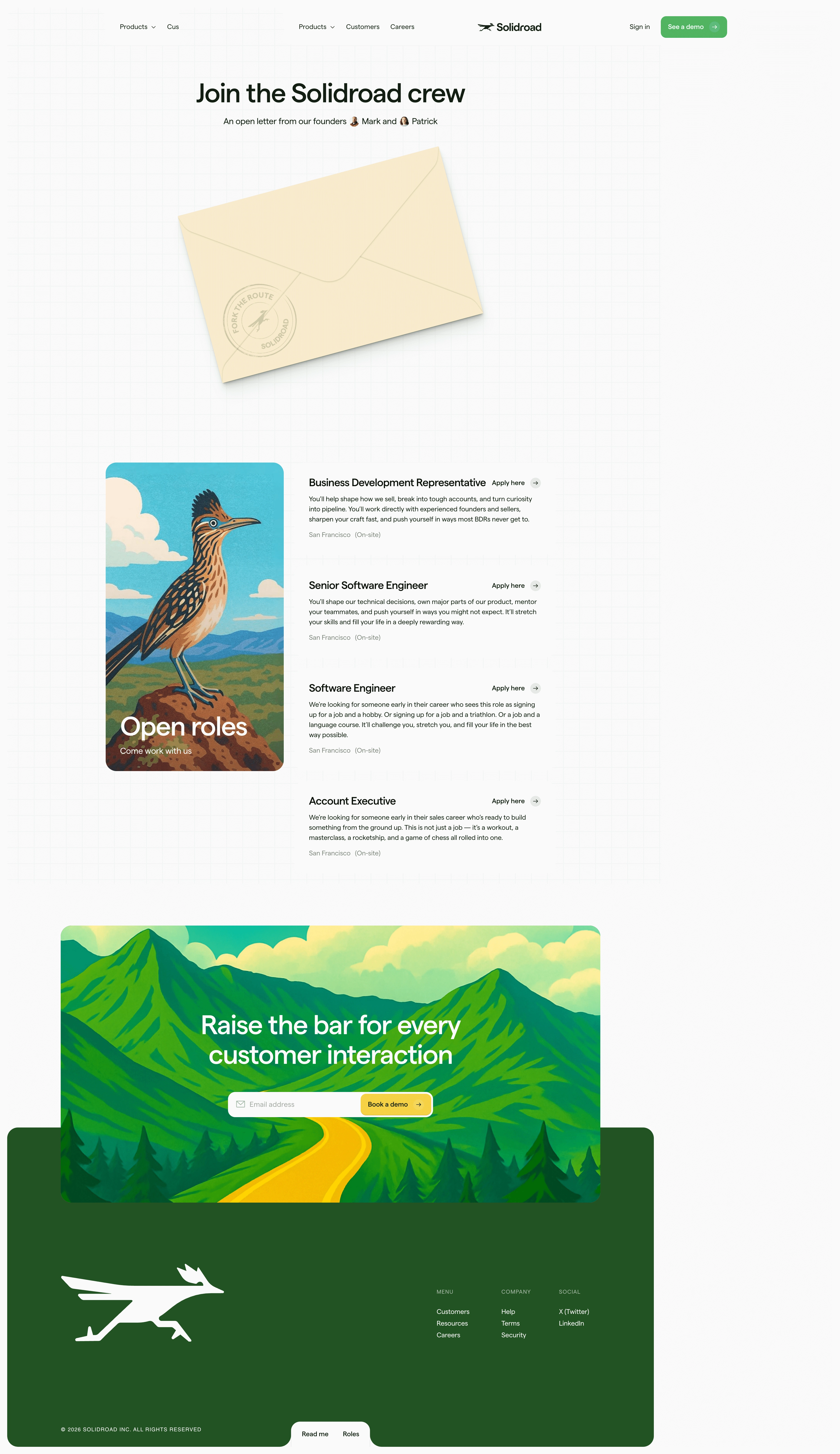
The illustrated roadrunner bird is the first thing that grabs you. It's bold, unexpected, and immediately sets Solidroad apart from every other SaaS careers page using generic stock photos. That hand-drawn quality carries through to the envelope illustration at the top, which frames the founders' open letter in a way that feels personal and intentional.
Smart Use of Restraint
The layout is clean but not boring. Job listings sit in a simple stacked format on the right while the bird illustration anchors the left side, creating a natural visual hierarchy. Green accent colors pop against the mostly white background without overwhelming anything. The typography is confident. Big serif headings mixed with smaller sans-serif body text give it editorial energy.
The Footer CTA Hits Different
That bottom section with the winding path through green mountains is gorgeous. "Raise the bar for every customer interaction" feels earned after scrolling through such a well-crafted page. The whole thing reads like a company that actually cares about craft, which is exactly what a careers page should communicate.