Overall Style and Aesthetic
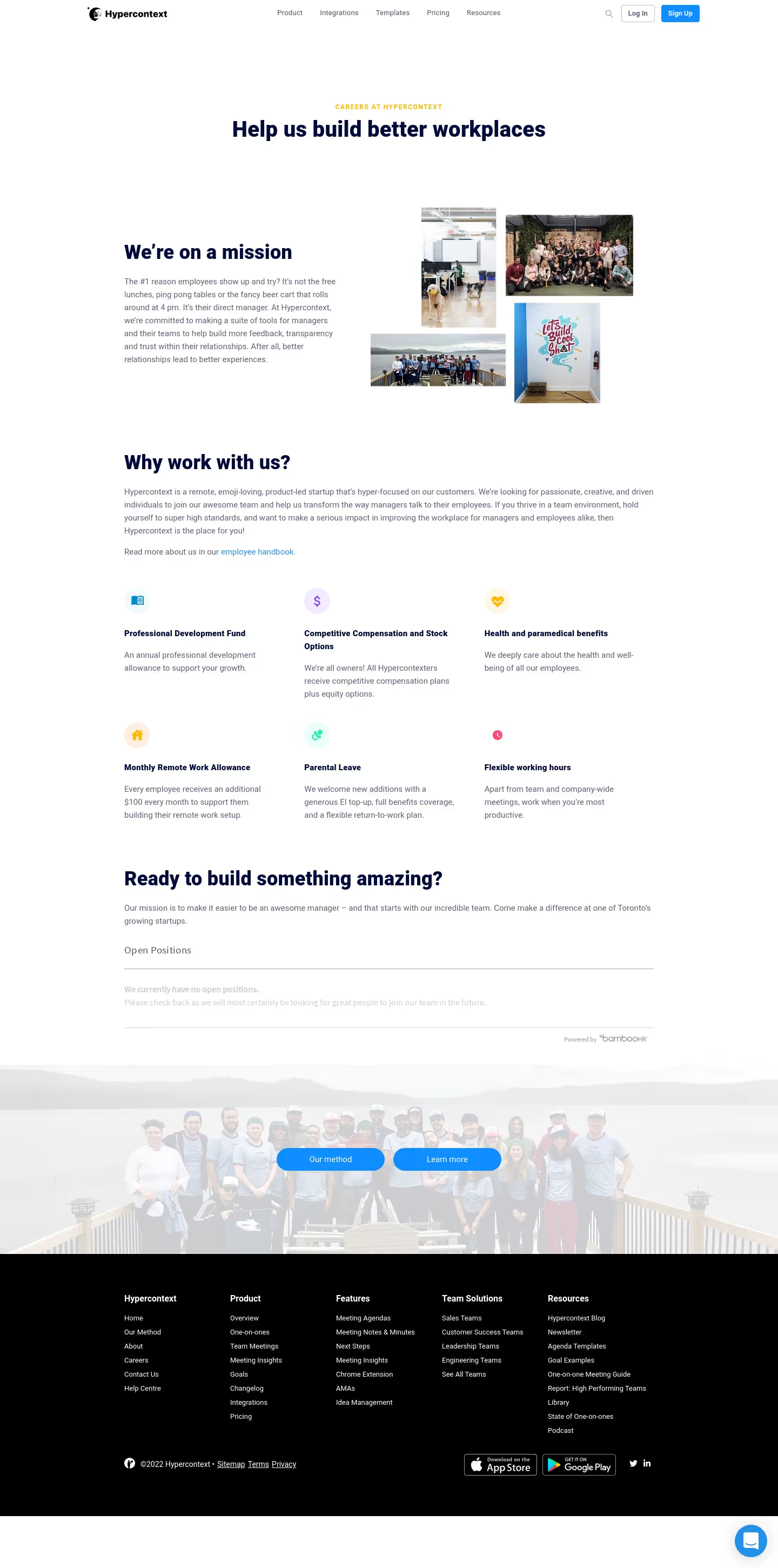
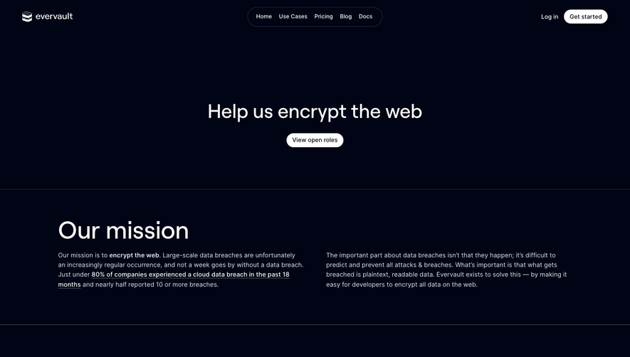
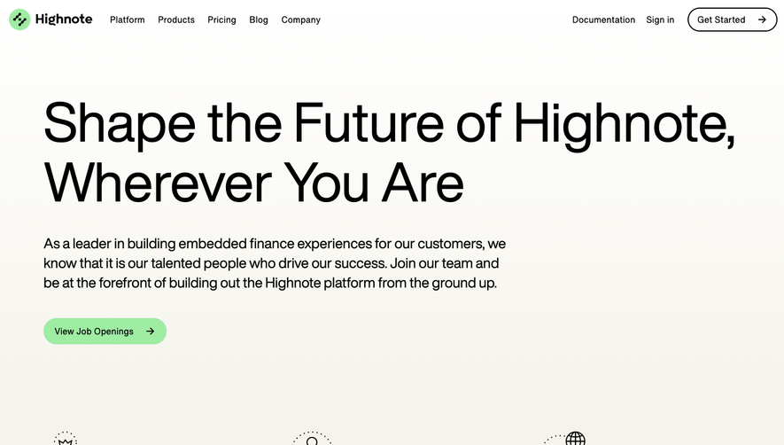
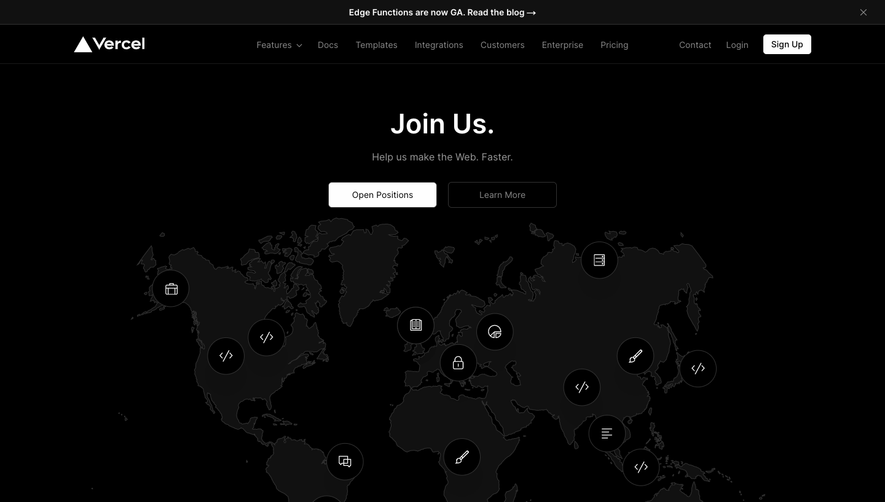
SoapboxHQ’s careers page radiates a playful yet polished energy, blending a modern SaaS sensibility with vibrant, friendly visuals. The minimalistic layout is balanced by thoughtfully chosen bursts of color and engaging illustrations, making the site feel accessible and lively without sacrificing professionalism. Layout and Structure
The page structure is direct and user-centric. An inviting hero section immediately sets the tone, followed by clear subsections: company culture, benefits, current openings, and a call-to-action. Ample white space ensures each section stands out, resulting in a flow that feels organized and easy to navigate. Visual Elements
Hand-drawn, whimsical illustrations are a cornerstone of the site’s identity, supported by custom icons that reinforce each value and benefit. Team photography humanizes the brand, showing real faces and candid interactions. Subtle micro-animations bring select elements to life, keeping users engaged as they scroll. Color Palette and Typography
Bright, optimistic primary colors—such as bold blues and warm corals—anchor the design, complemented by soft off-whites. The headline font is geometric and welcoming, while clean, sans-serif body text ensures readability. Visual hierarchy is maintained through size, color, and weight contrasts. User Experience Patterns
Navigation is effortless: a sticky menu with clear links, recurring CTAs (“Join Us,” “See Open Roles”) guiding the journey, and scannable, bulleted content. The job listings use accordion interactions for details, keeping the page concise yet informative. Application forms open modally, minimizing disruption to the browsing experience. Unique or Notable Design Choices
Quirky illustrated avatars, personable microcopy, and a focus on values-driven messaging create a memorable impression. The page exudes inclusivity and excitement, encouraging applicants by making the process feel friendly and transparent—traits that set it apart from more corporate competitors.