Generate a new design based on this screen using your own content.
Thank you! Your submission has been received!
Oops! Something went wrong while submitting the form.
# Design from Reference: Evervault Careers Page
Create an original, high-fidelity visual design inspired by the reference. Prioritize composition, typography, colors, spacing, and component styling over technical implementation.
## Reference
- **Product:** Evervault
- **Category:** Careers Page
- **Screenshot:** https://cdn.prod.website-files.com/5e9dc792e1210c5325f7ebbc/6acbbdadd6be908889c4e7a3_6acbbce56b6ddc4c143bb69b_cms-0c7ec0fe3c3f76b0b2d76f08.webp
Analyze the screenshot first. If inaccessible, request it rather than guessing.
## Content
{{content.instructions}}
{{content.data}}
Preserve essential messaging and factual accuracy. Adapt structure and copy length for visual balance; never invent product claims.
## Visual Design
Use this context to reproduce the reference's visual language: layout, typography, colors, spacing, borders, radii, and distinctive elements. The screenshot takes priority if descriptions conflict.
## Direction
{{preferences.fidelityInstructions}}
## Output
{{output.instructions}}
Deliver a polished, cohesive design with precise alignment, hierarchy, and spacing. Produce the requested visual artifact, not just a description. If unsupported, explain the limitation.
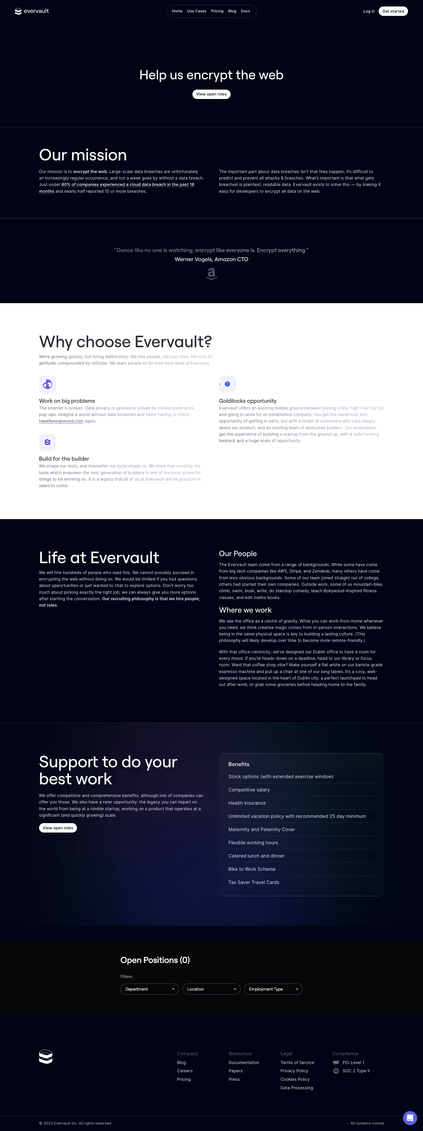
Evervault’s Careers page embodies a futuristic, minimalist aesthetic, exuding both technical prowess and approachability. Sleek geometries and generous whitespace create a refined, almost science-fiction ambiance, ideal for a security-focused SaaS brand. Visual restraint is balanced with playful microinteractions and inviting copy, ensuring the site feels both cutting-edge and accessible.
Layout and Structure
The structure is clean and purposeful: a bold hero banner introduces the brand mission with a succinct headline and subtle animation. Below, content is segmented into digestible blocks—open roles, benefits, and company values—each isolated for clarity, with ample breathing room. The navigation is sticky and unobtrusive, allowing effortless movement across sections.
Visual Elements
Custom illustrations and fluid SVG shapes infuse personality while reinforcing the brand’s tech-rooted ethos. Subtle, looping animations enliven the experience without overwhelming, creating a dynamic impression. Minimal use of staff photography conveys authenticity alongside the striking graphic palette.
Color Palette and Typography
A high-contrast color scheme anchors the identity: deep inky backgrounds, electric purples and blues, and crisp white text. Typography is futuristic yet highly legible—sans-serif fonts with distinct weight hierarchy guide attention from hero headlines to body content, blending clarity with subtle flair.
User Experience Patterns
Intuitive navigation and clear CTAs (“View Open Roles”) streamline the journey. Collapsible sections for job descriptions and smooth anchor scrolling enhance usability, while the “Apply” process is breezy and uncluttered. Strategic visual cues and hovers guide interaction, ensuring engagement at every stage.
Unique or Notable Design Choices
Noteworthy is the site’s ability to feel both robust and human: technical motifs never overpower warmth, and microcopy throughout builds trust. The interplay of color, motion, and structure provides a blueprint for conveying complexity and approachability—a hallmark of outstanding SaaS design.