Overall Style and Aesthetic
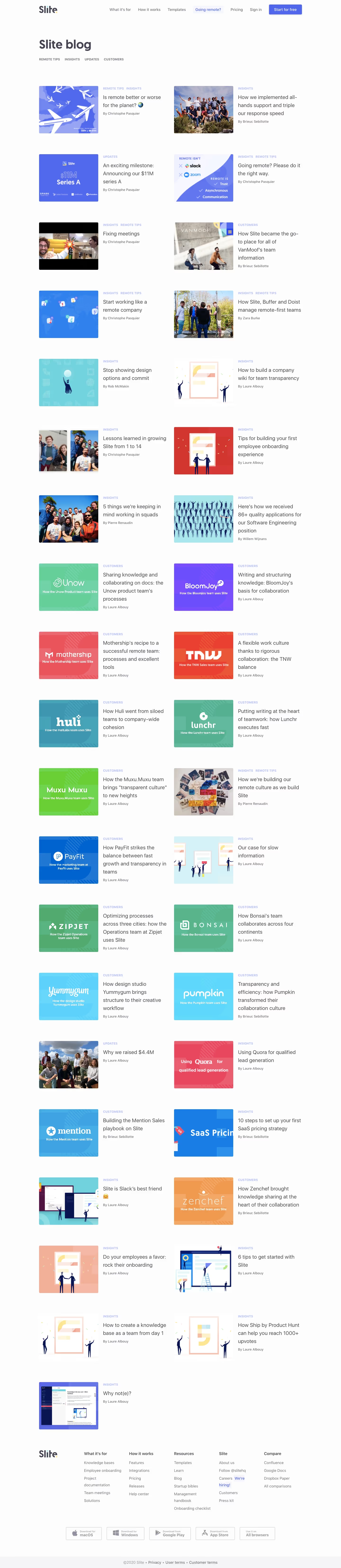
Slite’s blog page embodies a crisp, minimalist aesthetic fused with a modern sensibility. The look is approachable yet polished, balancing whitespace with understated, playful accents. The design radiates a professional, trustworthy tone while maintaining a friendly, engaging vibe—ideal for SaaS audiences. Layout and Structure
The layout is cleanly segmented, starting with a visually inviting hero area featuring a snug headline and subtle intro, drawing visitors in without overwhelming them. Below, the blog articles are neatly arranged in a grid, each card prominently displaying eye-catching cover art, a succinct title, and meta info for effortless content scanning. There’s no clutter from testimonials or pricing—content remains central, while the sticky, compact header and tidy footer enhance orientation and flow. Visual Elements
Flat illustrations and playful, on-brand icons pepper the page, infusing energy and clarity. The featured images for blog posts are simple yet memorable, using abstract shapes and soft color overlays rather than busy photographs, reinforcing a light, digital feel. Subtle hover states and micro-interactions bring a sense of interactivity without distraction. Color Palette and Typography
The palette spotlights cool, desaturated pastels—soft blues, fresh greens, and gentle purples—contrasted by warm, inviting highlights. Typography is contemporary and highly readable, with a strong hierarchy: bold sans-serif headlines stand out, paired with lighter body fonts, guiding users’ eyes fluidly through the page. User Experience Patterns and Unique Choices
Navigation remains anchored, always within reach, while CTAs like “Subscribe” or “Read more” are clearly differentiated using accent colors and unobtrusive hover effects. Standout details include the restrained use of animation and the editorial, almost magazine-like presentation of posts—offering an inspiring, seamless browsing experience that feels both innovative and effortlessly usable.