Overall Style and Aesthetic
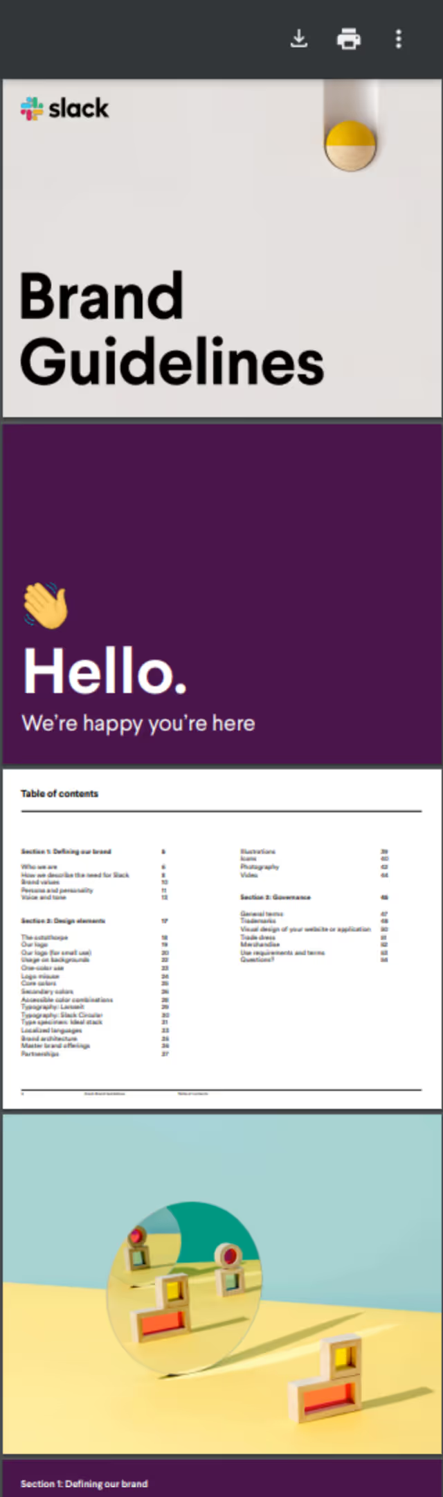
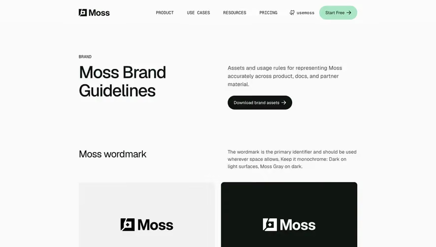
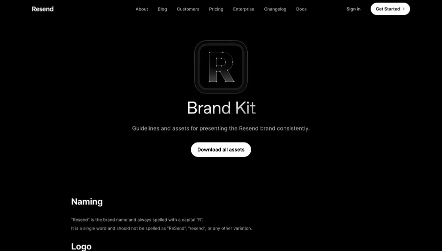
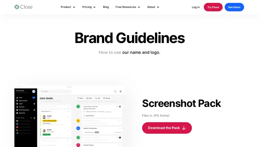
The Slack Brand Guidelines page embodies a modern, minimalist aesthetic fused with a playful yet professional vibe. Crisp white space sets the stage for colorful elements that echo Slack’s signature palette, delivering an approachable and energetic tone without overwhelming the reader. The design balances creativity with clarity, making the resource feel both trustworthy and innovative. Layout and Structure
The structure is straightforward and purposeful—a concise hero section introduces the page, followed by logically grouped sections that detail logo usage, color guidelines, typography, and imagery. Each section is framed with generous margins, promoting readability and focus. Information is presented in digestible segments, allowing users to scan or deep-dive as needed. Visual Elements
Vibrant illustrations and dynamic logo treatments illustrate branding do’s and don’ts, while real-world mockups and iconography demonstrate practical application. There are no overwhelming animations, but thoughtful visuals keep users engaged and enhance comprehension. The restrained photography supports, rather than distracts from, the guidelines. Color Palette and Typography
Slack’s familiar spectrum—plum, green, yellow, blue, and coral—carries through, each used intentionally to guide the eye and signal hierarchy. Typography is clean and modern: headings use bold, geometric sans-serif fonts, while body text remains understated for optimal legibility. Hierarchy is clear, with varied sizing and spacing guiding the visual flow. User Experience Patterns and Unique Choices
Navigation is minimal, relying on intuitive sectional homes rather than complex menus. Downloadable assets and clear CTAs are strategically placed, creating a focused, frictionless experience. Unique touches, such as demonstrating logo misuse with playful “wrong” examples, inject personality and ensure the guidelines are memorable and user-friendly.