
Thank you! Your submission has been received!
Oops! Something went wrong while submitting the form.
Get SaaSFrame Pro
Monthly
$18
Quarterly
$48
Yearly
$180
Upgrade to access this feature
Browse all screens & flows
Filter and search screens & flows
Access Figma files
Access mobile versions
Bookmark screens & flows
Join now
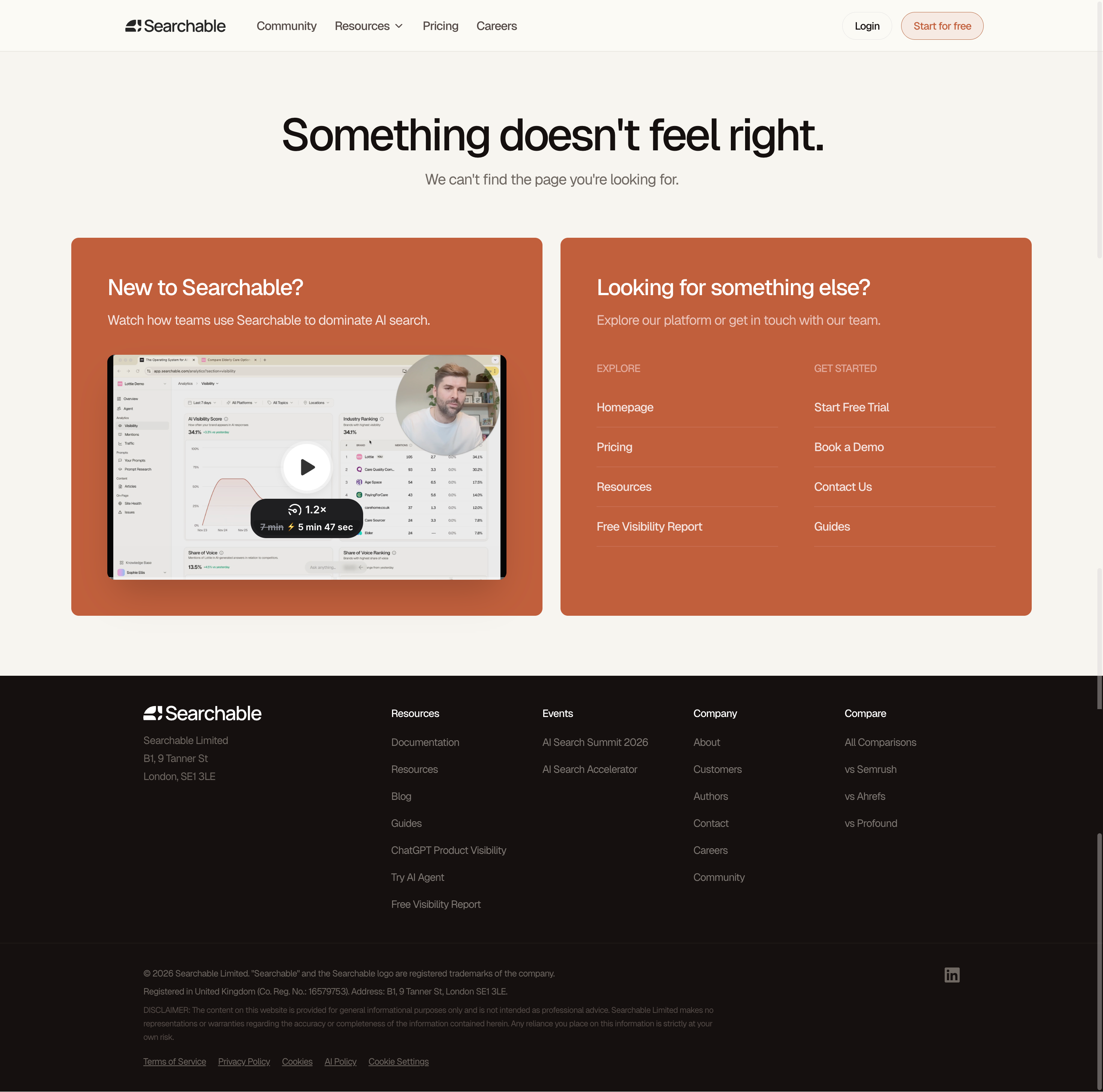
Searchable 404 Page

Searchable
Full Stack Visibility & Analytics for AI SEO
Designed by
No items found.

Bookmark
Bookmark

Design with AI
Thank you! Your submission has been received!
Oops! Something went wrong while submitting the form.
# Design from Reference: Searchable 404 Page
Create an original, high-fidelity visual design inspired by the reference. Prioritize composition, typography, colors, spacing, and component styling over technical implementation.
## Reference
- **Product:** Searchable
- **Category:** 404 Page
- **Screenshot:** https://cdn.prod.website-files.com/5e9dc792e1210c5325f7ebbc/6acad397c2028efdec71ae2d_6acad111ba38b07cf05d59f7_cms-45e8b7ccf38705779d0ca696.webp
Analyze the screenshot first. If inaccessible, request it rather than guessing.
## Content
{{content.instructions}}
{{content.data}}
Preserve essential messaging and factual accuracy. Adapt structure and copy length for visual balance; never invent product claims.
## Visual Design
### Overall aesthetic
- **Character:** A branded missing-page screen uses warm cream, terracotta recovery panels and a nearly black footer.
- **Capture scale:** The screenshot measures 2940 × 2912 pixels. Approximate CSS dimensions assume a 1470 × 1456 viewport at 2× density; this is unverified.
- **Tone:** Direct messaging and useful alternatives replace a decorative error illustration, while retaining the site's full navigation and footer.
### Page composition
- **Header:** A cream navigation bar contains the Searchable brand, primary links, login and a terracotta outlined signup pill.
- **Error message:** A large centered heading and muted explanatory sentence occupy an open region below the header.
- **Recovery panels:** Two equal-width terracotta rectangles sit side by side. The left promotes an introductory video; the right presents grouped destination links.
- **Video:** A large dashboard thumbnail with presenter inset, central play control and playback-speed overlay fills the left panel's lower area.
- **Footer:** A full-width dark region contains brand/company details and four link columns, followed by legal text, policy links and a small social icon.
### Information hierarchy
- **Error context:** The large heading communicates that something is wrong; the smaller sentence clarifies that the requested page cannot be found.
- **New visitor route:** The left panel introduces the product with a heading, one sentence and a prominent video preview.
- **Navigation recovery:** The right panel divides destinations into Explore and Get Started groups with four links each.
- **Persistent navigation:** Header and footer offer additional routes without obscuring the primary recovery choices.
### Typography
- **Family:** A clean sans-serif is visible; exact font identity is unverified.
- **Error heading:** Approximately 56–60px CSS, medium weight, tight tracking and around 66px line-height.
- **Explanatory text:** Approximately 20px regular, muted gray.
- **Panel headings:** Approximately 28–30px medium, white, with 36px line-height.
- **Panel body and links:** Approximately 16–18px; small group labels are uppercase and lower contrast.
- **Footer:** Group headings around 14px, links around 14px and legal copy around 11–12px.
### Colors & surfaces
- **Page canvas:** Sampled #F7F5F0 supplies the warm light background.
- **Header variation:** Sampled #FBFAF5 provides a subtly lighter cream.
- **Recovery panels:** Sampled #C15F3C supplies the dominant terracotta.
- **Footer:** Sampled #15100F supplies the dark warm near-black surface.
- **Neutral details:** Sampled #EBEBEB and #E9E7E5 occur in pale interface/media details.
- **Text:** Near-black headlines sit on cream; white and pale warm text contrast with terracotta, while footer links are muted gray.
### Components
- **Recovery cards:** Two approximately 630px-wide CSS panels use around 10px radii and 48px internal padding, with a roughly 24px gap.
- **Video preview:** A wide rounded image contains a central white circular play control and a dark playback-speed badge near the lower center.
- **Recovery link columns:** Two equal groups use small uppercase labels and fine translucent horizontal rules beneath each destination.
- **Header actions:** Login is a quiet pale outlined pill; Start for free uses a thin terracotta border and matching text.
- **Footer groups:** A broad brand/address column precedes compact Resources, Events, Company and Compare columns.
- **Legal region:** A fine horizontal rule separates footer navigation from dense small text and underlined policy links.
### Visual rhythm
- **Content width:** The recovery area uses approximately 96px outer gutters, with narrower header/footer content alignment.
- **Vertical spacing:** Large gaps separate the header, error message and recovery cards; about 80px separates the cards from the footer.
- **Panel consistency:** Shared top alignment, padding and height make the video and link routes feel equally weighted.
- **Footer density:** Compact link rows and legal text contrast with the open error region.
### Responsive
- **Evidence limit:** Only this desktop missing-page state is visible; video interaction and responsive behavior are unverified.
- **Panel recommendation:** Stack recovery panels, keeping the error message and key links visible before the full footer.
- **Typography recommendation:** Reduce the main heading and allow natural wrapping without compressing the explanatory line.
- **Navigation recommendation:** Collapse primary links and stack footer groups with clear labels.
- **Video recommendation:** Scale the preview proportionally and preserve a large accessible play target.
### Adaptation guidance
- **Recovery design:** Provide a concise explanation and meaningful product/home/support routes, with no invented error diagnostics.
- **Brand consistency:** Reuse the site's cream, terracotta and dark-footer palette rather than introducing a separate error theme.
- **Navigation clarity:** Keep recovery links explicit and grouped by intent; avoid relying on the video as the only route forward.
- **Accessibility:** Use a clear page title, semantic links, keyboard focus and an accessible video label.
- **Content scope:** The screenshot establishes the visible recovery options, not the availability or behavior of their destinations.
Use this context to reproduce the reference's visual language: layout, typography, colors, spacing, borders, radii, and distinctive elements. The screenshot takes priority if descriptions conflict.
## Direction
{{preferences.fidelityInstructions}}
## Output
{{output.instructions}}
Deliver a polished, cohesive design with precise alignment, hierarchy, and spacing. Produce the requested visual artifact, not just a description. If unsupported, explain the limitation.


Category
Patterns
No items found.
Tech Stack

Added on
January 17, 2026
Similar screens




Upgrade to SaaSFrame Pro now to see similar examples.
Monthly
$18 /month
Billed $18 monthly
Browse all screens & flows
Filter and search screens & flows
Search text in screenshots
Access Figma files
Access mobile versions
Join now
Quarterly
$16 /month
Billed $48 quarterly
Browse all screens & flows
Filter and search screens & flows
Search text in screenshots
Access Figma files
Access mobile versions
Join now
Yearly
$15 /month
Billed $180 yearly
Browse all screens & flows
Filter and search screens & flows
Search text in screenshots
Access Figma files
Access mobile versions
Join now