Design with AI
Generate a new design based on this screen using your own content.
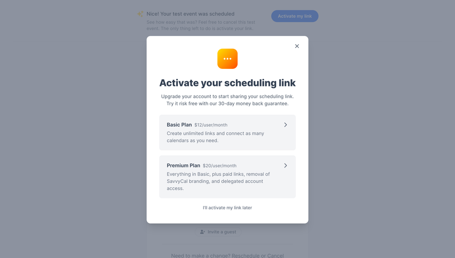
# Design from Reference: SavvyCal User Onboarding
Create an original, high-fidelity visual design inspired by the reference. Prioritize composition, typography, colors, spacing, and component styling over technical implementation.
## Reference
- **Product:** SavvyCal
- **Category:** User Onboarding
- **Screenshot:** https://cdn.prod.website-files.com/5e9dc792e1210c5325f7ebbc/6acb685d3f1023ca377079a5_6acb672793f403582dfdbb8c_cms-cbfc80c738ef024ea426756a.webp
Analyze the screenshot first. If inaccessible, request it rather than guessing.
## Content
{{content.instructions}}
{{content.data}}
Preserve essential messaging and factual accuracy. Adapt structure and copy length for visual balance; never invent product claims.
## Visual Design
### Overall aesthetic
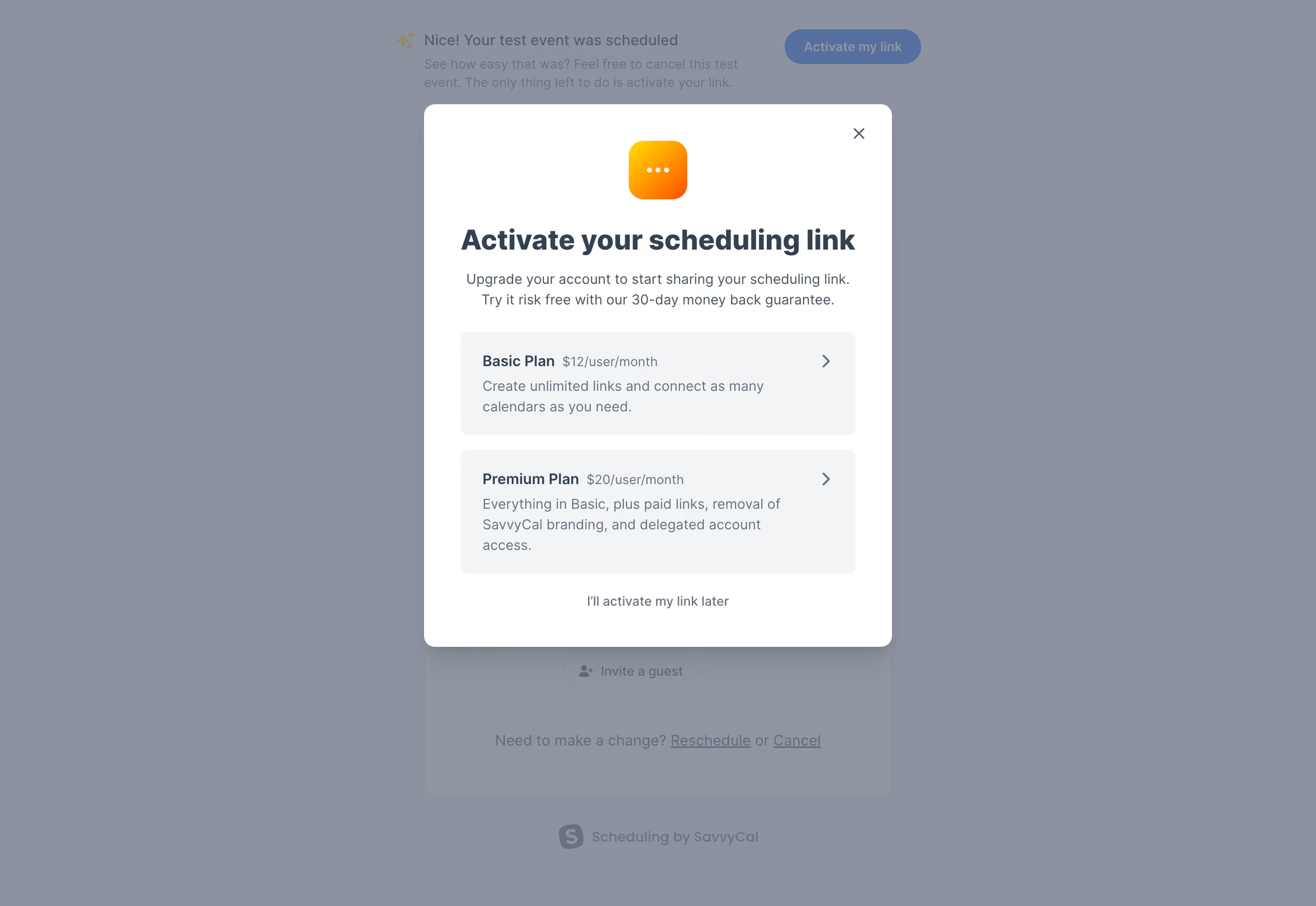
- **Style:** Compact scheduling activation upsell modal above a dimmed booking confirmation.
- **Character:** White dialog, dark slate title, pale plan cards, warm gradient icon.
### Page composition
- **Canvas:** 2880 × 1982 image px; CSS estimates assume an unverified 2× capture.
- **Modal:** Approximately 510 × 594 CSS px, centered.
- **Sequence:** Small icon, title, two-line explanation, Basic/Premium options, and defer link.
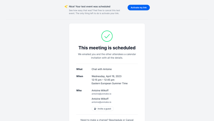
- **Background:** Confirmation banner and event card remain dimmed.
### Information hierarchy
- **Primary:** Activate your scheduling link title.
- **Options:** Two stacked plan cards with price inline beside name.
- **Action affordance:** Right chevrons signal selectable plans.
- **Secondary:** Activate later text below plans and close X.
### Typography
- **Family:** Neutral sans serif; exact family unverified.
- **Title:** Approximately 30 CSS px, bold.
- **Body:** Approximately 16px with 24px line-height.
- **Plan labels:** Approximately 16px semibold; prices 14px.
- **Precision:** Values and scale are estimates.
### Colors & surfaces
- **Modal:** #FFFFFF.
- **Plan surfaces:** #F3F4F6.
- **Dimmed canvas:** #8C929F and #8F95A1.
- **Text:** #344153; subdued background blue #566F9F.
- **Icon:** Yellow-to-orange gradient.
- **Precision:** Backdrop samples include overlay.
### Components
- **Modal:** Approximately 12px CSS radius and soft shadow.
- **Icon:** Rounded gradient square with three white dots.
- **Plan cards:** Roughly 430px wide, 8px radius, 24px padding.
- **Close:** Small X upper-right.
- **Defer:** Centered quiet text action.
### Visual rhythm
- **Spacing:** Centered heading/icon contrasts with left-aligned plan details.
- **Cards:** Consistent gap and aligned chevrons.
- **Whitespace:** Broad padding isolates the decision.
### Responsive
- **Observed:** Desktop only.
- **Recommendation:** Fluid modal width, wrapping descriptions, internal scrolling if needed.
- **Plans:** Keep prices tied clearly to their billing units.
### Adaptation guidance
- **Preserve:** Activation explanation, two plan choices, and clear defer option.
- **Content:** Use current supplied prices/features/guarantees.
- **Behavior:** Plan purchase and activation are not demonstrated.
Use this context to reproduce the reference's visual language: layout, typography, colors, spacing, borders, radii, and distinctive elements. The screenshot takes priority if descriptions conflict.
## Direction
{{preferences.fidelityInstructions}}
## Output
{{output.instructions}}
Deliver a polished, cohesive design with precise alignment, hierarchy, and spacing. Produce the requested visual artifact, not just a description. If unsupported, explain the limitation.