
Thank you! Your submission has been received!
Oops! Something went wrong while submitting the form.
Get SaaSFrame Pro
Monthly
$18
Quarterly
$48
Yearly
$180
Upgrade to access this feature
Browse all screens & flows
Filter and search screens & flows
Access Figma files
Access mobile versions
Bookmark screens & flows
Join now
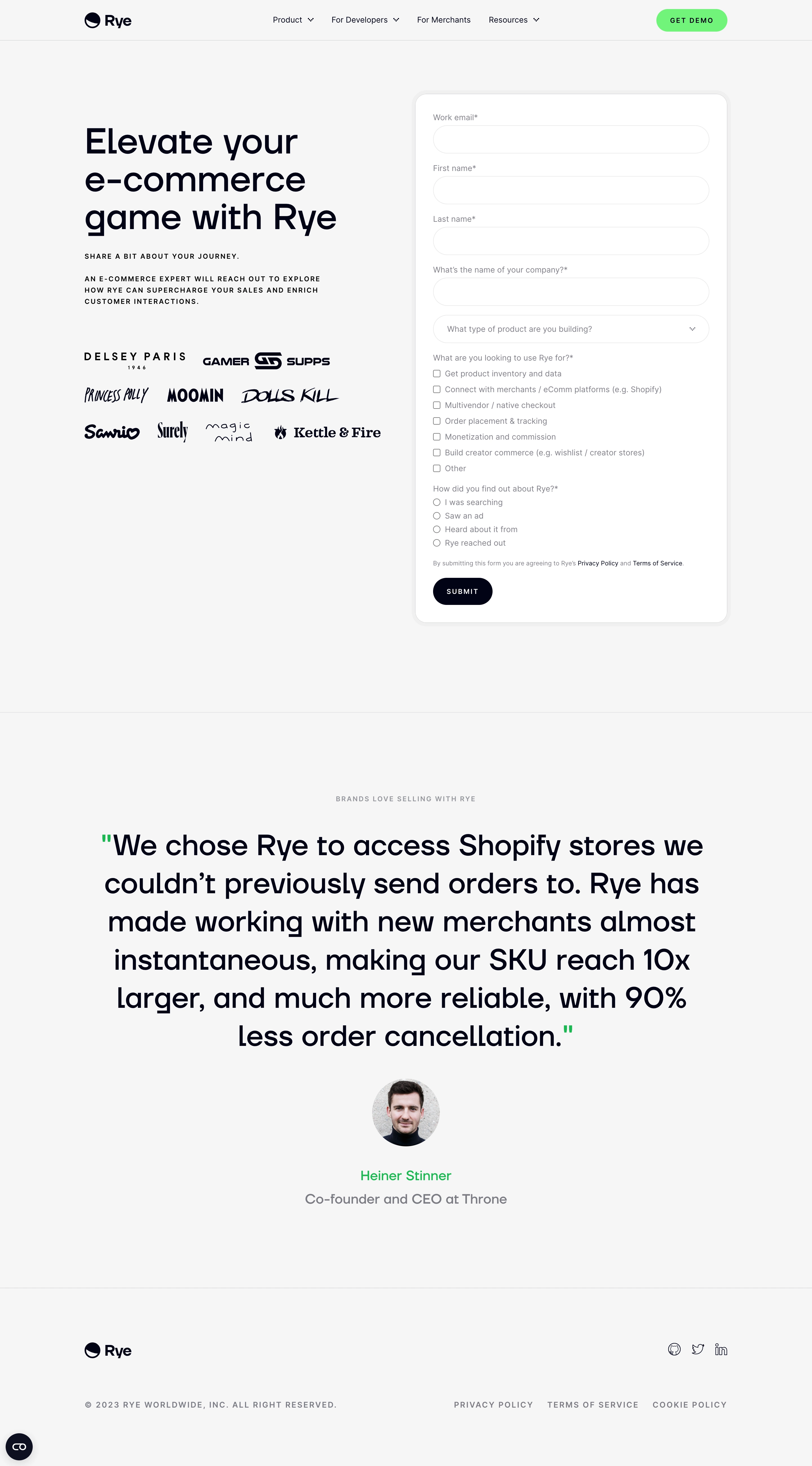

Rye Demo Request

Rye
Commerce superpowers for any context
Designed by
No items found.

Bookmark
Bookmark

Design with AI
Thank you! Your submission has been received!
Oops! Something went wrong while submitting the form.
# Design from Reference: Rye Demo Request
Create an original, high-fidelity visual design inspired by the reference. Prioritize composition, typography, colors, spacing, and component styling over technical implementation.
## Reference
- **Product:** Rye
- **Category:** Demo Request
- **Screenshot:** https://cdn.prod.website-files.com/5e9dc792e1210c5325f7ebbc/6acadcae8c9a73ab05f130df_6acadc0bd05a3f53c0a8684c_cms-0a38a2c8c95eee76fb593940.webp
Analyze the screenshot first. If inaccessible, request it rather than guessing.
## Content
{{content.instructions}}
{{content.data}}
Preserve essential messaging and factual accuracy. Adapt structure and copy length for visual balance; never invent product claims.
## Visual Design
### Overall aesthetic
- **Character:** A restrained commerce demo-request page with oversized dark typography, neon-green accents and a rounded white form on a light-gray canvas.
- **Evidence scale:** Original 2880 × 5196 pixels, inspected through both readable crops. CSS estimates assume an unverified 2× capture scale.
### Page composition
- **Header:** Rye logo left, centered product/developer/merchant/resource navigation and a green Get Demo pill right.
- **Main:** Two-column layout within an approximately 1140 px region. Left column contains a three-line large heading, uppercase supporting copy and nine black customer logos; right contains a roughly 560 px form card.
- **Form:** Four identity/company fields, product-type dropdown, seven use-case checkboxes, four discovery-source radio options, legal sentence and Submit pill.
- **Testimonial:** Below a divider, a wide centered oversized quotation is followed by a circular portrait, green author name and muted role.
- **Footer:** Brand and social icons precede a tracked uppercase copyright/legal row; a small dark utility bubble sits at lower left.
### Information hierarchy
- **Main proposition:** Large left-aligned heading is the primary opening landmark.
- **Form priority:** The white card separates data entry from marketing copy; required markers appear beside several labels.
- **Selection types:** Square checkboxes and circular radio choices distinguish multiple and single selections.
- **Social proof:** Customer logos support the opening; the large quotation becomes the strongest lower-page element.
- **Actions:** Green header action and dark form submit stand apart from small legal links.
### Typography
- **Hero:** Unverified sans-serif, approximately 60–64 px medium with 66–70 px line height and tight tracking.
- **Uppercase copy:** Around 12 px semibold with expanded tracking and 20 px line height.
- **Form:** Approximately 14 px regular labels/options; legal line about 11–12 px.
- **Quote:** Approximately 48–52 px regular with 68 px line height, centered.
- **Attribution/footer:** Around 24 px author/role and 13–14 px tracked uppercase legal labels.
### Colors & surfaces
- **Canvas:** Measured #F6F6F6.
- **Form:** White #FFFFFF with light-gray edge/shadow, including #F0F0F0.
- **Primary ink:** Near-black navy #010315 anchors heading, logo and Submit.
- **Secondary copy:** Gray #80808A labels and attribution.
- **Accent:** Vivid green #00F86A appears in the header action, quotation marks and author emphasis.
### Components
- **Form shell:** Approximately 560 × 940 px, around 24 px radius, thin pale border and broad light-gray outer ring/shadow.
- **Inputs:** Approximately 490 × 50 px pill-shaped white outlined fields; labels sit 8–10 px above.
- **Dropdown:** Matching pill with placeholder and trailing chevron.
- **Options:** Small native-style checkbox/radio marks with compact rows and muted labels.
- **Submit:** Approximately 106 × 48 px dark pill, uppercase white tracked text.
- **Logo grid:** Nine varied customer wordmarks arranged in three loose rows, monochrome and left-aligned with hero copy.
- **Testimonial:** Broad unboxed quote, green punctuation, roughly 120 px circular portrait and centered attribution.
- **Footer:** Thin rule, small outline social icons and spaced legal links.
### Visual rhythm
- **Form cadence:** Roughly 24 px separates input groups; option rows use a tighter approximately 28 px pitch.
- **Column balance:** Large headline and logo grid occupy less height than the form, leaving quiet whitespace below left content.
- **Section spacing:** Large margins separate form, testimonial and footer.
- **Alignment:** Form labels/options share a consistent inset while the testimonial switches to centered composition.
### Responsive
- **Observed limit:** Desktop only; no smaller layout is verified.
- **Recommendation:** Stack proposition before the form and keep fields fluid with 20–24 px gutters.
- **Quote handling:** Reduce display size and preserve comfortable line length on narrow screens.
- **Footer:** Wrap legal and social links into clear rows.
### Adaptation guidance
- **Retain:** Pair a focused demo form with concise positioning and credible visual proof.
- **Implement:** Use pill-shaped controls, a softly separated form shell and a limited neon-green accent.
- **Verify:** Confirm fonts, actual dimensions and form validation separately; no demo request was submitted and testimonial claims are not independently verified.
Use this context to reproduce the reference's visual language: layout, typography, colors, spacing, borders, radii, and distinctive elements. The screenshot takes priority if descriptions conflict.
## Direction
{{preferences.fidelityInstructions}}
## Output
{{output.instructions}}
Deliver a polished, cohesive design with precise alignment, hierarchy, and spacing. Produce the requested visual artifact, not just a description. If unsupported, explain the limitation.


Category
Patterns
No items found.
Tech Stack

Added on
August 7, 2023
Similar screens
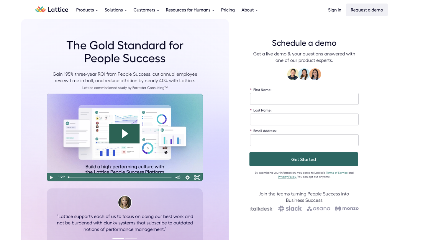


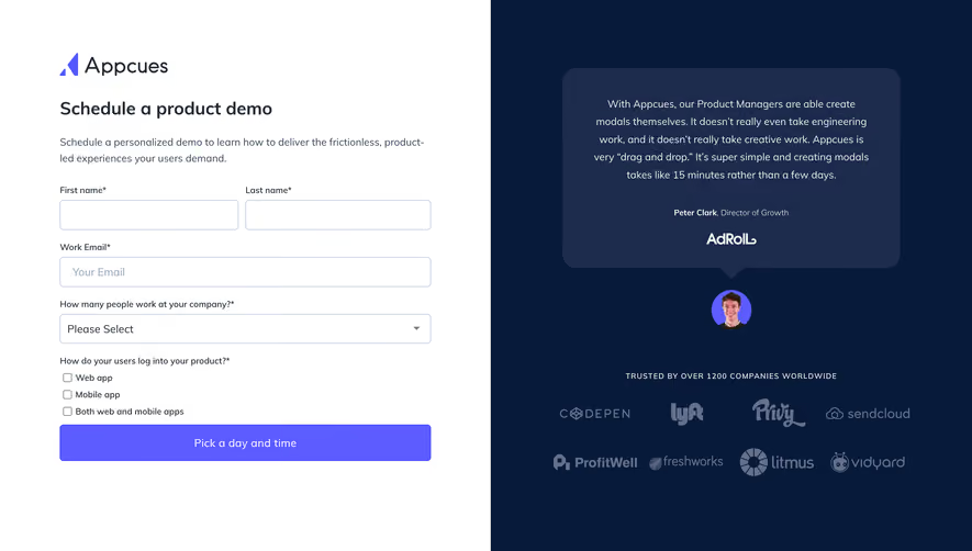



Upgrade to SaaSFrame Pro now to see similar examples.
Monthly
$18 /month
Billed $18 monthly
Browse all screens & flows
Filter and search screens & flows
Search text in screenshots
Access Figma files
Access mobile versions
Join now
Quarterly
$16 /month
Billed $48 quarterly
Browse all screens & flows
Filter and search screens & flows
Search text in screenshots
Access Figma files
Access mobile versions
Join now
Yearly
$15 /month
Billed $180 yearly
Browse all screens & flows
Filter and search screens & flows
Search text in screenshots
Access Figma files
Access mobile versions
Join now