
Thank you! Your submission has been received!
Oops! Something went wrong while submitting the form.
Get SaaSFrame Pro
Monthly
$18
Quarterly
$48
Yearly
$180
Upgrade to access this feature
Browse all screens & flows
Filter and search screens & flows
Access Figma files
Access mobile versions
Bookmark screens & flows
Join now
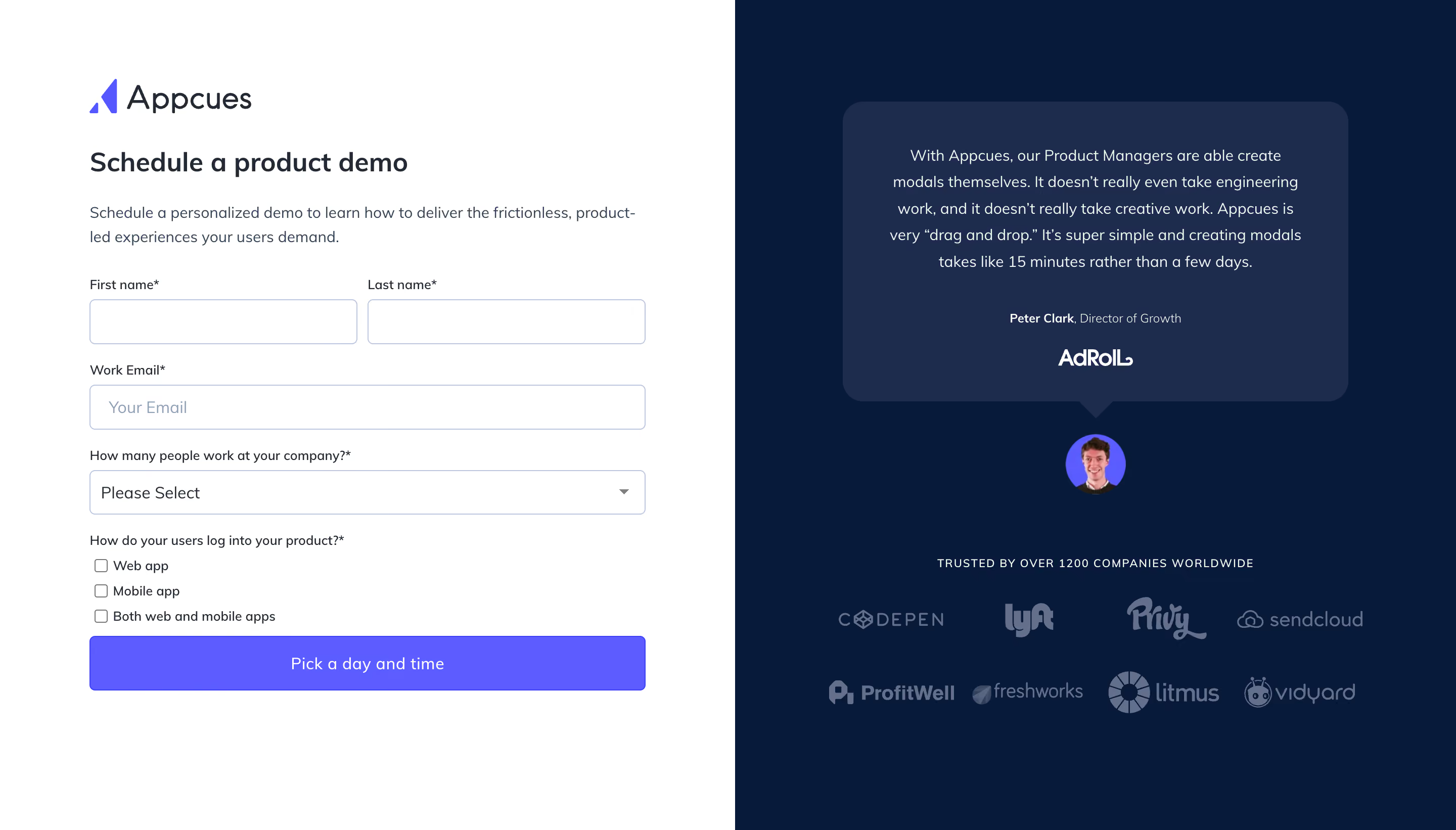

Appcues Demo Request

Appcues
The Product-Led Growth Platform
Designed by
No items found.

Bookmark
Bookmark

Design with AI
Thank you! Your submission has been received!
Oops! Something went wrong while submitting the form.
# Design from Reference: Appcues Demo Request
Create an original, high-fidelity visual design inspired by the reference. Prioritize composition, typography, colors, spacing, and component styling over technical implementation.
## Reference
- **Product:** Appcues
- **Category:** Demo Request
- **Screenshot:** https://cdn.prod.website-files.com/5e9dc792e1210c5325f7ebbc/6acbd6d2f9eac5af75489452_6acbd57cdd83b3a9f60a7bd1_cms-f07519dd0d1bf495ee9e0d13.webp
Analyze the screenshot first. If inaccessible, request it rather than guessing.
## Content
{{content.instructions}}
{{content.data}}
Preserve essential messaging and factual accuracy. Adapt structure and copy length for visual balance; never invent product claims.
## Visual Design
### Overall aesthetic
- **Style:** A split-screen demo-request page combines a practical white form with a dark navy social-proof area.
- **Character:** Restrained sans-serif typography, violet actions and a large testimonial keep the page focused and credible.
### Page composition
- **Capture:** The original measures 2880 × 1642 pixels. Sizes below estimate CSS dimensions under an unverified 2× capture assumption.
- **Split:** Approximately equal vertical halves extend the full viewport height, white left and navy right.
- **Form column:** A roughly 550-pixel-wide left column begins around 88 pixels from the edge, with brand, heading, description and fields in sequence.
- **Proof column:** A large speech-bubble testimonial sits above a circular portrait, uppercase trust line and two rows of customer logos.
### Information hierarchy
- **Task:** The demo heading follows the prominent brand mark; a short two-line paragraph introduces the form.
- **Form sequence:** Paired first/last-name inputs precede full-width work email, company-size selector and a three-choice checkbox group.
- **Primary action:** A full-width violet scheduling button ends the form.
- **Proof:** The quotation leads the dark region, with attribution and company mark beneath; the broader logo grid supports it at lower priority.
### Typography
- **Family:** A clean sans serif throughout; exact identity is unverified.
- **Heading:** Approximately 26 pixels, semibold, with compact line height.
- **Body and quote:** Approximately 15–16 pixels; the quote uses generous 26-pixel leading and centered alignment.
- **Form labels:** Around 13 pixels, with required asterisks. Input and button text are approximately 16 pixels.
- **Attribution:** Around 12 pixels, with the name heavier than its role; the trust line uses small uppercase text and open tracking.
### Colors & surfaces
- **Measured surfaces:** White #FFFFFF contrasts with navy #071A3A; the testimonial uses lighter navy #1D2B4C.
- **Action:** Violet #5C5CFF is sampled in the primary button and brand accent.
- **Text:** Dark #232A36 appears in the form; muted #64708B contributes secondary tones, including the subdued proof area.
- **Treatment:** Thin pale blue-gray form borders and flat fills dominate. The speech bubble has rounded corners and a small downward pointer.
### Components
- **Text inputs:** About 44 pixels high with thin outlines, small 4-pixel radii and comfortable horizontal text insets.
- **Name row:** Two equal inputs share the row with a narrow roughly 10-pixel gap.
- **Selector:** Full-width outlined control with left label and a small right-aligned down chevron.
- **Checkbox group:** Three compact native-looking square boxes stack vertically under their question.
- **CTA:** Roughly 550 × 54 pixels, violet fill, small radius and centered white text.
- **Testimonial:** About 500 × 296 pixels with approximately 20-pixel corners, centered quote, attribution and white company logo.
- **Portrait and logos:** A roughly 58-pixel circular headshot sits below the bubble. Eight subdued customer marks form two evenly spaced rows.
### Visual rhythm
- **Form cadence:** Labels sit close to controls; roughly 18–22 pixels separate field groups.
- **Proof rhythm:** The portrait, trust line and logo grid use much larger vertical gaps than the form, balancing its density.
- **Alignment:** Left content is consistently left-aligned, while the right region uses a central axis.
### Responsive
- **Evidence:** Only the desktop split is observed; validation, selector expansion and mobile behavior are unverified.
- **Recommended reflow:** Stack the form above social proof on narrow screens and make name fields single-column when needed.
- **Recommended controls:** Retain readable 16-pixel input text, comfortable targets and visible keyboard focus.
- **Proof handling:** Allow logos to wrap and keep the quote readable without forcing the desktop panel height.
### Adaptation guidance
- **Preserve:** Keep the white/navy contrast, violet action, clear field sequence and testimonial-led proof.
- **Implementation:** Use independently padded flexible columns, then a single-column breakpoint; avoid fixed screenshot-derived viewport heights.
- **Fidelity:** Keep the testimonial pointer, portrait and restrained logo coloring as distinct components.
- **Behavior:** Define required-field errors, checkbox semantics and scheduling transitions explicitly; these are not demonstrated by the captured frame.
Use this context to reproduce the reference's visual language: layout, typography, colors, spacing, borders, radii, and distinctive elements. The screenshot takes priority if descriptions conflict.
## Direction
{{preferences.fidelityInstructions}}
## Output
{{output.instructions}}
Deliver a polished, cohesive design with precise alignment, hierarchy, and spacing. Produce the requested visual artifact, not just a description. If unsupported, explain the limitation.


Category
Patterns
No items found.
Tech Stack


Added on
April 28, 2020
Similar screens
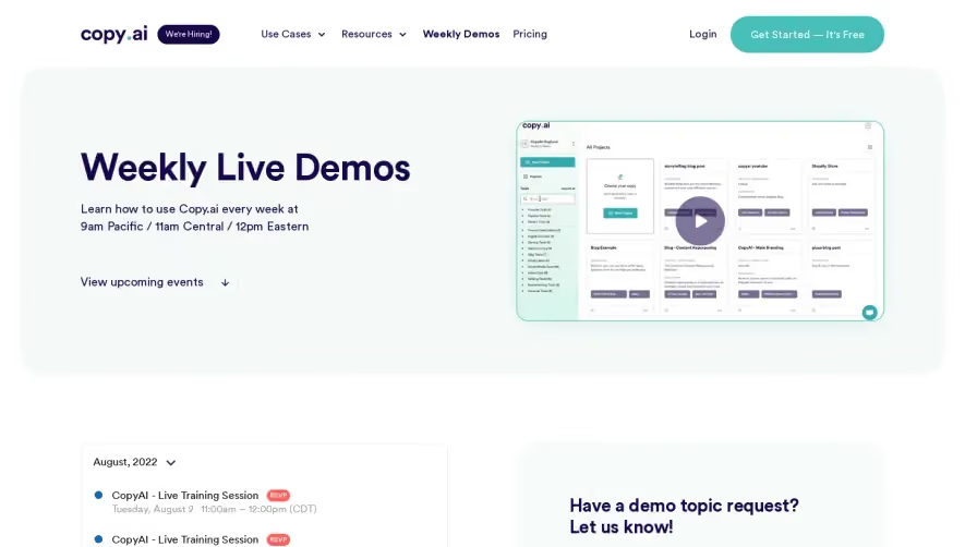


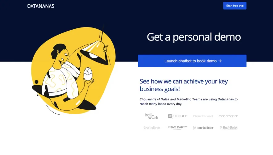

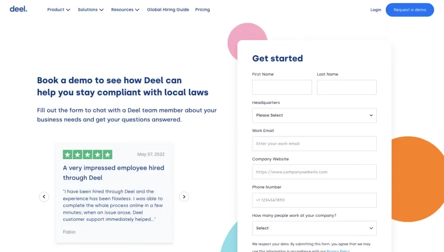

Upgrade to SaaSFrame Pro now to see similar examples.
Monthly
$18 /month
Billed $18 monthly
Browse all screens & flows
Filter and search screens & flows
Search text in screenshots
Access Figma files
Access mobile versions
Join now
Quarterly
$16 /month
Billed $48 quarterly
Browse all screens & flows
Filter and search screens & flows
Search text in screenshots
Access Figma files
Access mobile versions
Join now
Yearly
$15 /month
Billed $180 yearly
Browse all screens & flows
Filter and search screens & flows
Search text in screenshots
Access Figma files
Access mobile versions
Join now