Design with AI
Generate a new design based on this screen using your own content.
# Design from Reference: Ruul Referral Dashboard
Create an original, high-fidelity visual design inspired by the reference. Prioritize composition, typography, colors, spacing, and component styling over technical implementation.
## Reference
- **Product:** Ruul
- **Category:** Referral
- **Screenshot:** https://cdn.prod.website-files.com/5e9dc792e1210c5325f7ebbc/6acb6d87b206c0d3f8f39f3e_6acb6b92b206c0d3f8f2c9f8_cms-891f59d32eae9d3b902525b2.webp
Analyze the screenshot first. If inaccessible, request it rather than guessing.
## Content
{{content.instructions}}
{{content.data}}
Preserve essential messaging and factual accuracy. Adapt structure and copy length for visual balance; never invent product claims.
## Visual Design
### Overall aesthetic
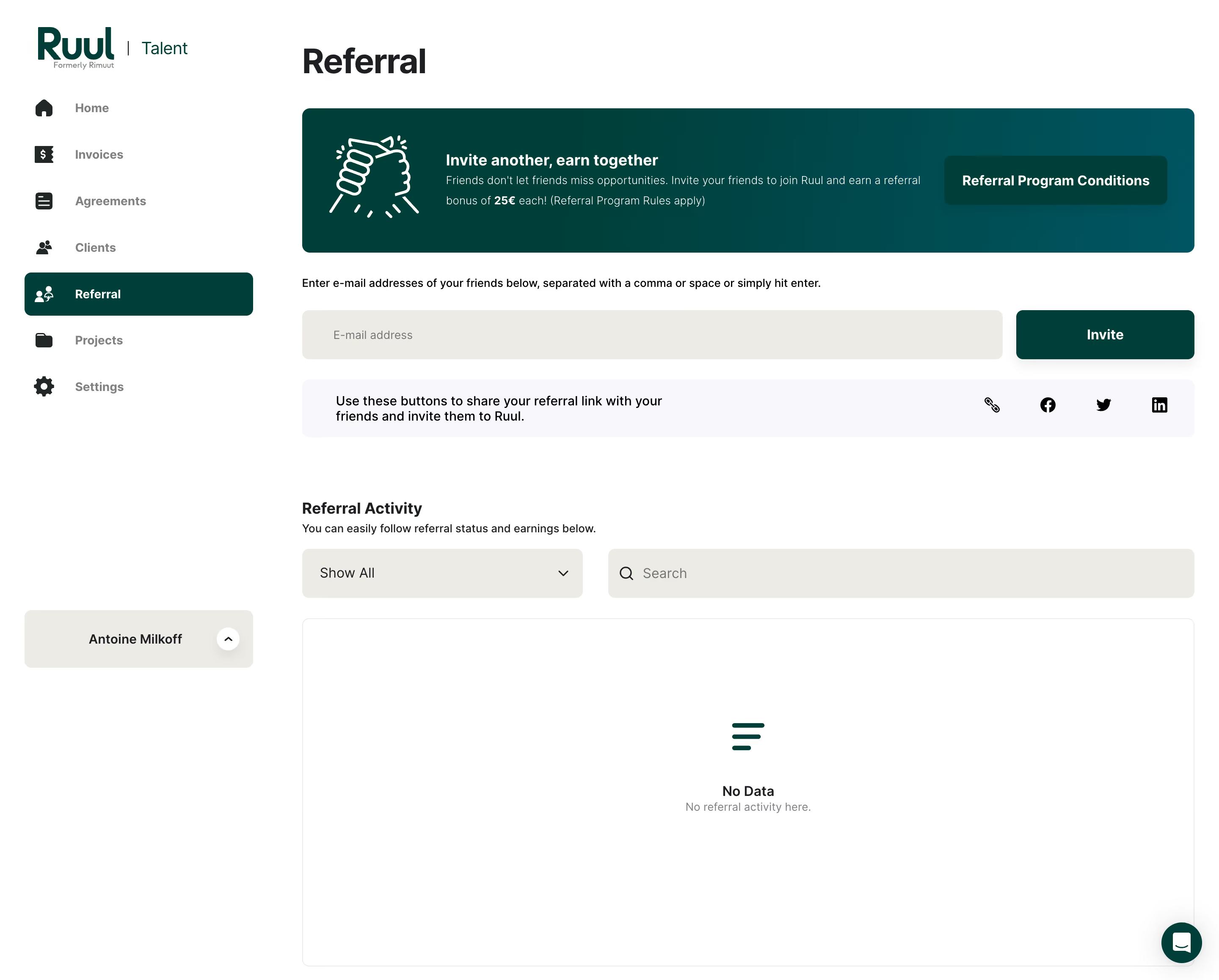
- **Character:** A white referral dashboard with dark-green branding, warm neutral inputs and a large empty activity state.
- **Evidence scale:** Original 2880 × 2316 pixels. CSS estimates assume an unverified 2× capture scale.
### Page composition
- **Sidebar:** Roughly 300 px white rail with Ruul/Talent branding, seven icon-led links and bottom account control.
- **Main:** Large Referral heading above a wide green invitation banner.
- **Invitation:** Instruction line precedes a long email field and green Invite button; a pale sharing strip follows.
- **Activity:** Heading/helper text, Show All dropdown and broad search field sit above a large bordered empty panel.
- **Utility:** Dark-green chat bubble floats at lower right.
### Information hierarchy
- **Location:** Referral is dark-green filled in the sidebar and repeated as the page heading.
- **Banner:** Handshake line illustration, bold message, smaller reward text and conditions button introduce the program.
- **Invitation action:** Green Invite button is the main input-associated control.
- **Empty state:** Centered icon, No Data title and short explanation show no activity.
### Typography
- **Page heading:** Unverified sans-serif around 40 px bold, 48 px line height.
- **Section/banner headings:** Approximately 18 px semibold.
- **Body:** Around 14–16 px regular with 22–24 px line height.
- **Sidebar/actions:** Approximately 14–16 px semibold.
- **Empty helper:** Around 13 px muted gray.
### Colors & surfaces
- **Base:** White #FFFFFF.
- **Brand/action:** Deep green #003F39 with neighboring #003F38.
- **Input surfaces:** Warm pale #ECECE5.
- **Sharing strip:** Near-white lavender #F8F8FC.
- **Ink:** Dark #1D1F23; supporting labels use gray.
### Components
- **Banner:** Approximately 1054 × 170 px rounded dark-green/teal rectangle, white handshake icon and darker conditions button.
- **Email/action row:** Approximately 58 px tall; long warm-neutral field and roughly 210 px green rounded button.
- **Sharing strip:** Pale rounded row with two-line instruction left and link/social icons right.
- **Activity filters:** Roughly 332 px dropdown beside wider search, both about 58 px tall.
- **Empty panel:** Broad approximately 1054 × 412 px white bordered rectangle with 8 px radius.
- **Navigation:** Broad rounded active row, dark icons and gray inactive labels; pale account dropdown at bottom.
### Visual rhythm
- **Main margins:** Consistent left/right edges across banner, input, sharing and activity panel.
- **Section spacing:** Roughly 72 px between sharing and activity heading.
- **Control gaps:** Approximately 16–24 px between adjacent controls.
- **Empty space:** Large blank activity panel reinforces the initial state.
### Responsive
- **Observed limit:** Desktop only; mobile referral layout is unverified.
- **Recommendation:** Collapse navigation and stack banner text/button, email/action and filter/search rows.
- **Sharing:** Keep icons labeled accessibly and large enough for touch.
### Adaptation guidance
- **Retain:** Separate invitation entry, sharing options and activity tracking.
- **Implement:** Use one dark-green action system with warm-neutral fields and a clear empty state.
- **Verify:** Confirm fonts, scale and current referral terms separately; no invitations or social messages were sent.
Use this context to reproduce the reference's visual language: layout, typography, colors, spacing, borders, radii, and distinctive elements. The screenshot takes priority if descriptions conflict.
## Direction
{{preferences.fidelityInstructions}}
## Output
{{output.instructions}}
Deliver a polished, cohesive design with precise alignment, hierarchy, and spacing. Produce the requested visual artifact, not just a description. If unsupported, explain the limitation.