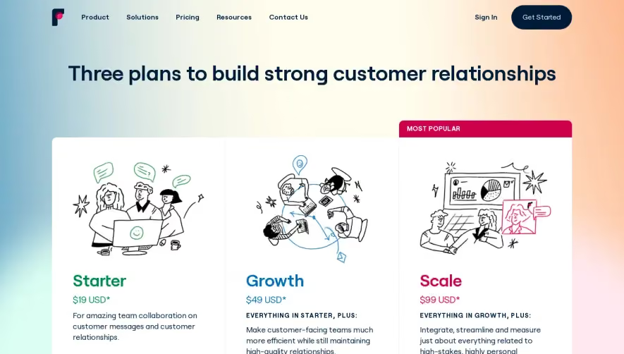
Generate a new design based on this screen using your own content.
Thank you! Your submission has been received!
Oops! Something went wrong while submitting the form.
# Design from Reference: Reply Pricing
Create an original, high-fidelity visual design inspired by the reference. Prioritize composition, typography, colors, spacing, and component styling over technical implementation.
## Reference
- **Product:** Reply
- **Category:** Pricing Page
- **Screenshot:** https://cdn.prod.website-files.com/5e9dc792e1210c5325f7ebbc/62eca447eb86d36a7c847694_1659675071109-62ec9ca88ef10801eb0f3d9b_screenshot-device-eb85a0dd4f9c72f5ac2f2bf5e34d3be3-1659618380715.webp
Analyze the screenshot first. If inaccessible, request it rather than guessing.
## Content
{{content.instructions}}
{{content.data}}
Preserve essential messaging and factual accuracy. Adapt structure and copy length for visual balance; never invent product claims.
## Visual Design
Use this context to reproduce the reference's visual language: layout, typography, colors, spacing, borders, radii, and distinctive elements. The screenshot takes priority if descriptions conflict.
## Direction
{{preferences.fidelityInstructions}}
## Output
{{output.instructions}}
Deliver a polished, cohesive design with precise alignment, hierarchy, and spacing. Produce the requested visual artifact, not just a description. If unsupported, explain the limitation.
The first thing you notice is those three pricing cards with the vibrant coral, teal, and green backgrounds. They hit hard against the white page. The $70, $60, $50 hierarchy reads instantly, and the "Chat with us" CTAs in contrasting pill buttons keep things clean. Reply nails the visual weight here.
Feature Comparison Done Right
Below the fold, there's a massive feature breakdown organized under clear category headers like "Multichannel sequences," "Contact Management," and "Cloud Calls and Tasks." Checkmarks across columns make scanning effortless. It's dense but never overwhelming because the spacing and section dividers do the heavy lifting. The little info icons next to certain features add depth without cluttering.
What Makes It Stand Out
The tab navigation up top letting users toggle between Sales Engagement, Email Search, and Email Warm-up is a smart move. Keeps one page doing triple duty. Typography is straightforward and functional. Nothing fancy, just solid hierarchy with bold headers and lighter body text. The sticky green "Try it free" CTA bar at the bottom is a subtle closer that works.