Design with AI
Generate a new design based on this screen using your own content.
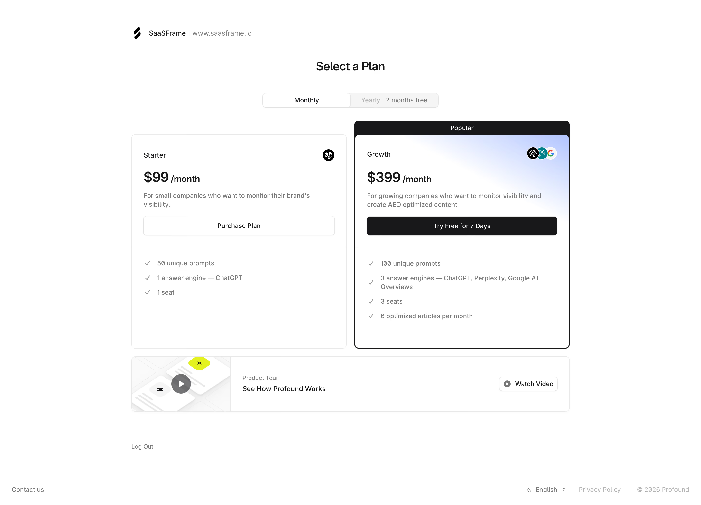
# Design from Reference: Profound Select A Plan
Create an original, high-fidelity visual design inspired by the reference. Prioritize composition, typography, colors, spacing, and component styling over technical implementation.
## Reference
- **Product:** Profound
- **Category:** Upgrading
- **Screenshot:** https://cdn.prod.website-files.com/5e9dc792e1210c5325f7ebbc/6acc0f645d6cd572f289cb50_6acc0e4f3eb7579a6a0dacd6_cms-a54f518db3f384182c0d3ee1-v3.webp
Analyze the screenshot first. If inaccessible, request it rather than guessing.
## Content
{{content.instructions}}
{{content.data}}
Preserve essential messaging and factual accuracy. Adapt structure and copy length for visual balance; never invent product claims.
## Visual Design
### Overall aesthetic
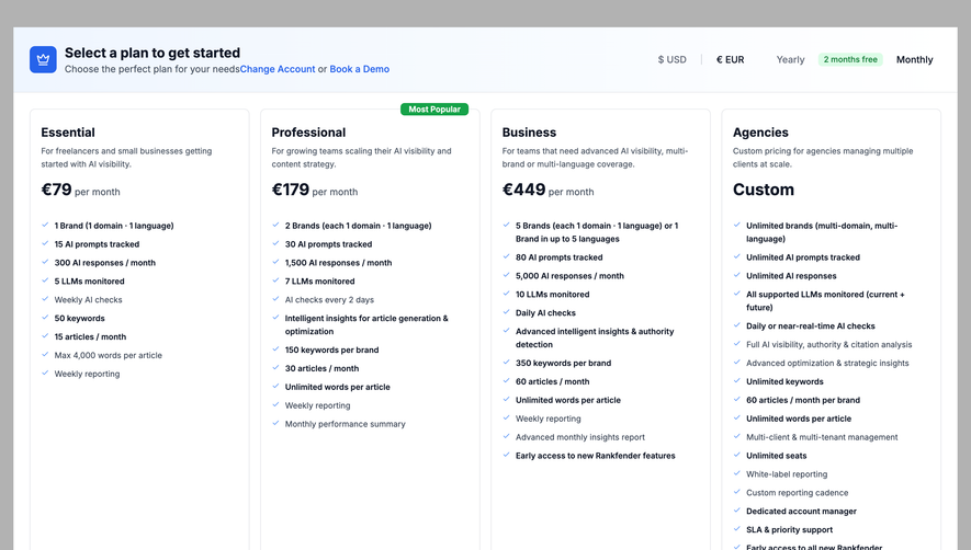
- **Character:** A restrained plan-selection screen with two large pricing cards, monochrome controls and a softly tinted highlighted plan.
- **Focus:** The comparison and primary trial action occupy the central page without marketing illustration overload.
### Page composition
- **Capture scale:** The source measures 2880 × 2076 pixels. A roughly 1440 × 1038 CSS-pixel page at 2× scale is plausible but unverified.
- **Identity and title:** A workspace logo/name/domain line sits above a centered Select a Plan heading.
- **Billing:** A centered Monthly/Yearly segmented control precedes two equal cards.
- **Comparison:** Starter appears at left; Growth at right has a dark Popular cap and stronger outline.
- **Lower region:** A full-width product-tour strip follows the cards, then Log Out and a minimal footer with contact/language/privacy utilities.
### Information hierarchy
- **Decision path:** Billing period leads into plan name, price, short audience description, action and checklist.
- **Highlighted plan:** Growth receives a dark outline, Popular label, subtle blue gradient and black trial button.
- **Secondary plan:** Starter uses a thin gray outline and white outlined purchase action.
- **Support:** The product-tour strip offers a video before the user commits to a plan.
### Typography
- **Family:** A neutral sans serif is visible; exact identity is unverified.
- **Heading:** Approximately 24 estimated CSS pixels, semibold.
- **Price:** Around 30 pixels, bold, with a smaller monthly suffix.
- **Card text:** Plan labels/actions are about 14 pixels; descriptions and checklist rows are approximately 13–14 pixels with 18–20-pixel line height.
- **Footer:** Utility text is smaller and muted.
### Colors & surfaces
- **Measured palette:** ICC-aware sRGB sampling yields white #FFFFFF, dark #18181A, border #E8E8E8, pale fill #F5F5F5 and muted text #787878.
- **Highlight:** A soft blue/lavender gradient appears near the Growth card's upper-right area.
- **Geometry:** Cards use roughly 8-pixel estimated CSS corners, thin outlines and a flat white surface; Growth has a heavier dark border.
### Components
- **Billing switch:** Two equal segments include Monthly and a yearly savings phrase; Monthly is visibly selected.
- **Plan cards:** Each is roughly 440 pixels wide and 440–470 pixels high, with about 24-pixel padding and a rule above the feature list.
- **Actions:** Full-width card buttons are approximately 40 pixels high, outlined for Starter and dark-filled for Growth.
- **Plan markers:** Small answer-engine logos appear near card tops; checkmarks introduce included features.
- **Tour strip:** A landscape thumbnail with play overlay sits left, title text center and Watch Video button right.
- **Captured prices:** The displayed $99 and $399 monthly prices describe the screenshot only, not a verified current offer.
### Visual rhythm
- **Spacing:** Roughly 16-pixel gaps separate cards and the tour strip; internal content uses consistent 16–24-pixel intervals.
- **Alignment:** Card titles, prices, copy and actions align to shared inner edges.
- **Emphasis:** The raised Popular cap gives the highlighted card a slightly taller silhouette while maintaining aligned lower edges.
### Responsive
- **Recommendation:** Stack cards with the highlighted plan clearly labeled and keep the billing control above both.
- **Recommendation:** Wrap the tour strip into thumbnail/text/action rows and maintain readable feature lists. No mobile state is shown.
### Adaptation guidance
- **Preserve:** Retain clear plan differentiation, billing selection and a low-friction product-tour option.
- **Implement:** Use accessible segmented-control state and explicit action labels; purchase/trial behavior is not verified by the still.
- **Content integrity:** Treat price, savings and allowance text as historical captured content rather than current validated commercial terms.
Use this context to reproduce the reference's visual language: layout, typography, colors, spacing, borders, radii, and distinctive elements. The screenshot takes priority if descriptions conflict.
## Direction
{{preferences.fidelityInstructions}}
## Output
{{output.instructions}}
Deliver a polished, cohesive design with precise alignment, hierarchy, and spacing. Produce the requested visual artifact, not just a description. If unsupported, explain the limitation.