
Thank you! Your submission has been received!
Oops! Something went wrong while submitting the form.
Get SaaSFrame Pro
Monthly
$18
Quarterly
$48
Yearly
$180
Upgrade to access this feature
Browse all screens & flows
Filter and search screens & flows
Access Figma files
Access mobile versions
Bookmark screens & flows
Join now
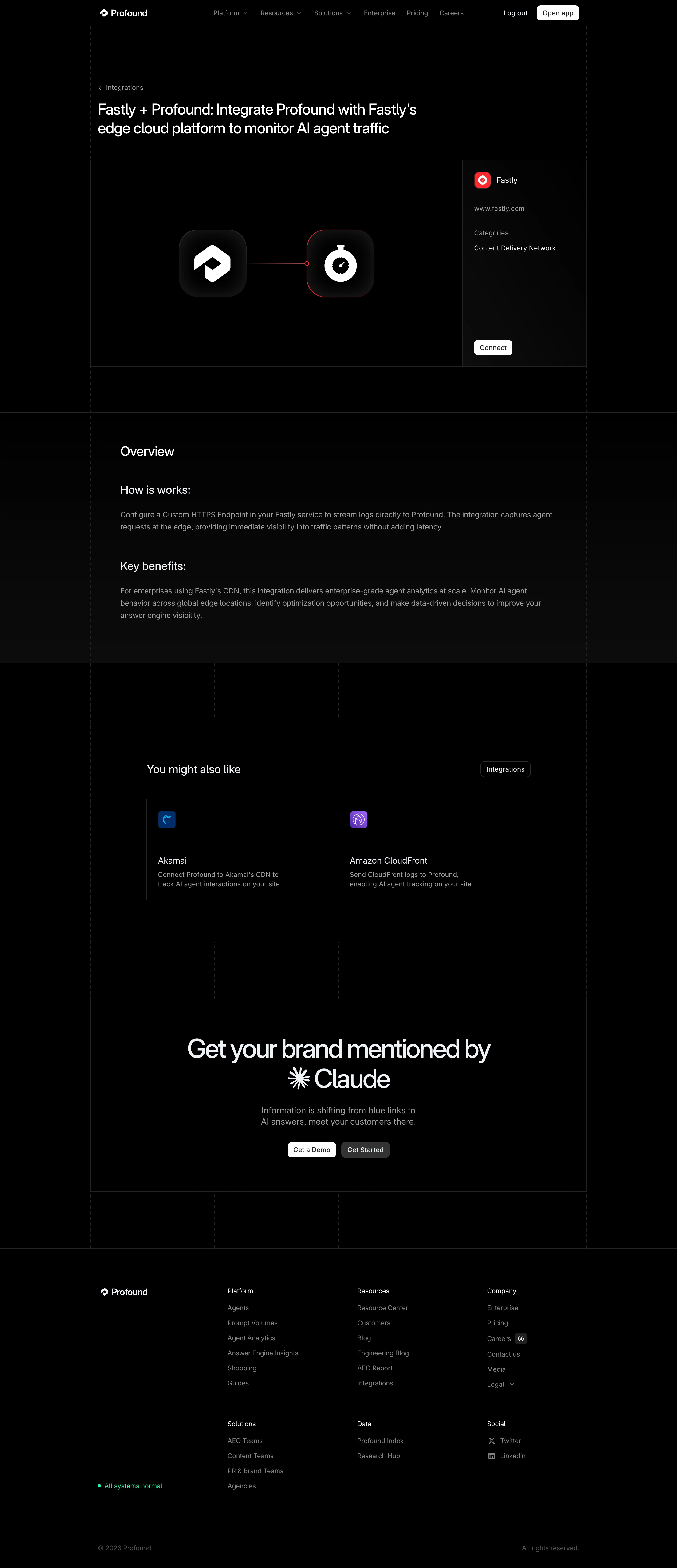

Profound Integrations Page

Profound
Marketing for the AI era
Designed by
No items found.

Bookmark
Bookmark

Design with AI
Thank you! Your submission has been received!
Oops! Something went wrong while submitting the form.
# Design from Reference: Profound Integrations Page
Create an original, high-fidelity visual design inspired by the reference. Prioritize composition, typography, colors, spacing, and component styling over technical implementation.
## Reference
- **Product:** Profound
- **Category:** Integrations Page
- **Screenshot:** https://cdn.prod.website-files.com/5e9dc792e1210c5325f7ebbc/6acad33cd5603a17eba5b657_6acad0c750cf4647822bb832_cms-ac5d3b33119369def4e0e2c3.webp
Analyze the screenshot first. If inaccessible, request it rather than guessing.
## Content
{{content.instructions}}
{{content.data}}
Preserve essential messaging and factual accuracy. Adapt structure and copy length for visual balance; never invent product claims.
## Visual Design
### Overall aesthetic
- **Character:** A nearly black integration detail page with technical grid lines, restrained white typography and an isolated red partner accent.
- **Capture scale:** The image is 2880 × 6666 pixels, inspected in three readable portions. An approximately 1440px desktop CSS viewport at 2× density is an estimate, not verified browser metadata.
- **Material treatment:** Flat black regions combine with subtle near-black gradients and softly modeled application icons; thin outlines supply most structure.
### Page composition
- **Navigation:** A compact full-width header aligns the white brand at left, muted menu links across the center and account/open-app actions at right.
- **Content frame:** A centered approximately 1050–1060px CSS-width frame has faint dashed vertical boundaries and solid horizontal dividers.
- **Introductory region:** A small integrations back-link precedes a two-line integration headline, left aligned with roughly 120px of space above.
- **Integration panel:** A broad illustration area occupies roughly three quarters of a bordered row; a narrower partner-information column contains logo, URL, category and Connect button.
- **Lower regions:** An overview text block is followed by a two-card related-integration grid, a large centered conversion panel and a multi-column footer.
### Information hierarchy
- **Primary message:** The integration headline leads directly into the connected Profound and Fastly logo illustration.
- **Partner details:** The right sidebar separates identity, muted metadata labels and the white Connect action with substantial vertical spacing.
- **Explanatory content:** Overview, implementation explanation and benefits use successively smaller heading levels above muted paragraphs.
- **Conversion and exploration:** Related integrations support lateral navigation; the large lower headline and two adjacent actions provide the strongest final emphasis.
### Typography
- **Family:** A clean sans-serif with compact forms is visible; exact font identity is unverified.
- **Main headline:** Estimated 32px CSS, regular-to-medium weight, approximately 40px line-height and slightly negative tracking.
- **Section roles:** Overview is approximately 28px; subordinate headings around 24px; card titles around 18px.
- **Body and navigation:** Approximately 14–16px CSS with 22–26px paragraph line-height; navigation and metadata use muted gray.
- **Conversion headline:** Approximately 54–56px CSS with tight line-height, centered across two lines and incorporating a white AI-provider mark.
### Colors & surfaces
- **Base surface:** Sampled dominant #000000 is accompanied by #020202 through #090909 in subtle gradients.
- **Text hierarchy:** Headings and logos are near white; descriptions and navigation use medium gray, while copyright text is visibly darker.
- **Partner accent:** A saturated red outlines the partner icon and connector detail; blue and purple are confined to related-integration logos.
- **Boundaries:** Low-contrast dark-gray solid rules divide panels; dashed vertical rails create a technical framing system.
- **Action surfaces:** Primary buttons are white with dark text; the secondary lower action has a medium-dark gray fill.
### Components
- **Connection illustration:** Two approximately 144px CSS rounded-square icon tiles sit horizontally, linked by a thin red line and small circular junction. Dark inset gradients give the tiles depth.
- **Metadata sidebar:** Approximately 264px wide, with around 24px padding, a small partner icon and a bottom-aligned Connect button.
- **Related cards:** Two equal-width square-corner cards share a central divider, with a small colored icon, large vertical gap, title and two-line description.
- **Buttons:** Compact white actions are around 32px high with roughly 7–8px radii and 12px horizontal padding; the integrations directory action is outlined.
- **Footer:** Brand and operational status sit left of grouped link columns; the status uses a small bright turquoise square.
### Visual rhythm
- **Structural spacing:** Large roughly 90–120px vertical bands separate content modules and expose the dashed grid.
- **Internal padding:** Overview content is inset approximately 64px from the frame; related content narrows further to about 820px.
- **Contrast rhythm:** The bright icon pair and conversion headline alternate with quieter text-heavy sections.
- **Border consistency:** Thin dividers connect the page regions into one continuous architectural frame.
### Responsive
- **Evidence limit:** The capture establishes a desktop layout only; responsive transitions and interactive states are unverified.
- **Panel recommendation:** Stack the partner sidebar below the illustration, preserving a clear Connect action and readable metadata.
- **Grid recommendation:** Convert related integrations and footer groups to a single-column or compact two-column flow as space permits.
- **Typography recommendation:** Scale the conversion headline to approximately 32–40px and reduce section padding while retaining comfortable body line-height.
### Adaptation guidance
- **System:** Use a black surface, low-contrast rules, a fixed maximum content width and shared vertical rails across modules.
- **Asset handling:** Use real vector partner marks and recreate the soft icon-tile lighting separately from the logos.
- **Conversion layout:** Keep the explanatory text concise, the partner action close to its metadata and the final action pair centered.
- **Accessibility:** Ensure muted text and thin borders retain usable contrast, provide visible keyboard focus and supply meaningful labels for logo links.
Use this context to reproduce the reference's visual language: layout, typography, colors, spacing, borders, radii, and distinctive elements. The screenshot takes priority if descriptions conflict.
## Direction
{{preferences.fidelityInstructions}}
## Output
{{output.instructions}}
Deliver a polished, cohesive design with precise alignment, hierarchy, and spacing. Produce the requested visual artifact, not just a description. If unsupported, explain the limitation.


Category
Patterns
No items found.
Tech Stack

Added on
March 2, 2026
Similar screens
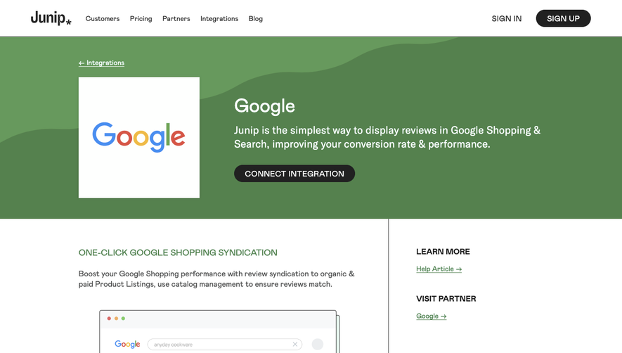


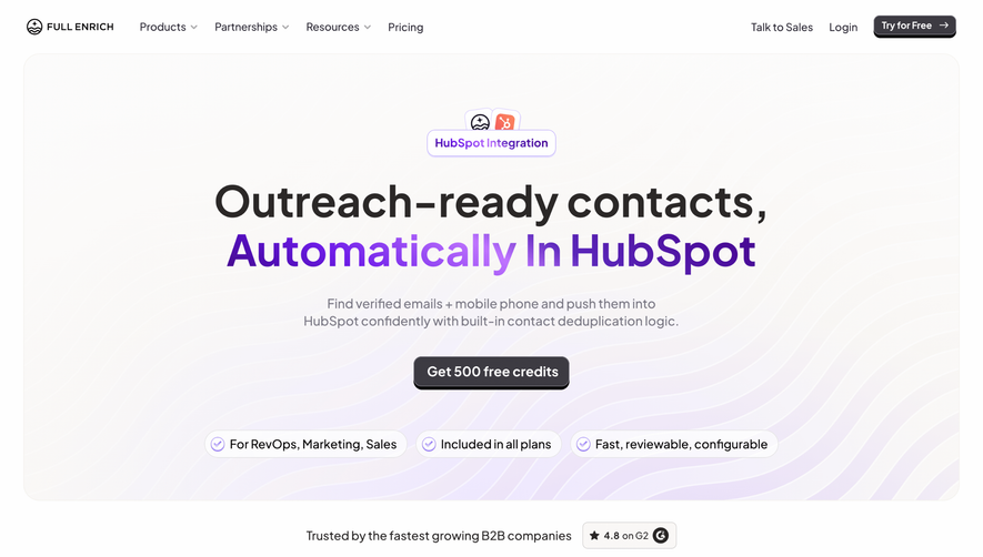

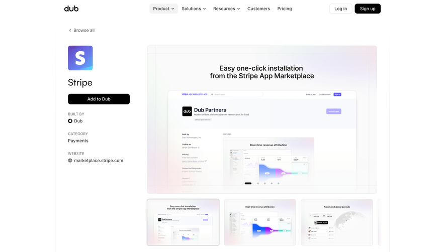

Upgrade to SaaSFrame Pro now to see similar examples.
Monthly
$18 /month
Billed $18 monthly
Browse all screens & flows
Filter and search screens & flows
Search text in screenshots
Access Figma files
Access mobile versions
Join now
Quarterly
$16 /month
Billed $48 quarterly
Browse all screens & flows
Filter and search screens & flows
Search text in screenshots
Access Figma files
Access mobile versions
Join now
Yearly
$15 /month
Billed $180 yearly
Browse all screens & flows
Filter and search screens & flows
Search text in screenshots
Access Figma files
Access mobile versions
Join now