
Thank you! Your submission has been received!
Oops! Something went wrong while submitting the form.
Get SaaSFrame Pro
Monthly
$18
Quarterly
$48
Yearly
$180
Upgrade to access this feature
Browse all screens & flows
Filter and search screens & flows
Access Figma files
Access mobile versions
Bookmark screens & flows
Join now
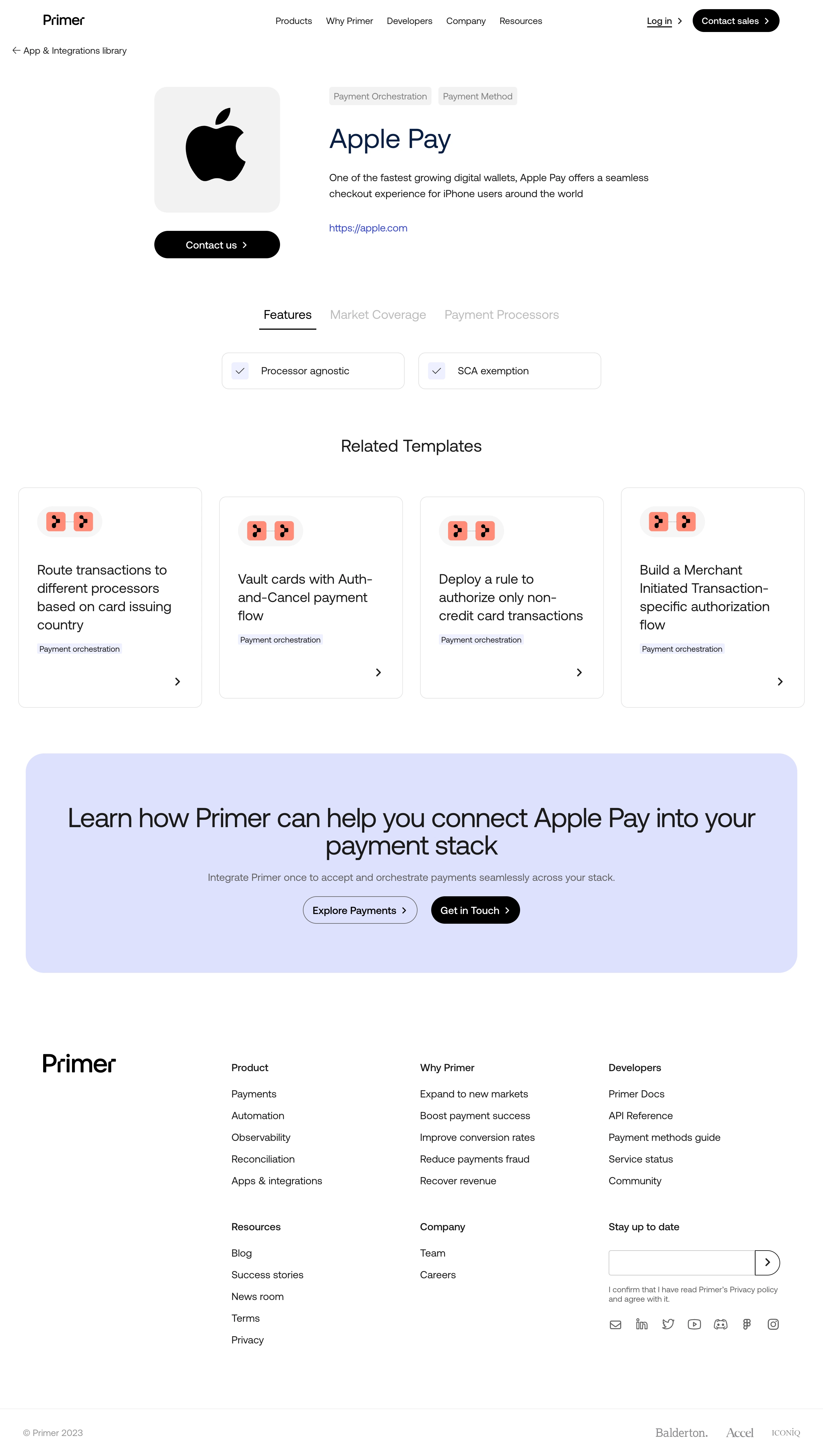

Primer Integrations Page

Primer
Build brilliant commerce & payment experiences
Designed by


Bookmark
Bookmark

Design with AI
Thank you! Your submission has been received!
Oops! Something went wrong while submitting the form.
# Design from Reference: Primer Integrations Page
Create an original, high-fidelity visual design inspired by the reference. Prioritize composition, typography, colors, spacing, and component styling over technical implementation.
## Reference
- **Product:** Primer
- **Category:** Integrations Page
- **Screenshot:** https://cdn.prod.website-files.com/5e9dc792e1210c5325f7ebbc/6acb646cb206c0d3f8f0670b_6acb63e2b79140e81e48a7b1_cms-a0981f22b58094c8e97c27a5.webp
Analyze the screenshot first. If inaccessible, request it rather than guessing.
## Content
{{content.instructions}}
{{content.data}}
Preserve essential messaging and factual accuracy. Adapt structure and copy length for visual balance; never invent product claims.
## Visual Design
### Overall aesthetic
- **Style:** A minimal integration-detail page with black pill actions, a large partner-logo tile, fine outlined cards, and a pale lavender conversion banner.
- **Character:** Clear and editorial, relying on regular-weight typography and generous spacing rather than illustration-heavy promotion.
### Page composition
- **Capture and scale:** The screenshot is 2880 × 5096 pixels, consistent with an estimated 2× capture. Following dimensions are estimated CSS pixels under that assumption.
- **Opening:** A white navigation header and back-to-library link precede a split detail hero. A large Apple logo tile/contact action sits left; category chips, Apple Pay title, description, and source link sit right.
- **Detail section:** Centered tabs for Features, Market Coverage, and Payment Processors precede two visible feature chips. Features is underlined.
- **Related content:** Four equal template cards form one horizontal row below a centered Related Templates heading.
- **Closing:** A broad rounded lavender banner contains centered headline, supporting sentence, and two pill actions. A large white footer combines brand, link groups, newsletter/social controls, and lower copyright/investor marks.
- **Content identity:** Despite the record's generic integrations title, the visible page is an Apple Pay integration detail.
### Information hierarchy
- **Partner focus:** The logo and integration name establish identity immediately, followed by a concise explanation and external link.
- **Capabilities:** Tabs organize detail levels; only the two displayed feature items are evidenced.
- **Next steps:** Contact and related templates provide practical routes, while the closing banner offers broader product exploration and contact.
### Typography
- **Family:** A modern neutral sans serif is visible; exact identity is unverified.
- **Hero:** Integration title is approximately 48 px CSS regular, with a dark navy treatment. Body copy is around 18 px with 27 px line-height.
- **Section/card type:** Section headings are around 28–30 px; template titles approximately 24 px with 31 px line-height.
- **Conversion and utilities:** Banner headline is around 44–46 px regular. Tabs are about 21 px; chips/footer links around 14–18 px depending role.
### Colors & surfaces
- **Foundation:** Sampled sRGB #FFFFFF dominates. Light gray #F2F2F1 supports the logo tile and small chips; #F5F5F5 appears in subtle UI details.
- **Conversion surface:** Sampled lavender #DCE0FF fills the large CTA banner, with #ECF0FF supporting small feature/check accents.
- **Ink and accent:** Sampled #1B1A1A and #000000 anchor text and pill actions. Coral #FF8471 colors the small template-symbol blocks.
- **Links:** The external link is saturated blue; its exact hex value is unverified.
### Components
- **Partner tile:** A roughly 220 px square pale-gray tile has 24 px radii and a large centered black Apple mark. A black contact pill sits directly below.
- **Feature items:** Two thin-bordered rounded rectangles pair pale check squares with short labels.
- **Template cards:** Four tall outlined cards use approximately 12 px radii, generous padding, coral workflow-symbol badges, multiline titles, small category labels, and lower-right arrows.
- **CTA banner:** A nearly full-width lavender panel uses roughly 32 px radii and ample vertical padding. One action is outlined, the other black filled.
- **Footer:** Unboxed link groups occupy three broad columns beside the logo. Newsletter uses a thin-bordered field with attached arrow end; social icons align beneath.
### Visual rhythm
- **Spacing:** Use roughly 80–100 px between major modules, with 28–36 px gaps inside hero and CTA groups.
- **Grid:** Keep template cards equal width and height, and align their arrows near the lower edge.
- **Restraint:** Maintain broad white regions and thin borders; reserve the large color field for conversion.
### Responsive
- **Observed state:** Only desktop and the Features tab state are shown.
- **Recommended reflow:** Stack logo/details, wrap tabs, collapse related cards to two then one column, and stack banner actions.
- **Footer:** Reflow newsletter and link groups with readable line spacing and 20–24 px mobile gutters.
### Adaptation guidance
- **Preserve:** Retain the logo-led detail hero, tabbed capabilities, outlined template cards, black pills, and lavender closing banner.
- **Adapt:** Use verified integration capabilities, categories, related workflows, and contact destinations.
- **Avoid:** Do not invent coverage/processor tab contents or import payment claims from the reference.
Use this context to reproduce the reference's visual language: layout, typography, colors, spacing, borders, radii, and distinctive elements. The screenshot takes priority if descriptions conflict.
## Direction
{{preferences.fidelityInstructions}}
## Output
{{output.instructions}}
Deliver a polished, cohesive design with precise alignment, hierarchy, and spacing. Produce the requested visual artifact, not just a description. If unsupported, explain the limitation.


Category
Patterns
Tech Stack




Added on
July 13, 2023
Similar screens







Upgrade to SaaSFrame Pro now to see similar examples.
Monthly
$18 /month
Billed $18 monthly
Browse all screens & flows
Filter and search screens & flows
Search text in screenshots
Access Figma files
Access mobile versions
Join now
Quarterly
$16 /month
Billed $48 quarterly
Browse all screens & flows
Filter and search screens & flows
Search text in screenshots
Access Figma files
Access mobile versions
Join now
Yearly
$15 /month
Billed $180 yearly
Browse all screens & flows
Filter and search screens & flows
Search text in screenshots
Access Figma files
Access mobile versions
Join now