Overall Style and Aesthetic
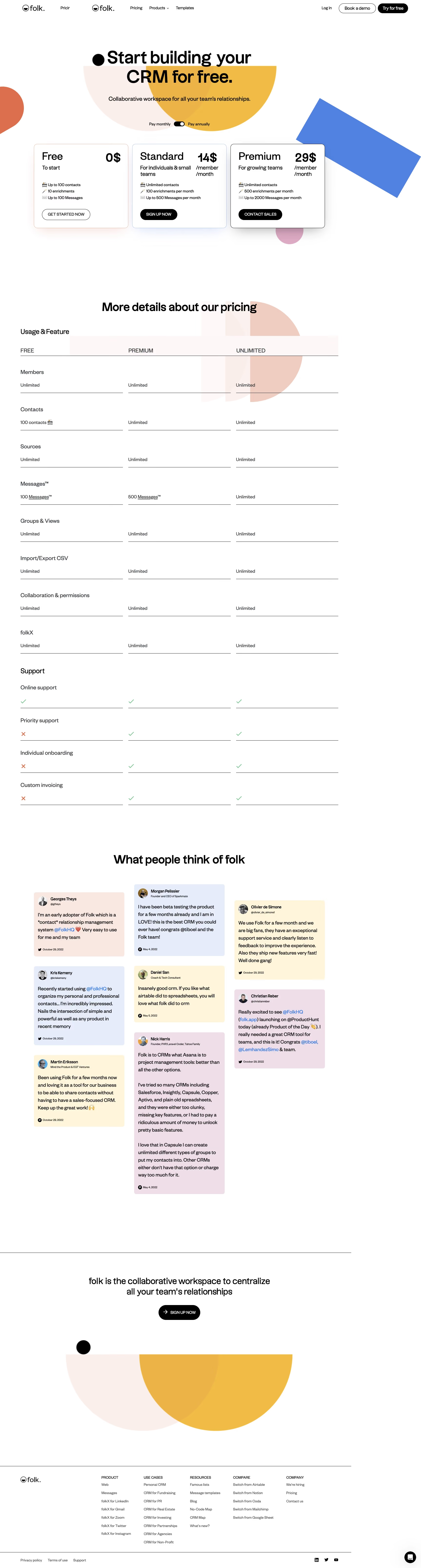
folk’s pricing page radiates a modern, minimalist professionalism with a dash of playful personality. Clean lines, generous whitespace, and streamlined modules create a calming and approachable environment, immediately instilling trust and clarity. Subtle gradients and bursts of color add vibrancy without overwhelming, striking a balanced tone between innovative and approachable. Layout and Structure
The page is architected for clarity and conversion. A focused hero section introduces the pricing tiers, immediately answering the visitor’s top question. Below, clear, horizontally aligned plans invite comparison at a glance. “Features” expand contextually beneath each plan, maintaining the site’s tidy structure. A tactful FAQ and compelling support section follow, while a tidy, subdued footer completes the journey. Visual Elements
Sleek, conceptual illustrations reinforce the brand’s modernity and user-friendliness. Gentle, on-brand icons highlight key features in succinct bullet lists. There’s a careful absence of clutter: no stock photography or distracting video, just purposeful visuals guiding the user through their decision. Color Palette and Typography
folk’s restrained palette of soft blues, subtle lavenders, and bold accent hues frames content without distraction. Generous sans-serif fonts exude warmth and accessibility. Typography hierarchy is strong: pricing headlines pop, features remain legible, and supporting information melts into the background for unobstructed readability. User Experience Patterns
Navigation is sticky and intuitive. CTAs are bold—standout buttons (“Start for free”) are unmissable but never brash. Interactive elements, such as feature tooltips and responsive plan highlights, make comparison frictionless. The flow is linear and logical, effortlessly guiding visitors towards conversion. Unique or Notable Design Choices
folk’s seamless feature expansion within plan modules minimizes scrolling and information overload. Micro-interactions on hover and selection add a refined, tactile feel. The overall experience is streamlined and energetic, inviting users to engage and convert without uncertainty.