Design with AI
Generate a new design based on this screen using your own content.
# Design from Reference: Plausible Analytics Add A Goal
Create an original, high-fidelity visual design inspired by the reference. Prioritize composition, typography, colors, spacing, and component styling over technical implementation.
## Reference
- **Product:** Plausible Analytics
- **Category:** Add & Edit
- **Screenshot:** https://cdn.prod.website-files.com/5e9dc792e1210c5325f7ebbc/6acadb70494a081980ea07fb_6acada8d819c11087507bc73_cms-9b2af11ae6a52fa31e607ff6.webp
Analyze the screenshot first. If inaccessible, request it rather than guessing.
## Content
{{content.instructions}}
{{content.data}}
Preserve essential messaging and factual accuracy. Adapt structure and copy length for visual balance; never invent product claims.
## Visual Design
### Overall aesthetic
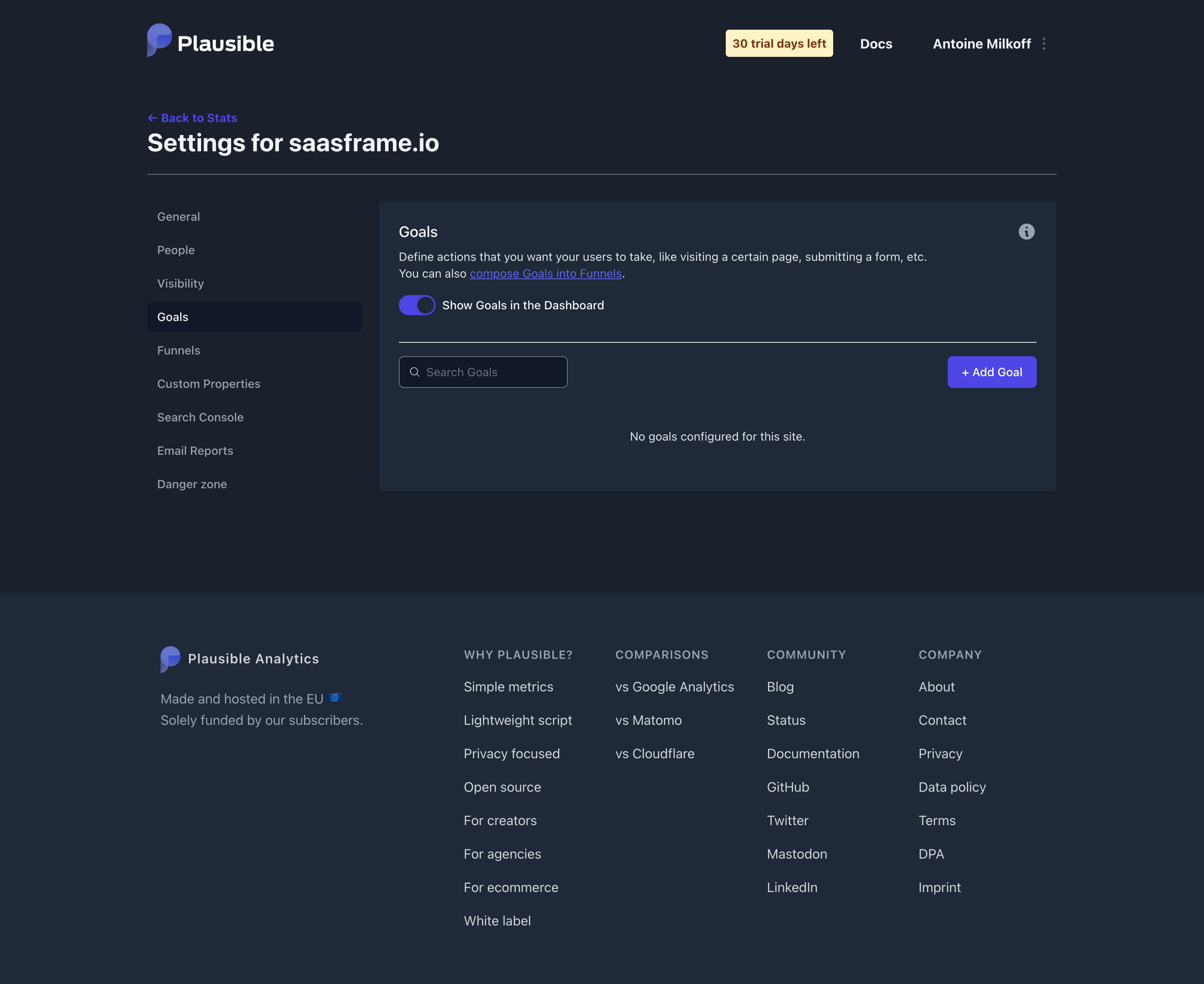
- **Character:** Restrained dark analytics settings page, with a clear empty state and violet functional accents.
### Page composition
- **Canvas:** 2880 × 2354 screenshot pixels; CSS estimates assume approximately 2× capture scale.
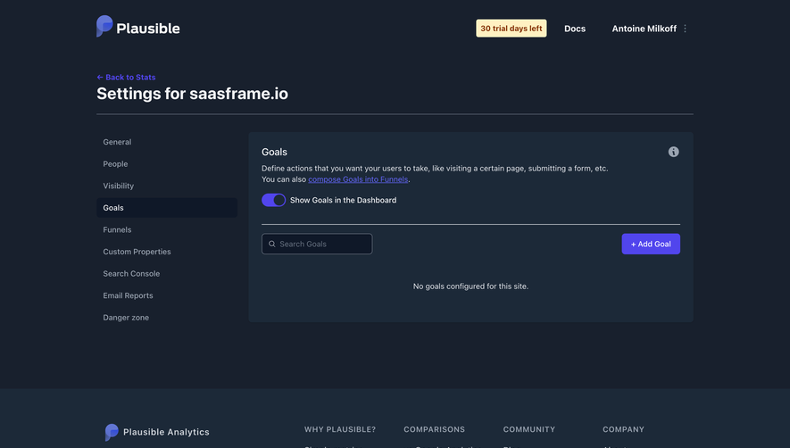
- **Structure:** Centered application header, settings title and rule, left settings navigation and a larger right Goals panel. A broad five-group footer fills the lower portion.
### Information hierarchy
- **Priority:** Settings title establishes context; active Goals navigation leads to explanatory text and enabled dashboard toggle.
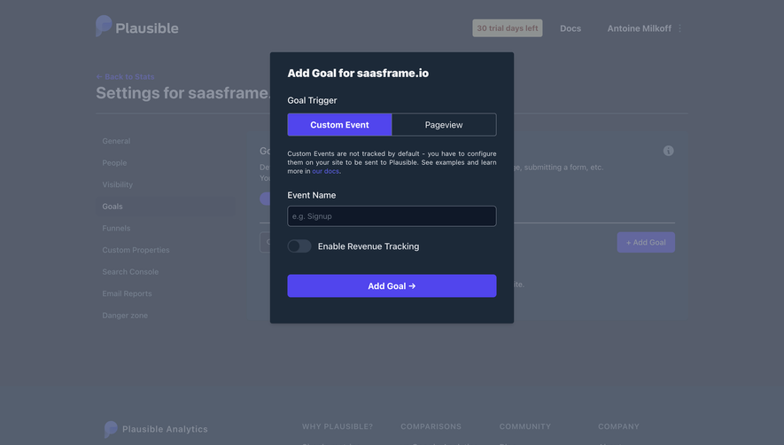
- **Action:** Search is aligned left and Add Goal right above a centered empty-state sentence. No goal-creation dialog is visible.
### Typography
- **Family:** Neutral sans-serif; exact font is unverified.
- **Scale:** Estimated CSS page title 28–30px bold, panel title 18px, body and navigation 14–16px and footer labels 13–14px uppercase.
### Colors & surfaces
- **Sampled palette:** Outer navy #18202D; raised panel/footer #1C2938; active navigation/search #0F1828; violet #5145ED; gray text #D0D5DB; light text #F3F4F6.
- **Accent surface:** Pale trial badge #FFF1C2 contrasts with the dark header.
### Components
- **Panel:** Rounded dark block with approximately 6px CSS radius and 24px padding; toggle and explanatory copy precede a thin horizontal divider.
- **Controls:** Small outlined search field, violet filled Add Goal button and compact rounded switch. Estimated 38–40px input/button height and 4–6px control radii.
- **Footer:** Brand/mission block beside four link columns.
### Visual rhythm
- **Spacing:** Approximately 24px between panel groups, broad blank space below the empty state and 64–96px around the footer.
- **Alignment:** Shared content boundaries align header, title rule, settings panel and footer.
### Responsive
- **Guidance:** Mobile is not shown. Replace the sidebar with compact settings navigation and stack search/action controls without hiding the empty-state guidance.
### Adaptation guidance
- **Transfer:** Preserve the settings/empty-state hierarchy and restrained dark palette. Adapt goal terminology and actions to the target analytics workflow.
Use this context to reproduce the reference's visual language: layout, typography, colors, spacing, borders, radii, and distinctive elements. The screenshot takes priority if descriptions conflict.
## Direction
{{preferences.fidelityInstructions}}
## Output
{{output.instructions}}
Deliver a polished, cohesive design with precise alignment, hierarchy, and spacing. Produce the requested visual artifact, not just a description. If unsupported, explain the limitation.