
Thank you! Your submission has been received!
Oops! Something went wrong while submitting the form.
Get SaaSFrame Pro
Monthly
$18
Quarterly
$48
Yearly
$180
Upgrade to access this feature
Browse all screens & flows
Filter and search screens & flows
Access Figma files
Access mobile versions
Bookmark screens & flows
Join now
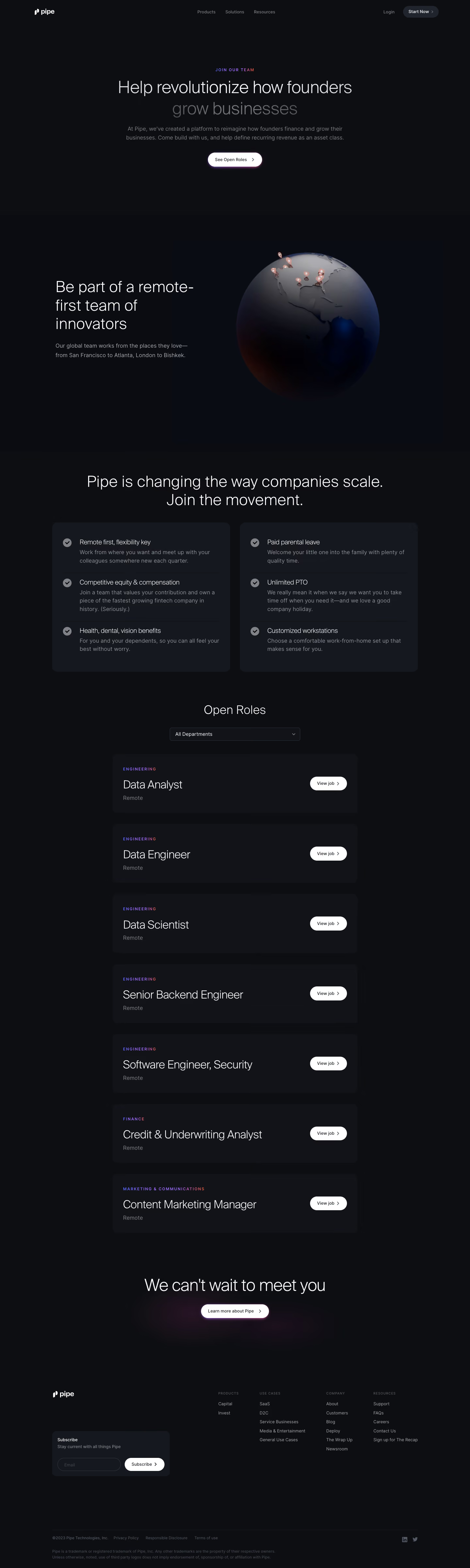

Pipe Careers Page

Pipe
Instant access to your annual cash flow
Designed by
No items found.

Bookmark
Bookmark

Design with AI
Thank you! Your submission has been received!
Oops! Something went wrong while submitting the form.
# Design from Reference: Pipe Careers Page
Create an original, high-fidelity visual design inspired by the reference. Prioritize composition, typography, colors, spacing, and component styling over technical implementation.
## Reference
- **Product:** Pipe
- **Category:** Careers Page
- **Screenshot:** https://cdn.prod.website-files.com/5e9dc792e1210c5325f7ebbc/6acbbd123b6b24eada54897b_6acbbc49857cbd7f46b5a256_cms-534fd77f6406f7afa5b08886.webp
Analyze the screenshot first. If inaccessible, request it rather than guessing.
## Content
{{content.instructions}}
{{content.data}}
Preserve essential messaging and factual accuracy. Adapt structure and copy length for visual balance; never invent product claims.
## Visual Design
### Overall aesthetic
- **Style:** Dark careers page with thin oversized typography, subtle surface changes and restrained violet/pink glow accents.
- **Character:** A dimensional globe and gradient labels give a global technology identity, while job listings remain clean and repetitive.
- **Capture:** The image measures 1440 × 4799 pixels. CSS estimates assume approximately 1:1 capture scale; browser scale and font identity are unverified.
### Page composition
- **Header:** A small white logo sits left, three navigation groups centrally and login/start controls right.
- **Hero:** A centered uppercase eyebrow, two-line recruiting statement, short paragraph and white open-roles pill occupy a large dark field.
- **Remote-team section:** Left-aligned headline and paragraph pair with a large shaded globe marked by small location pins.
- **Benefits:** A centered statement leads into two charcoal panels, each containing three checkmarked benefit groups.
- **Open roles:** A centered title and department dropdown precede seven wide stacked job cards.
- **Closing:** A short centered invitation and glowing white information pill follow the listings.
- **Footer:** Brand and newsletter signup occupy the left, with four link groups right and a small legal/social baseline below.
### Information hierarchy
- **Recruiting proposition:** The hero uses a bright first line and dimmer second line, supported by a smaller muted explanation.
- **Remote identity:** The globe section emphasizes distributed work through both copy and imagery.
- **Benefits:** Short labels precede smaller explanations; check icons provide repeated scan points.
- **Job discovery:** The department filter sits directly above the role list.
- **Role cards:** Small gradient department labels lead large job titles and muted location text.
- **Actions:** White View job pills align at the right of each card.
- **Captured content:** Listed roles are historical screenshot data, not verified current openings.
### Typography
- **Family:** A light geometric sans-serif is visible; exact identity is unverified.
- **Hero heading:** Approximately 50–54-pixel CSS size, light weight, with around 62-pixel line height.
- **Section statements:** Approximately 44–48 pixels, light, often spanning two or three lines.
- **Body:** Approximately 16–18 pixels with 26–28-pixel line height.
- **Benefit labels:** Approximately 18 pixels, light-to-regular weight; supporting copy around 16 pixels.
- **Job titles:** Approximately 32–34 pixels, light weight.
- **Department labels:** Approximately 11 pixels, uppercase, widely tracked and colored.
- **Controls/footer:** Approximately 12–14 pixels, with very small uppercase footer headings.
### Colors & surfaces
- **Measured base:** #0D0E12 fills most of the page.
- **Measured surface variants:** #111318, #0B0C12 and #15181E distinguish cards, panels and subtle section fields.
- **Measured dark gradients:** #0A0C13 and related near-black tones appear around the globe/section transitions.
- **Measured highlights:** White #FFFFFF supports principal text and pill controls.
- **Text hierarchy:** Medium/dark gray descriptions contrast with brighter headings.
- **Accent roles:** Violet-to-pink text gradients mark eyebrows and departments; soft purple/pink glows surround selected white actions.
- **Globe palette:** Dark blue-gray land/ocean shading and pale warm location pins provide the main visual color.
### Components
- **Hero action:** A white pill approximately 166 × 44 pixels combines text and right chevron with a subtle colored glow.
- **Globe:** A large shaded sphere shows the Americas and small location markers.
- **Benefit panels:** Two roughly equal rounded charcoal blocks use check icons, descriptions and thin horizontal separators.
- **Department filter:** A compact dark outlined dropdown approximately 400 × 40 pixels is centered above the list.
- **Job cards:** Approximately 750 × 180 pixels, with about 16-pixel corners and 32-pixel inset.
- **Role actions:** White rounded pills approximately 114 × 42 pixels align to each card's right.
- **Visible departments:** Engineering, finance and marketing/communications appear across seven cards.
- **Newsletter module:** A small charcoal footer card contains label, explanation, outlined email field and white subscribe pill.
- **Footer details:** Four compact link groups sit above a thin divider and muted legal copy.
- **State scope:** No filter menu, role detail, application form or subscription result is shown.
### Visual rhythm
- **Container:** Broad desktop gutters frame the page; the job list uses a narrower centered measure than the benefits section.
- **Hero whitespace:** Large empty areas isolate the opening message and action.
- **Section spacing:** Generous 120–180-pixel breaks distinguish hero, globe, benefits and roles.
- **Listing cadence:** Equal card heights and roughly 32-pixel gaps create a steady vertical sequence.
- **Contrast restraint:** Small dark-surface shifts and glows replace strong borders or saturated sections.
- **Footer density:** Compact columns follow a spacious closing invitation.
### Responsive
- **Recommendation — header:** Collapse navigation while retaining the careers path and account action.
- **Recommendation — globe:** Stack text and globe, scaling the illustration within the viewport.
- **Recommendation — benefits:** Stack the two panels without shrinking explanatory text.
- **Recommendation — jobs:** Wrap long titles and move View job beneath text when necessary.
- **Recommendation — footer:** Stack newsletter and link groups with readable legal copy. No mobile layout is evidenced.
### Adaptation guidance
- **Preserve the recruitment narrative:** Move from mission to distributed team, benefits and open roles.
- **Reuse restrained dark tokens:** Keep near-black surfaces, light headings and muted descriptions.
- **Keep role structure consistent:** Department, title, location and action should align across cards.
- **Use glow sparingly:** Reserve the violet/pink halo for selected conversion moments.
- **Treat openings as maintained data:** Separate role content from the reusable layout.
- **Define interactions separately:** Filtering, application navigation and newsletter feedback are outside the capture.
Use this context to reproduce the reference's visual language: layout, typography, colors, spacing, borders, radii, and distinctive elements. The screenshot takes priority if descriptions conflict.
## Direction
{{preferences.fidelityInstructions}}
## Output
{{output.instructions}}
Deliver a polished, cohesive design with precise alignment, hierarchy, and spacing. Produce the requested visual artifact, not just a description. If unsupported, explain the limitation.


Category
Patterns
No items found.
Tech Stack

Added on
February 18, 2023
Similar screens
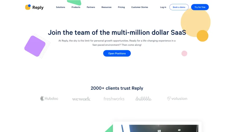


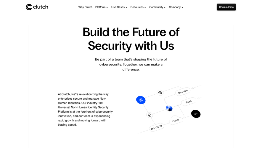

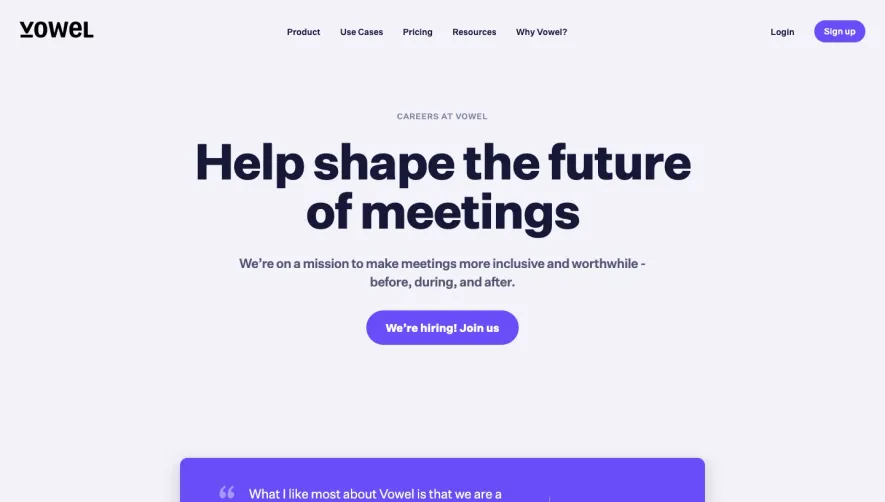

Upgrade to SaaSFrame Pro now to see similar examples.
Monthly
$18 /month
Billed $18 monthly
Browse all screens & flows
Filter and search screens & flows
Search text in screenshots
Access Figma files
Access mobile versions
Join now
Quarterly
$16 /month
Billed $48 quarterly
Browse all screens & flows
Filter and search screens & flows
Search text in screenshots
Access Figma files
Access mobile versions
Join now
Yearly
$15 /month
Billed $180 yearly
Browse all screens & flows
Filter and search screens & flows
Search text in screenshots
Access Figma files
Access mobile versions
Join now